I began thinking about a wreath of oak leaves for a lovely old circular mirror I own some time a good few years ago now. You may recall I’m intending, once of these days, to do a “Golden Fleece” panel, and apparently the Fleece was hung up in a sacred oak grove. I don’t have Jason and Medea clear in my head yet, but I can do a separate oak leaf wreath regardless, after all.
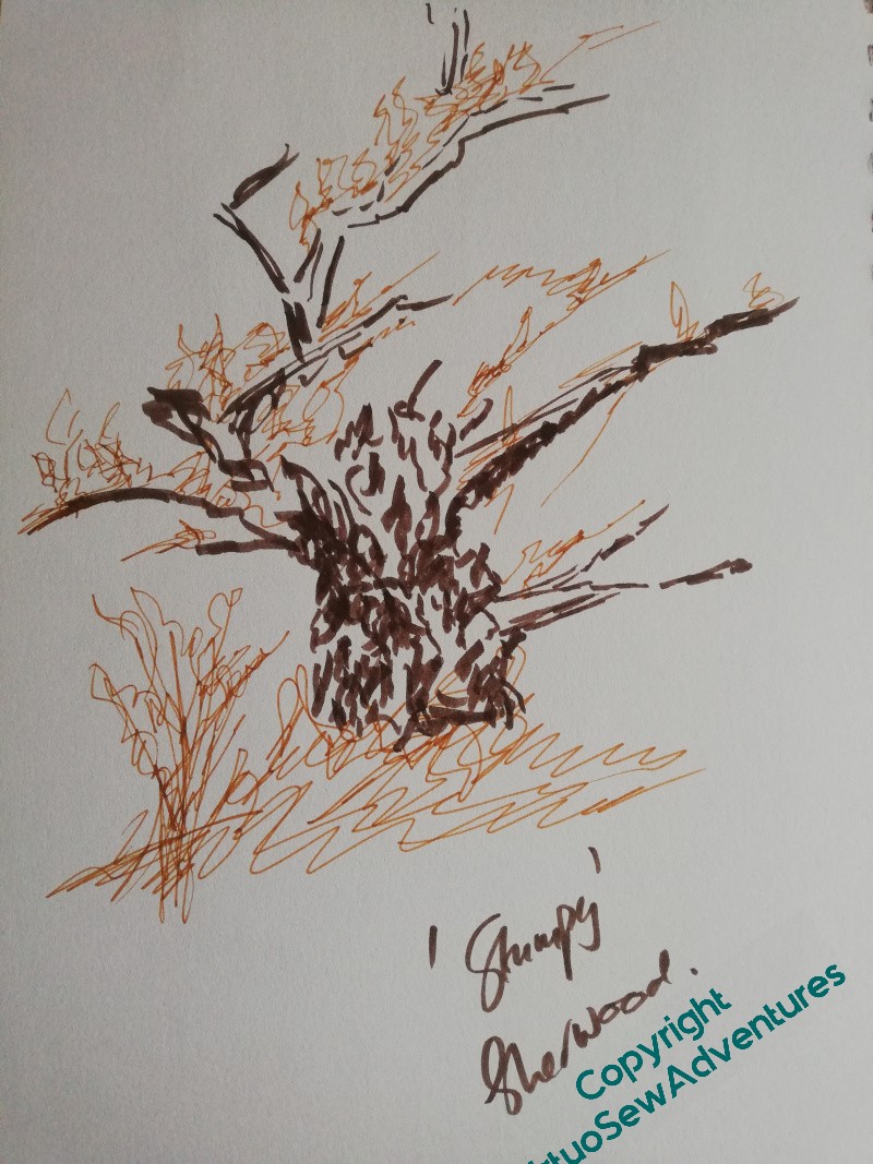
Over the summer we had a friend come to visit, and since he’s fond of walking, we went on a (very long) day trip to Sherwood Forest. I sketched some oaks, tried to work out how to record the shape of an oak grove (I’m going to have to go back and try again), and saw a busy little Wood Mouse who is now destined for Placidus.
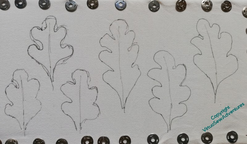
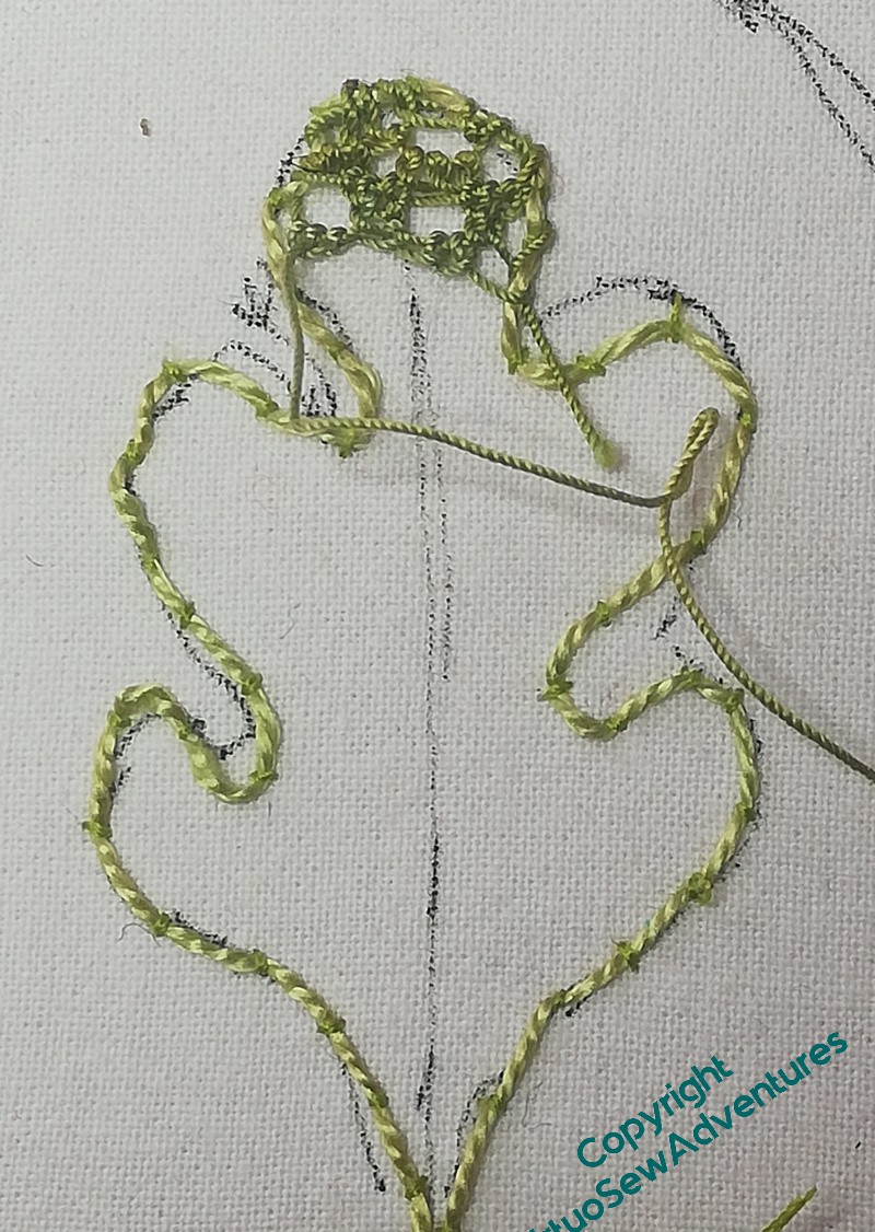
I was also reminded of my mirror frame idea, so I’ve decided to make a start on some more needlelace experiments. I’ve put a double layer of cotton sheeting on some bar frames and drawn oak leaves on it. They’re quite rough, and I’m not sure they’re quite the right size in comparison with the mirror, but I do think they’re close.
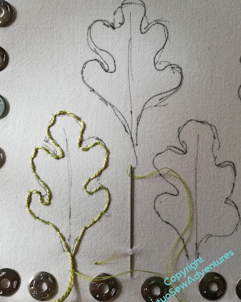
I hoped that I would be able to hold the frame and work comfortably, and indeed for the simple couched outline, it was easy enough.
Once I started on the needlelace, it became very awkward and uncomfortable and I kept getting extra knots I didn’t want.
I have a feeling I need to find a different approach…
In other news – my blog is in the top few for the UK on Feedspot!
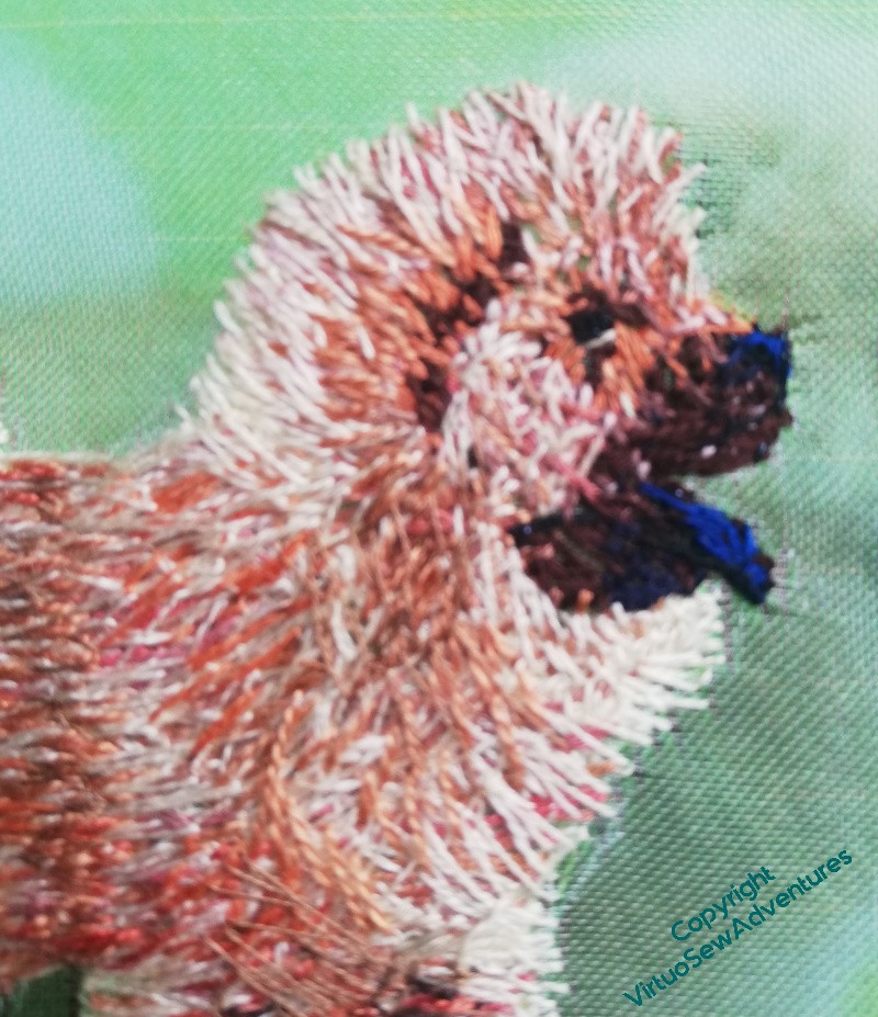
When I looked harder at the photograph, there was a gleam of blue on the model’s tongue, so I’ve added that. I’ve also tried to increase the contrast with the main body of the animal by creating the impression of shorter fur over the head and muzzle.
Yes, I think that’s working.
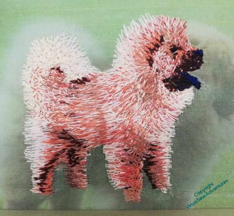
Then I worked over the whole animal again. The challenge with Pooh-Bah in particular has been the depth and fluffiness of the fur. I’m not convinced that I’ve made sense of it entirely, and at this point he seemed a little bland, rather than the sober and stately animal of the book. Well, I know how to deal with that – emphasize the darks and the lights, bring some some contrast and shape to the scene.
I think he’s done now. He’s been rather a battle, especially when you consider that there’s a good chance only his head will be on show. But I don’t know that yet, and who knows, I may come up with the final tweak that makes me entirely happy with him.
Since I want oak trees in both Placidus and The Golden Fleece, we took the opportunity over the summer to take a friend on an excursion to Sherwood Forest. Our friend likes going for walks, and I wanted to sketch oaks, it seemed a reasonable blending of interests.
And I did do a couple of sketches, and a watercolour sketch as well, but what I hadn’t expected was to see some rather bold and busy mice, scuttling about their lawful occasions with only the occasional wary eye on the big clumpy humans wandering around. So, definitely, there will be a wood mouse of some description in Placidus.
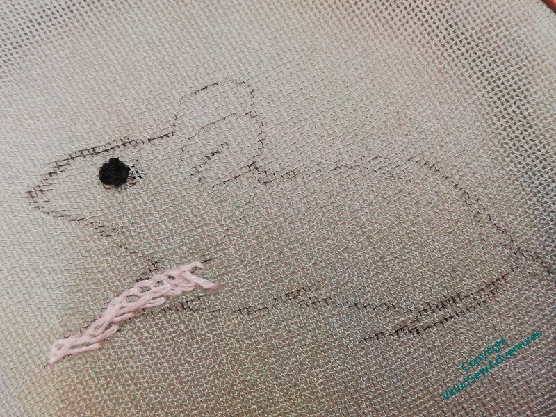
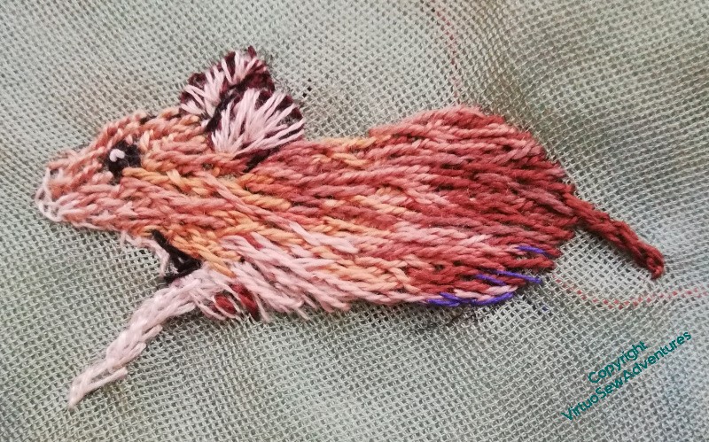
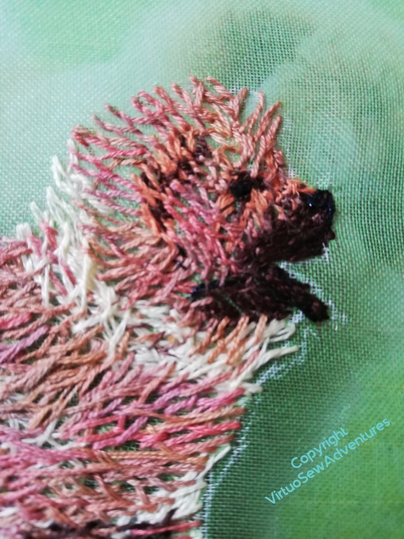
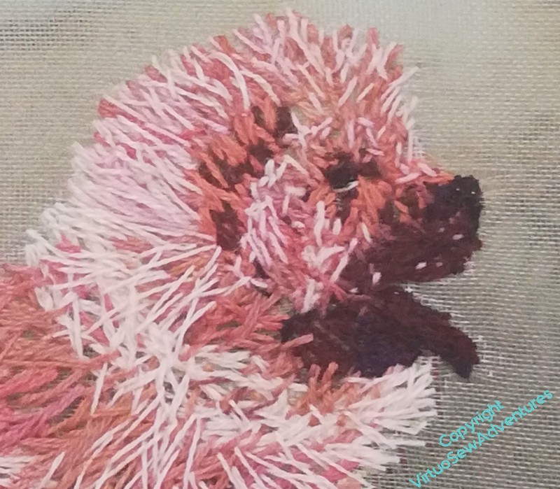
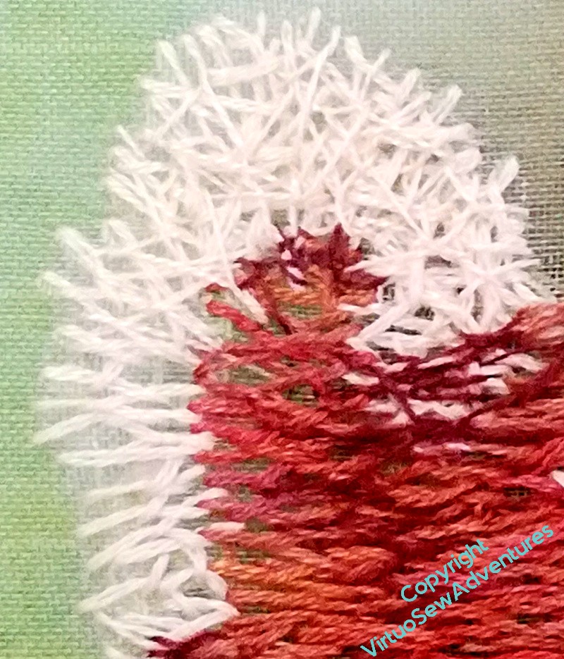
My photos all show a brown furry blob, so I went rummaging online for some suitable mice, and finally settled on a nice profile view that will make more sense when all you see is a nose and an ear. I started with single strands of stranded cotton, and then realised that, oddly, it wasn’t giving me the right sense of the fur, so I moved on to variegated silk perle. This is a bundle of thread I’ve had for years, and don’t use as much as I expected to. But when it’s the right thing to use, it’s very right!
The big beady eye went in first, as you see in the first picture, and then I just worked backwards and forwards, staring at my source photo, stitching a little, starting again, trying to paint with my needle. It’s not needlepainting in the classic sense, being neither as planned nor as careful, but it is very much bringing the way I paint into the way I stitch.
And there’s a thing I would never have said, thought, or attempted, before the “Dreams of Amarna”!
Ears, shadows, highlight on the eye, slightly blue shadow underneath. I’ve left the tail as a stub until I know where my little mousey will end up and whether the tail will need to show!
Many years ago, we went to Cornwall, For not nearly long enough, given how far away it is, but that’s partly my fault. I went home the long way around, via an evening event at the Egypt Exploration Society!
We spent one day at the Lost Gardens of Heligan, and one at the Eden Project. Both of them were absolutely splendid, full of delights, from startlingly lush vegetation to fascinating tales, from beds buzzing with insects to domes full of unfamiliar plants. It’s Heligan that is relevant today, however. There was a wall in the kitchen garden, which was there simply to house and protect the skeps, each in their own niche.
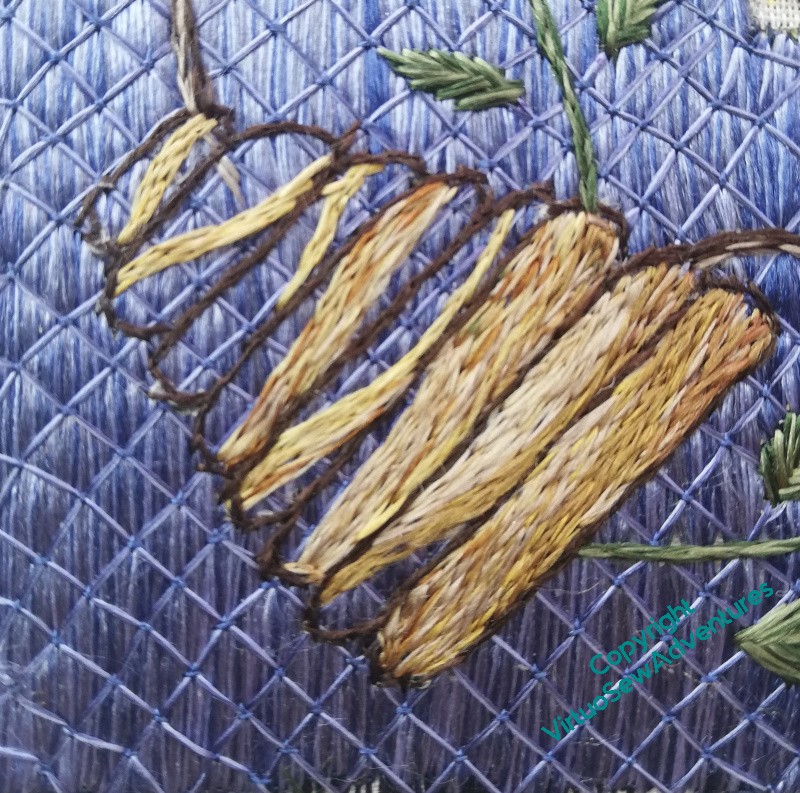
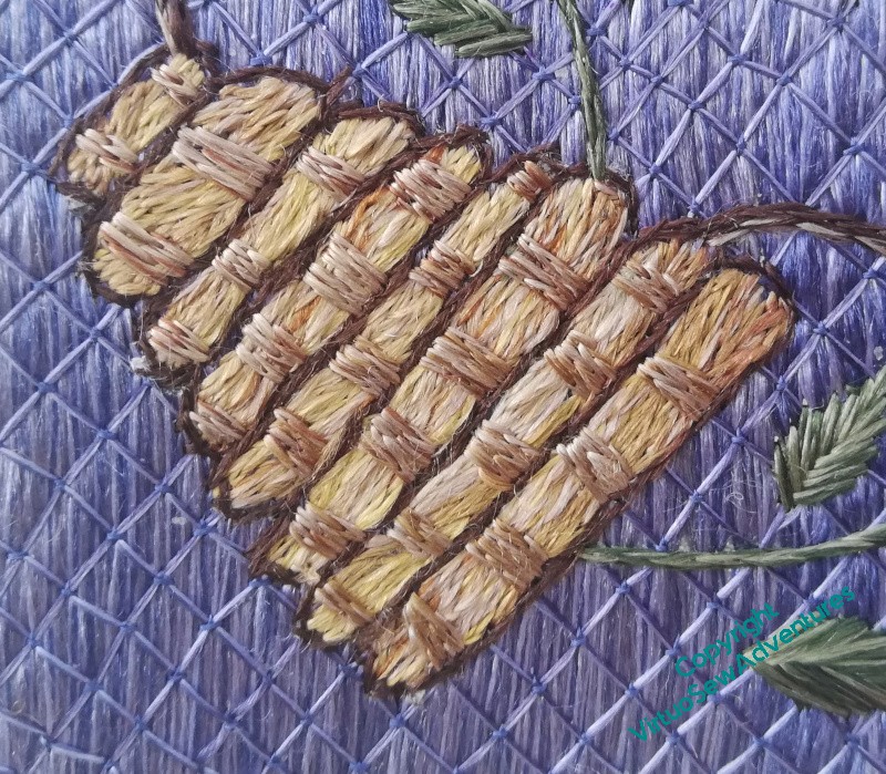
Anyone who’s watched a freshly thatched cottage dull and fade knows how quickly the gold turns grey – those skeps exemplified that beautifully, creating a soft tapestry of creams and greys, modifying the colours in the stone. So that is what I am choosing to guide my choices. I’m blending colours in the needle, beiges, creams, yellows, greys. Some of them are from the Thistle Threads collection of historical colours, some are from my Devere Silks, and these aren’t all the same in twist or thickness, but they seem to have worked pretty well.
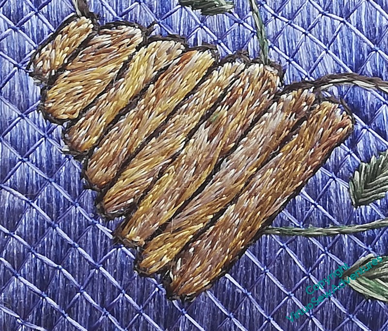
When I had finished the first layer, it plainly wasn’t enough, looking rather flat and cartoonish in spite of the heathered colours. After some thought, I’ve added bands of strapping, as it were, to hold the layers together.
I think that looks a great deal better. As I discovered with William Marshall, it’s the wonderful variety of effects of light on silk that are so attractive with opus, and I think this photo, mobile phone photo in dull light though it is, shows that admirably.
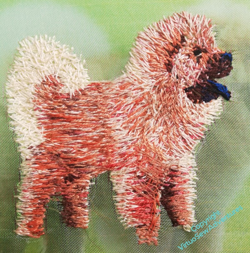
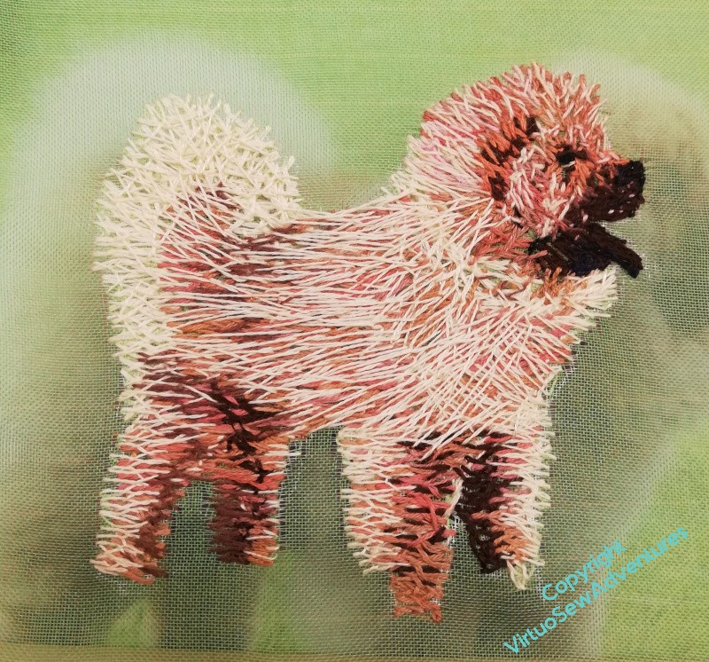
I’m still struggling to make sense of the deep, fluffy furball that is a Chow. You can see me trying very hard here to make the layers tangle and intertwine, breaking up the colour of each stitch so as to create the overall effect I’m looking for. He must be getting quite dizzy as I turn the frame this way and that, around and about.
The stitches around his head are much shorter, and maybe still too parallel. The eye isn’t quite beady enough, and I want a slight hint of blue on nose and tongue. The tail needs more “loft”, and isn’t quite the right shape.
The layer of cream is helping, I think, to create the sense of changing tone and colour, “lifting” it in places, offering contrast in others. I’m not concerned about him floating in mid-air, because when I finally come to assemble the piece, he may be peering out from behind a bush, with only head and tail on show!
Let’s do a bathtub review here (that means, start with something good, enumerate everything that’s wrong, then end with something good again).
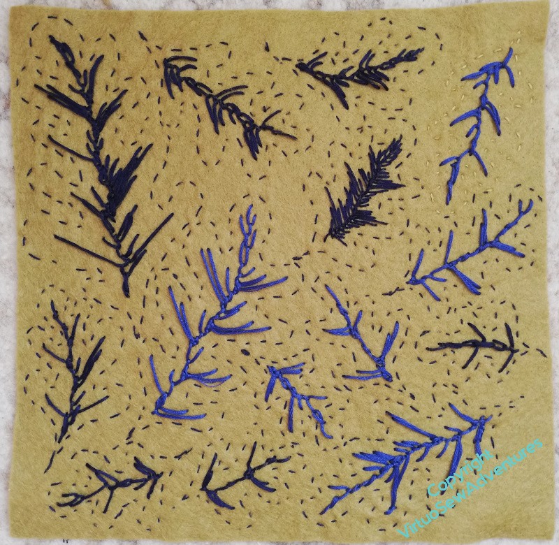
I have done a small sheet of felt, covered in oak leaves, and, taking the idea from the way old tapestries fade, worked centres of two different blues. I’ve used slightly random feather stitch, changing the lengths to reference the lobes on the the oak leaves.
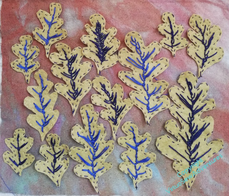
Then I cut them all out…
The running stitch outlines were enough to help me with the stitching, but I grant you, they make the felt sheet a bit confusing. Laying out the cut out leaves makes them a bit easier to see.
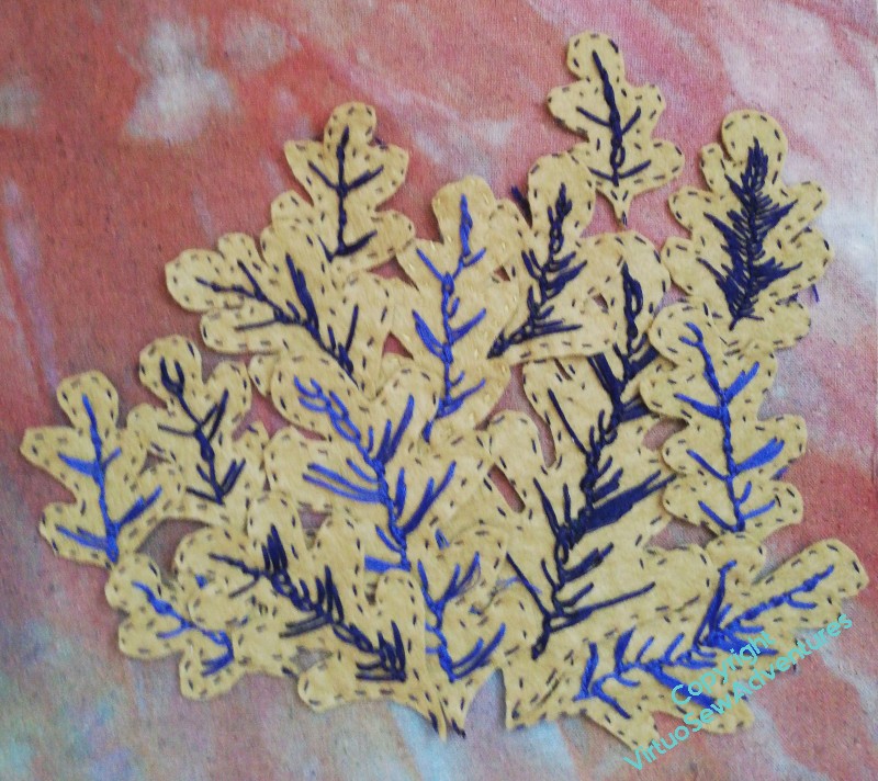
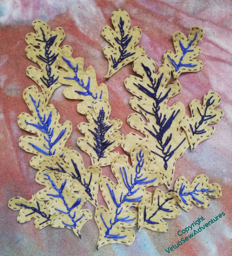
I know that oaks don’t really go into bushes, but what I’m trying to see with these layouts is what I think of the effect of this technique for rendering the leaves.
So, I hear you ask, what do you think of the effect, Rachel?
Well, I still like the concept. I think the idea may well find its way into the final piece.
I found them a bit tricky and frustrating to stitch, and moderately tricky to cut out. I don’t think that the stitching works. Too spindly?
So, maybe worth another iteration?
So, it turns out, the phrase I was looking for is “Not There Yet!”
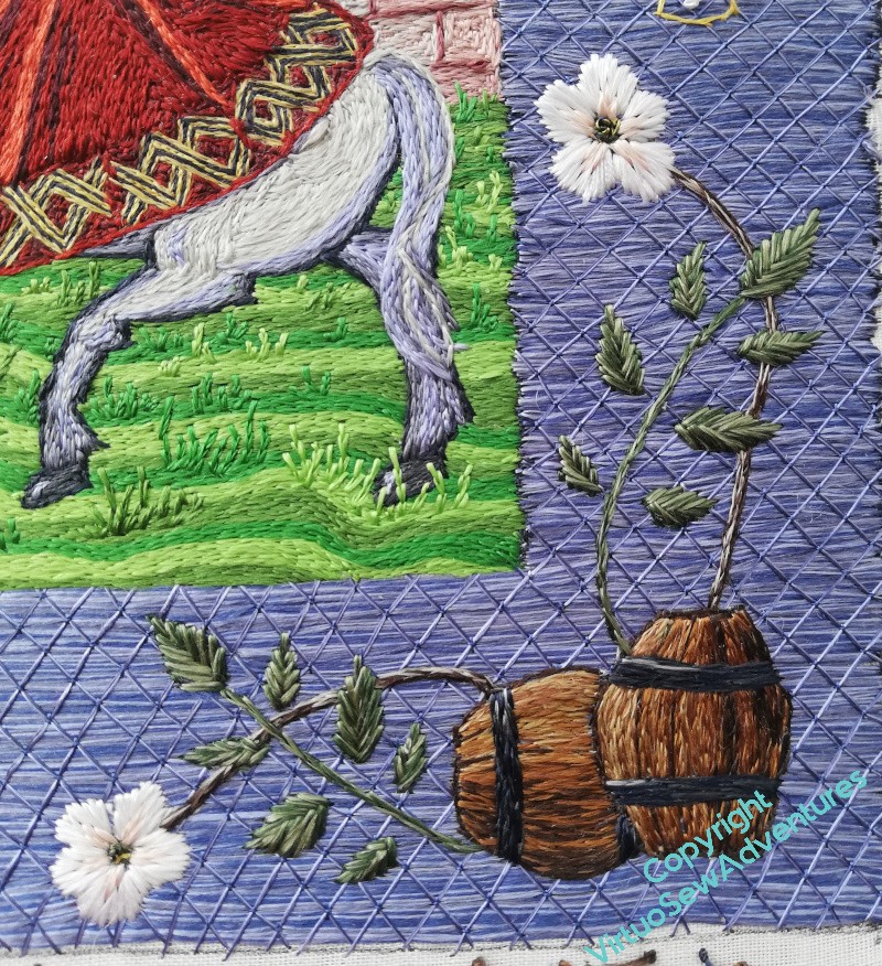
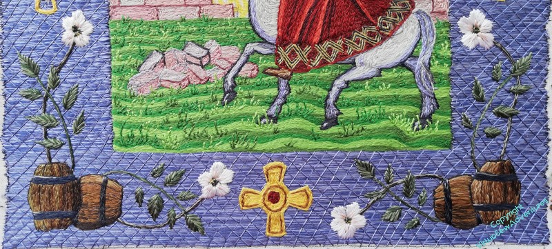
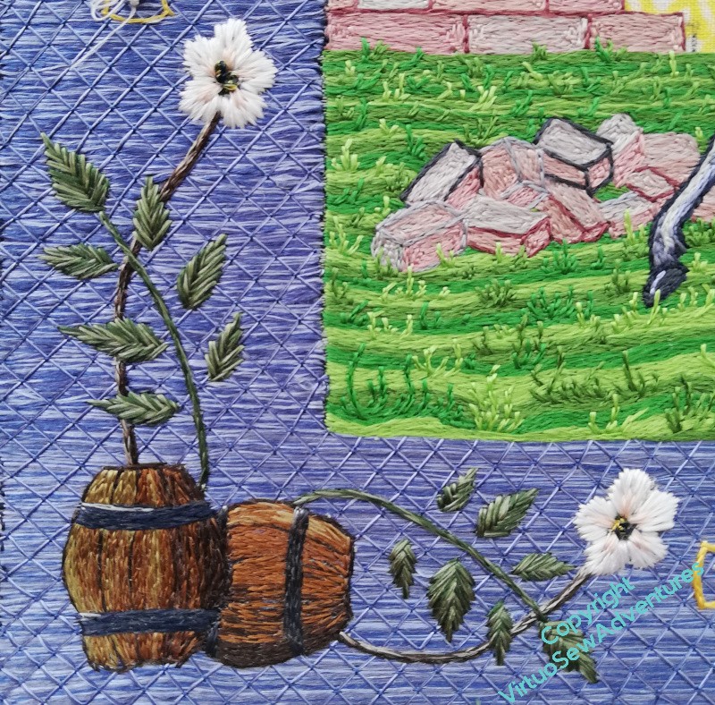
The lower right hand side of Aethelflaed’s border came together reasonably well.
I bore in mind the idea of the light coming from the top left which I used when working Aethelflaed’s dress to make sure that the barrels are sensibly lit from more or less the right place. What I haven’t done is give them a stand to make sure that the one lying down doesn’t roll away, but at this point I am betting that there is so much going on in the image that people will either stroll past, completely unengaged, or be so caught up in what is there that they don’t notice the lack of a stand either!
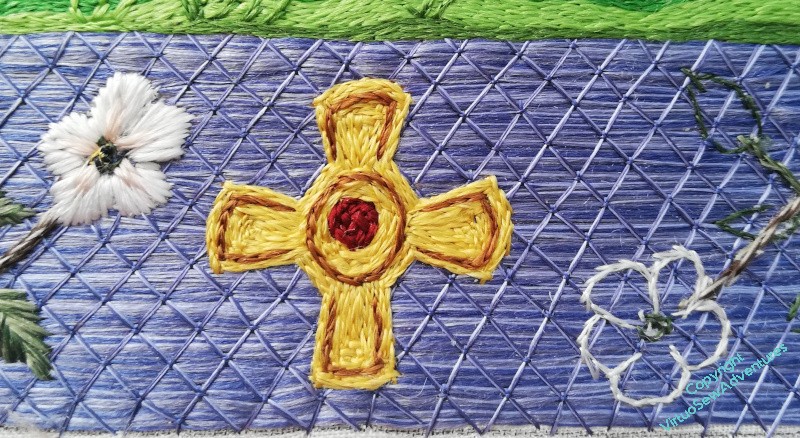
Now I have the whole of the lower border in place, complete with cross, I can look at the combination, and consider whether the colours are going to work.
I think that if I make the bee skeps slightly greyer and less brightly straw coloured than I originally intended, the crosses will probably work well. At least, I’m sure enough to keep working them as I’ve worked this first one.
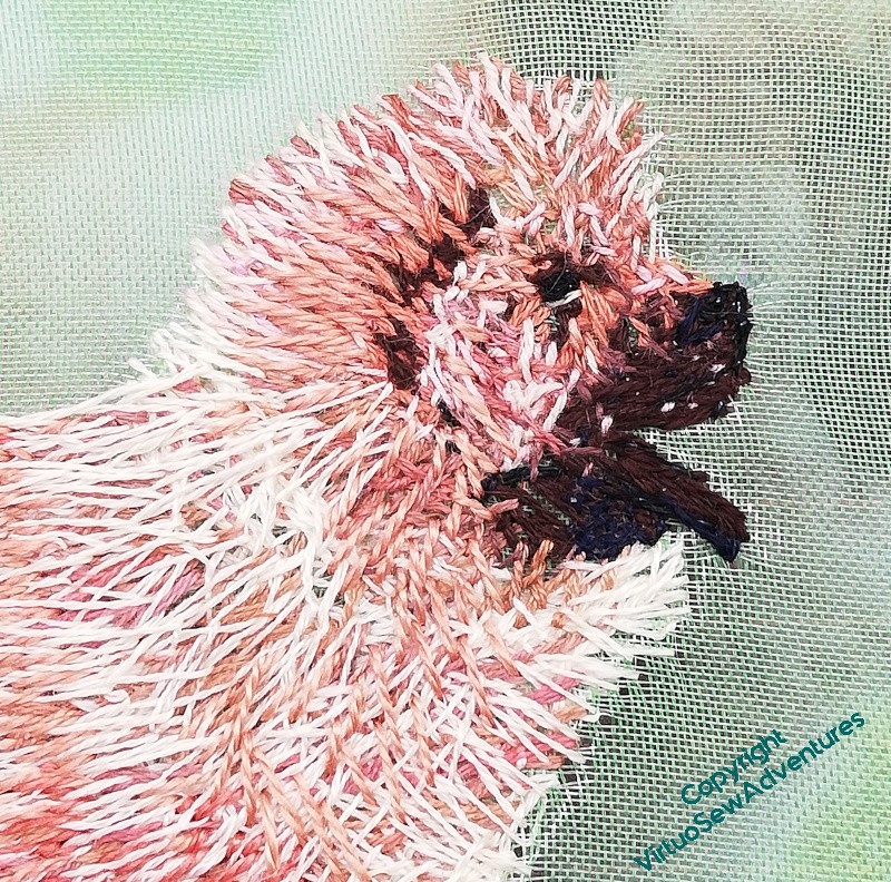
I thought it might be interesting to have a closer look at the way I am trying to bring Pooh-Bah and his ridiculously deep and fluffy fur to life (honestly, I think if I tried to find the body of the dog through the fur I’d lose my arm to the elbow!). It’s very much being invented on the spot, and although the approximate idea is the same, each animal is taking it differently.
So here you see, probably, stage three or four.
I’ve done the eye and the muzzle and lower jaw, quite densely. I tried to find some of the shadows of the ear and under the chin, and the highlights around his ruff.
And from that point it was really a case of “scribbling” my first layer of stitches in very sloppily worked Cretan Stitch. No, that’s unfair. At this stage I’m not trying to be very precise in my stitch placement, so “scribbling” is a reasonable approximation. But I’m trying to balance that sense of a layer of colour with leaving enough space for the next layers and the sense of the depth of fur. I’m not being precise, but “sloppy” isn’t quite right either!
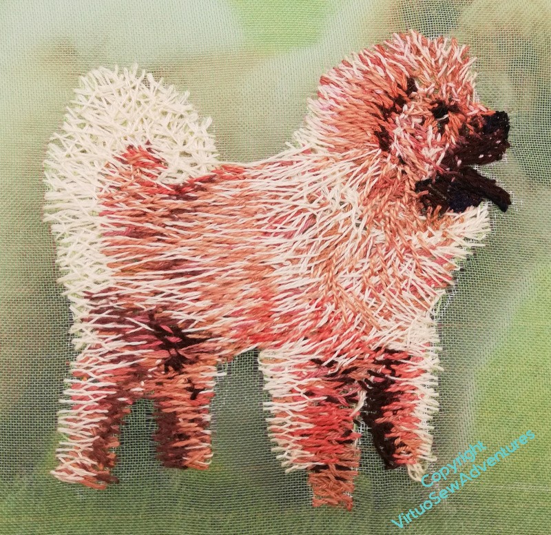
Now look at Pooh-Bah at a somewhat later stage.
The next layer of stitches is in a lighter thread (Pooh-Bah is a creamier colour than the photo I have), and I’ve used much shorter stitches around his muzzle and his face, to suggest the shorter fur. As I move outwards, I’m trying to stitch into the layers below, tangling my stitches to help build the fluffiness.
You can see the same thing happening with the tail, here. There’s a sort of basic “scribble” layer, in this case in something more like Herringbone Stitch – although, if you think about it, it’s not hard to mutate Herringbone into Cretan! I used two strands of stranded cotton for the scribble layer, but I’m beginning to go over it in single strands. I’m hoping that when I come to the final layer, I will be able to tangle it into previous layers enough to camouflage the order of work.
I’ve reversed the colours of the dog roses relative to William Marshall, making the outer edges of the petals white, with only a hint of pink towards the centre. The rose leaves have been heathered, pale and dark green in the needle together. I may decide they need a bit of the paler green around the edge to make the edges more obvious, but for now I think I’m content with them.
The next thing I wanted to do was to get the crosses in progress. I’m having quandaries about the skeps, and doing the crosses at East and West will give me some thinking time.
I remember with William that leaving the crosses until last left me a bit doubtful about them, and since I learned then that the crosses needed to be filled in, the only question, really, was How?
As I want to bring to mind the several crosses found in the Staffordshire Hoard, and some others of the period, they are obviously going to be gold and garnet – we got that far when I was doing the design work. However, How much detail of chasing (engraving) or embellishment with niello do I want to add? There’s the real gold of the background which is going to alter the balance of the whole piece, so I may need to add more, but for now, a single outline for each shape and a central garnet, and I think I have a reasonable version for my purposes.
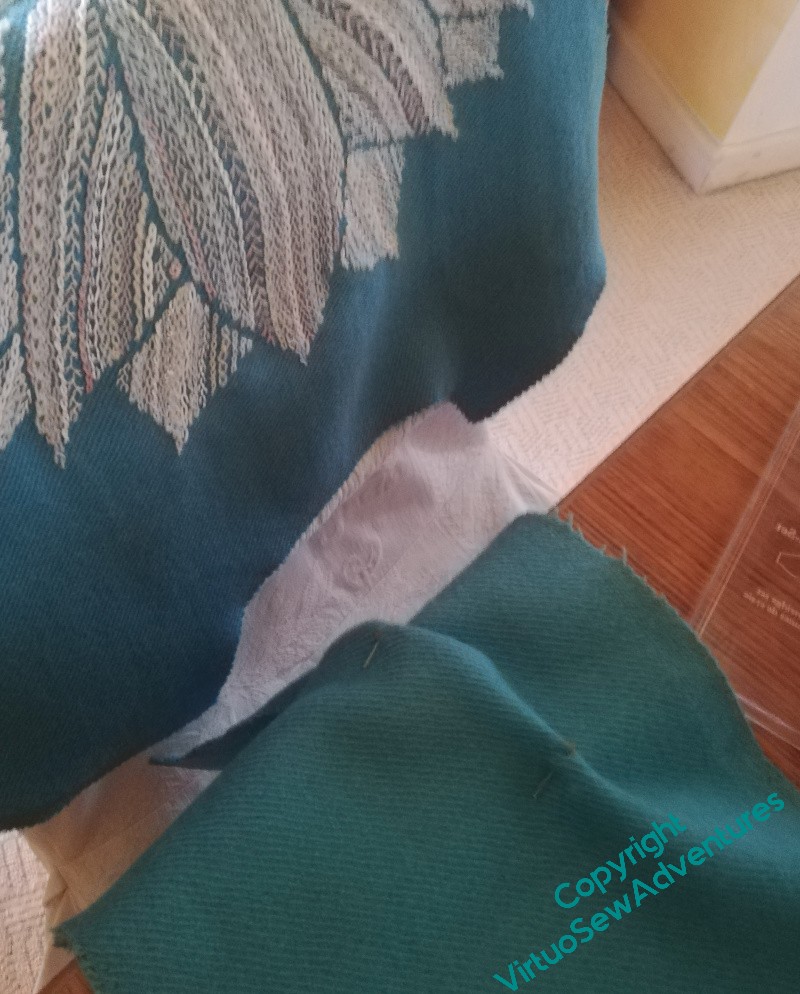
Having finished the embroidery I’d planned, and concluded that I can only decide on any extra twiddles once the jacket is made, I’d best get the jacket made. I want to be wearing it this Autumn, after all!
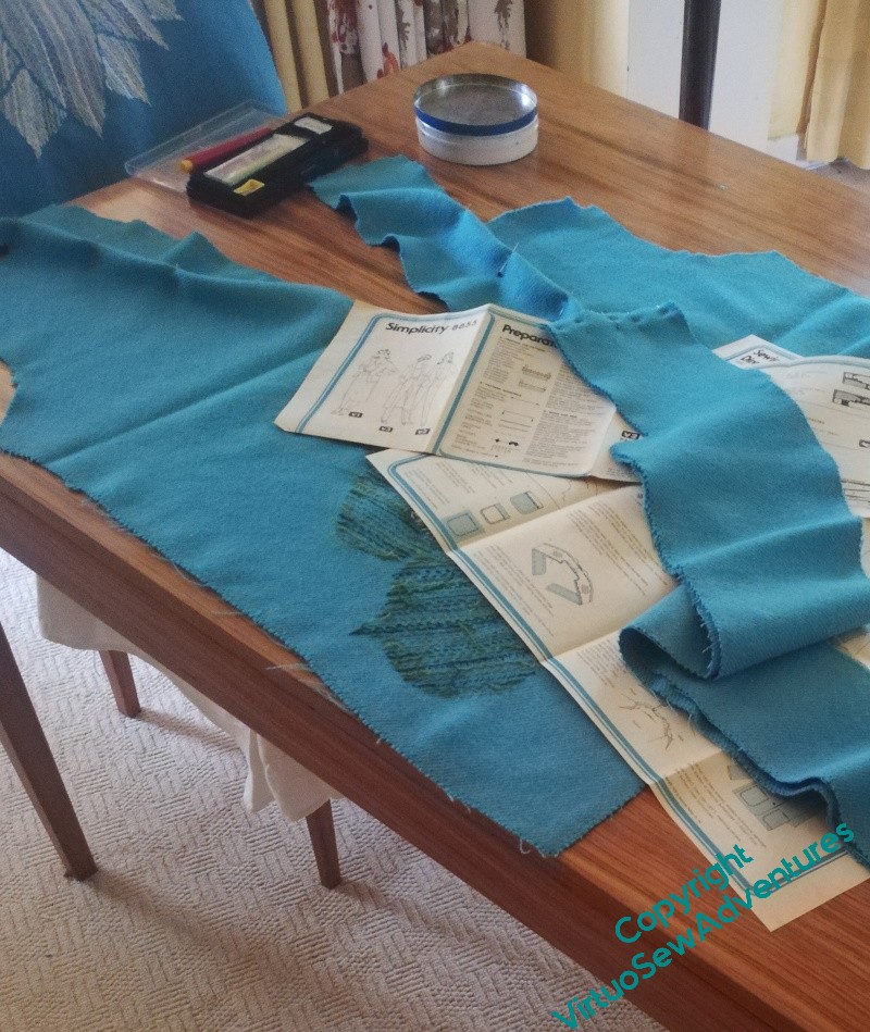
After a bit of a summer hiatus, I fished out the pattern pieces and the pattern instructions, and made a start, only to be immediately wrong footed. The shawl collar was a bit tricky to wrangle, and then I realised that the entire process suggested in the pattern was contrary to what I’d been assuming.
Picture one bemused sewer in a mental four-wheel skid!
Control resumed, darts inserted in the collar, sighs of relief that I jettisoned the idea of pockets. I did wonder about pockets in the lining, and I think, probably not. I’m not sure what I could put in them without ruining the line of the garment, and besides, as I think I’ve said before, I like a bag for carrying things!
Sit down, spectacles perched on nose, solemnly reading the pattern, hoping I’ll understand it this time… (I wouldn’t last five minutes on The Great British Sewing Bee. I’m not quick, I’m easily derailed, and I never see all the problems ahead in enough time to dodge.)
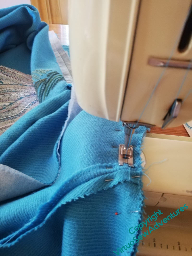
There are two great advantages to using my mother’s Bernina, rather than my hand-cranked Jones. One is that I get two hands to control the fabric. The other is that if I am truly bemused, I can ask for help!
We had a very productive day, me sewing and my mother doing a painting. Neither is yet finished, but we are certainly closer than we were!