The Camberwell Panel – Ten
I ended up using both fabrics.
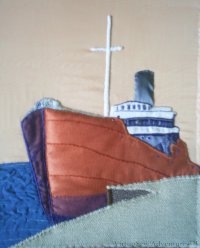
I decided to use a layer of the darker fabric to create the shadow of the face of the quayside edge, covered with a layer each of brown and navy net.
The two layers of net intensified the darkness of the shadow, but at the same time, suggested the roughness of the surface. The net was cut as fragments – not the same size – and the heavy material is cut to the same basic shape as the top layer, there were no lines of fabric edges showing through.
The slip for the upper layer was outlined in buttonhole stitch and then attached over the top. At this stage I felt that some additional stitching would be be needed to create an impression of the quayside in similar detail to the ship itself but now the only fabric to be applied was the border.
Which at this point I still hadn’t yet decided on….!


This is really coming along, the 3d effect is quite amazing!
Wow – it looks stunning!
It does have an astonishing 3D effect. Looks brilliant!
Wonderful stitchery – you’ve captured the scene perfectly.
I can really see the quayside done in lafge rectangles to suggest stonework, done in a darker grey thread. What do quaysides looks like anyway? (exept the modern ones – all poured concrete I imagine…..)
typed with Tommy kneading my lap……
I like your use of shadow it adds real depth to the piece.
I love this piece more every time you show it to us 🙂
How could this get any better? It gets more life-like each time you work on it. It’s going to be stunning!!
gorgeous Rachel and so beautifully worked.
It’s now really begining to look like what I have hanging on the wall.
The original photo was taken sometime in the 1930s and the quayside was wooden. We discussed among other things the posibility of using corduroy from the wrongside to show the effect of planks.
This is just fabulous!