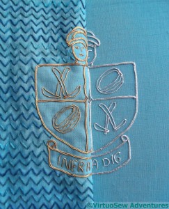
The Second Crest for the Dig
Last month, I had made several unsatisfactory trials with silver thread, and took my headaches to the Harrogate Knitting and Stitching Show to ask advice on the Golden Hinde stand.
I got to the show with about 40 minutes to go of the Thursday evening late opening, which meant that the aisles were relatively clear and I could actually talk to Sarah. After some discussion, we came up with a very bright and blingy silver Jap. In fact it’s so bright and blingy as to be verging on mirrored, and I was surprised at quite how calm it looked when I finished it.
The reason it is so bright is that the metallic wrapping film is much broader than it was on any of the other silver threads I tried. That carries its’ own penalty, because turning corners becomes trickier – and indeed, in a few cases, rather untidier (click on the picture to enlarge it and look at a few of the corners!). I found that I had to devise new pathways for the couching, and use more short lengths. This panel is markedly more fluffy on the back than the gold one was!
I just have miles of that cloud filling stitch variation to do now (and, of course, choose and apply the braided edging!). The background stitching will help to throw the silver crest into relief. I have laid the completed gold over the silver so that you can see. With decent lighting, it should have enough personality to hold its corner.
If it doesn’t, I will frame it up as a separate panel, and show people just how difficult it was!


Oh yes! From these photos it looks perfect. I guess it’s a case of knowing your product and having experience of working with it. Sarah must have known that this gaudy looking thread that you simply wouldn’t have looked at normally would give you the exact RESULTS that your project required. It’s a perfect match for the gold one.
Great work!
You have really progressed a lot on this project! The crests both look gorgeous.
Beautiful!! Now lesson from Penny – don’t you focus on the areas that aren’t ‘perfect’ when you look at it – promise?! Always remember ‘perfect’ is in the eye of the beholder and I’d wager that all of us out here in blog land are thinking its ‘perfect’.
Looking good! Glad to know you got the help you needed.;)
From your comment: I don’t mind proof-reading too much as long as I’ve time for it (not too bad if I’m expecting it to come) and he doesn’t start to nag. Then I get cross!!=)
it does look good from here. nice that you were able to get some good advice.
Looking good and think that he will hold his corner well enough. Jap does handle differently from passing threads, you need to maintain the twist on it.
A very good solution to your problem of threads even if there is a downside. I think the final appearance outweighs any short comings.
I think this ‘silver’ will work, because (caveat: this may be due to my ancient monitor, or to my need-&-refusal to wear my glasses except for driving) I didn’t at first realize that the 2-in-1 pic WAS both the gold and the silver. So I think you’ve achieved parity between the two shields.