More to do, more to think about..
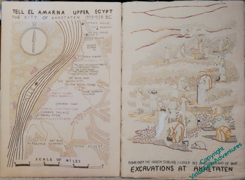
Having finished the title text and got to a point with the seeding where I think it is more or less complete, I pinned up the View of the Excavation over the lovely frame prepared for it, and then set it beside the Map, sat back, and stared thoughtfully.
I think the conversation is beginning to happen, now. There are still a few infelicities – the area at the far right where the tete de boeuf stitch falls away from the trench, and the area above it where there’s a sort of funnel shape between the areas of seed stitches. I think, too, that in the far distance, the seed stitching maybe tracks the shapes of the people a little too closely, and I need to make the edges a bit wispier.
When summoned to act as Cardboard Programmer, or Rubber Duck(!), The Australian said that he was having a hard time making out some of the people, and could I put a very narrow shadow that would balance pulling them out of the scene with not emphasising them to the point of obliterating the dust?
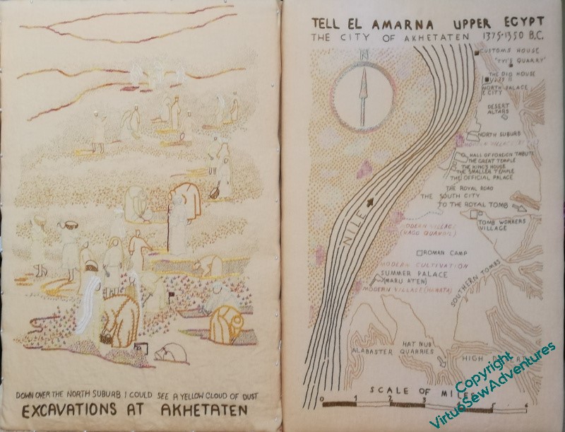
And then I had another thought. I have always put them in this order: Map on the left, whatever else I was going to do on the right. Should I keep to that, or should I change my mind?


I like this new arrangement! It seems to distribute the weight better.
Agree, with Mam (hi Mam!), the map works better on the right. The eye runs down the excavation, and back up the “railway lines” and then down. The excavation doesn’t have anything to pull the eye up again, so keep it on the left, and let the map do the heavy lifting.
Yes, I too think map on the right. I like the way the flow of people from top to bottom echoes the flow of the Nile and this seems to resonate better in this configuration and, as Sue says, carries the eye better across both. I also agree that some of the figures are less prominent now. Those that are outlined in paler thread have sunk into the background a bit, though I suspect this may in part be the colouring in the photograph, which flattens out the texture. I’m most troubled by the man standing with his back to us in the middle ground as his stick is quite strong and one wonders what is holding it upright! Having said that, yes, the conversation is most definitely beginning to happen, and a very chatty one it is too. There’s a real sense of the bustle that must have been such a feature of this excavation. Talking of which, have you seen the archaeology programmes from the fifties on BBC iPlayer? They are part of the BBC Collections series, and some of the accents are positively archaeological in themselves; quite delightful
I don’t know why but I prefer the second arrangement.
Well I had decided that I preferred the second arrangement and then read that everyone else did too! xx
I like that idea about the shadow for your figures. It will add depth and draw your eye into the picture.
I like both arrangements equally. Interesting how different they look the other way round though.
I’m going to be difficult and say I prefer the map in the left. It seems to me to be starting with the bigger picture – the aerial view – and then as your eye tracks to the right, being the way we naturally read, it goes from impersonal long shot to the detail of the close-up, which feels more natural to me.
Either arrangement, right or left, works, but I find myself being drawn to the second one. Maybe because I’m usually looking at things in the order of the first one! I do like what you’ve done, and would probably call it finished if it were mine, but I know you have more stringent standards. =)
I find that I like the second layout better, maybe because this is what I expect to see. As to if it is finished, well, I sometimes return to a work years later and add a bit more.