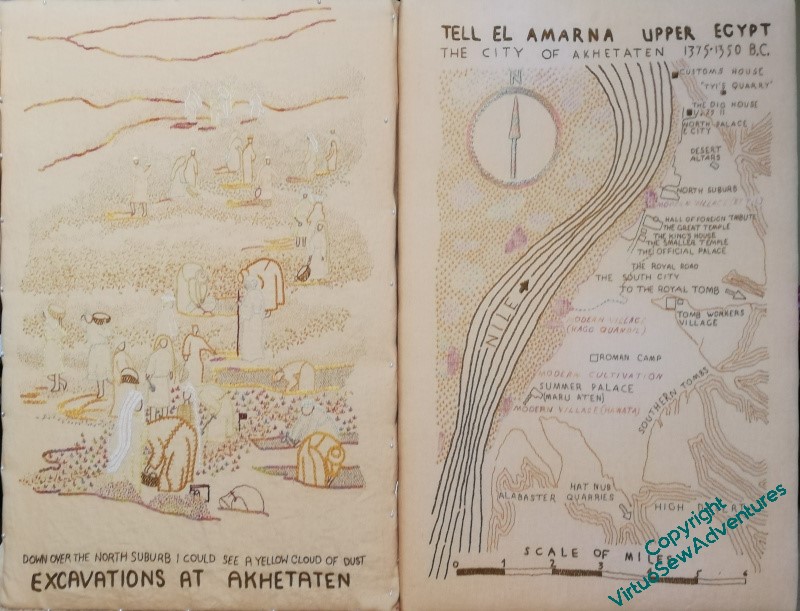
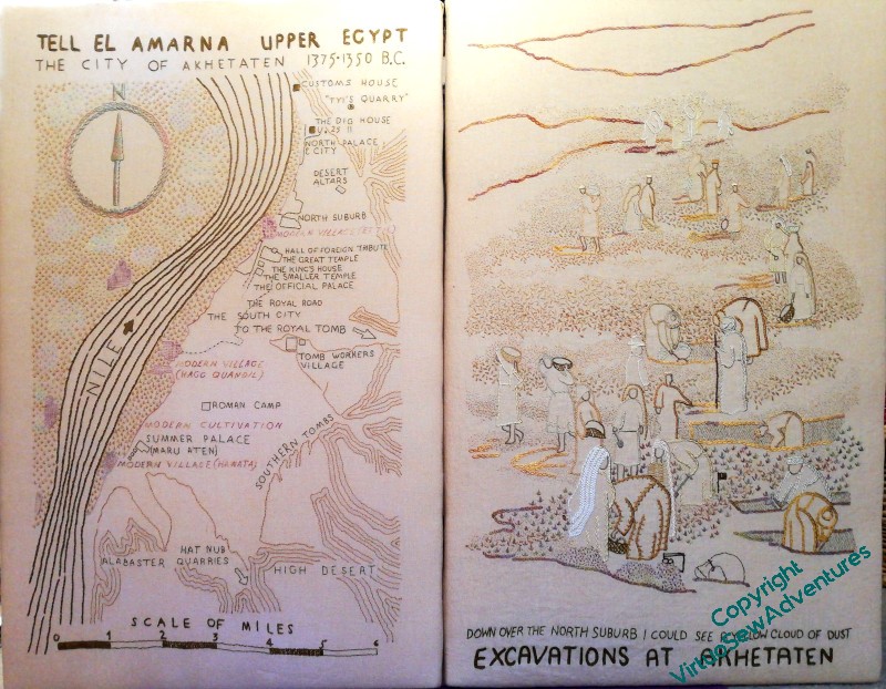
Continuing to think about display ordering..
You may recall that I wondered whether I should reverse the order I had planned for these two main panels of the Dreams of Amarna.
When I finally add the border panels and the “spots”, my intention as far as possible to have the spots that were already known set with the Map, and the spots which are more closely linked with Mary’s experiences at the dig set alongside the View of the Excavation. I’m still not sure which way around to put them, but perhaps if I can arrange the border panels to be moveable, we can change that depending on what else is in the exhibition? There was a suggestion, pre-Covid, that particularly northern British museums associated with the EES might be interesting in combining my embroideries with their finds. Now that’s an enticing thought…
I don’t think I’ve quite finished adding details, and I still need to think out my reasoning and placement for these two, but although the extra shadows are barely visible, even in person, they have, I think, brought a better sense of focus. I do, however, have a few highlights and details to add!
One thing I really like is the clear, un-seed-stitched section at the bottom. When the fabric is washed and ironed, I think that area of plain cloth above the title and surtitle will help to make everything settle together.


Your little details and all the shading have really brought The Excavation to life. It stands up to the map beautifully now, and has scale and distance. Knowing the strange and awkward spaces some museums (and the like) have for touring exhibits, I would make your display layouts as flexible as possible!
Looking good! I imagine lots of museums would be interested in this work.
I would also suggest that you focus on flexibility.
The soft tones are so beautiful.
The shadows have really accentuated the line leading the eye through the composition and I think you now see more of it and linger longer as it draws you into the image – stunning!
I was hoping to see all the lovely details bigger by clicking on the pictures but unfortunately they were no bigger.
It looks lovely as it is, but flexible is probably always best. I would love to walk into a museum and see your work!
This piece is edging towrards completion and you have achieved ‘visual impact’ with your stitching.