Some Thoughts on the Path
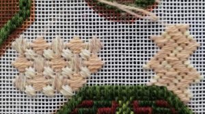
While I’m thinking about the large octagonal borders (they’re proving very tricky to plan!), I’m also thinking about the “path” section. I really like both of these stitches, but they are both much too close in scale to the stitches in the border, and I think they’d be much too busy as well. The path is much the largest area, and I need to keep it from fighting with the borders. There needs to be some calm somewhere!
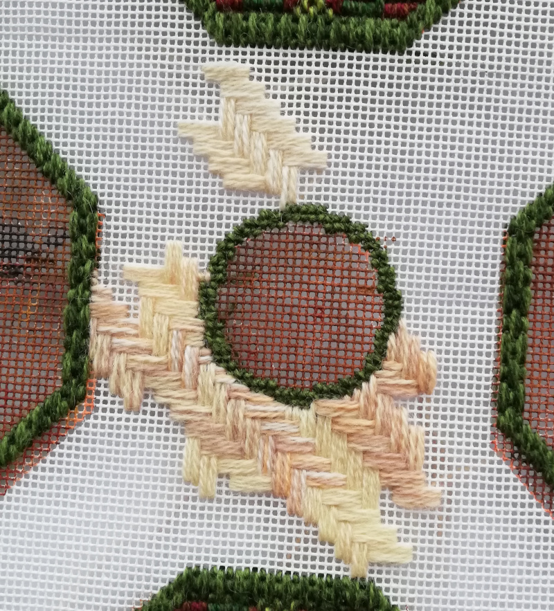
This is more promising, but the lower experiment with lots of different colour combinations and thicknesses is also too busy. I think if I can stretch out the variations to create larger sections and make the colour changes less strident, this might work. The stitch grows quite quickly, as well. I just hope my stash is equal to the task…
I wasn’t intending to start on the path yet, but given the already-referred-to difficulties I’m having with the octagonal borders , I wanted to be making progress somewhere!


Perhaps you could try putting the mix near the outside edges and have a glow in the centre
I like the parquet pattern. A slight variation in colour would be welcome. They are usually warm brick colours in old gardens, a range of shades which might bring out the actual patterns of the green/red beds more, rather than the combined effect of them, as there would be less overall contrast to distract the eye. Keep exploring, you will find a perfect solution before long. You could also consider a little velvety moss, or weeds, between the slabs in places…
I think the paths need to be a bit ‘dirty’, with darker brick colours mixed in with a bit of mud and moss/weed…
The stitch pattern is great, though.
I like the parquet pattern and the colour variation – the stitch seems to cover the canvas better as well.
I like that pattern and I agree that a bit of variation of colour would be a good . It’s terrible when you have difficulty on a part of a pattern, I blame the gremlins.
.