Parterre – where had I got to again?
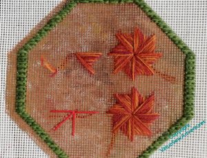
There was a lot of path to stitch, but that gave me plenty of thinking and experimenting time. I started playing with the Milanese Pinwheels when I wanted a break from the endless limestone pavement, and began by using them in the interlocking form shown in the book.
But I didn’t like the look of it, too congested, too solid in the wrong sort of way.
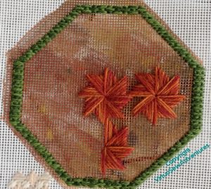
So then I tried a square.
It looked better with somue actual pinwheels, rather than the skeleton pinwheels I used to determine the placement, but again, I thought this was too congested, pulling away from the border a bit too anxiously.
Nope.
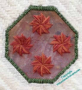
So I asked for comments, and my cousin said, have you tried the diagonal placement without the central one – four pinwheels, rather than five, more space for them to breathe.
I think this is going to work, in fact. There’s plenty of space for the heroic pinwheels to make themselves felt, and if I can find a stitch pattern for the background that runs all the way across, I think they will be nicely set off by it.
It’s good to have progress to report!


Aha! If at first you don’t succeed… Yes, think you have a winning layout there. I don’t think that you want much height or any long stitches in the background. Keep it small and quiet to let the pinwheels get the attention they deserve.
It’s good to have cousins!
This is definitely the best placement of the pinwheels.
I agree with Sue Jones, a small and quiet background stitch would enhance the pinwheels even more.
Keep up the good work.
Lovely – I adore those pinwheels!
Always amazes me how the slightest change can transform a piece. The diagonal placement is perfect.
Loving it. It looks 3D layout.
We are always taught to think in ood numbers for balance but the even number here looks much better.