More Planning for Aethelflaed

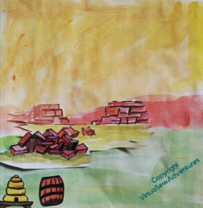
As I have thought about Aethelflaed and begun to plan the design of her panel, I’ve also begun to plan what the background will look like.
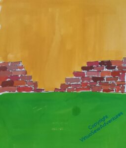
Brought up, as I was, in Chester, the obvious point in her life to choose is her defense and refortification of Chester. So the stone for the wall is the distinctive dark pinkish sandstone of Cheshire, and in reference the the beehives and boiling beer turned on the Viking assault, I have a barrel and a bee skep ready for deployment.

But I need something that I can try to place Aethelflaed against, and strong enough in colour to give me a start on picking her colours, so I’ve redone some of it to give me something to work with. Although I do feel that maybe the wall isn’t high enough.
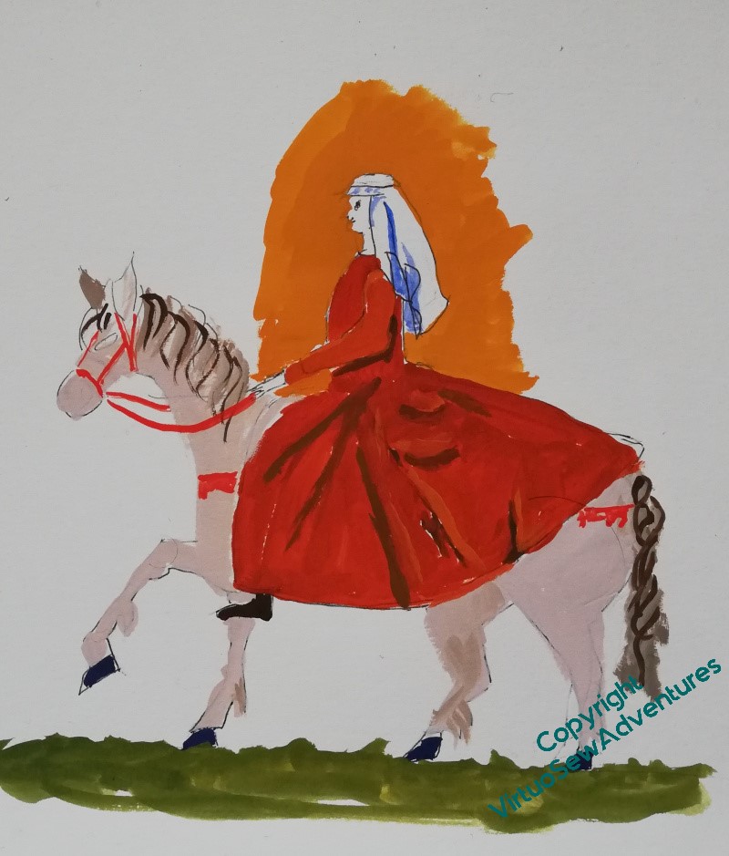
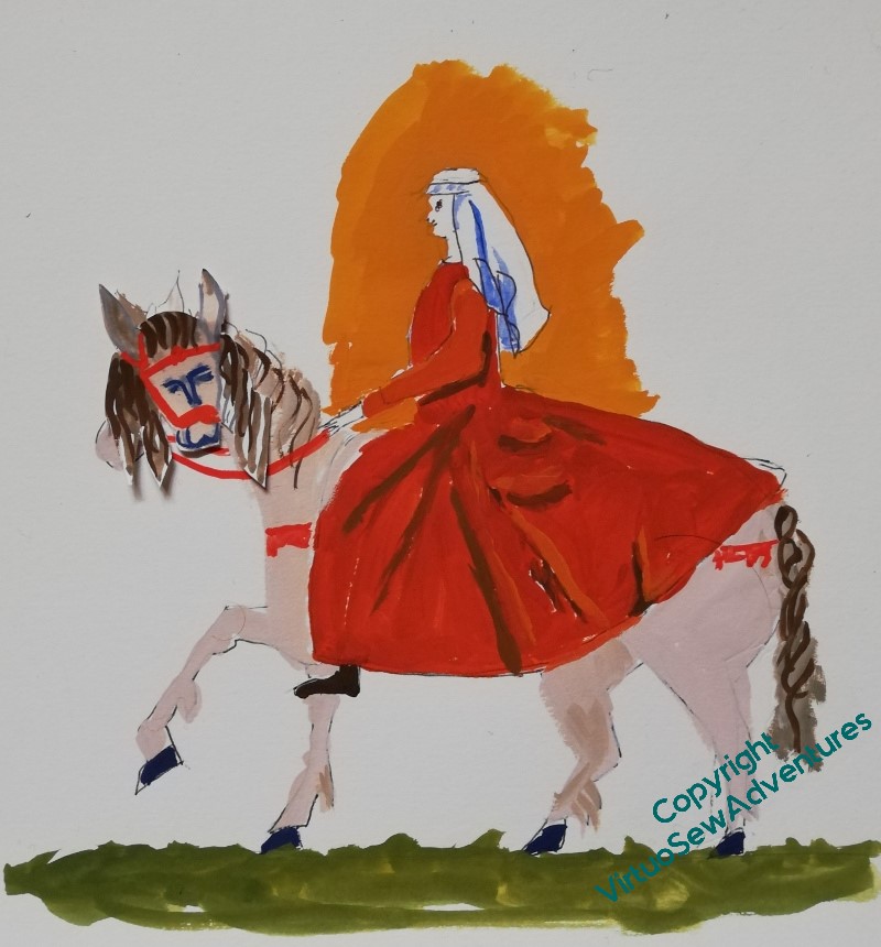
While I’m working on the walls of Chester, I also need to work a bit more on Aethflaed and her horse. The pair of them are proving much trickier than William, mostly because examples of horsemen aren’t hard to find in medieval art. I only had to decide on a few tweaks of presentation and insert the appropriate coat of arms. Aethelflaed is being invented as I go.


In fact, the invention, reinvention, and re-reinvention continues! I think the horse has become a little too long-backed, and needs to be a bit madder. And I’m not sure that Aethelflaed is in suitable proportion to him. What I might do is go back to the original horse, and indeed, the original lady, and then work forward (yet) again, using all the information I now have.
All this planning is keeping me from stitching, and I’m getting twitchy!

Frustrating, but it seems to me like the embroidery version of measure twice, cut once. All the careful planning and checking and rechecking will hopefully avoid issues when you finally start the stitching. And for what it’s worth, the horse seems to be too long in the body to me too. Is it worth taking some measurement from the photo you were using and turning them into relative proportions?
You have many decisions to make. Maybe a wee bit of relaxing stitching will help you find what you need to do.
I agree, the horse in the sketch is a bit too long, but it is not as noticeable because of Aethelflaed’s garment.
Yes, a slightly shorter middle for the horse would look better. Size? Hmm, is it a Welsh mountain pony, a knight’s charger, a dray horse, a lady’s everyday riding horse…? I’d start by getting her just big enough to give you room for the details you need, and then seeing how much space you have for everything else. There’s also William to consider – if they are to be seen as a pair, you need to consider comparative size as well as size relative to the frame…
Doing all this now will save more difficult rework at the stitching stage. You will get there, don’t worry!
I like the proportions of your horse but would prefer to see him looking ahead, he has this attitude when he looks directly at you! (I’ve known horses like that.)
I agree with the comment about proportions compared to William although that will of course depend on how you plan to show them. I prefer the proprtions on the left if that is any help..
I think horses are really hard to draw, you are going in the right direction.
Good luck – always tricky to know what to do first. I like the horse as it is, personally (didn’t horses used to be longer and squatter before we started breeding them to suit our preferences?) but looking forward to seeing what changes you decide to make.