Aethelflaed Begins to Progress..
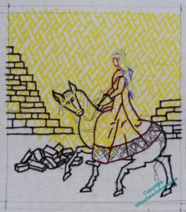
The first stage is to outline everything, so here goes…
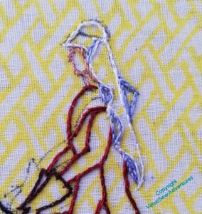
Since a white veil would have been an important part of the outfit, I’ve made sure the shadows are outlined in blue. That will make the white seem whiter, making the day seem sunnier.
I’ve given her mittens, rather than gloves – that may be cowardice (no fingers to do!) – but it will make for simpler shapes. How much the Medieval Movers and Shakers will wander from a truly medieval style and sensibility, I don’t know as yet, but I’m trying to keep my wanderings within reason.
Anyway, here we are, all principle outlining completed.
It barely shows, but the stones are outlined using three different shades of dark brown. It shows a little more in real life, and it might helpd to create slightly different impressions on patches of stonework. We’ll have to wait and see about that!
I’ve left the horse’s headstall and harness unstitched – I’m going to stitch that over the top of the main horse stitching.
I’ve not really tackled the grass, even in thought. I’m intending to make it tussocky – another contrast with William Marshall, approaching his kinsman’s well-kept castle, with undergrowth kept back from the walls. But how – I’ve no idea as yet!
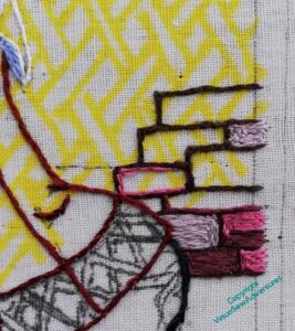
I have another problem, anyway. I’ve started to put the walls in, and I’m more than a little concerned that the contrast of the stonework, if I continue like this, is going to be much too high, pulling the wall forwards and dominating the picture.
I can’t have that – Aethflaed is the one I want people to see. Her work comes after her.
So now I’m wondering about blending the colours to soften the change. That feels like a rather un-medieval thing to do, somehow, so I have to decide whether that’s a point I’m willing to concede.


You certainly have done a lot of work filling in the outlines!
As for the brick wall, I’m a bit concerned that the red shaes will compete/interfere with Aethelflead’s riding gown…
Cheshire stone is certainly a strong gingery-red, but in an era of smoke, mud and dust, and in a state of neglect, with moss, etc, you can probably grey it considerably. The veil edging looks very fine.
Good progress – I too think the bricks need to be a bit more muted. xx
Lots to think about… The blue shadows on the veil are very effective though (tucks that piece of information away for future use!).