
Having Doubts…
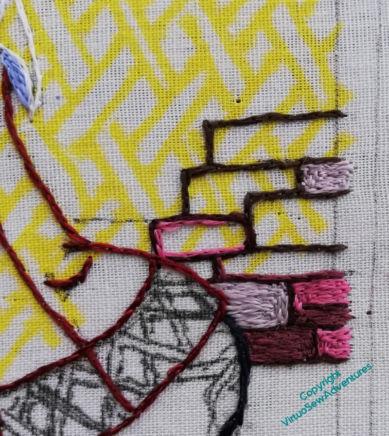
You may recall that I became concerned about the wall and the colours beside Aethelflaed’s riding dress. I filled in some stones, and had even more doubts.
Cheshire sandstone is an absolute horror to depict in stitch or paint – every time I’ve tried in the past I’ve missed in one direction or another. So I’m not especially concerned that this version is proving exasperating too. I just need to find a way to create something I can live with. And indeed, something that Aethelflaed can live with!
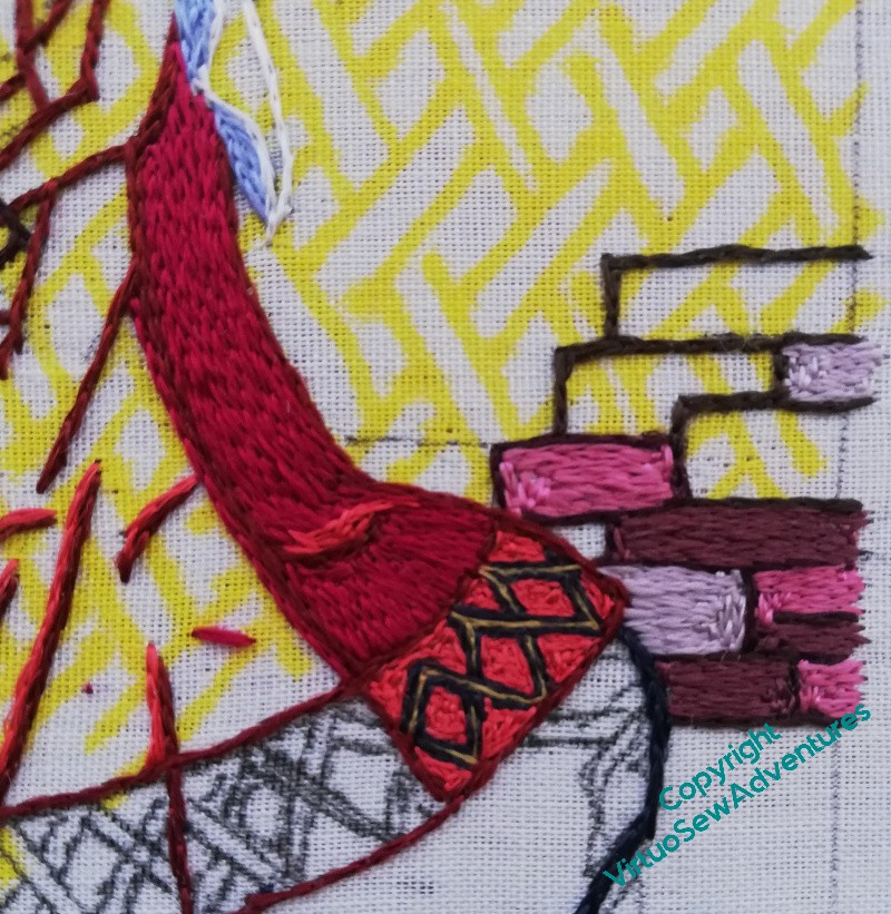
The sensible thing seemed to be to do the back panel of the dress and then look seriously at the combination. So here we are, back panel of the dress, including the bright, dramatic, interlaced pattern on the border.
I do need to retweak the highlight on the skirt, somehow, but I have dress and the border in place, and I think the wall colours are definitely going need a bit of tweaking.
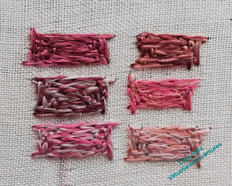
So with the idea in mind of blending colours to make the walls sit back from Aethelflaed a little more quietly, I did some experimentation.
Now I have to make some decisions, of course!
I had to google Cheshire Sandstone to see what it looks like. Most images were rather pale with accents of white. If that is what you want, I think you will get a good contrast to Aethelflead’s riding costume.
Distance lightens, greys and dulls. Also moss and lichen, soot and mud, dust and dirt, shadow, rainwater,… you can grey a fair bit, to soften the colour and distract. The darkening of wet walls might be the easiest get out.
Dress panle and border looking good, I love the border. Yes, those bricks definitely need dirtying up somehow.
All I can say, is best of British to you, having looked up some images of it in the wild online. Rust and russet were two words used quite a lot to describe it and certainly on my monitor your samples look more on the pink end of the spectrum, so perhaps angling more to the russet/peach end of the spectrum?
Love the sampling you’ve done – I think they look rather promising. The beauty of the rough-textured stitching and the colour variations in each of them make it easy to adjust them with just a few added stitches in a thread colour that will change the tone or intensity. I also had to look the stone up and it’s beautiful, but certainly a challenge. Good luck!
I had to look the stone up too. I think the colours look like they need tweeking, some look very pink, although it could be the monitor I’m looking at.
I think the only way to try and match the colour is to mix different thread colours. But remember it is the effect of the colour you are after not an exact match.