The Camberwell Panel – Two
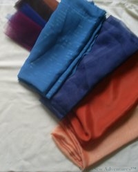
So here are the final colour choices for the Camberwell Panel, after much deliberation.
I wanted to maintain the flat expanses of colour used in the posters, together with the slightly unreal colours, but at the same time, I did not want to create a wilfully unrealistic colour scheme. So although I decided to use apricot organdie for the sky (after all, we’ve all seen strange colours of sky, haven’t we?), the fabric for the sea was a blue-green georgette, and for the hull a dark orange crepe-back satin, crepe side out. The dark orange is close to the terracotta/red lead colour often used on merchant shipping, while sitting comfortably alongside the apricot. Then I picked some fragments of net in a variety of dark colours to help with the rough textures of the quayside, and navy blue organdie to help create the shade on the hull.
I chose a cream cotton velvet to make a solid, but pleasantly textured background, thinking it would make a pleasant surround when the panel was complete (as you will see, there were some design changes made during the process…!).
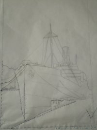
This in turn meant that transferring the design threatened to be an exercise fraught with difficulty – right up to the point where I realised that since much of the design would be applied in pieces, all I needed on the background velvet was basic clues for placement.
So I traced the design onto tissue paper, tacked it in place, put the whole thing on a slate frame and went over the main design lines in running stitch.
Easy!


Gorgeous strong colours. I can’t wait to see it finished! 🙂
I like the colors you’ve selected. Now I’m waiting for the ship to come to life!
easy!!! ha!!! I think not….
An apricot sky sounds heavenly!
did your book not come??
Sounds like you had a lot of fun stash building!
Looking forward to the final piece…..
I sent you 2 e- mail today at your usual e-mail address, and it bounced back “e-mail box is full”. My computer has been in computer hospital for 4 days, hence my sudden silence. But I’m back now!
This looks very intriguing….I love the poster of the old cruiseline ships. I’ll be back to see how it progresses. Love your needlework.
Yes, the colours are very typical of those old posters and I’m looking forward to seeing how you progress this, since I’m sure it won’t just be appliqué but my poor old brain can’t imagine anything further on from that!