Beginning to think about assembly
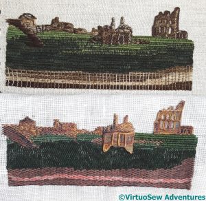
Here’s a direct comparison of Version One with Version Two – and it doesn’t help my decision making one bit!
That said, when I put a similar picture up on Instagram and Twitter, the top one (version two), of which I had considerable doubts as I was stitching it, was overwhelmingly the favourite of those who responded.
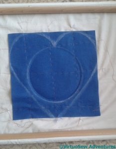
So while I continued to think about that, my next step was to attach the fabric provided for the heart shapes to a backing fabric and draw the shape on it, together with the circle for the roundel. Since the fabric supplied is only just big enough, and there are going to be many layers to my appliqué, I want to ensure that it remains stable and controlled during the layering. Attaching it to a backing fabric and then stretching the backing fabric in a frame seems to me the best way to achieve this. It’s also a very good use for the remaining “good” section of a lovely cotton sheet I had put my foot through!
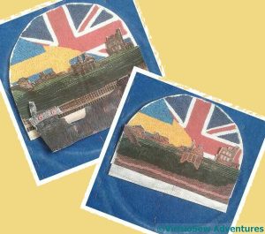
I made photocopies of the flag sunrise, the headland, and what I have done of the ship so far, trimmed them close, and made an unwelcome discovery. Neither the flag sunrise, nor either headland was quite as wide as I wanted them to be, which is a little worrying when you consider I could have sworn I used some form of measurement!
Still, onwards and forwards….


Rachel, which ever one you choose, this piece will be so stunning! And don’t worry, I measured St. Laurence too and stillhe didn’t quite cover the hole in the background I left for him :).
Wonderful work Rachel, both versions are very complex and interesting. I prefer the colour and stitching of the top design.
I really like the one on top. The colors are more accurate.
You have put a lot of work into this project and made several discoveries. I am sure your Great Grandfather is looking on and watching over you. Every choice you make will be the right one.
Onwards and forwards…
I can’t decide between the top and bottom pieces. They both have beautiful qualities and are equally as lovely.
Love the cliff on the top one and the windows on the bottom one! The top one looks more realistic with a sense of depth. 🙂
I can’t remember how we voted last time, but we have both stared and squinted at both versions, and have decided that we both like the bottom one!
I still like both pieces but I think that No2 has a slight edge. As to the measurements, well how about fudging it?
I am still preferring version two – but I do love the ruins on version one!! xx
So frustrating! I’ve just done something similar with a piece of furniture I’m upcycling and I still don’t know how I came to mismeasure. Perhaps it’s to test our creativity to the utmost!
Well, now I can see where this piece is going, and it looks splendid. I do prefer the lighter buildings as a stand-alone piece, but the darker ones work better in context as middle-ground. As for size, chain stitch filling is a great eater-up of fabric – it quietly shrinks everything. I found that out the hard way, too, so you have my sympathy!
Love the way it’s all coming together.