Moving on to the Sea
Having got the headland attached, I moved on to the sea.
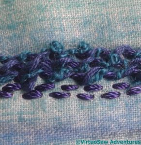
I began by colouring a piece of fabric with Inktense and aloe vera gel, and then started to work whipped running stitch across the width for the sea. The idea of the colour was to keep the fabric from showing through.
Don’t like it. Not one bit. The fabric was too tightly woven for the threads I want to use, and it wasn’t growing quickly enough.
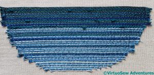
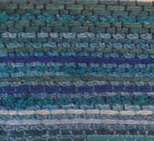
Fortunately that was the only false start. The second version was rows and rows of couching. I used a less finely woven fabric, although that mattered less in any case when I settled on couching. This gave me the change to make good use of some textured yarns to create the impression of a slightly sullen, lumpy sea.
After the first few lines, I used an overdyed rayon spiral yarn as the “standard sea colour”, and alternated it with variety of other threads, couching them down with different tones of thread and lightening as they came forward towards the front. The tones of the couching threads help to modify the colours of the couched threads.


What was the purpose of the aloe Vera gel?
I’m eager to see how everything works out. I can see that the running stitches would take forever to cover the space, and the couching seems to have done the job!
I love the couching you have done on this piece, the colors are lovely and I look forward to watching this progress.
I think the Whipped Running Stitch makes a nice choppy sea, but more suitable for a close up look. Your choice of couching a variety of yarns was a good one.
I, too, am wondering what part aloe vera plays.
I think the regularity of the stitching has added to this as well. At first appearance the sea looks irregular but that isn’t how we see it.
Despite you not liking it at first, glad it has turned out well.
Two very different looks to your sea attempts. I really like your second couched sea, it has worked really well, and your constant sea colour has mixed really well with your other colours. I bet getting this stitched was exciting!
I like that! I think it will link in very well with the horizontal lines grass of the cliff top, especially with the vertical lines of the cliff in between them.
Yes, this looks like another success. Quiet enough not to overwhelm the other parts and interesting enough to be worth more than a passing glance.
I was away for a while. Back to view your blog and love to see the color of your work. I love this blue.
mmm, very moody. xx
Wow. And again, going up to the top post, I can see how well this worked. You must be able to see really clearly inside your head how things will work together. I could almost see the undulating water lapping at things – and then it’s going to be almost completely covered. That’s a little sad, when it’s so perfectly wonderful!