The grounds around the castle
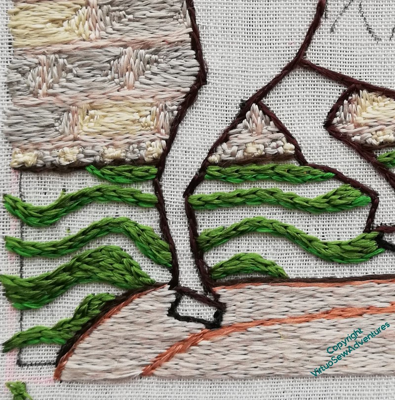
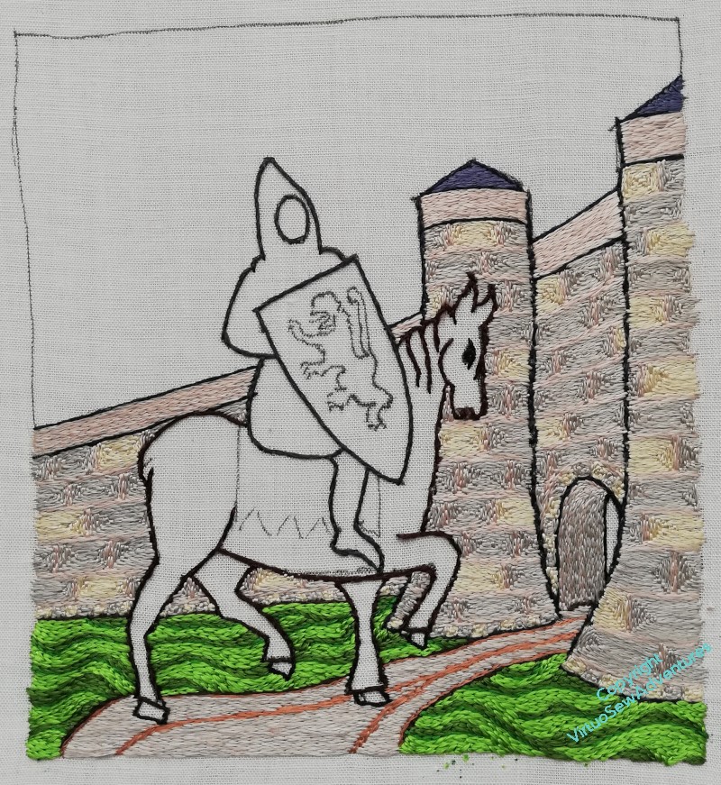
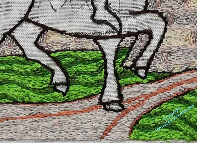
In her book, Tanya suggested using a slightly thicker thread for the ground (that is, more strands in the needle), to help it look a bit more uneven without interfereing with the glorious light effects of silk. I decided to vary the different colours as well, to help with that effect. This is the mid tone, although the “dark” isn’t so much dark as a different tint – that’s because I bought it online, and when I started stitching with it, it wasn’t quite the colour I thought it would be.
That said, I think it has turned out very well indeed. I enjoyed trying to keep the curves curving the way they needed to, varying the way each colour filled the allotted space, changing the way the lines flowed. It somehow does manage to look a little like an illustration in a book of fairy tales, partly because of the lines of colour, partly, I think, because the lightest of the greens is very much in that vein.
Not an Arthur Rackham illustration, obviously!
I love the way the grass has made the horse look much crisper, as though he’s conscious that this is An Occasion, and he’s putting his best foot forward.
But I do keep looking at him very panicked, to make sure that he’s not going to fall over. I once did a painting of an elephant, and it was only afterwards that I realised that the poor beast would have overbalanced and landed on his side with a rib-crushing Thump! if what I had painted had been accurate observation…


The grass is looking good. Thick and fresh. Horsey must be disappointed that he’s not getting a chance to stop and tuck in. Ah well, the sooner they are through that archway, the sooner he will get that weight off his back.
I like how you did the grass very much – it certainly does have the look of a storybook. It always fascinates how each seemingly simple bit of detail elevates something else.
William’s horse does indeed look relieved to be standing on solid ground, and not as though he may fall over. When you come to stitch him, the shading you’ll put on the legs furthest away from the viewer will make him more solid as well – at the moment he’s still a bit like a cutout which may be what is troubling you. The grass is wonderfully wavy and deliciously green.
The stitching for the grass is very effective and sets off the other figures in the picture. Congratulations.
Loving those grassy greens, very effective.
I keep meaning to ask, do you have a ‘follow by email’ option for your blog? I don’t have a login for bloglovin’ and would like to get notifications for your new posts if possible. Thanks