Something I didn’t quite think through
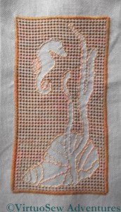
I’m really not at all sure what to do with this. It’s an abandoned experiment that I recently rediscovered, and which is nagging me more than somewhat! I really should finish it, or do something with it. It was originally intended to be a traycloth, and I’ve also run out of the thread I was using to hem the piece. So, since I can’t remember what that was I have some unpicking to look forward to, whatever I decide to do with it.
I wanted to play with the idea of stitching the background, rather than the design. I also wanted to take advantage of the fact that Caron Collection colourways are dyed onto different threads (in this case, a fairly fine single-strand thread, and the heavy three-stranded type).
As it stands, I’m not happy with it. Maybe I chose to make the pulled work too large (it goes over four stitches in each direction), maybe it is too dark. Maybe I just haven’t done enough stitching yet?
I still think that doing most of the stitching in the background – a little like Assisi work – would be an interesting variation. Back to the drawing-board!


Very pretty and I love the variation of texture and colour. I can’t at the moment think of what you might do with it either. Never mind, knowing it’s beautiful will do; you don’t have to believe it’s usefull as well. I know! Frame it and hang it in the bathroom!
I think stitching the background and leaving the main motifs does work. I also like the balance of the design. I think you may be right that the pulled work should have been worked over fewer stitches, I also think a less linear pulled work stitch may have suited your design better. What I can’t get over is the pinkness of it but then I have little imagination 😀
I’m glad to know that I’m not the only one who has half-finished projects…I feel for you…the angst, the guilt, the dilemma…it’s a very lovely piece, I’m sure that inspiration will strike!
good luck with this…I don’t like finishing ‘old’ work….I am very poor at that kind of thing….(hanging my head in shame)
I like it a lot, but it is a bit chunky. I’d make it into a quilt….
Oh, sighhhh…it must be ‘projects we’re not happy with day’! 🙂
I know you, though, and it will end up a ‘silk purse from a sow’s ear’ in the end!! XXO-
I know it is not quite the same but when I saw this I thought of this here http://www.jmddesigns.co.nz/seahorse.htm maybe you could finish your piece doing something along similar lines and frame it. It would be a shame to leave it unfinished. I look forward to seeing what you do with it.
I wonder if it’s the ratio of the background to the motifs that you’re not happy with. There does seem to be a big blocky area on the left and perhaps that’s unbalancing the design? Just a thought.
How about doing your “Assisi work” in a way that would represent moving water? Knowing your bathroom, I think it would fit there!
I think your outline around the outside is too heavy and too angular. Perhaps if you removed this, changed the shape that you work with pulled thread and replaced the outline stitching with some thing finer it would balance better. Just a suggestion.
I like it as it is. Having no reference to size, I can’t comment on that, except that it seems OK from what I see. Perhaps if you really don’t like it, you can use it as a beginning for a very encrusted piece. Just stitch over it as if it were plain fabric, or fill in certain areas (but not the negative spaces you’ve created).
It looks good to me as it is! It’s hard to judge the size, but you did say tray cloth – so perhaps you could applique it on to a towel for the bathroom (but not to be used!!)
Perhaps the pattern would stand out if the background were a darker shade?
Good luck with this!
How about painting the unstitched areas? I do agree that as it is it doesn’t ‘work’, but the idea was worth following through. And without the ‘what if’s’ where would we all be?!
I agree with Alex re the weight (or ‘non-weight’) in the lower right hand corner.
Also, I can see the motifs done in bright colours – but that is probably because I’m not seeing the variegation in the colours of the background as well as they appear IRL.
Painting does sound cool.