About Rachel
View all posts by Rachel
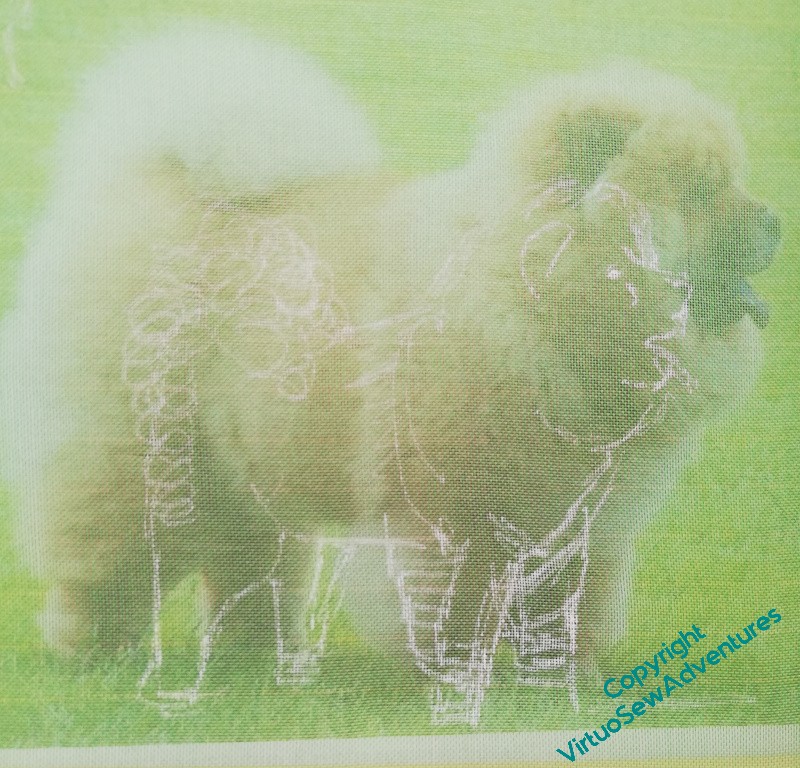
Starting Pooh-Bah the Chow
It’s been a while since I did any work on the Placidus panel, or more strictly, on the various elements thereof. It’s not for want of trying, but in my usual fashion, I became distracted by the Lotus Flower Coat. Now I’ve got that in the state where it’s awaiting assembly, I can return to my previous progress!
I am becoming aware that I have run out of “easy projects”. I need to start thinking about how I’m going to do the forest and the rocks, the stag, the man and his horse… At the moment, I’ve not the vaguest clue about that!
However, for Pooh-Bah the chow, I’m continuing as for the other animals I’ve done, with layers and layers of entangled stitching. I’m having to stitch myself painfully back into the right mindset to see what I need to see in my source material and then to bring it alive in my stitches. In this case, I’m scrambling in a light underlayer where I want the lighter coat, and I’m hoping that the final layer, in the direction of growth, will then look like the deep, fluffy fur of the animal.
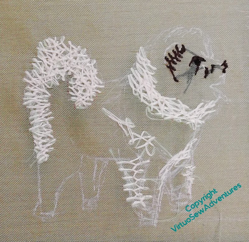
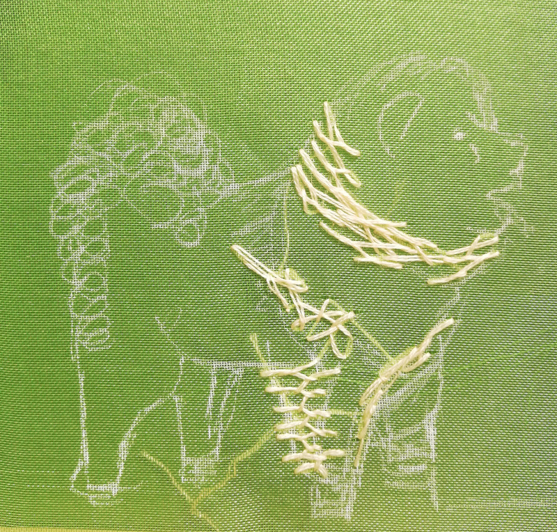
There’s quite a lot more cream in place. More around the neck, short small stitches on the foreleg, trying to work myself back into my technique. It’s coming, I think. The foamy tail is looking suitably tangled here, and I’ve now added in a few dark stitches, the eye, ear, and start of the nose.
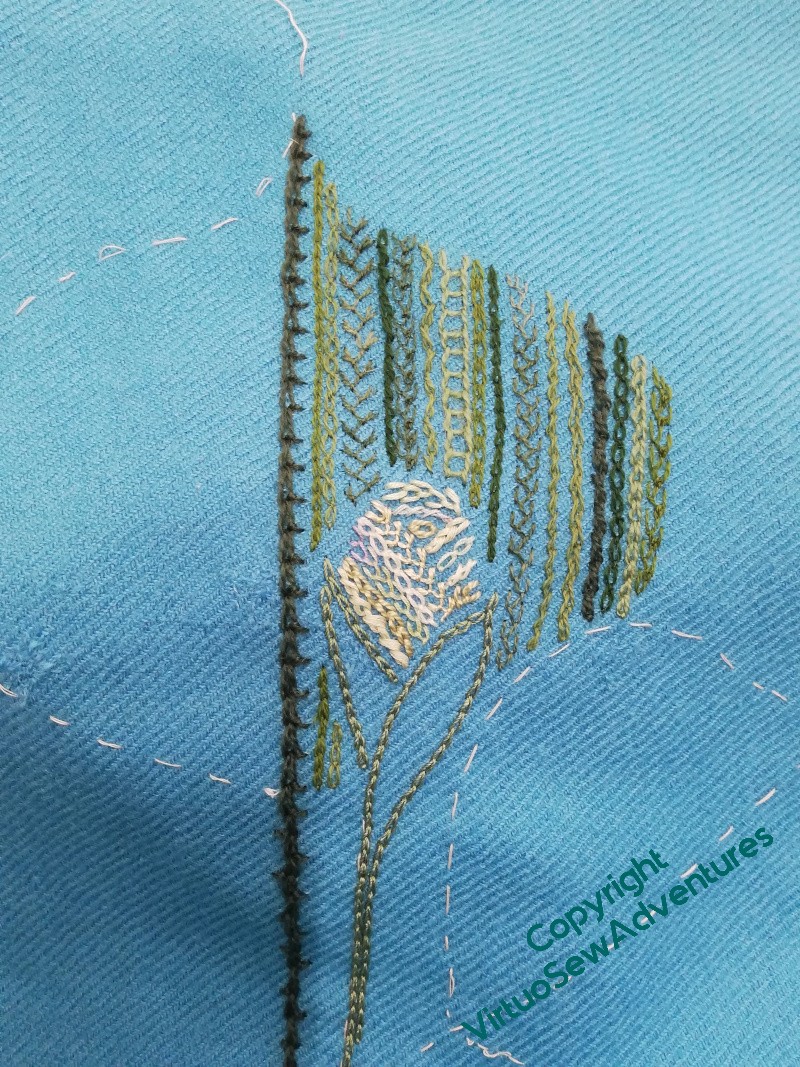
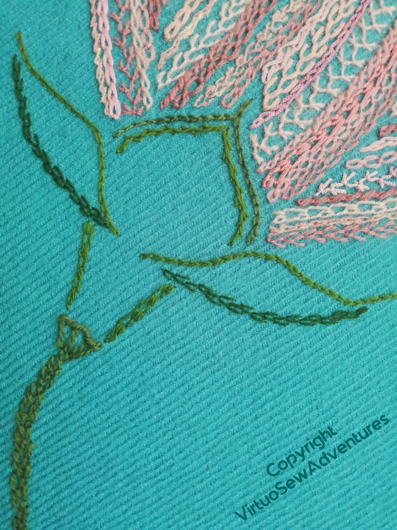
Lotus Flower left front
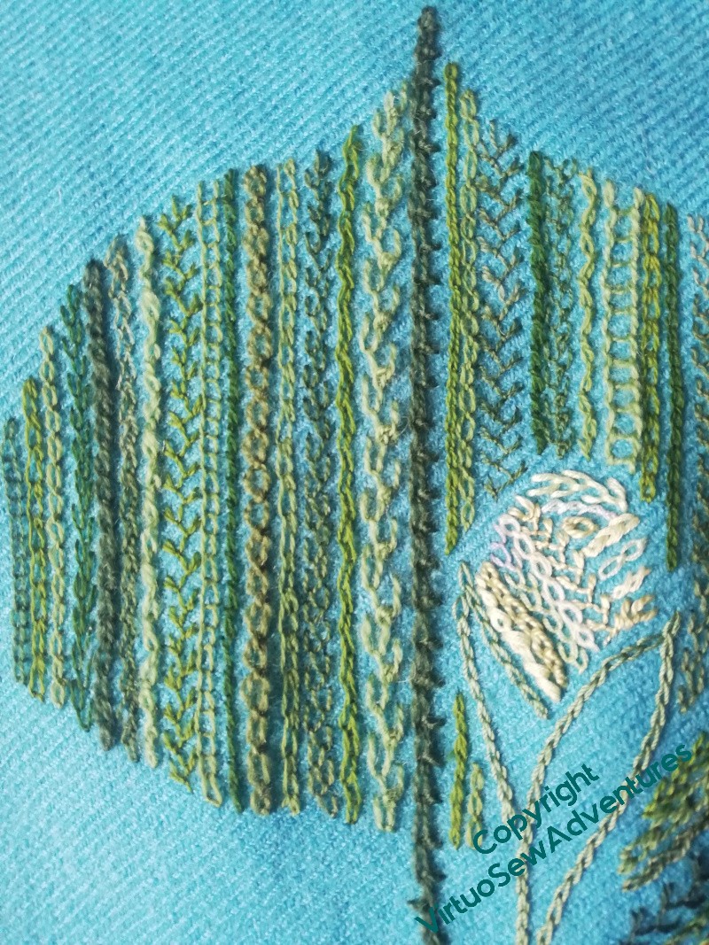
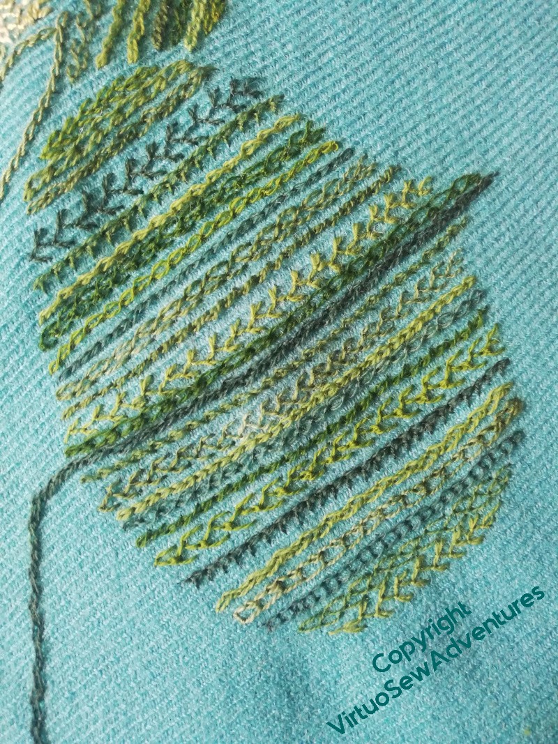
I’ve continued exactly the same style for the Left Front of the jacket as I did for the back – lines and lines of stitches in close(ish) tones. I’ve used some broader stitches – floral feather stitch, feather stitch, Mountmellick Thorn stitch – and some narrower – cable chain, closed feather, shell chain. And I’ve differentiated the two leaves, partly by putting the bud between them, partly by leaving a channel of fabric between them, and partly by including a few darker blue-greens in the lower one.
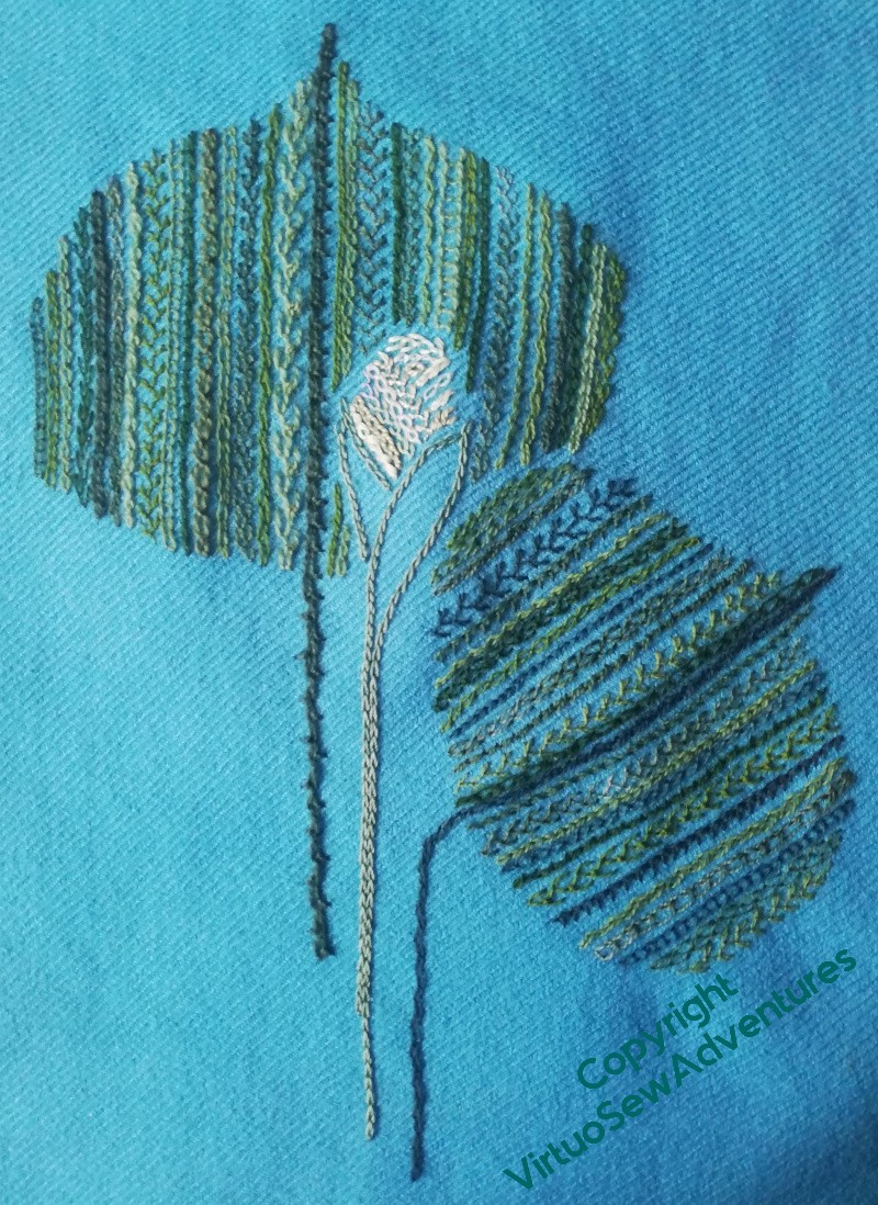
I think I’m fairly pleased so far – although I may add an extra line at the extreme left of the upper leaf as we look at it, to round it out a little more.
First, however, I think I’ll need to get around to assembling the jacket. I’m almost certain I don’t want any embroidery on the right front. Almost.
That, however, is a judgement I can’t make until I’m looking at the garment in at least semi-complete form – which means that if I change my mind, the embroidery will be accompanied by much muttering and the closest approaches to profanity that I ever allow myself. It’s an index of my confidence in my decision that I’m risking it!
Finally getting on with it
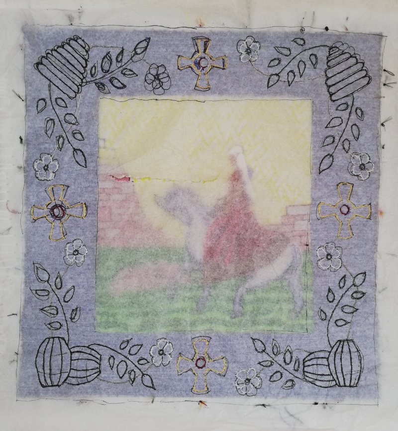
It has been quite the epic trial, getting Aethelflaed’s border designed, fiddly and full of repetition. I have learnt over the years that in fact that’s what I need to help me gain some surety in a design. And in turn, that is why I’m working so hard on being able to paint and draw. Improving those skills will make the iteration quicker and easier, so I may even be able to do more and gain greater surety. Rahere and Mother Julian are both going to offer significant challenges that I’ve not quite got the measure of yet!
However, one could write a substantial article on the various choices of design transfer method and when to use them. In fact, I’ve already written a blog post, many years ago during the Great Lady’s Magazine Stitch Off (happy days!), which described the methods I had experience with, and what that experience was. There are useful responses in the comments, too, describing other experiences and favourite tools.
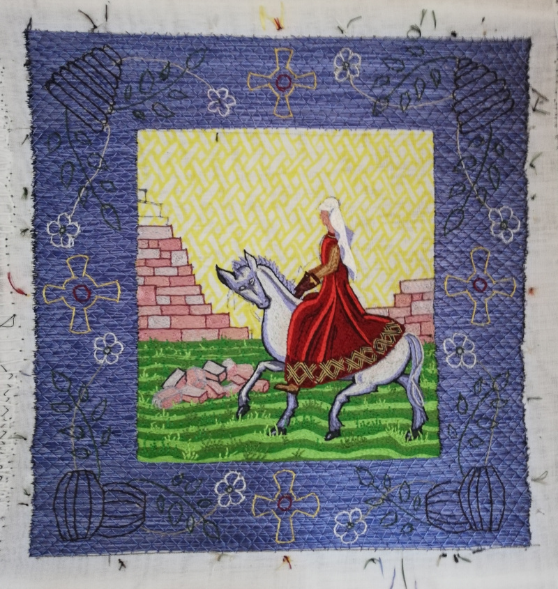
In the case of these Opus Anglicanum panels, there’s really only one sensible choice of design transfer method. Since I will be stitching over stitching, and what’s more, that stitching is in silk, I really can’t attempt to draw on it or transfer marks to it.
That leaves the running-stitch-through-tissue method, except that I discovered with William Marshall that that didn’t make the design clear enough to follow! Having learned from that, therefore, I went directly to split stitch through the tissue paper. It took several mornings of stitching, but I got there in the end.
And I have now managed to get started on it. I’m using blended strands in a couple of places – as I’ve said before, I’m not attempting to do something that looks as though it was done during the medieval period. This is a modern piece, by a modern embroiderer, exploring how the ancient and modern techniques can be in conversation with one another.
And yes, that does sound perilously like an artist statement in an exhibition, but it captures the sense I have of the techniques alternating the lead, as it were. It doesn’t really sound better if I say the techniques are dancing, does it?
Some Interesting Stitches
I keep going on about Floral Feather Stitch as one of my favourites. I’ve done a video of it and uploaded it to my MakerTube “Interesting Stitches” channel, in hopes of seeing more people taking it up. It has been auto-captioned, and I’ve not worked out how to correct infelicities yet. But at least you may find it helpful.
Another stitch I’ve recorded, I’ve called Super Closed Feather Stitch. It doesn’t quite cross over, but on Stella’s Birds I found it made quite an interesting line, and since textures are very much part of the fun of embroidery, I thought it was worth sharing.
Finally, although it’s hardly new, I thought some of you might like to see again the recording of Holly Braid Stitch in its new home on MakerTube. This is one of the stitches from one of Jacqui Carey’s books about Elizabethan stitchery, and although it’s beautifully diagrammed in the book, the workflow didn’t quite work for me as diagrammed. Looking at this video helps me to rediscover it when I decide to use the stitch again. In particular, I usually work line stitches towards myself, and this one I can only work successfully in the other direction!
Finally getting the border settled!
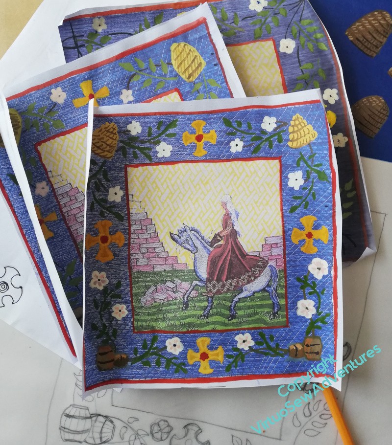
Aethelflaed’s border has been quite a trial, what with one thing and another. I became distracted from her by an assortment of non-embroidery things, which of course didn’t help, so having had that wonderful orgy of painting on printouts that resulted in a whole stack of variations, I found myself once more facing an undesired hiatus.
Still, I got back to it eventually. En avant!
I’m very aware that the stitched version will project Personality in a way that paintings don’t (not even my paintings, which tend to be on the striking side). It’s one of the things that I mention in “Dreams of Amarna” because it was then that I became aware of it. So I felt that when I was developing the Aethelflaed design I was going to have to take that into account, and maybe give the elements of the design a bit of air around them, so as not to look too cluttered.
In the end, I did a bit of jiggery-pokery, and didn’t exactly translate any of the designs I originally came up with.
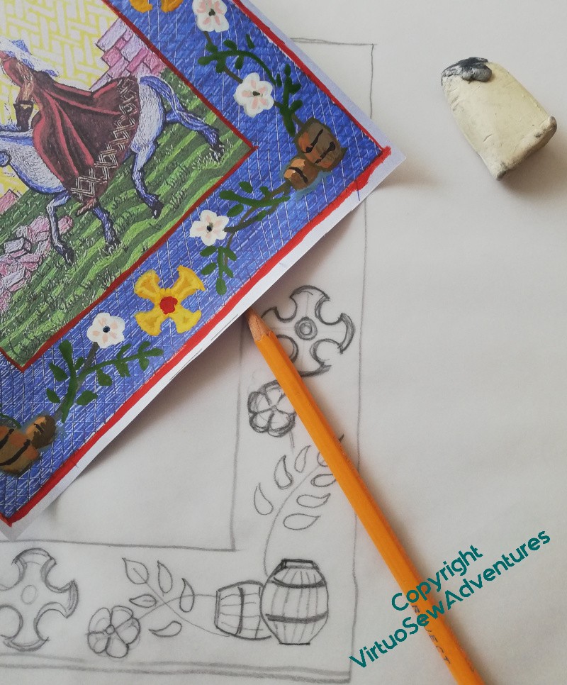
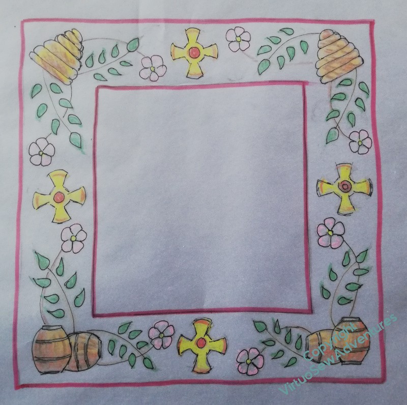
I drafted the design on a piece of tracing paper that I’d laid over the embroidery to get the dimensions of the actual border, and then put a bit of colour on the underside, rubbed out all the pencil lines on the top and reinstated them in pen so I could find them when I traced them onto tissue paper to get the lines in the right place on the actual piece.
And yes, it’s an almighty fuss and bother, going round and round and over the same ground over and over again. But it helps me to think through my plans, and gives me opportunities, sometimes, to come up with something entirely new and better.
First mend, then start stitching..
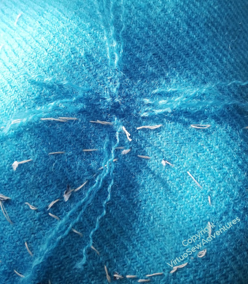
The first thing to do was to darn the holes. This isn’t something I’ve ever done, and it was a bit of a wild adventure. I didn’t manage to replicate the woven structure, which is I think a 2-over-1 twill. I pulled lengths of the thread out of offcuts of the fabric piece, so at least the darning uses exactly what was used in the fabric. But even with my magnifiers, reproducing the structure was a bridge too far!
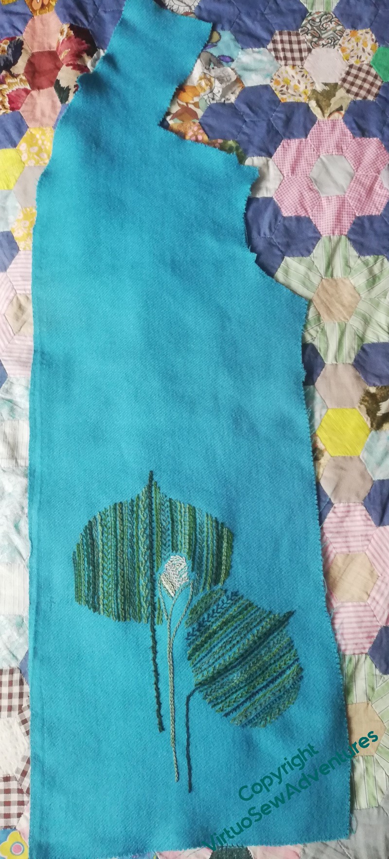
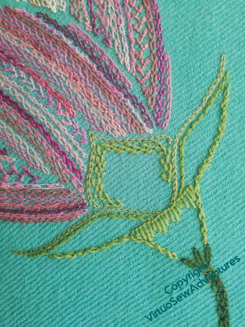
Once that was done, I could get started on the embroidery. We are back to rows upon rows here, to give the front some of the impact of the back.
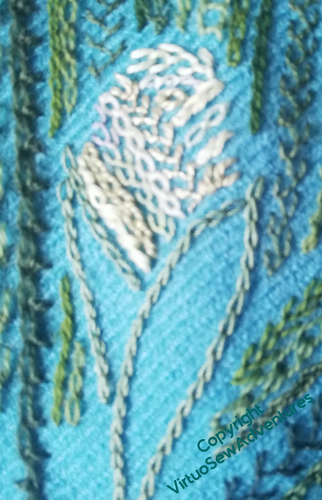
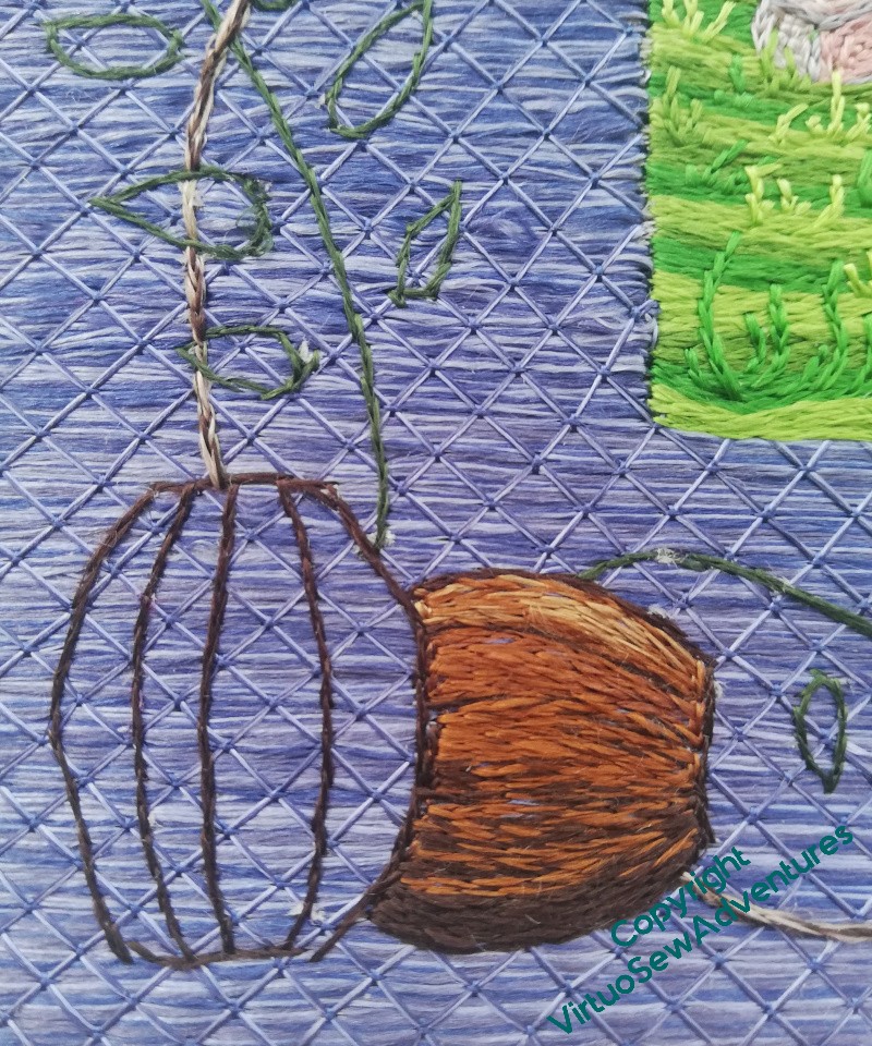
I decided that the bud would be very pale creamy greens, and slightly more silky threads than everywhere else, and I’ve left the enclosing calyx open. The thread for that actually is silk, one I think I bought for the Nefertiti Shawl, all those years ago.
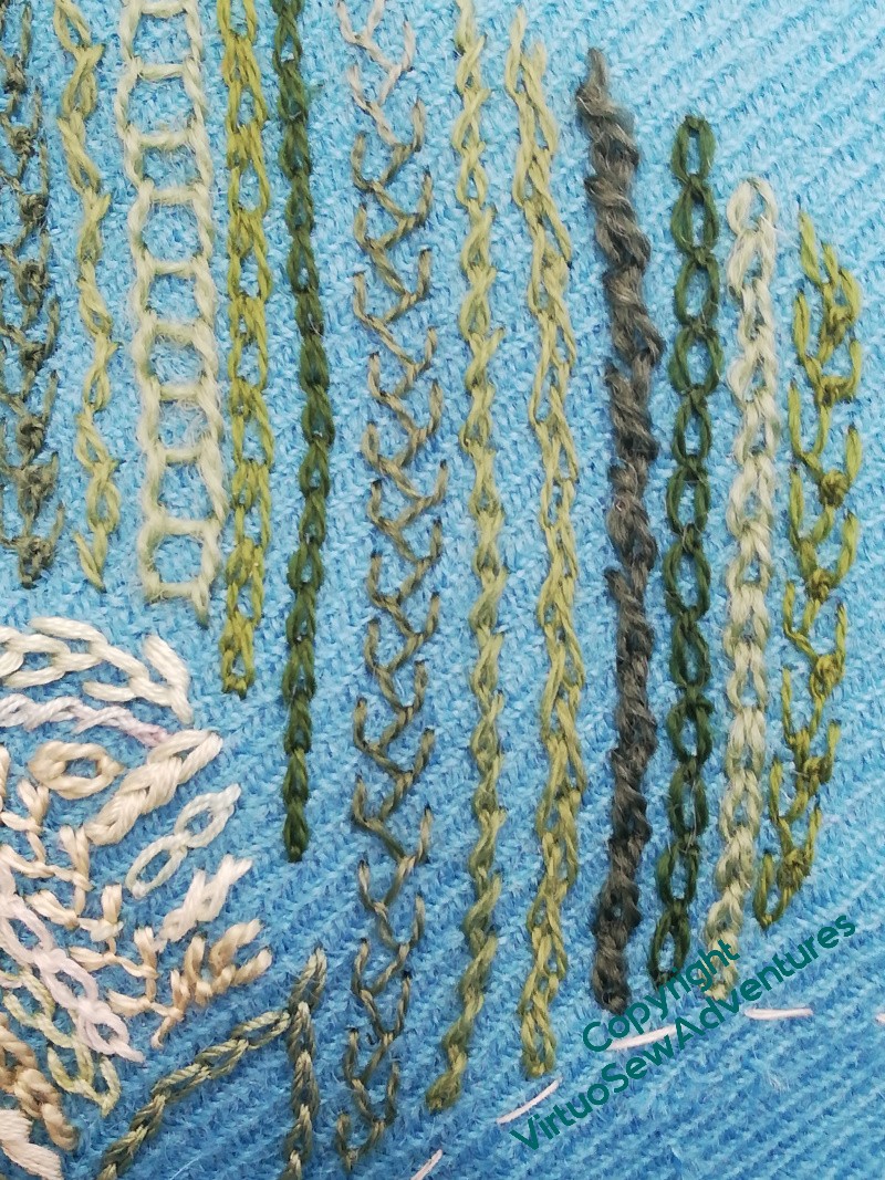
Everywhere else, as you can see in the close up here, is the same variety of wool threads I’ve used on the back. A couple are slightly variegated, a couple of them heavy enough that I need to use them with caution. And as I looked them over, I noticed two with a much more blue tinge than the others. I’m going to introduce them to the front leaf to change the “ambience” of its colour, because otherwise I’m afraid that the edge between the two leaves might not work cleanly. A different colour effect might be just enough.
Thinking about a finish..
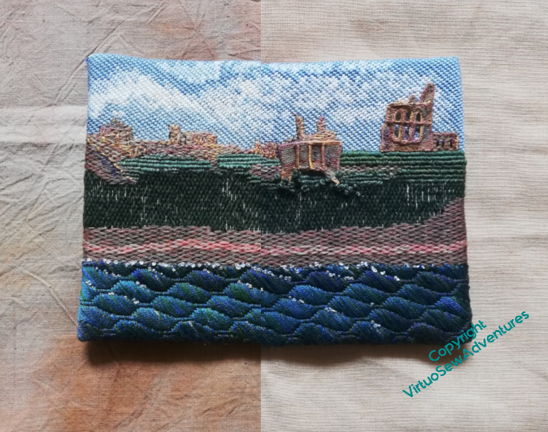
Tynemouth Priory has been in progress for what seems like forever. It was started when I was working on “Leaving The Tyne, 1915”, as part of the many experiments it took took to make that piece the success it eventually became. And it was: I am still very pleased with Leaving The Tyne, and extremely glad that my father saw it before he died, and maybe was able to see something of where my embroidery was headed.
I finished this version over lockdown giving it a new sky and a new river (rather sea-like, I admit, but if you know where the Priory stands on the headland, you’ll know that that isn’t unreasonable!). Then I stared at it perplexedly and put it in a box until Later. They say Tomorrow Never Comes, but the aphorism says nothing about the vaguer Later.
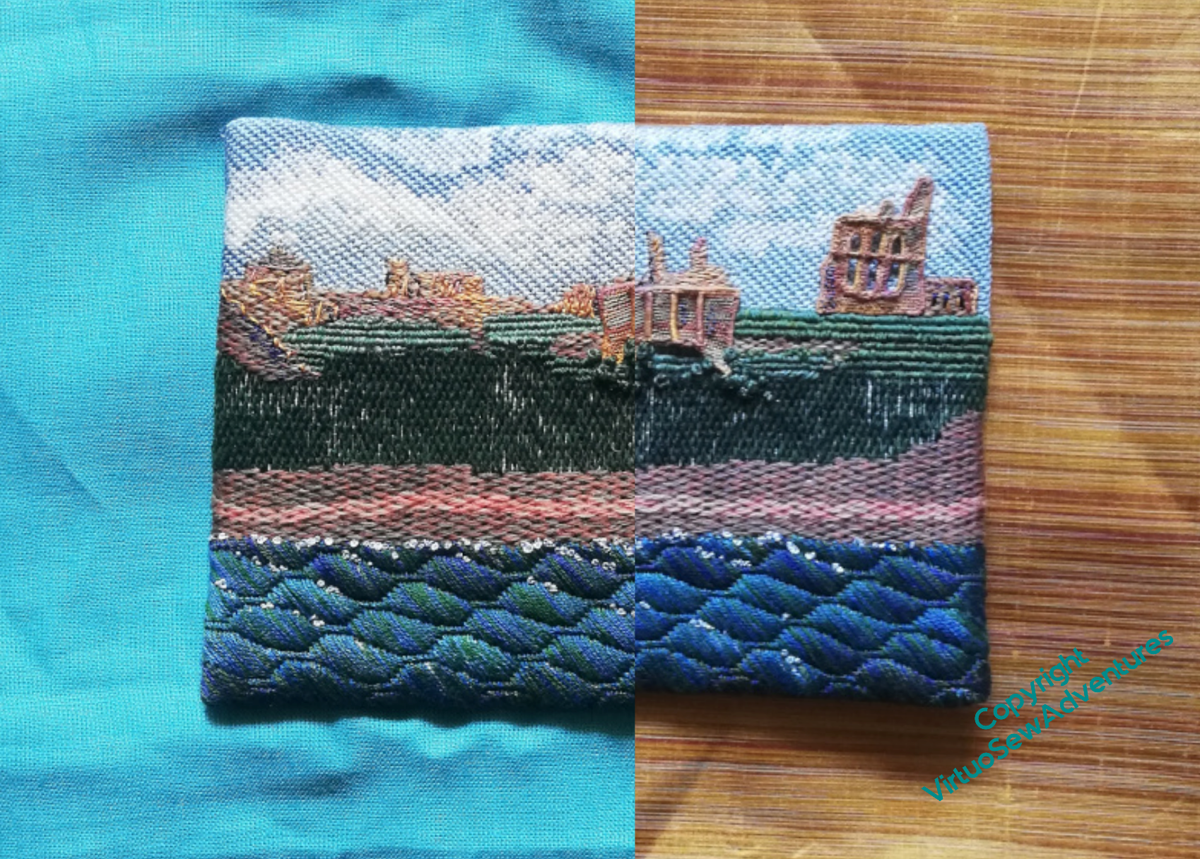
I have decided that Later is Now, if you follow me, and that since I am still quite pleased with it, I should mount it properly and send it out into the world for someone else to enjoy. That in turn means I need to decide how to deal with it.
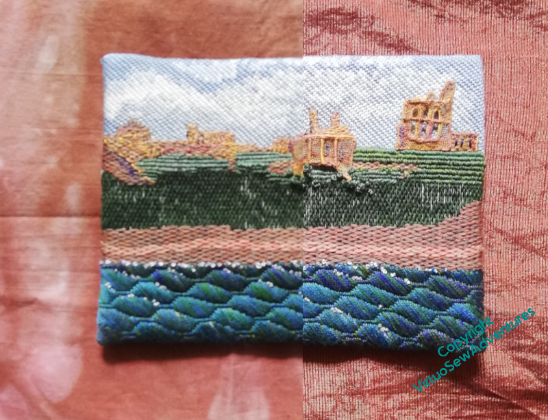
Since the needlelace is raised, it can’t go in a frame, and in any case, I’m not keen on putting embroidery behind glass. So I’m trying to choose a fabric that I can mount it on.
Although having put all my photos in landscape orientation, I’m having second thoughts. I think I’ll turn the canvas into portrait orientation and then mount the picture above the centreline, giving a space of fabric at the bottom to lead in. I wonder whether that changes my decision?
Something different this week
Late last year, a local film-maker friend who had bought a copy of “Dreams of Amarna” said that it had revealed a whole new world to him, and he’d like to make a film about me and my work. To begin with it was going to be a standard documentary, with him doing the filming and me just being the subject, but then he realised just how difficult it would be to film the embroidery and painting that he wanted to under the constraints of our respective diaries. So apart from a couple of bits at the beginning and end, I became camerawoman as well as subject.
The film became a First in the annals of Swan Moviemakers, in that the direction happened entirely by email. Tony would ask questions, ask for footage of <something>, I would attempt to oblige, get it to him via some means or other, and we’d go around again. I found myself thinking quite hard about the whys and wherefores of what I do and how, in a more abstract way to the way I do it here on the blog, so I’m not sure how clearly I’ve expressed myself, or how much sense I make for anyone not involved with the art and craft of embroidery.
In the end, the film won two awards at Swan, and very definitely introduced the other members of the club to the idea that embroidery can be an art form and not “merely embellishment”. So that’s definitely a win.
It’s less than fifteen minutes long. I hope you’ll enjoy it too!
Planning the front..
I started to plan the design for the embroidery on the rest of the coat with a decision: there’ll be nothing on the sleeves. The whole thing will be utterly overpowering if I’m not careful.
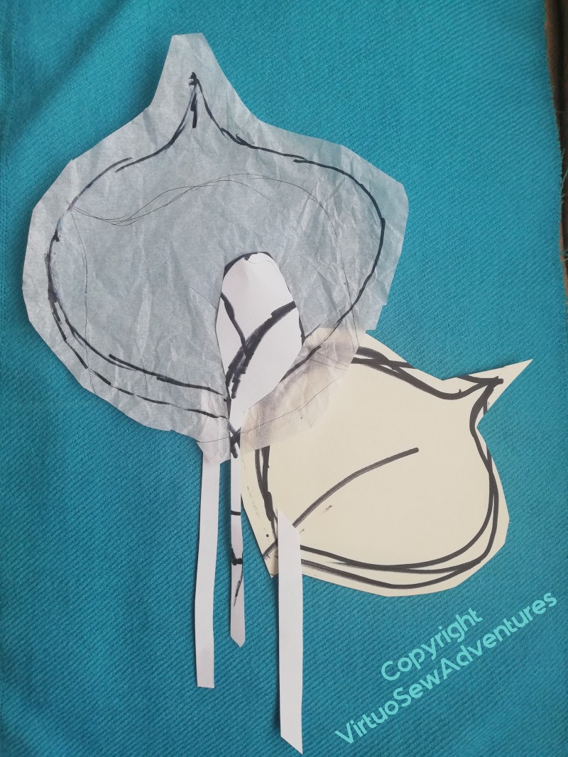
Then, further, the idea of having a group of leaves, almost overlaid, or at the very least touching one another, and adding one small, pale, early bud. The paper cut outs look very scrappy, but I am finding that as I become more experienced, and more taken up with my ideas and how to embody them, I don’t need quite the same level of clarity and simplicity in what I’m looking at to make a decision as I used to. That’s encouraging!
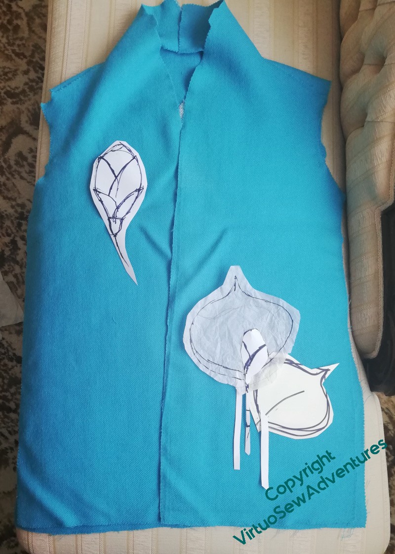
However, that does, occasionally, turn out not to be the case. I was intending to have a bud on the upper front of the jacket.
Looking at this, I’m really not sure that it will work. I think I need to have the bit I am certain of in place, and worry about the rest of it later. I might even end up assembling the jacket and having to do any last embroidery with everything in place except the lining, which would be distinctly trying.
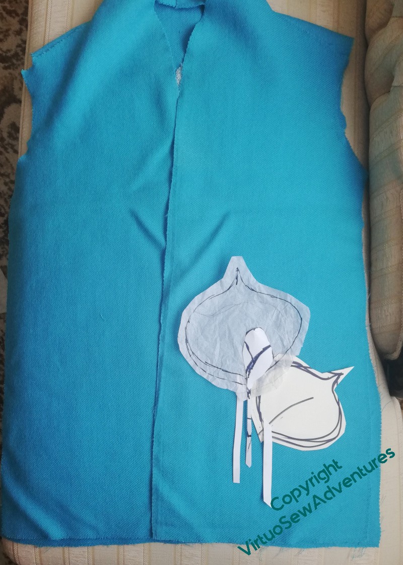
So, back to the simplicity of the leaf arrangement in the lower corner.
I do have a challenge next, in that there are a couple of small holes I need to darn before I get started on the embroidery.
The original pattern, by the way, has patch pockets. They are not going to be involved here. I’m not all that keen on pockets (I’m what Trinny and Susannah used to call a Bag Lady!) and in this case they would interfere with my plans. If I decide the garment does need pockets, they’ll be put in the lining.
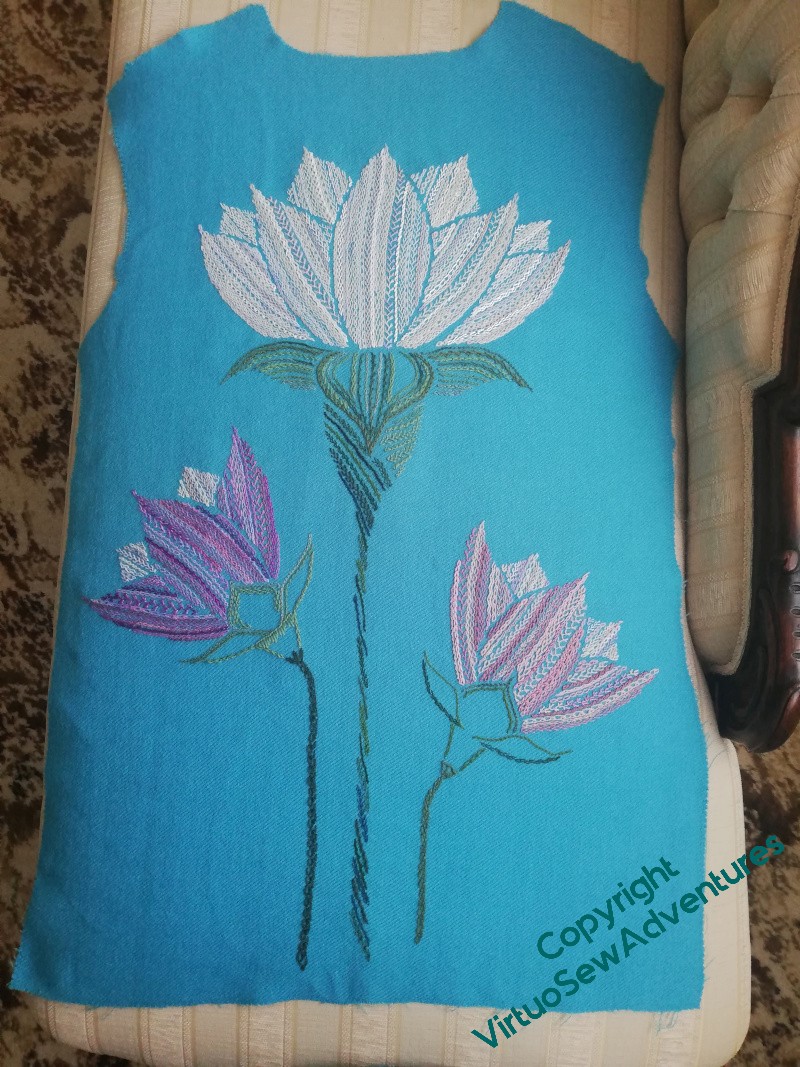
Finishing the back of the Lotus Flower Coat
I did rather wonder about how densely to stitch the calyxes for the half-open flowers. I was bothered about stitch direction and stitch choice, and I was full of anxieties about making them work.
And then, lo and behold, I am surprised!
I don’t think I need to do more on these two. You can see that they aren’t by any means identical. The visual weight is in different places, the stems are different, the stitch choices are different. But they have the same “feel”, and when you look at the finished, pressed version, below, I think you’ll agree that it is working nicely.
Of course, now, I have to plan the front….