About Rachel
View all posts by Rachel
A tree for the trinkets..
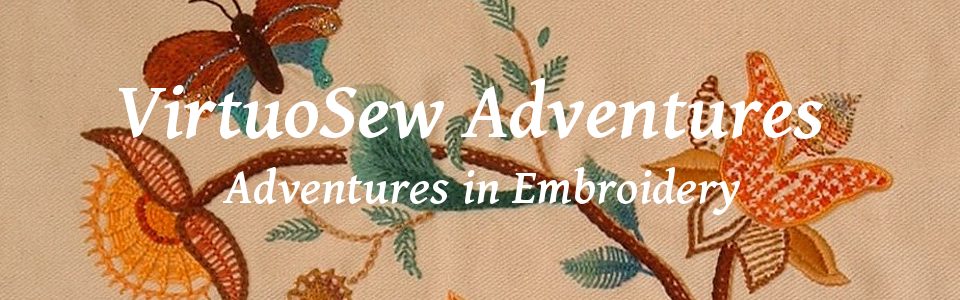
When I had the idea about using a parlour dome for the Violets and for the necklace, I realised that I would need to play with how I displayed them, trialled the Tudor Nightcap in the dome and realised that I could now put it on display.
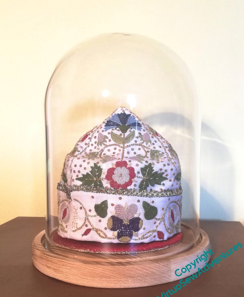
So what about all the other Thistle Threads pieces?
Well, it turns out you can get parlour domes that aren’t round, so I got the largest I could bring myself to buy and then stopped to think…
I started by playing around with propping the various pieces I’ve been planning for that Winter Decoration Corner against one another within the dome. It’s a flattened oval, and quite high, but anything I could improvise seemed not to have the height I wanted without taking up all the display space.
I think this shows the idea will work, but it doesn’t really have the presence that the pieces deserve.
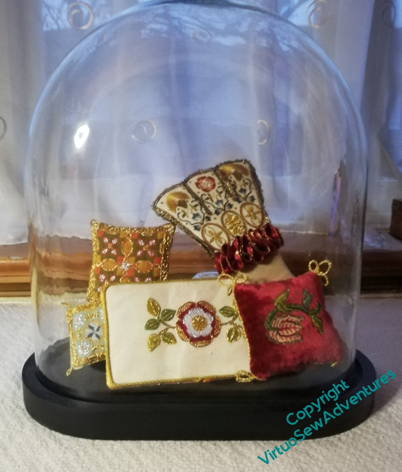
This is better. I’ve used offcuts of the foamcore that I bought to help me with Nefertiti and Akhenaten to create the base that will sit inside the glass, sandwiching the beginnings of the wires forming the tree between two layers. I’ve built up a support for the green and orange cushion at the back using smaller bits of foamcore, and wrapped pipe cleaners around the wires.
It’s not perfect, but I’ve set it up in the hall where I will pass it every day, to work out whether I like it. Then the idea is that I will have a lovely messy hour or so covering the wire with papier mache, allow it to dry, and paint the whole thing gold.
The Tudors were as fond of bling as the ancient Egyptians, after all!
Another Decision To Make
I can’t imagine how people can have a design planned down to the smallest detail before they begin. Even when I’m more organised than usual – William is a prime example – there are always details that either escape me, or that I hadn’t even considered at the start.
I should say, this isn’t a complaint. I don’t think I would find it remotely interesting to have planned everything out and have nothing to discover. These days, when I follow someone else’s design, it is to learn what they can teach me, so even though the design is planned, there is nothing sterile about the experience.
However, the fact remains that I am, yet again, wondering what to choose.
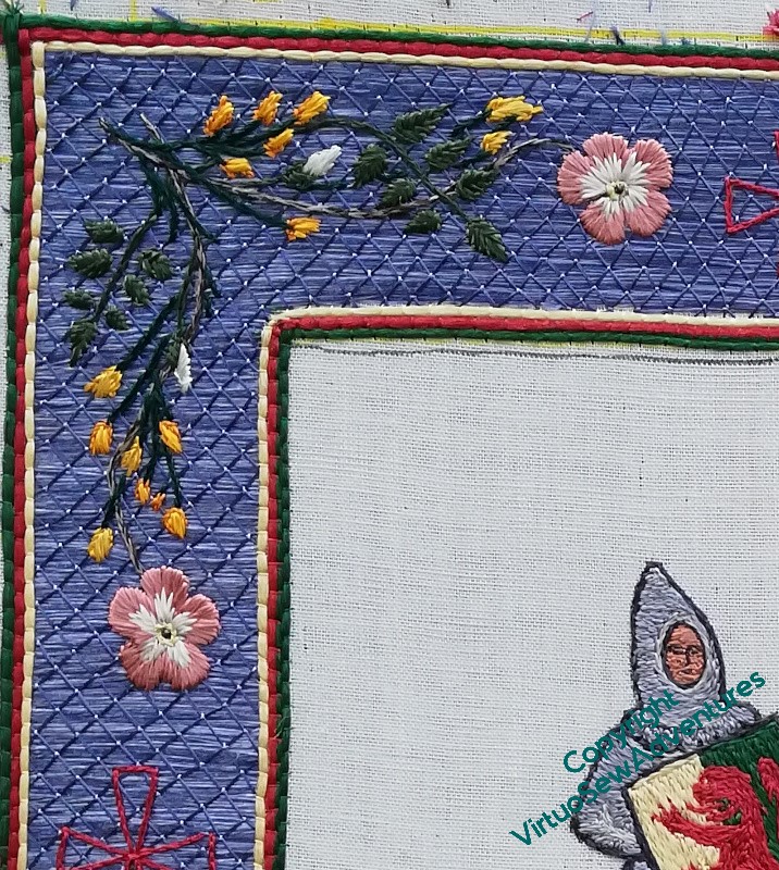
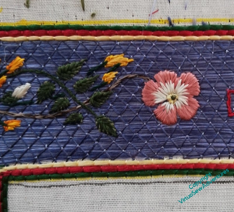
When I twisted together the fawn and the brown silk to stitch the stem of the dog rose, it was partly because I wasn’t happy with the colour and wanted to modify it slightly. When it was done, however, I felt that maybe I hadn’t, in fact, modified it enough. It seemed too close in tone to the background, so I worked the stem in the top right in just the light fawn.
And all the time I was working it, I felt twitchy. It seemed too bright, too bald, too obvious.
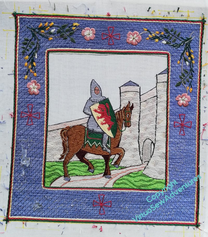
Now I have the top two corners done, and I have a decision to make – two colour stem, or single colour stem?
It doesn’t seem quite as glaring from a respectable distance. Note to self: for goodness sake, never decide anything from ten inches away, that’s not how anyone else is likely to see it, and if they do, you’ve already won them over anyway!
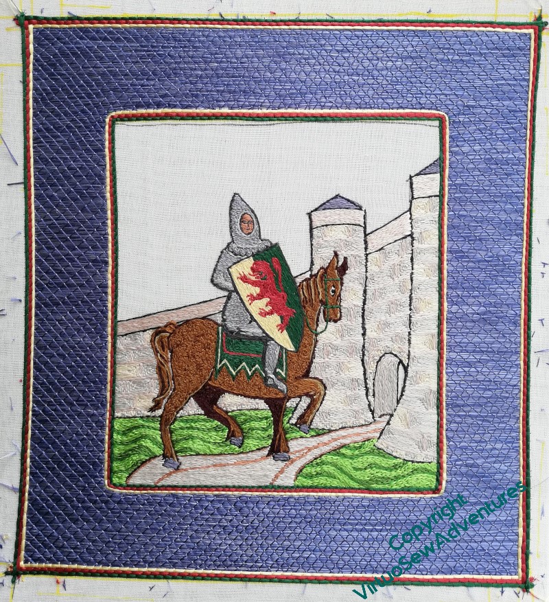
There is, of course, a middle ground. I could do the two colour stem on one diagonal and the fawn the another, echoing the angle of the castle walls and the trajectory of William’s career.
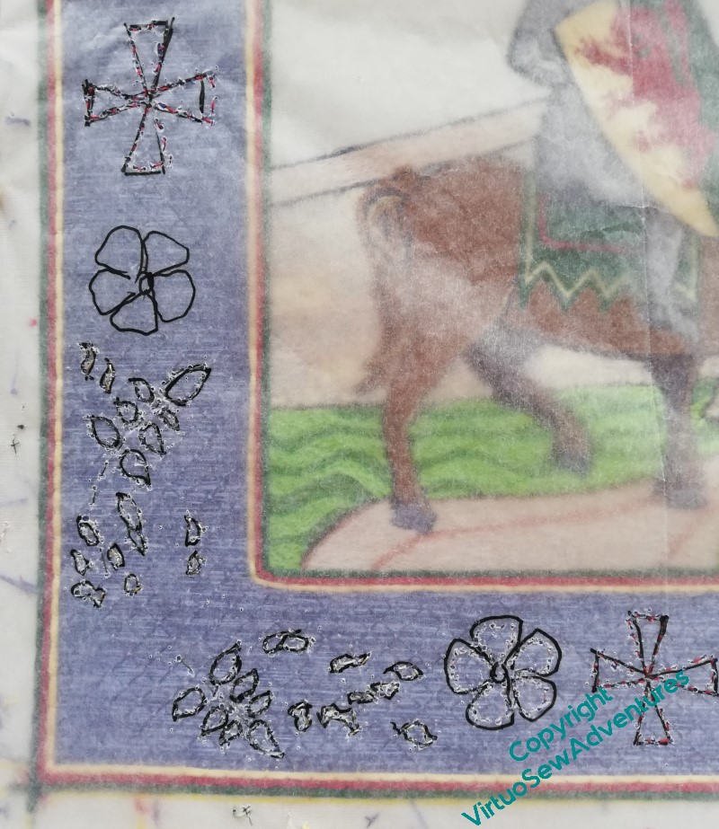
However, one decision has already been made – remember I wasn’t sure whether to fill in the crosses or not? I am now, and they will be filled.
The Excavation – Further Dilemmas
You may recall I was wrestling somewhat with the large title, still trying to work out what the stitch was. Since I had jumped the gun a little, and already have the Map stretched and stapled to the frame, I can’t look at the back, and I wanted to maintain consistency across the two panels, so I had to find out.
I did a little more rummaging on my blog, and finally found a reference to it!
So now I know what to do there, I can move on to my next dilemma..
You can see, I think, that the uppermost strand of this section is in Seed Stitch, and the next is Twisted Chain Stitch. All single strand (honestly, what’s happened to me, I used to be all about chunky stitching with six strands in the needle!!) and random as far as I can make them. I felt that the lowest area of this section needed to be more emphatic, and tried a variant on Danish Knotted Cross, followed by single chain, followed by both of those in a slightly thicker thread, and then stood back and looked at them.
Even with my glasses, I was struggling to see any difference.
Now, I find myself wondering, does this matter, or does it not? How emphatic do I need to be, how much do I need to emphasise this mid-ground area?
A Happy Christmas to you all!
The Excavation – dust in the air
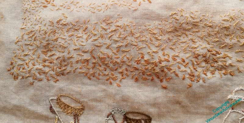
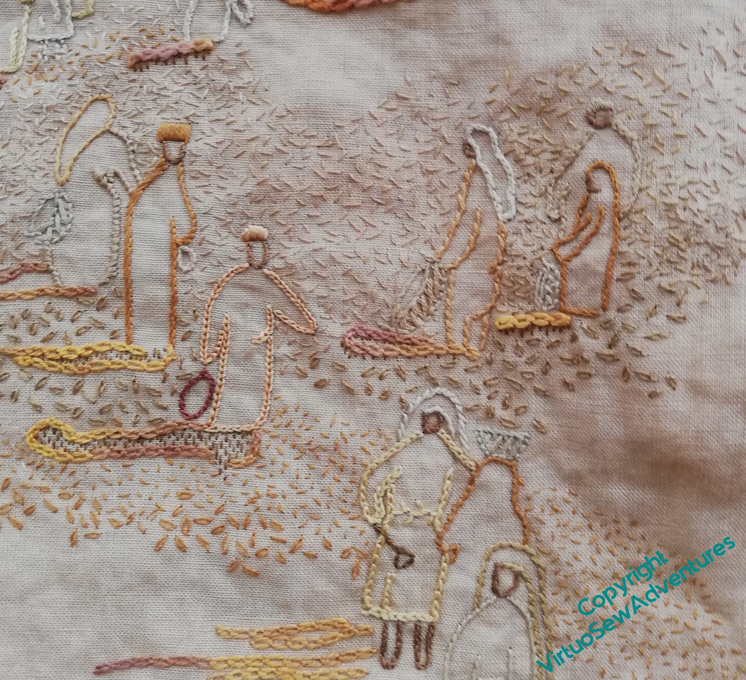
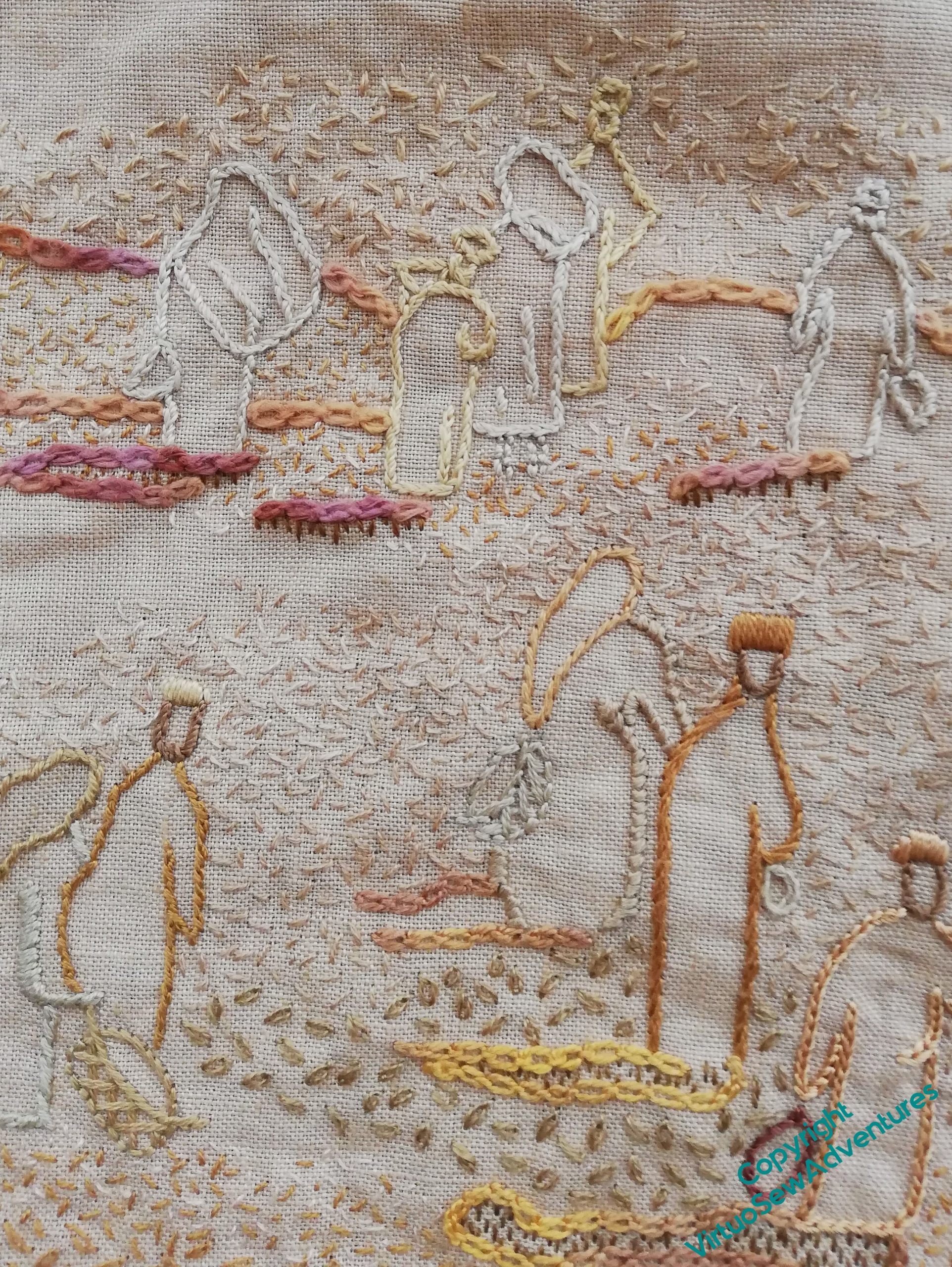
There’s a great deal of stitching still to do on the Excavation. I’ve not tackled the large title because my hoops are in the loft and I’ve not got them down yet, but in any case, adding texture across the piece to help the figures to pop out a little more is taking quite a lot of work. The seed stitches in the distance and around head height help to create the impression of dust in the air – much more effectively, in fact, than I could ever have hoped. Adding the very lightest cream stitches has made quite a difference, in a subtle sort of way.
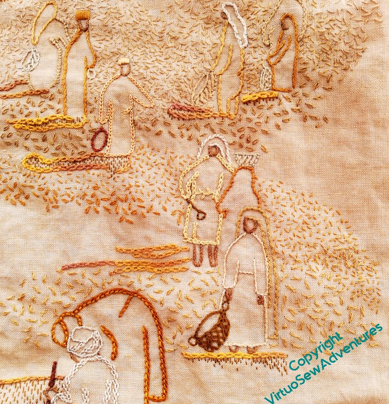
The difficulties come as I bring the stitching forward, the figures being closer, but the air still dusty. There are relatively few singleton stitches, and many of them are quite square and “manufactured” in appearance, making the dusty, earthy effect harder to produce.
Here you can see that as I’ve moved closer to the viewer, I’ve moved from seed stitch, to single chain stitches, and now to twisted chain stitches. They are well spaced because I’m intending to flow other stitches around them – seed stitches and single chain stitches, to start with.
You might just be able to see one of my experiments here, although it must be said, good as phone cameras are these days, this picture is rather pushing beyond the limit.
I’ve added at the bottom of the section, in among the twisted single chain stitches, a variation on Danish Knotted Cross Stitch. In the original version, the cross is worked first, and the knot on top of it. That helps in working a regular shape, but I want something more tangled here, so I work one stitch of the cross, and work the knot as part of the second stitch. I’ve found that as I tighten the stitch, I can move the knot a little, and where I place the end of the last leg helps to make the stitch look more ragged.
Whether I like the result or not, I’m not yet sure!
Beginning The Border
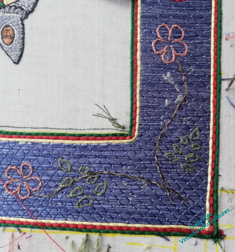
Once I took the tissue paper away, I discovered that in fact my running stitch transfer wasn’t very clear. So I’m going to start by split stitch outlining each element before I fill it in.
You can see in this photo that I still hadn’t quite got all the tissue paper that had the design on it out from under the stitches, and I’m only part of the way through outlining this corner.
I did think I might try to outline everything first, and then I thought about what happens when I have something like that to do, and decided that each corner would be worked to a finish separately!
It is probably at this point that I start to wander from the path of classical Opus Anglicanum. I’m using fishbone stitch for the rose leaves and satin stitch for the broom. But after all, this is a modern work, by a modern embroiderer, not a reconstruction of an existing, or imagined, medieval work.
The wanderings continue with the dog roses – long and short stitch in the petals, over two rows of split stitch outline to help define the edges, and a tiny French knot for the dark centre.
I’m using two differnt dark greens for the rose leaves and the broom, to help the design make sense, and I worked the rose stem in split stitch using two shades of brown. I am not entirely sure about that, so I think the next corner around I will use one, maybe the darker one, and see whether that is an improvement. If it is, bringing this one into line might be a bit hair raising, considering how small all of this is!
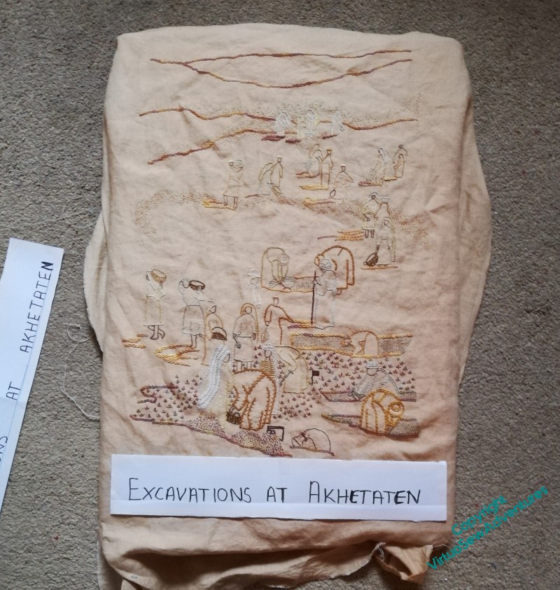
The Excavation – more progress
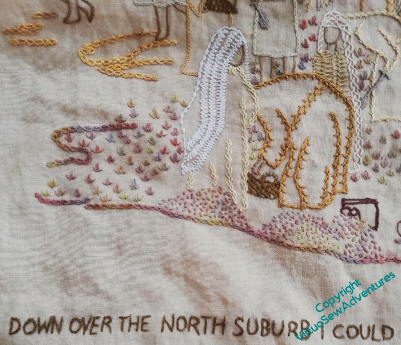
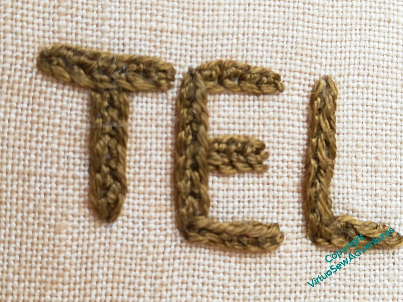
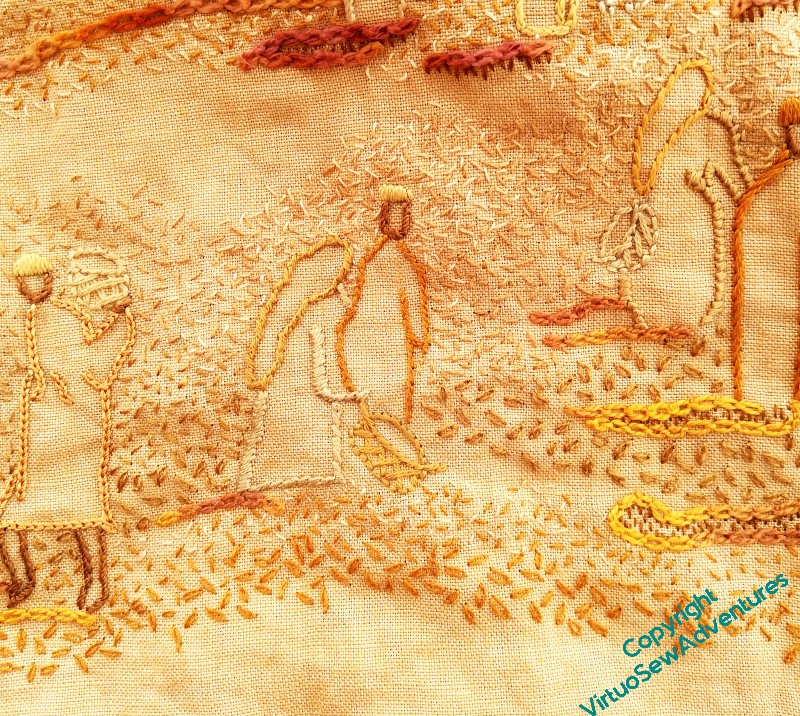
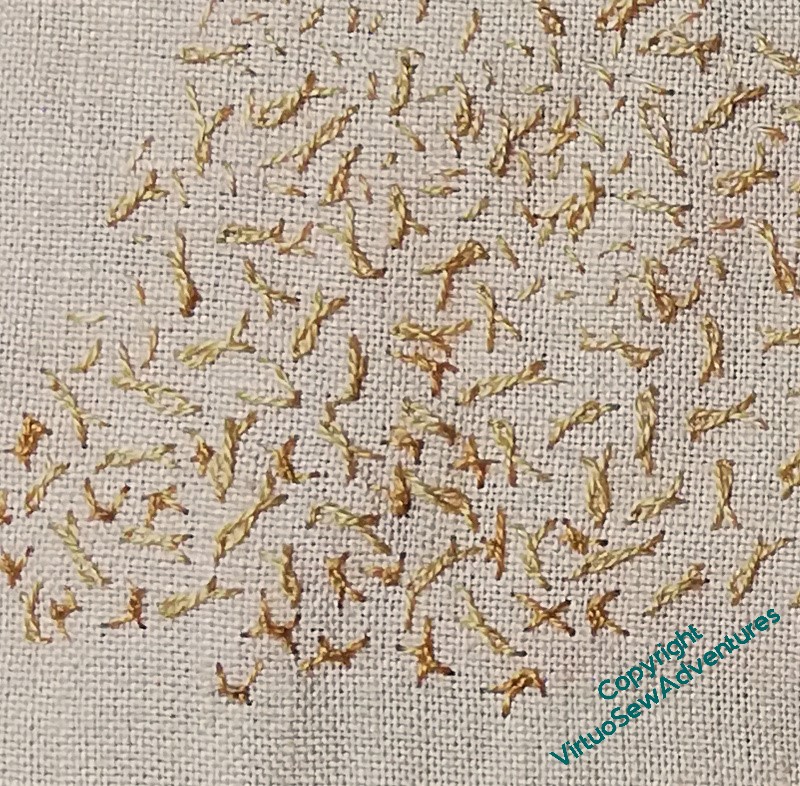
I was clear that the surtitle would be in split stitch, so I got started on that. It’s in a dark, plain colour, to be clear and readable and add weight to the bottom of the design.
I definitely like the tête de boeuf stitches. They add visual weight, a good variation in colour, and although the colours in the thread are similar, the small seed stitch spoil heaps at the front look completely different.
I may yet find I need to add more stitches at the base, above the text, but of course, by now, you are all accustomed to the way I tend to build up these pieces as the elements occur to me!
The middle ground is, so far, not quite so successful. I am using small sandy coloured seed stitches, and they work at some distances, but not quite so well in others. It certainly doesn’t photograph well at present. I want to make sure that the colours aren’t too dark, because I want it to remain dusty, but developing this section will involve a good few extra layers!
The distant section, I think, has worked. It does all look very dusty, and the distant figures are pushed out of the stitching and don’t vanish into the fabric as much as they did.
Adding the random single chain stitches in the mid ground has also helped. They may need some seed stitches scattered through them the meld the areas together, but I am hoping that each part of this scene will make more and more sense as I continue to work on it.
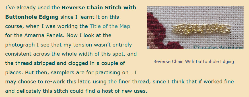
I haven’t quite worked out which stitch I used for the title on the Map of Amarna. Quaker Stitch? Whipped or Interlaced Reverse Chain Stitch? I even checked the early blog posts, where I read a somewhat elliptical:
For the main title I picked up one of the stitches from the Tudor and Stuart Masterclass – it’s lovely to find myself using a stitch I’ve learnt recently in a project I first started thinking about over fifteen years ago
Me, in 2012
Be warned by me – better recordkeeping reduces frustration!
Border Transfer
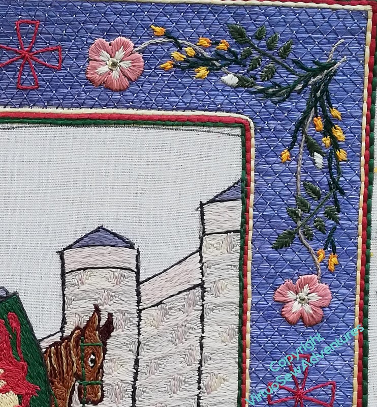
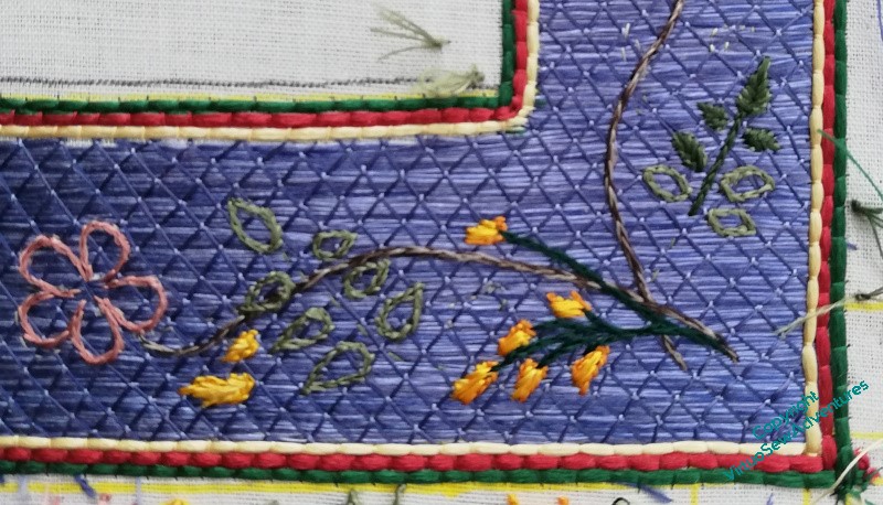
It may not be very obvious in the line drawing, but although the two sides of the corner sprig are very similar, they aren’t quite identical. I wanted to keep a sense of movement and flow, without the chaos of having every little bit different, so in the end I chose to create my corner sprigs based on two slightly different straight sprigs. In this photo you can see that the rose leaves are pointing in different directions, and the broom flowers are arranged differently.
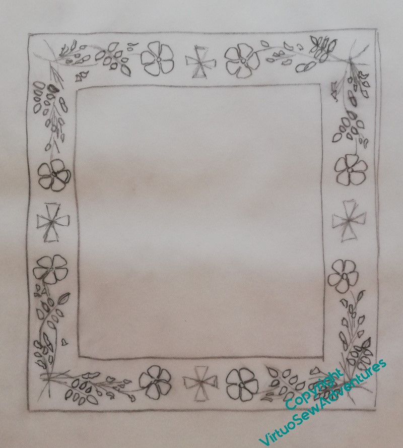
When I did the line drawing, I took my guiding sprig and turned it through ninety degrees for each corner. By doing that, there’s a sense of continuity, whereas I think if I had reflected the design in a mirror line through either the vertical or horizontal crosses, it would have created a rather stop-start effect. I was much impressed, years ago, by a programme about the carver and sculptor Grinling Gibbons, which said that he always aimed for balance rather than symmetry. I like that, it feels more human somehow, so that’s what I try to do too.
Now, however, I have to transfer the design to the border. Clearly that’s not going to be possible using prick and pounce or a drawing method, so I have chosen to create a drawing on tissue paper of the main elements, and running stitch along the design lines. I am hoping that this will be sufficient!
In any case, it allows time for the extra thread I had to order from Devere Yarns to arrive..
Finally, two Announcements:
- The eagle eyed among you may have noticed that the Ko-fi link went away and is now back (plug-ins not playing nicely!). I’m still hoping to put together an exhibition and a book about Dreams of Amarna, and any support, whether financial, moral, or material (suggesting venues, publishers, copy-editors) would be gratefully received!
- You may also noticed the lack of a link to Twitter. I’m mostly on Mastodon now, as @virtuosew@mathstodon.xyz, for reasons that anyone else who’s been on Twitter lately will probably understand very well!
Planning Titles for the Excavation
You may remember that I was a bit concerned about ensuring that the View of the Excavation properly balances the Map. When I got the Map out again it was much more emphatic than I had remembered.
Eeek!
Then came a suggestion that if I gave it a title – at the bottom, rather than the top – it would add visual weight, and the presence of lettering on both would enhance the sense of a conversation between the pieces. I liked that idea, so I started making plans.
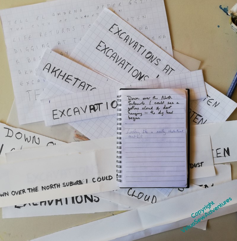
I started with a single large title, but the Map has title and subtitle, so I thought, maybe what I need is title and surtitle. Furthermore, I thought, the surtitle should be in Mary’s words. I’m sure she would approve of my foregrounding of the artifacts and the Egyptians, both ancient and modern, but had she not written so enchanting a book, I would have missed out on years of delightful adventures in embroidery. So, that gave me a perfect excuse to curl up with the book, notebook by my side, which enabled me to feel I was making progress while I was fading in and out of focus with Covid.
Since I’m not at ease with lettering, once I had chosen – or at least half-chosen – my text, it required a whole lot of squared paper and letter counting, and a depressingly uncolourful desk for a while, as I tried to bring it all together. This is the Very Unglamorous side of planning and creating. I’m getting better at it as I learn and invent more techniques to help myself pull my ideas together, but it is still very much the part of inspiration that isn’t inspiring!
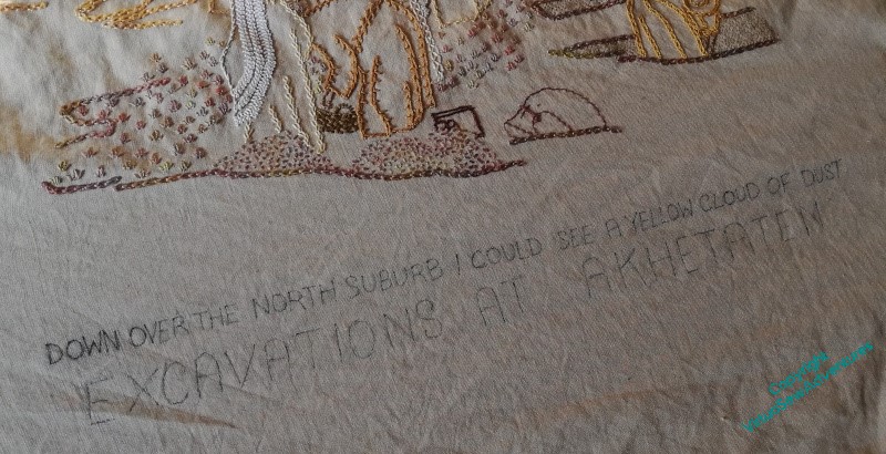
Finally, I chose my extract: “Down over the North Suburb I could see a yellow cloud of dust”, in the smaller capitals of the subtitle, and “Excavations at Akhetaten” in the larger capitals, and transferred it by prick-and-pounce. Progress!
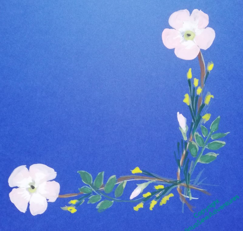
Border Design Finally Nailed!
Once I had the border trim in place, I felt I really had to get the details sorted out – but having that trim in place seemed to help. The dark green, red, and yellow on the inside, mirrored by the yellow, red, and dark green on the outside seem to bracket the blue just exactly as I planned, and I began to feel that all that painting and puzzling might have been worthwhile.
So I tried photocopying the full piece to see whether playing with my cut out sprigs on a flat surface I wasn’t worried about snagging might be useful.
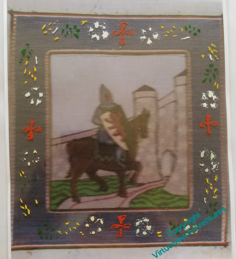
In actual fact, the photocopying wasn’t a great success, but it was close enough that when I overlaid an old acetate and experimented with the border sprig I’d finally, tentatively, settled on, I suddenly became a lot happier. The paint is gouache, and it really doesn’t get along well with the acetate, but I felt that it gave me just enough of the sense of the design that I could be confident it would evoke an illuminated manuscript – which is what I was hoping it would do.
It’s always so pleasing when a plan comes together!
The next stage was to produce a line drawing of the planned design, and use that to transfer the final design to the piece itself.
And this was the point at which all that painting and drawing and redrawing began to show real benefits, because even though the photocopied sprig design I was using as a guide was distinctly muddy, I found myself drawing the lines I needed with a freedom from care I rarely experience with pencil in hand.
Well now, who’d ha’ thunk – more practice does produce better effects!