About Rachel
View all posts by Rachel
Testing, Testing (phase 3)
There is still much to play with, with regards to the the stitching for the Knot Garden Parterre.
At this point, I’m trying to balance accurate impressions – and therefore useful testing – with not tearing my thread to pieces or wasting any of it. At present I am still thinking of doing this out of stash, if possible, which is why I’m using an impossibly bright shade of green here – I’m unlikely to want it in the real thing!
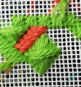
Now, you see here that the short Parisian Stitch enticed me into a broader strap than I was intending, and it has unbalanced the Mosaic Stitch of the border, which in turn became Scotch Stitch as it turned into the diagonal, and lost the pattern it had.
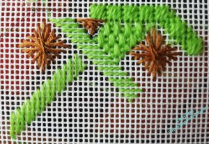
Here, by contrast, I have demonstrated one of the other hazards of canvaswork, especially for my astigmatic eyes – I’ve suddenly managed to turn a Diagonal Rhodes Stitch into a slightly oblong and twisted diagonal Rhodes stitch. I didn’t see it happening, so I am going to have to guard against it with some care.
I think I need to make my stitches and straps bigger, too: the shape drawn on the canvas is the size of one of the ones on the finished piece, and I started the outer border on the centreline, and turned onto the diagonal at the appropriate point. The first horizontal row of diamonds should have two in it. Two properly square diamonds, that is!
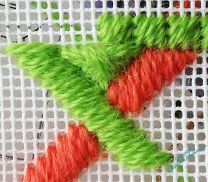
And here you see the challenge I need to address: the diagonal Rhodes Stitches start with a horizontal or vertical stitch, so what I need in the angle between the straps is a gap (as you see top and bottom of this intersection) and not a thread (as you see left and right)
At this point I’ve been stitching and unstitching so often that I have lost count of myself, and keep on losing track of the stitch lengths I intend, so there will be a pause to regroup!
William Himself
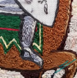
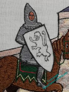
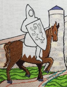
I started William with his leg in its mail, narrow highlight down the front and darker shadows around the back.
I’m going to try to shorten my stitches slightly on William, to emphasise the texture of the mail, and to help throw the shield forward. I want to make that, by contrast, as smooth and glossy as I can – part of the counterchange of texture I am pulling in to the whole piece.
The saddlecloth really does need a bit more red, I think. Something for a later moment.
I’ve tried to make the stitches on William himself suggest the shape of the body, except for the scalloped edge to the mail coif he’s wearing, which breaks up the shape, and adds a bit more detail. I find myself rather fearing that the scalloped edge on the mail coif is more reminiscent of a Fair Isle sweater than anything else, but I hope that the balance of the whole thing will prevent that.
I did the face in tiny stitches, using a single length of silk. Arguably the perspective is a bit off, the face more turned towards us than the head or boady, but I daren’t attempt to unpick it!
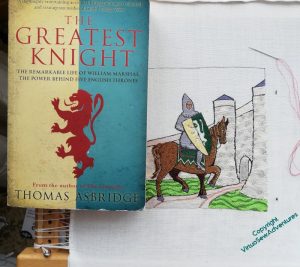
The shield stitchery is fairly simple in concept – I wanted to make the green and cream (it should be gold, but I don’t want it to argue with the underside couching) as smooth and straight as possible, and in doing so I didn’t really consider how I was going to address the failings in drawing the lion rampant.
So this is how I am going to do it – by having a source picture ( in this case the cover art from Thomas Ashbridge’s biography of William) balanced beside me on the frame, and using it as a reference, rather as I used the photo when I was stitching Ankhsenspaaten.
When I have completed the lion rampant, I need to make my final decision on where the edges of the underside couched gold are to be, and work the border to make those edges crisp. So more silk to work for a while..
Testing, Testing (phase 2)
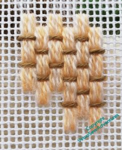
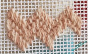
I’ve been playing around with possible stitches for the pathway in the Knot Garden. In the source picture, it looks to be made of bricks laid in a pattern, rather like a parquet floor.
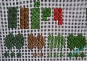
I don’t feel I’m obliged to replicate that pattern, but this one on the left is altogether too square, and won’t help the sense of movement I’m going to need to counterbalance the borders, which I rather expect to be rather static, given all the Diagonal Rhodes Stitch that’s going to be happening.
The one on the right is the same Medieval Mosaic Stitch from Jo Ippolito Christensen that I used, voided, in the sunglasses case, but this time worked exactly as diagrammed. I like it, and it’s easy enough to work, but I don’t think it does the job I will be asking it to. I’m sure I will work it for real one day, but not for this project!
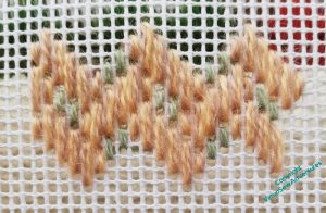
When I replaced the stitches that were voided in the sunglasses case with stitches in a different colour and thread, to point up the woven pattern, I got something a lot more hopeful…
I like this one a lot. Although I must admit it does rather recall the diaperwork you sometimes see on Tudor buildings, so maybe not very floor-like!
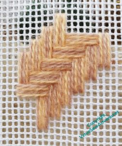
And then I found another, one that actually looks a lot like herringbone brickwork without any adaptation.
I like this one a lot, too.
I will have to see which of these presents itself most strongly when I’ve got more of the ideas crystallised.
Thinking about assembly for “Dreams of Amarna”
It is all very well having a whole host of little embroideries and a general intention to use them to embellish a larger piece, but that begs a whole series of questions about assembling those larger pieces. I’ve left the embroideries untrimmed and unfinished, which will make them hard to manage while I experiment, so the first thing to do was to photocopy the “spot” embroideries and cut them out.
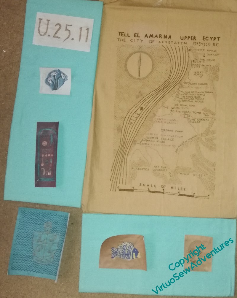
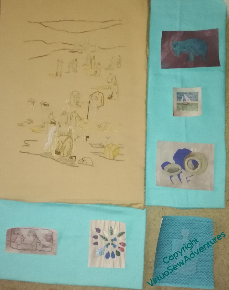
I’ve got mount card in the sizes of the blocks covered with the linen I intend to use, which made it possible to lay out the panels on the floor, stand back, and stare.
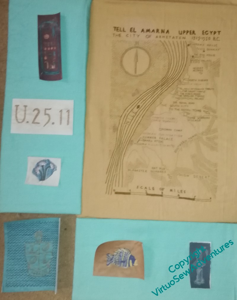
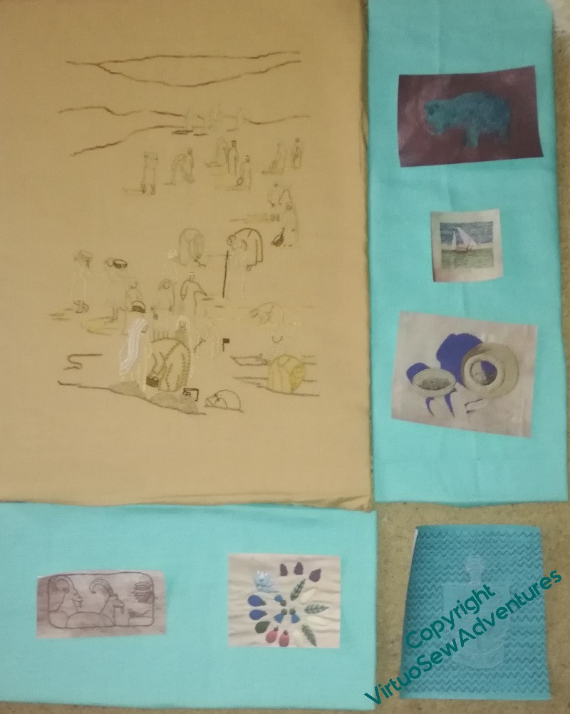
One decision I’ve made is that I don’t want the cartouche and the hippo (on the same fabric) either on the same panel or on the level as they are in this second example. I’m trying to put elements related to Mary’s first experiences around the map, and other elements around the dig scene – not quite achieved yet, I think.
My main take-away from this first exploration, however, is that I’ve made the pieces too wide. Since the two Crests are somewhat inflexible, I may find myself having to do them again, or think of something else.
Nothing worthwhile is ever easy, is it!
Adding the saddlecloth and other details
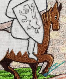
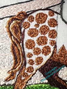
I still have some doubts about the tail I gave Mars, but I also still think that any changes are “tweaks” to be left until I have most of the piece finished and just need to balance it out.
And no, I’ve not forgotten that he needs reins and a few other pieces of tack, but those are details that I didn’t want to have to stitch around. I’m not quite sure how and where they are going to run, although as far as I’m aware William would have steered using reins held in the hands, rather than using the feet, as you see the riders of the the drum horses in mounted bands doing, or as I read the ancient Scythians did (although they were archers!).
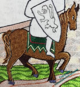
I wanted to do the saddle cloth in William’s heraldic colours, and I wanted the extra interest from the points, but I am not entirely sure I’m happy with the colour balance and shapes. I am wondering whether I should make the red line a little wider, or even fill that whole section in red.
Another tweak I am considering is a couple of tiny stitches to highlight the blued steel horseshoes. I have light lines running down the horse’s leg, but not onwards, and while it’s the tiniest of details, I remember realising with some of the Thistle Threads pieces just how much of an impact a tiny detail can have..
I’ve couched several strands of silk together to make a headstall and reins, and again, there may be tiny details to add, when the shield is in place, to help create the right sense of William, as the wealthy and successful tournament winner, high in the favour of Henry The Young King, on a visit to the kinsman under whose auspices he trained, dripping in tournament bling, and generally showing off a bit.
He settled down as he got older, but given that his father was rather unsatisfactory, and even the Lord of Tancaville dropped him at an inconvenient moment in his youth, a bit of rubbing their noses in his success would be only human!
Testing, Testing… (phase one)
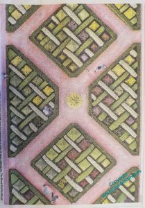
Remember this, the Knot Garden parterre?
It’s going to require a little more precision and therefore a little more planning than I usually indulge in. So there’s also going to be a bit more experimentation than usual. I might not go to the length of actually charting the finished piece, but I’m certainly intending to have a very clear idea of what is going where, and what thread or threads I’m going to use.
I’ve been intrigued to note that, from pulling out a huge variety of threads to use, an assortment of fibres and an assortment of colours, I’m beginning to restrict my ideas to a much smaller palette of threads and stitches.
As I looked at the picture more closely, it became clear that the squares within the beds were topiary pyramids. Maybe some are suffering from box blight, hence the colour variations, but this gave me a good place to start experimenting. I’ve gone to the trouble of framing up a piece of the canvas I’m going to use, so as to experiment properly, and my first observation is that I am going to need to be on top form when I work this, because it’s dreadfully easy to go adrift!
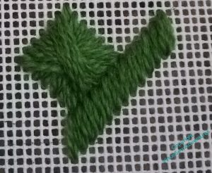
However, I think it’s fair to say that Diagonal Rhodes Stitch makes a fine pyramid in topiary! The straight stitches are in the same colour, which they won’t be, but I think the stitch length, compared with the Rhodes Stitch, looks about right for the width of the little hedges that create the strapwork effect.
I’ve also been testing out other threads and stitches – tapestry wool, soft embroidery cotton, stranded cotton. I want to have varying textures and patterns within the strapwork, creating a nice harmonious whole – but a stitched harmonious whole. I could easily chart – or even freehand – a tent stitch reproduction of the picture, but it wouldn’t have the personality needed for the place it’s going to live. Textured stitches will help to create that personality.
Last details..
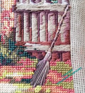
The birch besom leaning up against the fence rather caught my attention, because we had one when I was a little girl, and I’ve not seen another for years. Like all these low-tech looking things, it takes more to make one than you’d think, but they are good at what they’re good at.
They’re harder to make in stitches than you’d think, as well. I’ve used some fine unmercerised cotton, and some of that accursed stranded linen that DMC used to produce. Honestly, I’m all in favour of experimentation, but what one earth were they thinking? It’s ridiculously fragile, even on a fabric with huge holes, it’s uneven without being pretty, and it doesn’t even produce texture. But it was the colours I needed, and I didn’t want any shine…
At this point, I frolicked gently – it’s finished! – and took it off the frame.
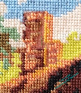
Only to discover that, in fact, it wasn’t finished!
One colour of the chimney and a bit of one of the clouds remained unstitched. This wouldn’t have happened if I’d been working on it from the start, but as it was passed on by someone else, and I think, looking at the stitching, that at least two someones before me were involved, I’m not surprised to find bits missing. Fortunately, they weren’t hard to fix!
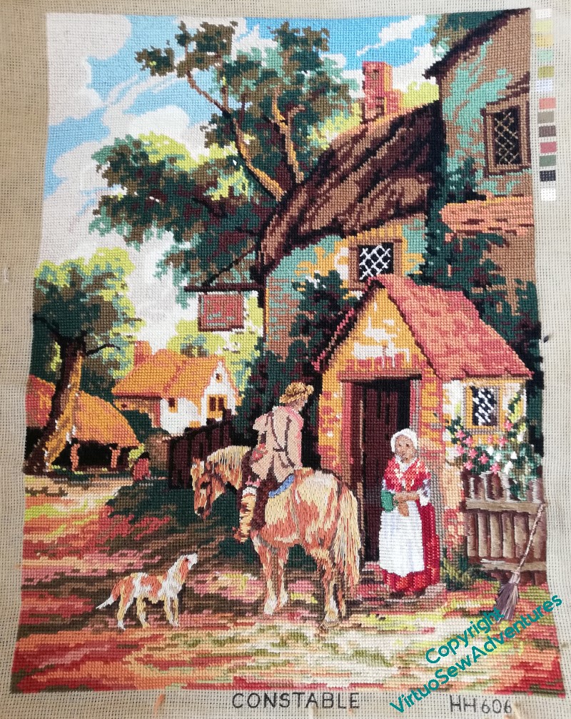
And now it really is finished! It’s turned out much better than it might have done, and it wants blocking and mounting in some way, but I think our local charity shop stands a chance of selling it once that’s done..
Update: my cousin is looking to furnish her office and has asked for it in return for a donation to my pet charity!
Dobbin
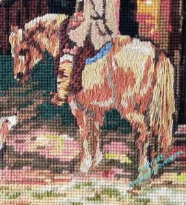
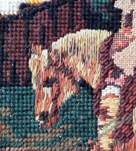
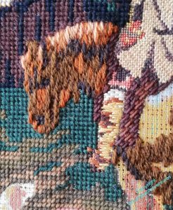
Dobbin covers quite a bit of the canvas!
Once I’d done all the masses of what for want of a better term I am going to call long and short stitch, using blends of stranded cotton, I sat back and looked.
I’ve added some long stitches to the tail, using two differently coloured strands of stranded cotton twisted together. I’m not sure whether to add more of this, or even whether to leave it in, but I wanted to help emphasize the length of the tail, and this is one way to do it.
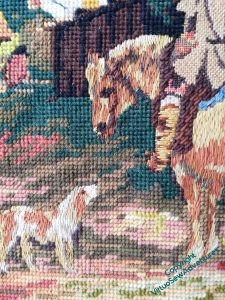
The conversation is very clear to see now, I think. The colours are similar, but not the same, the technique is the same, and there is a real sense that Dobbin and the dog (Polly the pointer?) are having a proper catch-up.
I wonder what they are talking about?
Actually, once I looked at the conversation as it stands, I thought there was a little still missing…
That’s better.
It’s nothing like the thickness the mane would truly have, but I think it gives just the right recollection of the shaggy long hair of Dobbin’s mane, and the blue cotton on the harness and the back of the saddle suggest sunlight on the leather.
He’s turned out much better than I feared!
More on the Horse, hereafter known as “Mars”
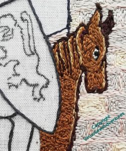
I do wonder whether the mane is quite luxuriant enough. Like the tail, if I decide it needs more, I can probably add some length; if I’d been thinking straighter, I might have given him a short cropped mohican, because I suppose you don’t want to give an enemy something to hang on to as you charge them down, which a mane might well.
But then, no-one suggests that warhorses had docked tails, so I may be overthinking this!
There are all of about six stitches of white silk around the eye (my flat silk from working the Amarna Family Group) and they seem to be just enough to make it suitably staring. This is clearly a Visit of Ceremony, and Mars is determined not to let the side down, so he is focused and crisp in his movements.
I’m going to give him a saddlecloth in William’s heraldic colours, so I am leaving all that unstititched for now. And I have made very sure that the darks help him to feel solid and stocky.
I did say that I would be going around in circles for quite some time!
The stitching of the “dapples” in the same colour as the background give him a slightly thicker coat than a modern race horse, and I am hoping that the alternation of the textures will help knit the piece together, creating a a sort of counterchange: the shield and saddlecloth smooth, like the top of the wall and the path beneath his hooves, while the walls and horse are slightly rough, bouncing the light in different directions.
Incidentally, while I’m working this section, I’ve been thinking and planning for the “frame”, and the ideas keep changing beneath my feet. So if you were wondering where my plans were – the answer is “in flux”!
A second conversation
You may recall that I started on the horse in the canvaswork, and then suffered from Doubts. I thought it looked an unholy mess, and diverted my thoughts to the fence by the cottage. Which turned out very pleasingly, which is always a relief.
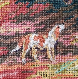
Then my cousin made a passing comment that helped me unstick the problem – she said that there are two conversations going on in the picture, one between the man and the woman, the other between the dog and the horse. That being the case, it seemed to me that I should maybe use the same technique for the dog and the horse, even the same sort of thread, so as to highlight the conversation.
I wanted to create the impression of fur, but nothing too shaggy, so while I wrestled with unpicking the horse, I started on the dog. Stranded cotton, separated and recombined using several close colours (I have a lot of stranded cotton, so this is all still stash), and then worked upward from the feet and the end of the tail in something a bit like long and short stitch.
I think this has worked well. We have friends whose dog is a similar shape and colouring to this one, and it was fun to sit and stitch with her in mind.
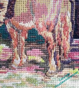
Of course, an entire horse (I’m calling him “Dobbin”, of course!) is going to take some time to do, since I need to work upwards. But at least I’ve made a good start here, smaller stitches around the hoof, longer stitches, with still longer ones planned, for the tail.
He’s a rough-coated working country horse, not a sleek and shining racehorse, so if the colours are clouded a bit, and the darks and lights not as distinct as they might be, that’s all to the good.
I’ve continued to work on the tent stitch, too, every which way, as it is in the sections already worked when I got the canvas, so the whole thing is getting closer to being finished..

