
About Rachel
View all posts by Rachel
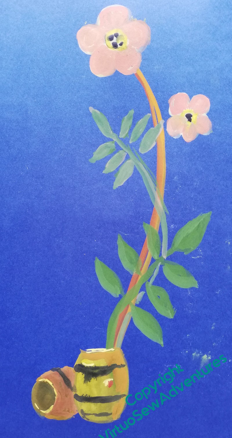
A Merry Christmas to all who celebrate!
Stella’s Birds – Starting the Embroidery..
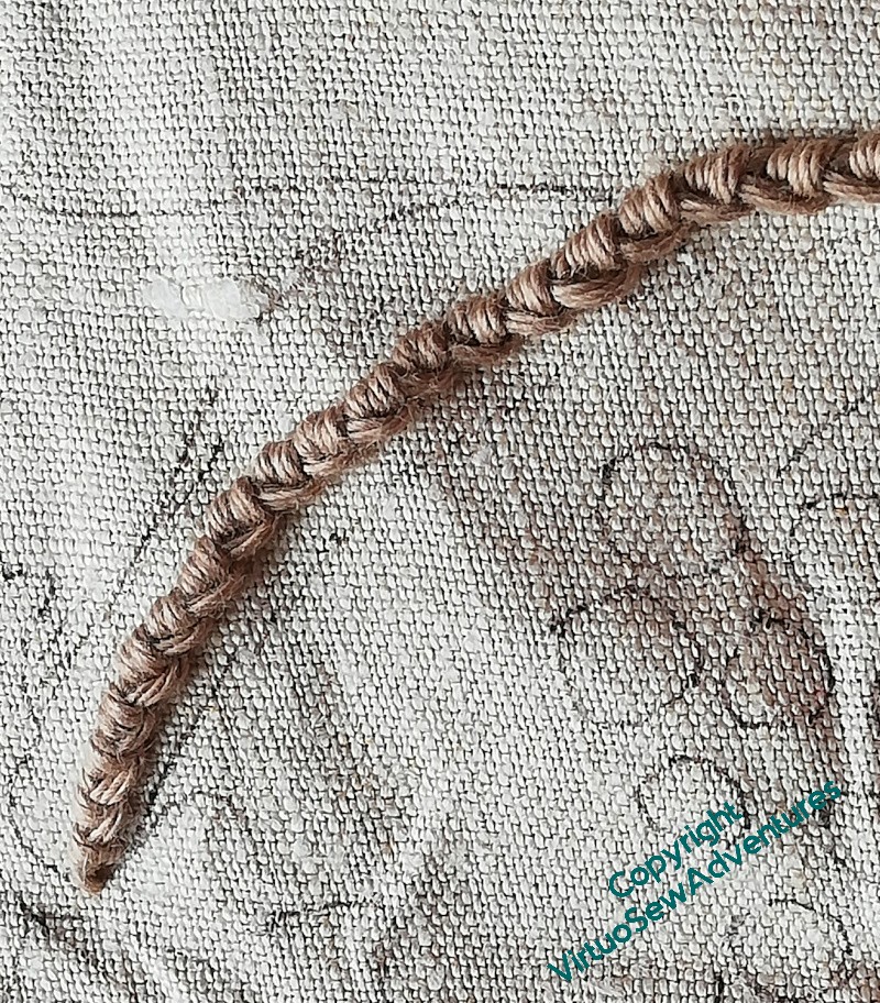
You have to start somewhere, don’t you!
Once I had finally become happy with the design for Stella’s Birds, I thought it was Time To Start.
And you may remember that I mentioned when I was working on the Jacket of Many Flowers that I have learnt, over the years, that when I’m working something like a spray or branch of flowers, leaves, and fruit, I need to start with the branches. In the past when I have started with leaves and flowers, the whole design has remained “spotty” and unconnected, and I don’t feel that I’m making progress.
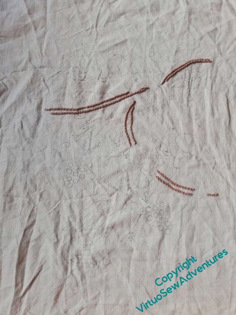
That’s so dispiriting that these days, I do the branches first.
I’ve used soft cotton in a warm pinky-brown, and chose one of my favourite stitches, Portuguese Knotted Stem Stitch (link to the RSN stitch bank entry). It leaps forward very satisfyingly, so it didn’t take me long, once I got a chance to settle down to it, to get the branches done.
However…
I wasn’t entirely paying attention.
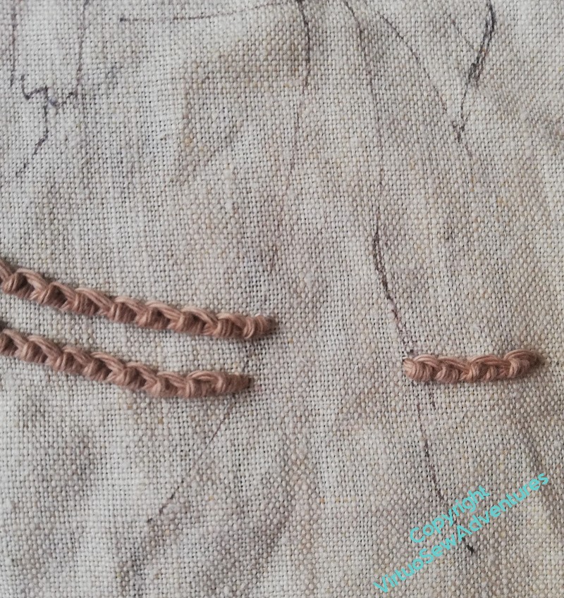
I remembered to leave a gap for one of the bird’s tails, but not the other. And as I look at my other choices of thread, this pinky brown has no other friends. So I may decide, at a later date, to remove part of the branch stitching to allow for tails and feet.
I have a slight fear that I may even have to remove all of it. I love Portuguese Knotted Stem Stitch, but it is full of personality, and if I don’t get the balance right in the rest of the stitching it might unbalance the whole thing!
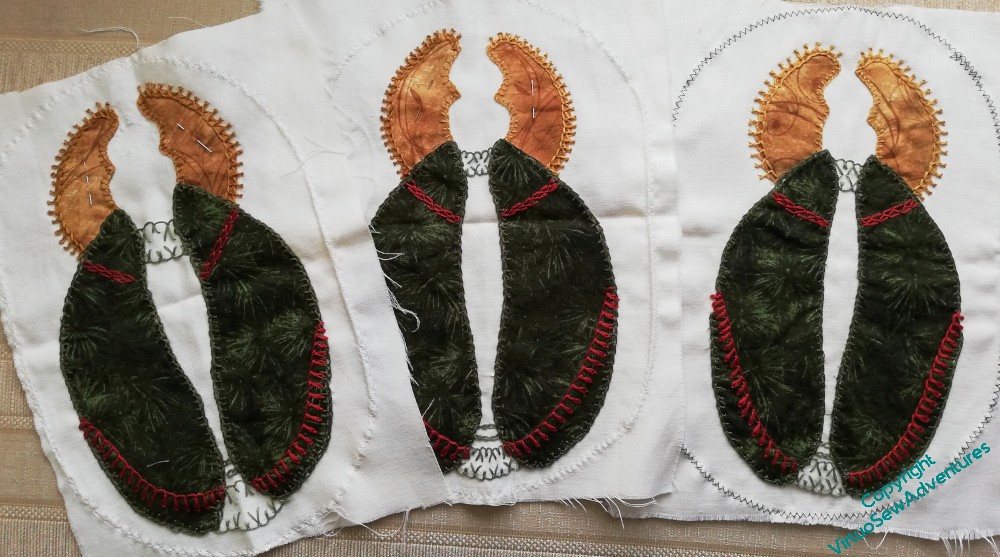
Chorus of Angels Progress
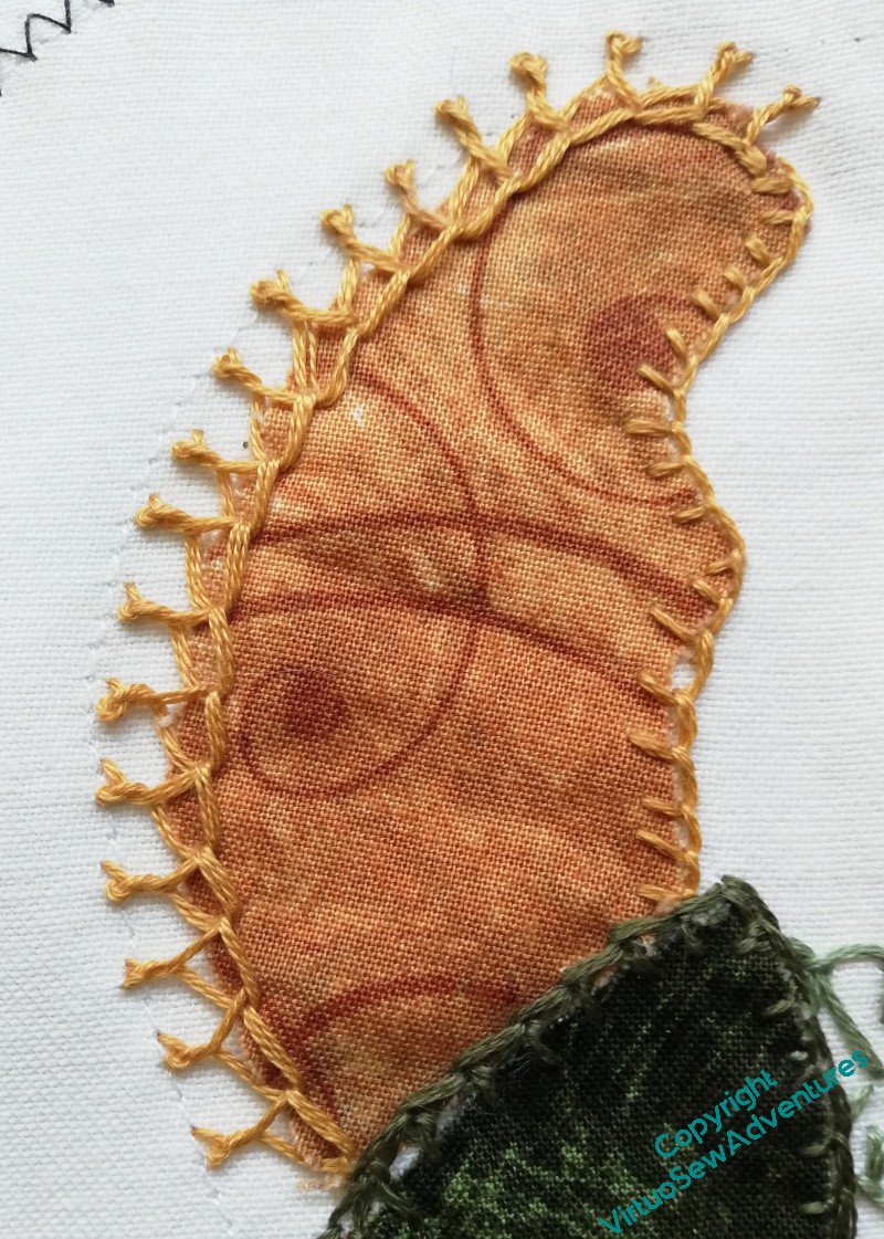
You may recall that my mother and I have been doing some embellishments for a Christmas Tablecloth.
We have twelve angels (or is it eighteen?) to do. I don’t think they’ll be done in time for this Christmas!
However, I do feel quite pleased that we’ve got the stitch choices set, at least for the green angels (half of the angels have green capes, the other half have red capes).
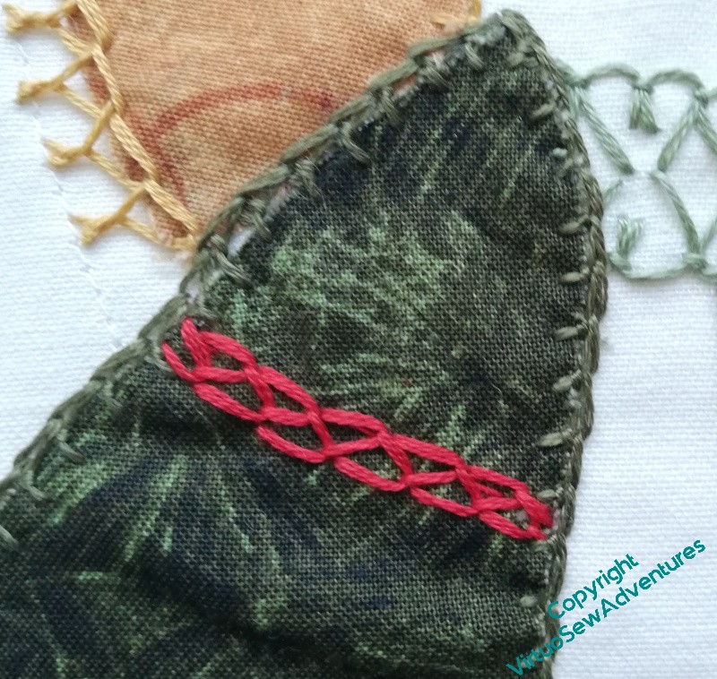
The wings are edged with crested chain stitch, and the cape has a shoulder line of closed feather stitch, and another line of petal stitch. The dress is defined with a pattern of up and down blanket stitches, since it is actually the background fabric.
On that subject, the face wil also be part of the background fabric, defined by the hair. We’ve not come up with a good solution for that, yet. Or for how much face there will, in fact, be. With such a small area, if we misplace an eye or a nose, we’re careering straight into uncanny valley. And we don’t want to be there!
So, anyway, three complete. Onwards!
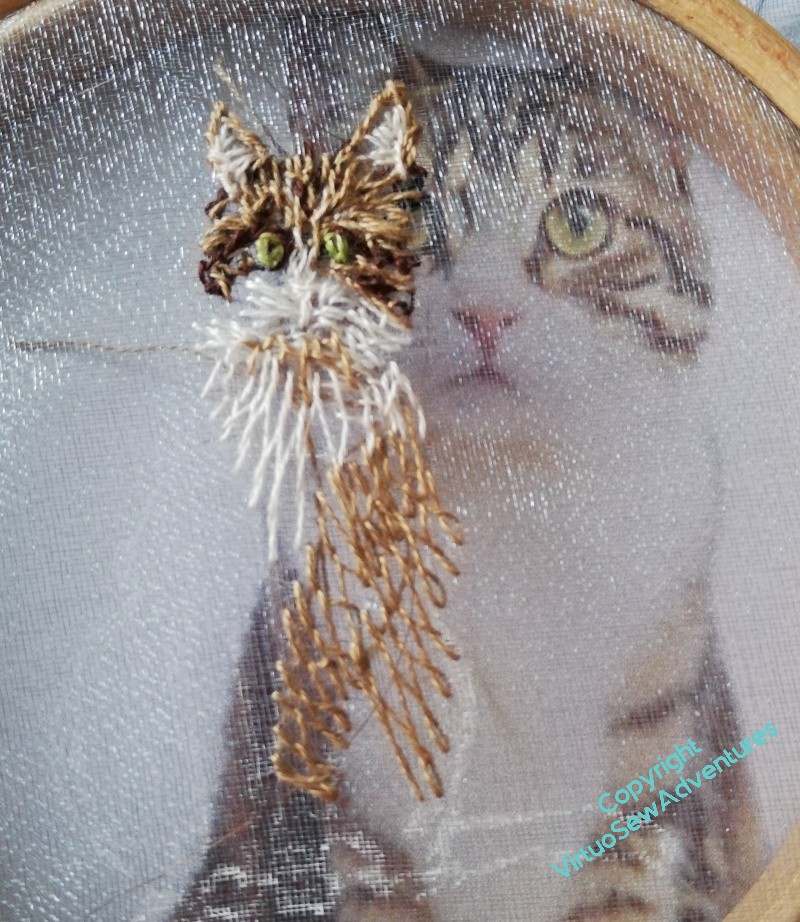
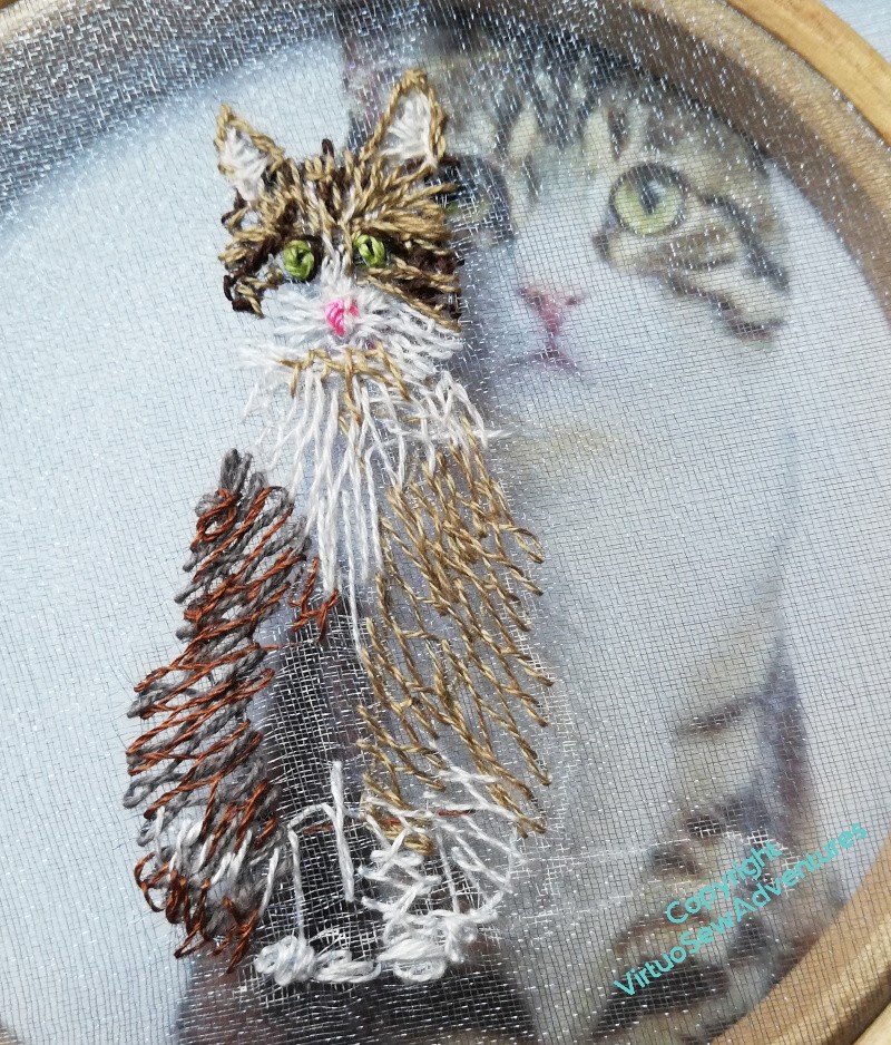
The Cat, Smith, creeping onward
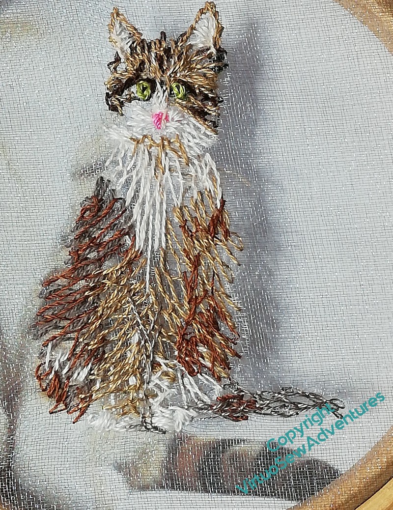
You may recall that when you last saw The Cat, Smith, he was more or less tail-less, a situation which accorded not at all with his dignity, and could not, he assured me, be permitted to continue for so much as a minute.
Alas for poor Smith, shortly after that there was an outbreak of chaos, and he had to sit there on his little stub of a tail for three whole weeks before I could put it right.
Still, here we are, at last, I’ve managed to get at least a first layer of stitching down all over Smith, including his tail.

As you can see here, I’m building up layers of stitches in single strands, trying to entangle the layers a bit, so that each layer modifies other layers, and I am beginning to try to separate out the front legs and hind paws.
The white of the cat’s bib reaches much further down than I had it originally, but of course, in the shadow it won’t be white. Finding the right shade to help with that is not entirely straightforward, it turns out.
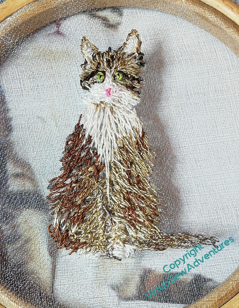
At this point, though, I think he’s ready for me to start putting his dark markings on him. There will be some more of the various lighter browns to put in later, but I think I need to put the darks in to see whether I have got the rest of it right.
As always, now, I find that the way I work in stitch and the way I work in paint are beginning to blend together. In this case, the darks will help me find my anchors and mooring points across the design (yes, he’s small, but the smaller the design, the more important the waymarkers – trust me on this!) and that in turn will create a nice solidly, furry cat.
Stella’s Birds – design settled!
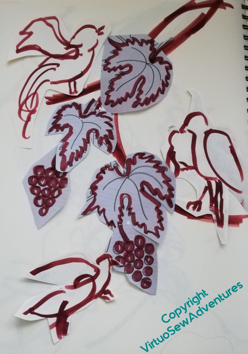
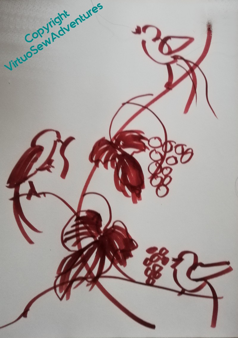
I took my problem with Stella’s Birds to my Mam, who pointed out that grapes hang downwards from the vines. You can tell I’m no gardener, can’t you! So I turned the triangular design upside down and started playing with curved branches. That immediately began to feel better.
Then I found a Delft tile of a bird in flight (still in the vaguely mad territory of the medieval inspiration) and that unlocked the headache I was having over the feeding bird. The placings for the birds were fairly straightforward – I’m simply alternating them and placing them in the right part of the design area. The leaves and grapes were trickier, because the angles they sat at were going to matter.
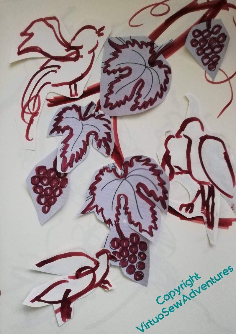
So – remember my Thread Talk? – back to paper cutouts! – I started playing around with cutouts of the leaves and bunches of grapes, to get the spacing to make a bit more sense, and finally decided to have three bunches of grapes, and three leaves, to go with the three birds (who have now been informally named Bitey Bird, Stabby Bird and Shouty Bird!).
At which point, I found myself quoting from My Fair Lady : “By George, she’s got it!”.
So, time to do a tracing, transfer it to my fabric, and then also transfer it to a piece of paper so that I could play with balancing the solid bits and more open bits of the design.
This is about as far as I can go without having the actual stitched textures in front of me. Solid emphasis on the vines, the grapes, and the leading edges of the wings – yes, I’m sure about that. Other details – maybe filling in half of the vine leaves, some of the details on the birds – they can wait.
Time to get stitching!
Starting to plan Aethelflaed’s Border

As I get nearer to stitching the border for the Aethelflaed Embroidery, it is starting to become imperative that I make some plans for it.
This is why I started to work on painting, originally – not to become a painter, but simply to make design mistakes more quickly and easily than in stitches!
As I began thinking about it, and since I am conceiving of four panels which will between them cover four now lesser-known characters in politics and religion during the medieval period, I came to the conclusion that I should keep some themes across the four.
I’m keeping the background of trellis couched laid silk, for a start, and it will be the same blue, although I may make a change to the order of dark and light in the trellis couching itself.
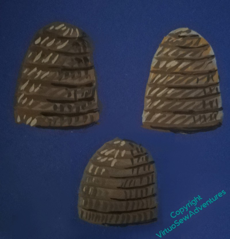
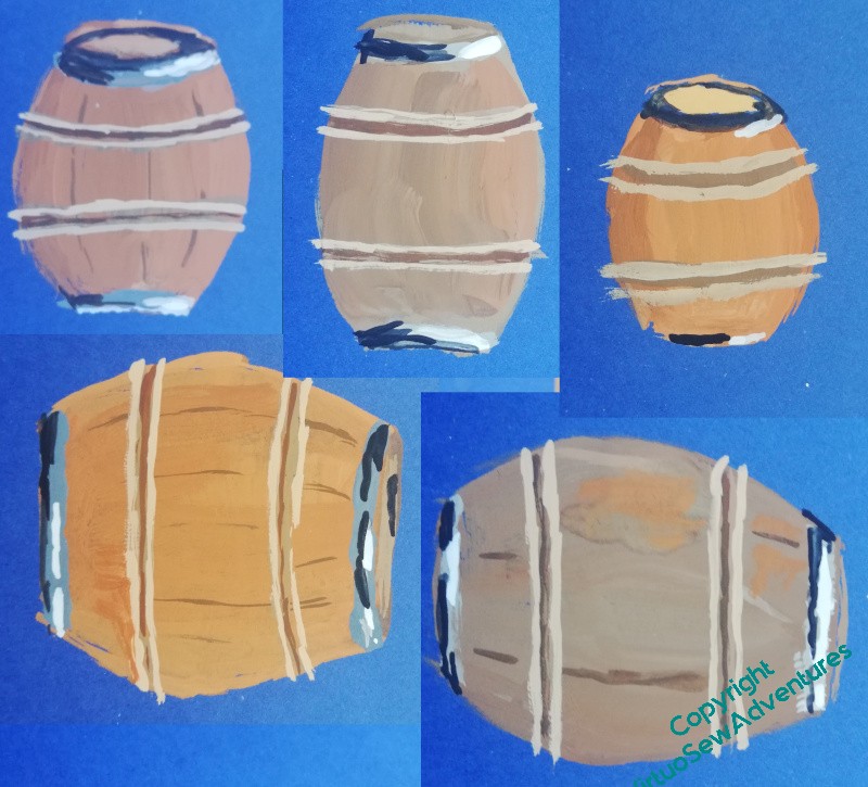
The dog roses I used for William Marshall will appear in Aethelflaed’s border as well. My researches haven’t turned up any specific flora associated with Aethelflaed, but there’s a tale that the Viking attack on Chester was routed with boiling beer and angry bees, so I’m experimenting with beer barrels and bee skeps.
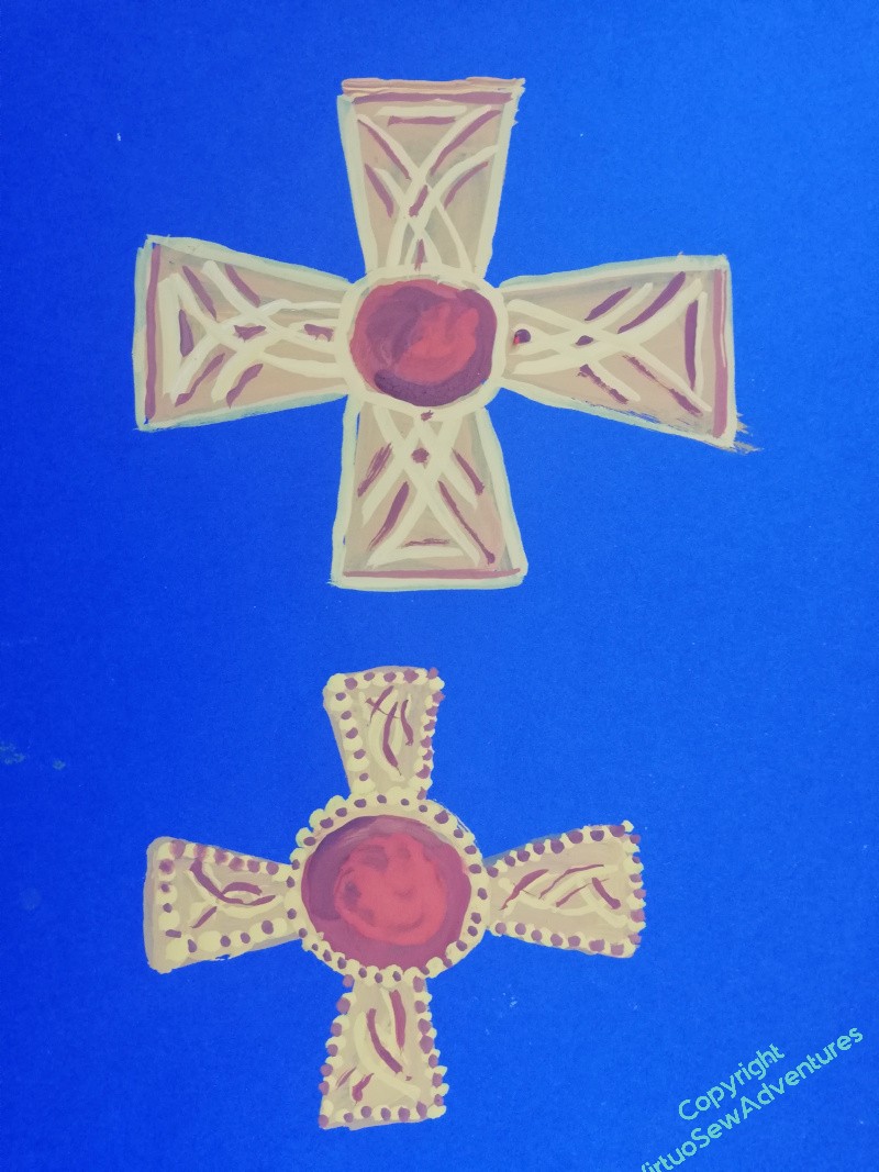
And there will be a different cross at the cardinal points of the embroidery. These first efforts are patterned after sketches I’ve made at some of the exhibitions I’ve visited, showing elements of the Staffordshire Hoard and other items. Garnet and gold is a combination very strongly associated with the Anglo Saxons, and I’m having a lot of fun playing with details.
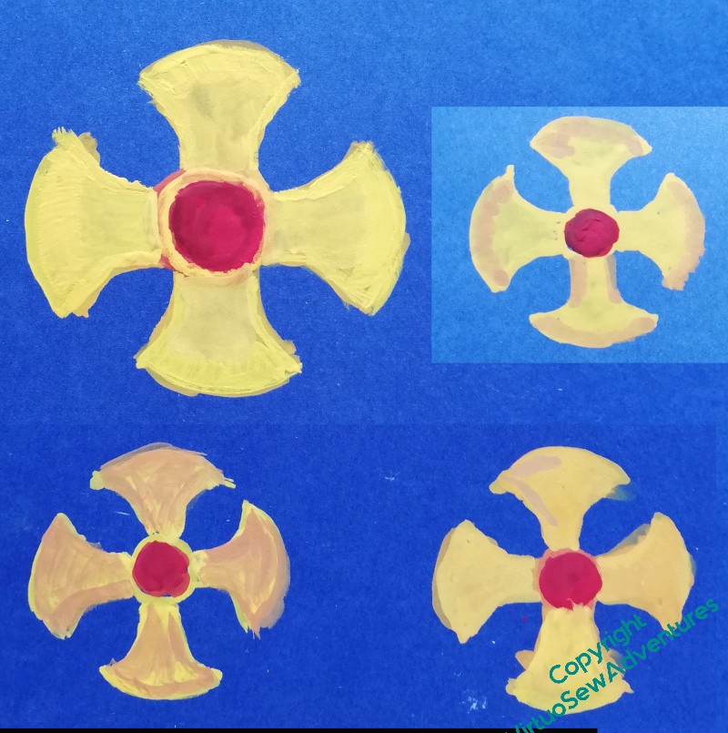
Some of the ideas are not really working, others I think definitely are.
I’m certainly not yet ready to assemble a finished design. But at least there may be some signs of something to work with, and after all, I’ve still got a few weeks of thinking time while I do the laid and trellis couched border!
News for this week
First Newsflash

A few weeks ago, I listened to the FiberTalk podcast episode with Tanya Bentham, and left a comment to say how much I’d enjoyed it. I had a reply quite quickly from Gary Parr saying “Thank you for your comment. I’ve just been looking at your blog, would you like to be on the podcast yourself?”. It seemed like it would be fun, so I said Yes.
It was fun!
Gary had clearly been rummaging on my blog to find things to talk about, and I think he found some interesting questions to ask. Certainly he gave me a great deal to think about!
You can find the podcast episode here on the FiberTalk website: https://wetalkfiber.com/2025/11/16/stitches-and-stories-with-rachel-wright
Or you can watch it here on YouTube: https://youtu.be/TGEJw_q8tOA
Second newsflash
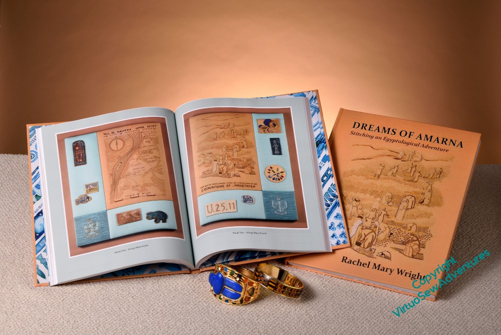
I will be joining the Embroiderers Guild UK on their stand at Knit And Stitch, Harrogate, on Friday morning. I’ll be happy to talk about embroidery in general and Dreams of Amarna in particular, and I will have my pens all ready to sign copies of “Dreams of Amarna – Stitching An Egyptological Adventure”!
More on the cat, Smith
The Cat Smith, like all cats, has Standards. Whether I’ll attain comparable standards is still not certain!
I think the head is pretty much done, at least until final balancing, so now I have to move on to the body. This is the blocking-in stage, so I’m starting by looking at my image source. This particular cat looks lighter on the right hand side than the left, so I’m starting with a sort of underlayer of cretan stitches across the body.
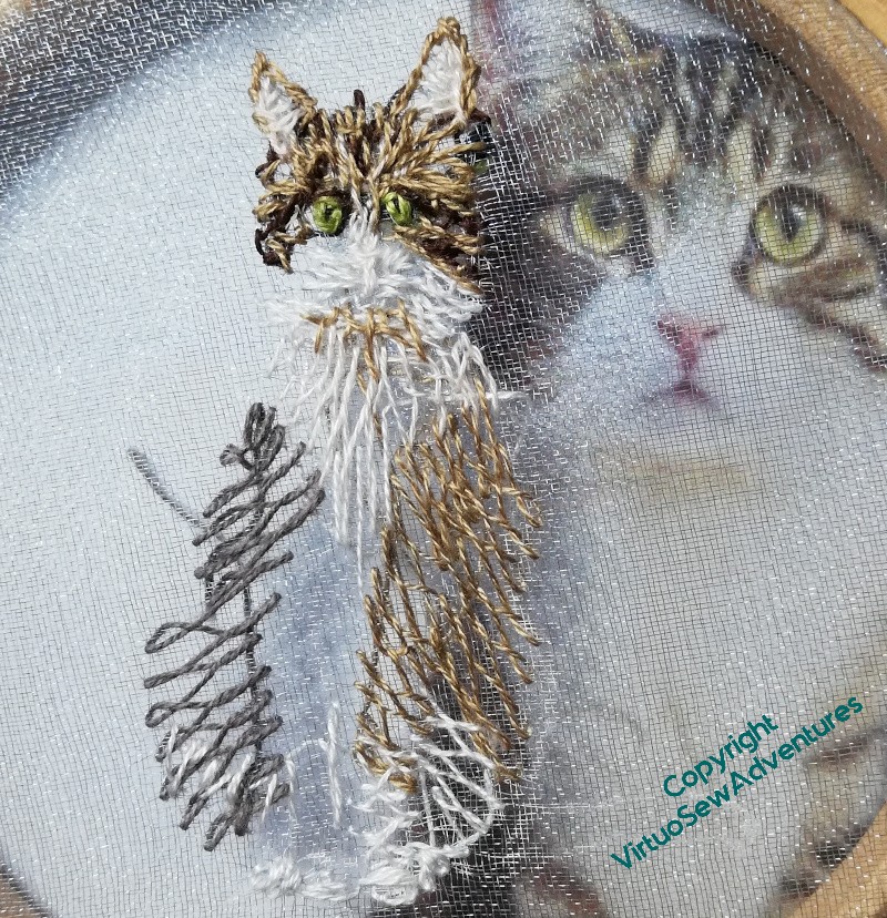
Light fawn on the right, here, and grey on the left. What I am hoping is that after a couple of suitably tangled layers of cretan stitch, as I do the smaller markings, there will be a nicely furry effect. It’s really useful that I can see the cat through the gauze while I’m planning this!
I now realise, however, that I’ve forgotten to do poor Smith’s tail!
I also think that his white shirtfront isn’t quite big enough, but that gives me a chance to blur the edges a bit more, which will help with the furriness.
And I think the eyes need to be bigger, and maybe lighter. But, you know, the more I study my sources, the more it becomes possible to see what I need to do next.
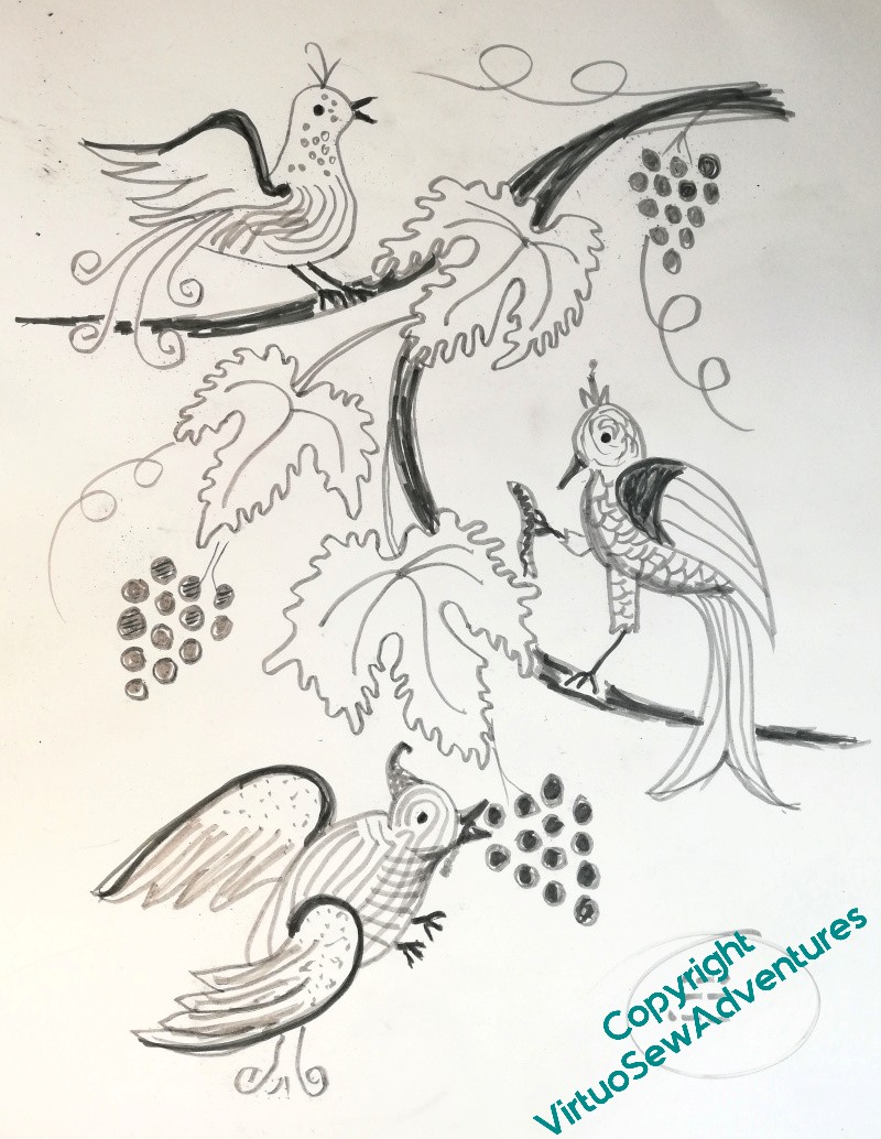
Back To Stella’s Birds
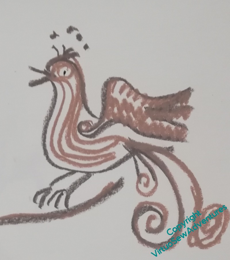
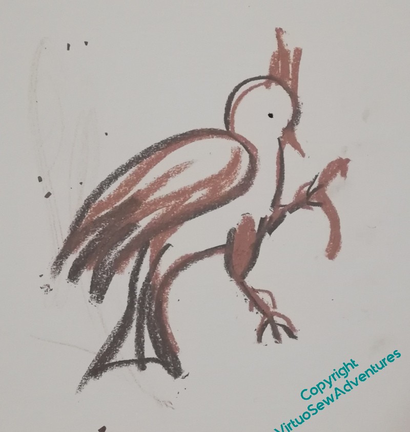
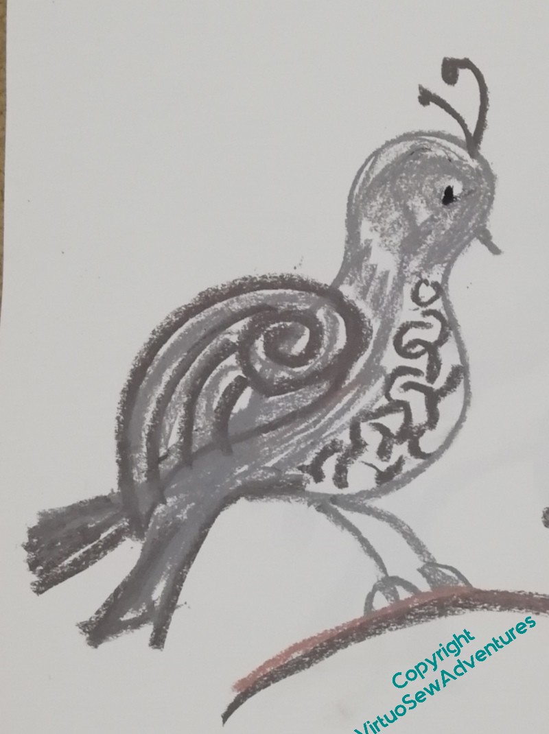
The design inspired by Elizabeth Goudge’s “Gentian Hill” is continuing to give me some difficulties. The stitchery itself will be inspired by Mountmellick work, although it’s not going to be anything even close to classical Mountmellick. You didn’t think it would, did you?
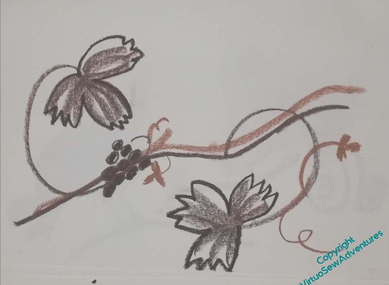
I was planning to use a vaguely medieval flavour for the birds, so they’ll be a bit mad, all curlicues and twiddles. The ones above are looking promising, I think. I will need to consider balancing solid stitching and line stitching, but that can wait until the design itself is settled. Keeping them mad once I start stitching may be a bit of a challenge, but we’ll see.
The branches they’ll be sitting on are worse. I’ve been trying two different styles – a rectangular design, and a triangular design. Both of them look a bit clumsy, and they’re somehow unsatisfying. Granted, neither of them is the whole design, the rectangular one is lacking the birds, and the triangular one is lacking curlicues and any sense of spacing. I’ll get there in the end, but it’s going to take a while.
What I am pleased with is that I’m getting better at doing scrappy, fast, thinking-with-a-pen drawings. Even a year ago, I don’t think I’d have had the freedom I felt as I was doing these.
Which is just to tell you, it’s never too late to start on drawing – or any other skill!
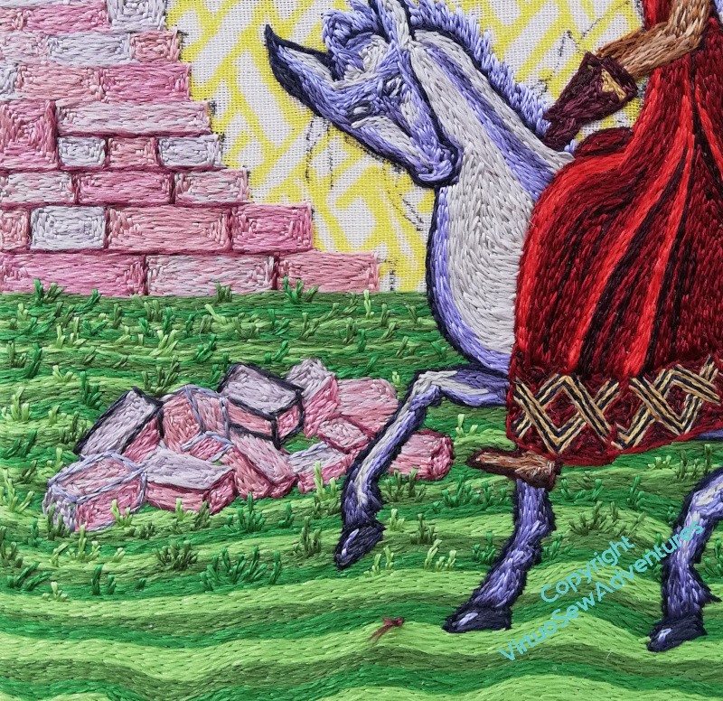
Walls and Tussocks
One of the things I find happens very often to me – as regular readers will have noticed! – is that there’s a lot of rethinking that happens.
This is partly because rather than being trained to create a design in detail from the start, I have worked it out all very painfully for myself, with different levels of success for each project. And I’ve only been doing it for twenty years. I’m much better than I was, but I am sure that my visual imagination would be much more detailed had I started at the age of sixteen, say!
So, for example, when I first stitched outlines for the blocks, and hadn’t stitched the blocks, it looked very much too dark and out of balance, so I lost confidence, took out the outlines, and worked the blocks without them. Now that Aethelflaed is in place, darker and more emphatic than she might have been, the walls need a little more definition to stand up to her. But not too much, so this time I’m using essentially a mid tone of pinky plum. I think that’s going to work.
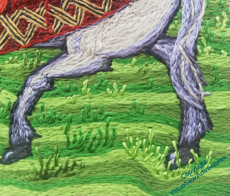
I’m also returning to the grass. You may recall that I had a thought as I was doing the early stages of the grass, thinking that it might be a good idea to increase the scale of the tussocks as I came forward. This is one of those elements which is a departure from classical opus anglicanum, as far as I know, but it is a way for me to explore some of the outer reaches of filament silk.
As I’ve said before, I’m not doing a reconstruction, I’m doing a thing which tries to tell a story using a blend of old and new design sensibilities, something that will be definitely a modern piece, but which has echoes.
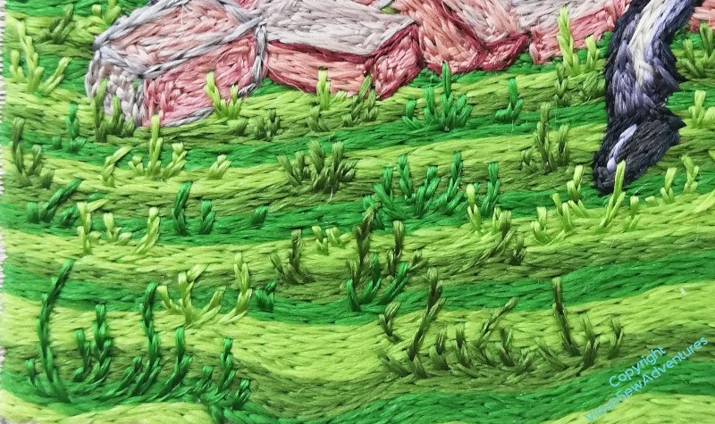
How well this will work when all four of the Medieval Movers And Shakers are done and displayed together, I don’t know.
How well I will balance old style and new style, images, stories and echoes, I don’t know.
But it’s going to be fun finding out!