About Rachel
View all posts by Rachel
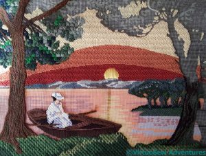
Canvaswork – Sunset Study
Catherine, of Hillview Embroidery, is doing an RSN canvaswork course at the moment, and commented in a recent post that the folder of photographs of the work of past students at the back of the studio has been really useful, partly for ideas, and partly just to practice analysing designs and stitches.
I have two canvaswork pieces that use ornamental stitches to represent the textures and colours they depict, both worked when I was a teenager. It’s much easier to analyse someone else’s work than your own, so Catherine, this post (and another, as yet unwritten) is for you!
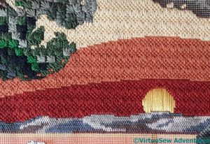
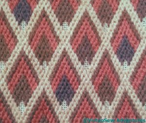
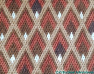
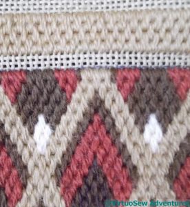
It was actually the sky that made me buy this particular painted canvas (this was long before I’d tried designing my own!). I think the stitch is Hungarian Point, and since the canvas had such a graphic feel, rather than being painterly, I was quite happy to leave the sky with those sharp colour changes. The pattern in fact runs clean through from bottom to top, but that those same colour changes mask the fact. The heather clad hills are in Plaited Stitch, worked small to help them recede. And the foliage of the tree is Ray Stitch. I do wonder whether I should have done the ray stitch facing downwards, but some of the pines have a slight upward curve, so they are staying as they are.
Almost all the threads in this piece were wool. It’s a fairly large gauge canvas, and again, there’s so much flat colour that blends wouldn’t really be suitable.
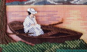
The lady in the the punt is Soft Embroidery Cotton for her skin and hair, and tubular synthetic for her gown and hat, and the punt is straight stitches in assorted browns. The tree trunk is effectively in stem stitch, and the bushes at the front are interlocking elongated cross stitches. They look surprisingly bushy, don’t they!
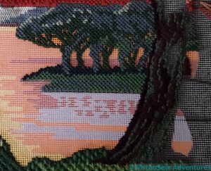
The trees in the distance are in Upright Cross Stitch, which makes a good intermediate texture between the bushes at the front and the distant hillside.
And that near tree? That’s one of the reasons I didn’t finish. I found that not only was I not enjoying the combination of stitches, I was running out of the threads and colours I was using. I threw it in the loft in frustration and disgust and only fished it out again after I’d read Catherine’s post.
The sea is another reason. I still haven’t worked out how to do it, and at the moment, I am still not at all sure I want to.
You can click on all the pictures to see them more closely, so Catherine, your homework is to look at them all, think about what you like and what you’d have done differently.
And if any of you have any suggestions for the sea – let me know!
More progress on The Head of Nefertiti
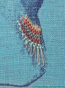
Once I had finished the polychrome bands, I sat back and looked at them. Using the darker shades of the colours in the darker part of the print helps to tie it all together and wrap the bands around the headdress.
I had a moment or two of concern, then decided that I would not, after all, ruin everything if I continued to add the other elements of the design that I had planned. There is always a moment or two of fear, especially when an early section has gone well!
The original bust shows something that looks like a browband of gold, fairly plain and flat. I fished out a piece of gold kid, but although the photograph doesn’t show it very well, the kid is the wrong colour (too pale, and not yellow enough) for the gold thread, so I have to think of something else.
*Thinks hard*.
Meanwhile, I thought I would experiment with the necklace, or collar. My thought was that, rather than do the whole thing, I would do a small section of it, to make sure that I maintain the feeling of an embroidery, and not a portrait of a portrait.
What I have done here is to make radiating stitches of the gold thread, and then use the same whipped filling stitch I used on the polychrome bands, but alternating them so there is a hint of a gold net underlying the collar.
I like this, but maybe I do need to do an entire collar’s worth.
*Thinks hard*. Again.
Nile Tilapia Fish
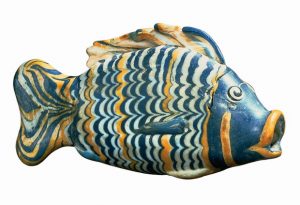
There is a glass vessel which frequently shows up in image searches relating to Amarna, a representation of a Nile tilapia fish. I saw it reconstructed by a modern glassworker in a recent programme about the art of Ancient Egypt presented by the British art critic Alistair Sooke. The glassworker said it was a somewhat unnerving technique to do, and with all his experience, and all his practice, he was never entirely confident of his results until a fish was finished,
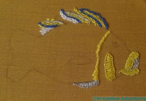
That being the case, it seemed to me that as an example of the skill of the artisans of Amarna, the glass fish deserved to be included. I’ve found a public domain image to act as my source – and to show you what I’m talking about. I’m thinking of padding it slightly and attaching it to one of the background panels as a fish-shaped slip, rather than a rectangular patch, but we will have to wait and see what seems the right thing to do when I’ve finished.
I’m using some rather lovely vintage linen thread, bought at the recent “Sewing For Pleasure”, on a fine but sturdy cotton. I wanted something that would not require a backing, but I’m not sure that the fabric will be left to show, so I could have used some plain calico. The thread is wonderful to work with, strong, lustrous, and resilient. Much better than any linen thread I’ve ever worked with before – they’ve tended to be stiff, and a little “dead” in feel. This stuff is a delight!
So far, the stitches are blanket stitch, seed stitches, chain, stem, and feather stitch. I’m rather enjoying this!
The Head of Nefertiti – working with Silk
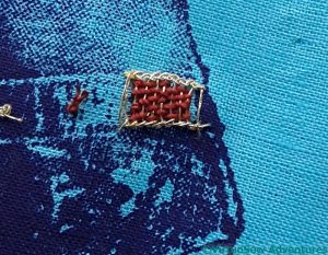
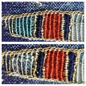
You will recall that I was rather underwhelmed by the effect of my first attempt at weaving the silk into the gold. Leaving the threads loosely packed to allow the gold to show through allows them to look untidy, and the colour is somehow a little flattened, not the rich, strong colour I wanted.
So I decided to work the whipped style of filling stitch instead. It creates a strong colour, something like a grosgrain ribbon, in fact.
I’m using primarily colours from the Mulberry Silks “Nefertiti” colour range (appropriate, don’t you think!), and I’m happy with the rusty red. The navy is actually a heavy perle type and I’m not sure where it came from. That works too.
The lightest colour, however, on the far right, is too fine. It produces too retiring an effect, and weakens the whole effect. So I tried one of the stranded silks from Thistle Threads (lower example, left), and wasn’t convinced by that, either.
This looks better. In fact the two light blue-greens are different, although that isn’t as clear in this photo as I might have liked. They aren’t as green as I would have liked, but I’m reasonably happy. If I decide to redo them, I may have to redo the whole thing, as the unpicking earlier on has left the Ladder Stitch a bit floppy.
The Head of Nefertiti – Goldwork Completed
There are small elements of goldwork which I am planning to work last, but most of it, I wanted to put in place first, so that I can be sure that the whole thing remains in balance.
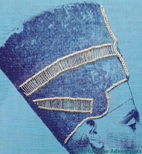
As I’ve mentioned, the framework for the silk is in Ladder Stitch – the whole of the first section redone, as I threatened.
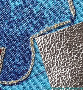
The narrow line around the base is in reverse chain stitch (much easier to work in a frame than the ordinary chain stitch). The coloured bust suggests a gilded inner section for the headdress, and I have yet to decide how to represent that. Maybe gold kid?
The ornament on the front of the headdress looks rather heavier and thicker than the other lines, so I’ve worked it in Hungarian Braided Chain Stitch. I’m a little disappointed with it at present, and wondering whether I need to pick a still heavier stitch – such as the dreaded (not any more!) Plaited Braid Stitch. I’ll decide, I think, when I’ve completed the rest of it.
So, on to the silkwork. I had a previous, failed print to experiment with, and I’m just as glad I did.
I’m rather underwhelmed by this effect, with the silk woven through the gold. I thought it would allow a subtle glint of gold, but in the end it has simply undermined the effect of the silk. Hmm…
Some early (very early!) experiments for the Vision Of Placidus – Part Two
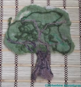
Once everything had dried, I could sit back and look at my trees.
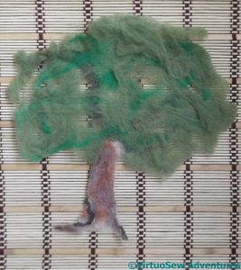
This is the first one I did. It used some multicoloured merino in the trunk, and two greens from the beginners felting kit I bought on eBay a while back. They’re not very nice greens, but all I’m doing is investigating the technique.
There are only two or three layers of wool in this one, which means there are gaps in the felt, and the junction of the trunk and the canopy is a bit flimsy. Gaps in the felt for the canopy are no problem at all – they would help to add depth to the finished piece. Since everything will be caught down (somehow – I don’t yet know how!), strong, dense felt isn’t really the aim here.
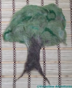
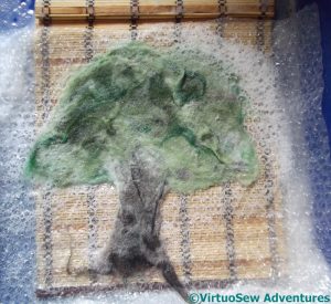
The second experiment had the addition of some short staple (that is, short fibre length), very crinkly wool. I was hoping it would result in greater shrinkage, which it has a little. It also produced a greater variety of shades in the canopy, lightening and interrupting that rather dull green. This may have promise, and the felt itself seems a little more stable and would be easier to stitch into.
Since the fibres are rubbed and soaped and rolled, and generally beaten up, it’s not surprising that the effects of trying to place the fibre colours to create a particular appearance is, to put it mildly, an inexact science. I wonder whether I could combine needle-felting with wet-felting to make the results more controllable?
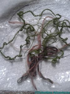
In the final experiment, I added crocheted chains and some tangles of yarn as well. Some parts of the chain didn’t felt in quite as well as I might have hoped, but with more crocheted chain and a better understanding of how to felt it in more thoroughly, it might produce a very good effect.
My semi-spun yarn on the trunk has worked, though, and looks even better in real life, although, again, what it needs is the courage of my convictions and rather more of the same.
So, not a completely unsuccessful experiment, and certainly a good basis for further experiments, perhaps with added stitching…
Some early (very early!) experiments for the Vision Of Placidus – Part One
I’ve been struggling with a sore and stiff shoulder for some months now. It’s made me reluctant to go back to Eve In The Garden of Eden because at this stage she demands perseverance in a single, small stitch for the gold groundwork. The Head of Nefertiti has involved more variety, and earlier signs of progress, while the canvaswork is perfect for evenings.
However, my shoulder is beginning to ease and I’m feeling more willing to experiment. So I had a very entertaining morning last week (it was on Instagram and Twitter) having a go at something I saw on someone’s blog a few months ago and thought might have possibilities for the underlayer of my planned Vision of Placidus panel. If what you see looks familiar, please let me know and I will gladly edit the post to give credit!
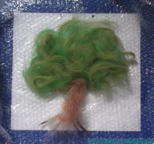
Now, the Placidus panel is going to be about five foot by four foot, so even using some of the chunky threads I am happy to use (… and may even spin for the purpose!), it will take quite some effort to cover it. So I thought maybe I could wet felt some rough elements – trees, rocks, clouds, the stream, which could then be applied and tweaked, improved and generally titivated with stitchery.
In the absence of a real – waterproofed! – studio, therefore, I was to be found squatting on the kitchen floor, using a Lakeland Limited tray for cleaning oven shelves to contain the splashes and soap. I must have looked distinctly odd, but I’m accustomed to that!
In the case of the final experiment ( I did three), I rummaged for some fine crewel wool and made a crochet chain, with some very slapdash and freeform loops added in, and laid that down first, with a tangle of leftover yarn.
I also fished out my spindle and had a go at spinning and doubling some wool to create a different effect on the trunk. That didn’t work too well – the yarn kept unspinning itself. My shoulder isn’t up to a concerted attempt to crack spinning, so I made do with what I’d got, and backed it with various other wools to hold it together.
At this point – creaking slightly in the lower back – I decided to stop, rinse everything off, and let my trees dry before going any further. .
Shadow Play
I decided, as I stared at the printing of this blocky pattern onto gauze, that I wanted to use the transparency of the gauze as part of the finished effect.
I don’t have a destination in mind for this piece which will give me a theme, so I decided that, in order to highlight that one quality, I would use a single thread (as it happened, a variegated silk), and design a fragment that would allow me to experiment with the effect of stitch cover and openness.
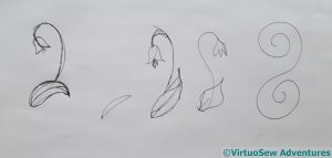
I leafed through books about pattern, saw nothing that gave me the combination I wanted, and then evolved the fragmentary organic sketch on the far left to give me the balance of line and form I was looking for. Incidentally, this is quite possibly the swiftest and shortest progression of any sketched design I’ve ever come up with!
It’s astonishingly difficult to trace a design onto a fabric which is essentially invisible, and still harder, I might add, to follow the lines when you have finally put them there!
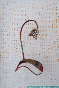
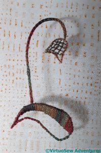
I used Hungarian Braided Chain Stitch for the stem, satin stitch for the solid side of the leaf, and Jacobean trellis for the flower-head. Clearly that gives me a solid coverage, and a firm line; I was hoping that the Jacobean trellis might offer a sort of half-shade.
A qualified success, I’d say. The printed pattern doesn’t create a shadow, and the Jacobean trellis shadow isn’t a sort of half-depth.
But, my goodness, the shadow of the stem and the leaf work exactly as I hoped! The gauze itself almost disappears, leaving the printed pattern floating above the surface, and the leaf and flower thrown forward by their shadows.

