Category: Dreams of Amarna
Working On The Lotus Flowers
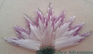
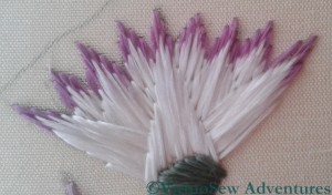
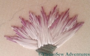
Last week I posted about my progress on the Lotus Tile Fragment, and commented that I was rather concerned about producing a suitable effect. Remember, the original fragment was described by Mary Chubb as “faintly lilac-tipped”, and my first effort looked distinctly clunky. That wasn’t going to be suitable, because the Amarna-period art of ancient Egypt has a particularly graceful style.
There were a lot of useful suggestions in the comments, and more than one encouraging email conversation as well (thank you all very much!), and I’ve enjoyed experimenting in the week since then.
I’ve now got two lotus flowers using blended thread, and one using solid colour tips, and I can’t quite decide between them.
If it comes to that, I’m not sure whether even I, who stitched them, can tell the difference between the two blended tip flowers! In one case, I simply split my original silk thread in two, and laid the two halves side by side, whereas in the other, I split each half in half again, and reassembled them alternately.
I suppose that if I can’t really tell the difference, that suggests that splitting and reassembling once will be enough. I just need to decide whether to go for blended silk or separate colours.
Decisions, decisions!
Developing confidence in satin stitch
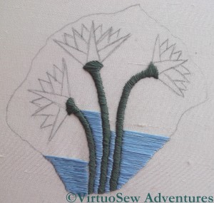
It may not seem as though much has been going on with the Lotus Fragment, apart from satin stitch, but I have in fact been learning a lot, and experimenting rather a lot too.
To begin with, I was intending to use a couching stitch for the blue background of the image. This is partly because I keep forgetting that the final Dreams of Amarna panels are not intended to be worn or leaned upon. The stitches would need to be quite long, which is contrary to my ingrained instinct to keep stitches short in order to make the finished article reasonably hard-wearing. But then, stitched on silk, using silk, it was never going to land in the washing machine!
After my short class with Midori Matsushima, I had a little more confidence in my satin stitch, and so I worked one side of the fragment in satin stitch and the other in Bokhara Couching, and then sat back and looked at them. Satin Stitch won, hands down. The flat silk spreads beautifully to help blend the stitches, and the reflectance of the silk filaments creates an almost radiant effect. So that small section of couching has been unpicked, and replaced in short order! In fact, the satin stitch fairly galloped away once I got settled and gained some facility with my mellor.
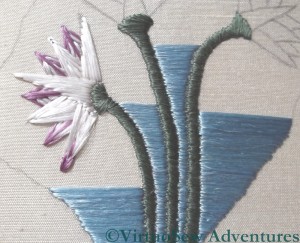
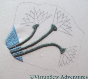
The lotus flowers themselves are giving me a little more trouble. As you can see in the second photograph, I have been trying various ways of stitching them. My challenge is that Mary Chubb describes the originals as “faintly lilac-tipped”, and so my experiments have two goals, not just one: I want to find the most effective way to use the silk to represent the lotus flowers, but at the same time it has to be a way that lets me tip the petals in the lilac without creating a clumsy effect.
The earlier petals use stitches that come to a point at the tips of the petals, crossing under a central stitch that seeks to smooth those tips. I am not happy with this – it looks clumsy and heavy, even though it makes adding in the lilac stitches fairly easy.
The later stitches use a more classical satin stitch, with the longest stitch on one long side of the petal, and shortening stitches creating the other side. This is better, and I think will be improved if I take all of the experiments out and then begin again, with the long stitch on the central axis of the petal and shorter ones to the side.
However, the challenge of creating the effect of the lilac tips remains. I want to blend the lilac and white stitches into one another, and for the life of me I can’t see how to achieve it, or even whether to stitch the lilac first or the white!
Progress on the Lotus Fragment
I have chosen to work the Lotus Tile Fragment using Japanese Flat Silk, which I bought at last year’s Knitting and Stitching Show in Harrogate, from Midori Matsushima. This is rather an adventure, because I have never used flat silk before, except when I experimented with one of Stef Francis’s overdyed flat silks.
Suddenly, therefore, it rather matters to me whether I produce the effect I’m looking for, which was not the case with the Experimental Seahorse, entertaining and instructive though he was to do!
Last week , Susan of Plays with Needles quoted a Buddhist proverb in her blog – “When the student is ready, the teacher will appear“, and it turned out to be true for me too. Entirely by accident, I discovered that Midori would be teaching an introductory workshop in Japanese Embroidery techniques, not fifteen minutes’ drive away…
In two hours, there was only time for the merest scuttle through the techniques – making a twisted thread (we made a four-into-one), learning how to work a Japanese knot, how to stitch with the twisted thread and with the flat, untwisted silk, and finally how to use one of the fine metallic threads. As it happens, the techniques I have ended up using for the Lotus Tile Fragment are (understandably given my background) more Western than Japanese, but although I am intending to use flat silk throughout, it has already occurred to me that I might work an interesting alternate version using Japanese embroidery techniques. I just need Midori to come back and run another short workshop in s0me of the slightly less basic techniques…
An Experiment in Screen Printing
My current plan for the Dreams of Amarna panels is to overlay the embroidered panels with gauze panels screen printed with the heads of Akhenaten and Nefertiti, and since the panels would be hard to store safely and out of the way while I do the embroidery I have always intended to do the screen printing last of all.
Then, as I mentioned when I was beginning on the Lotus Fragment, I had a Dreadful Thought. What if the gauze killed all the colour in the embroidery? Would it be possible simply to brighten the colours of the embroidery (which would also involve abandoning nearly everything I have done so far) or would I be able to find a suitable fabric? Obviously some early experimentation would be required… Fortunately, “Creative Stitches and Hobbycrafts” happened shortly after my Thought!
I found the stand for Thermofax Screens, and explained what I wanted to do. When I explained that the image I intended to print (in the end) would be of the style of an old-style newspaper print, the lady’s face cleared. Yes, she said, it would certainly be possible to print onto gauze, and when I eventually get to the appropriate stage, it would be possible for them to prepare screens for me based on images I provided. She also said that I should experiment with fabrics, but that synthetic gauzes were likely to prove more transparent than natural fibres. So I bought a starter kit and a screen that had some of the characteristics I expect my final images to have, and got ready to experiment.
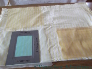
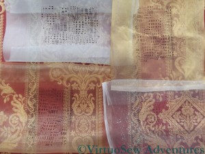
The photo shows, from top left, clockwise: Silk organza, Silk Tissue, Synthetic Diamond Mesh Net, and a Synthetic gauze.
I’ve overlaid them over a strongly patterned upholstery fabric, and it’s clear that the bottom two are going to be better bets. The silk organza all but obliterates the upholstery material, so embroidery is going to stand no chance, and the silk tissue is only slightly more transparent.
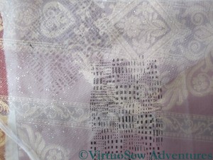
This photo shows the contrast between the heaviest and lightest of the fabrics I have tested. The silk organza took up most of the ink that passed though the screen, and the design shows up clearly, but it reduces the fabric underneath it almost to a pattern of light and dark, with very little colour. By contrast, the diamond net has to be laid over the organza before the print shows up at all, as you will see if you look at the middle picture at full size.
To be absolutely certain, I will need to set up some of the embroidery as I intend to display it, and then hang the gauzes about an inch in front, but as an early indication, I think this gives me enough to go on that I can feel reassured. There are suitable fabrics for my purposes, and basic single colour printing is no harder than I remember from university.
I can set my worries aside and continue embroidering – just so long as I bear my ultimate plans in mind!
Close ups on The Crock of Gold Hoard
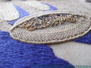
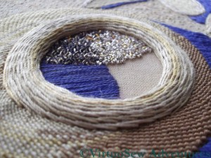
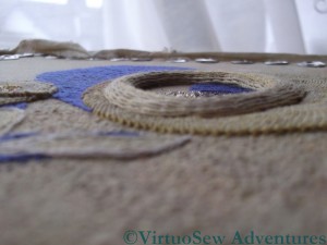
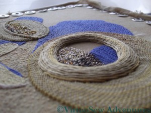
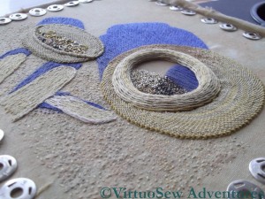
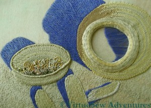
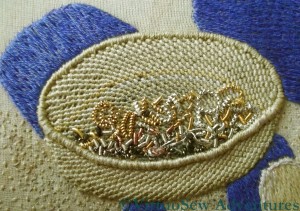
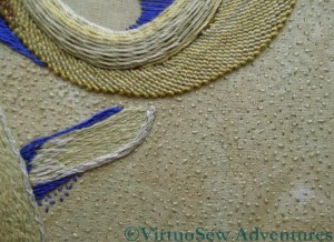
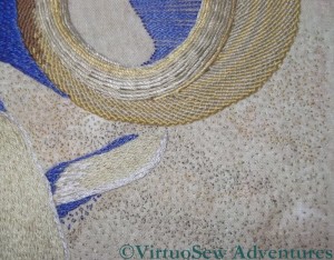
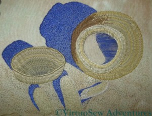
Very few words with this post – Megan asked for some pictures that showed the dimensionality of the various stitches, so here they are!
I’ve left the pictures larger than usual, so do click on them to have a closer look at the stitches and the purls!
I’ve enjoyed revisiting the Crock and looking at it from new angles. I would have loved a strong side light to pick up the glints, but is has been overcast – a good light for working on the Glittering Nightcap, which I’ve finally got back to, in spite of my breath condensing on the magnifier!
Beginning work on the Lotus Fragment
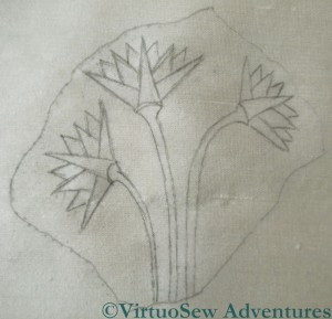
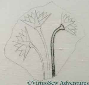
When I first wrote about the Lotus motif, in September (The Fragment of Tile That Started It All) it was because I wanted to buy materials for it at the Knitting and Stitching Show in Harrogate in November, which I duly did. And now that the Crock of Gold is finished, I can move on to the Lotus Tile Fragment! The colours I bought were soft and slightly greyish, rather than bright and clear, partly because that was all I could find, and partly because I was thinking more of the way Mary Chubb would have first seen the fragment, covered in dust.
However, just when I had got the design drawn out, I had a Dreadful Thought.
My intention for the final mounting of the two panels is to print a head of Akhenaten on a piece of gauze and stretch it in front of one of the completed panels, and a head of Nefertiti for the other. Just how fine and gauzy can it be and still create the effect I want of the Heretic Pharaoh and his Queen, brooding over the excavation of their city? How fine and gauzy a fabric can I find that will take a print? And how much brighter do the colours have to be to ensure that the jewel-like panels around the central panels shine like jewels, rather than being killed off by the gauze?
I shall finish this version, since I’ve started it, and I might, perhaps, need to begin learning about screenprinting, and experimenting with fabrics much sooner than I thought. If all the pieces I’ve worked so far need to be re-done in brighter colours, my current estimate will need to be revised outwards…
The Crock of Gold Hoard – Finished
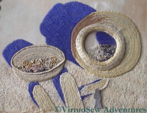
Here is a close up of the finished chipwork on the Crock of Gold Hoard. I’m very pleased with how it has turned out. Especially with a strong side light, there is the right mixture of glint and dullness to suggest old, tarnished metal. I’ve used a mixture of rough purl (both tarnished and untarnished), and check purl, in several shades of silver and gold.
I decided not to use any of the pearl purl, which I used to create the effect of bangles and broken jewellery in the lid. I’ve taken care not to over crowd the chips, because if they started to pile up, it would reduce the illusion of recession that I’m trying to create.
You may recall that last time I posted I had only just spotted the Amulet, set in front of the Crock for the photograph, and I was wondering whether or not to include it in this particular piece. I’m intending to work an or nué version of the Amulet, so even if I fail to include it here, it will still figure in the completed panels.
I could simply tell you what I decided, without explanation, but I think that would be unfair.
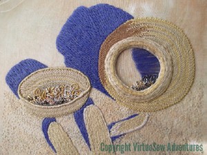
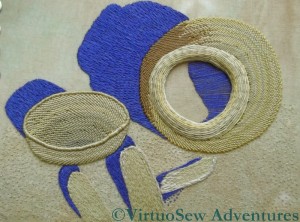
This first photo shows the piece as I originally intended to finish it. There are the sticks in the foreground, the deep blue shadows of the Egyptian sun, the Crock, its Lid, and the chipwork and curls of the fragments of metal.
I think it looks pretty good, and in fact I’ve decided to leave it like this, without adding the Amulet.
The second photo shows my experiment with adding the Amulet. Since creating the Amulet in stitchery would risk causing damage to the fabric, damage which would be impossible to repair if I dislike the effect, I thought that using silver kid leather would be ideal.
I cut out the Amulet shape – approximately – and laid it on the piece, shifting it around and looking at it in different lights. In some lights, the silver kid drew the eye to such an extent that the rest of the piece might just as well not have been there. In others, it looked like a greyish smudge, killing all the other colours, losing the sunshine and shadow. What it didn’t do, in any light, was create the sense of dialogue between the Amulet and the Crock it had been guarding so faithfully for so many centuries that I was looking for.
I’ve kept the piece of leather I cut out, and may, later, add the padding and stitching to give it form, and keep it to sneak onto the finished work as a challenge for the viewer – Find The Hittite Amulet!
Crock of Gold Hoard – A Surprise in the Photo
I’ve been working on the Crock of Gold Hoard for months, now, with the photo or even an enlargement of it, close at hand at all times. My mother and I even spent several hours staring fixedly at the photo while we tried to sort out the shadows.
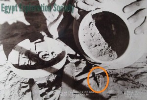
During all that time, something has been nagging me. Mary Chubb mentions that in one of the photos they took at the time of the discovery, the Hittite Amulet was placed in front of the Crock, rather as it had been on top of the Hoard for all those centuries before. And in all that time, with all that staring, I never found it.
And now I have – circled in orange here. In fact, now I’ve found it, I can’t not see it, but since it took me so long to spot it, I thought a bit of help might be in order for my readers!
And here’s the update on progress. I’m working slowly, a bit at a time, on the chipwork inside the Crock. The tarnished silver purl is creating just exactly the effect I thought it would, because the tarnishing hasn’t been even, allowing just the occasional glint to show through.
What I’m still not sure of is just how far I need to go to get the effect of the Hoard still within the Crock, which is a matter of some concern to me, because I don’t have an unlimited supply of tarnished purl.
Oh, and there is the other question – do I even attempt to represent the Hittite Amulet at this scale? I’m going to work it in or nue, as a separate piece, and as the embroidery is only about the size of a postcard, the Amulet would only be about a centimetre high, and if it goes wrong and needs unpicking it will probably leave a blemish.
Tricky.
Crock Of Gold Hoard – Beginning the Chipwork
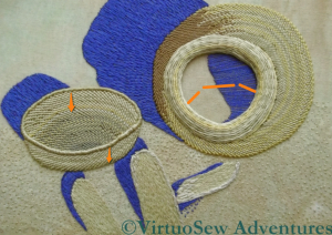
I began by staring at the black and white photograph for a while, and then “Skitch’d” an approximation of the shape of the chipwork inside the Crock. The arrows on the lid are there to remind me that it is quite shallow, and that the back wall and the front wall of the lid should be about the same. The photograph doesn’t show the lid as absolutely full, so I won’t be hiding the base completely, but I do need to remember details like this and bear them in mind.
Since the Hoard has been described as forming in effect a jeweller’s cache of materials to recycle, I’ve assumed that it would be a mixture of metals. The Egyptians certainly knew enough about metal to create alloys, and different alloys would be different colours, which enables me to use a selection of materials. The Hoard was composed of ingots and bits and pieces, so none of it has to be perfectly shaped or even especially neatly assembled.
I found some tarnished silver purl – it wasn’t tarnished when I bought it, but I was hoping it would be by the time I used it, so I was very pleased. It helps to create a bit of a shadow around the inside of the front rim of the lid. Untarnished silver check purl and rough purl, and various shades of gold and copper in pearl purl and rough purl help to create the impression of a collection of bits and pieces, broken bangles, roughly formed ingots and general jeweller’s scrap.
Now I just need to work on the chipwork inside the Crock itself. I don’t think that I have the shape of the scraps, even in the lid, quite right, but I am pleased with this as a start, and it will be several days before I can do some more, so I have propped it up where I can gaze at it thoughtfully at odd intervals.
Update on the Crock of Gold – a definite milestone reached
It’s been a month since I posted about the Crock of Gold Hoard, and that is due partly to the intervening holidays, partly to the continuing Saga of the Tennis Elbow, and partly because I am really not good at all when it comes to large expanses of long and short stitch – or indeed any other stitch!
The shadow in the interior of the pot is done very simply in long straight stitches, because I know I will be adding chipwork there, so I want to avoid giving myself too much to stitch through. If I can find a “tarnished silver” or bronze purl to use, that will help to make the whole thing “read” properly, with the odd untarnished chip to sparkle and catch the light.
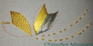
This picture shows the effect of the seed stitches. Although they’ve created a nice grainy background, the scattered seed stitches have slightly “flattened” the colour variation in the background fabric. That’s rather a pity, because the gentle changes in shade were rather attractive.
There is always a silver lining, however, and this gave me the opportunity to add a little more detail. The basic seed stitches were done in the same colour as the sticks, using two strands of stranded cotton. For the additional textures, I added “drifts” of tiny seed stitches in a darker shade, using a single strand of stranded cotton, and and then another scatter of them in a slightly more golden shade.
I’ve been wondering whether the looming chipwork might have been making me slightly nervous, because I have been saying that I can’t do the chipwork until the rest of the embroidery is done, and somehow, I’ve found myself adding other layers of embroidery that must be done.
If that’s the case, I think I have now run out of excuses. I need to make sure that no guide lines are showing, re-stretch the fabric, which is sagging slightly, and then screw my courage to the sticking-point.

