
Category: Large Embroidery Projects
The Hittite Amulet – Beginning to stitch
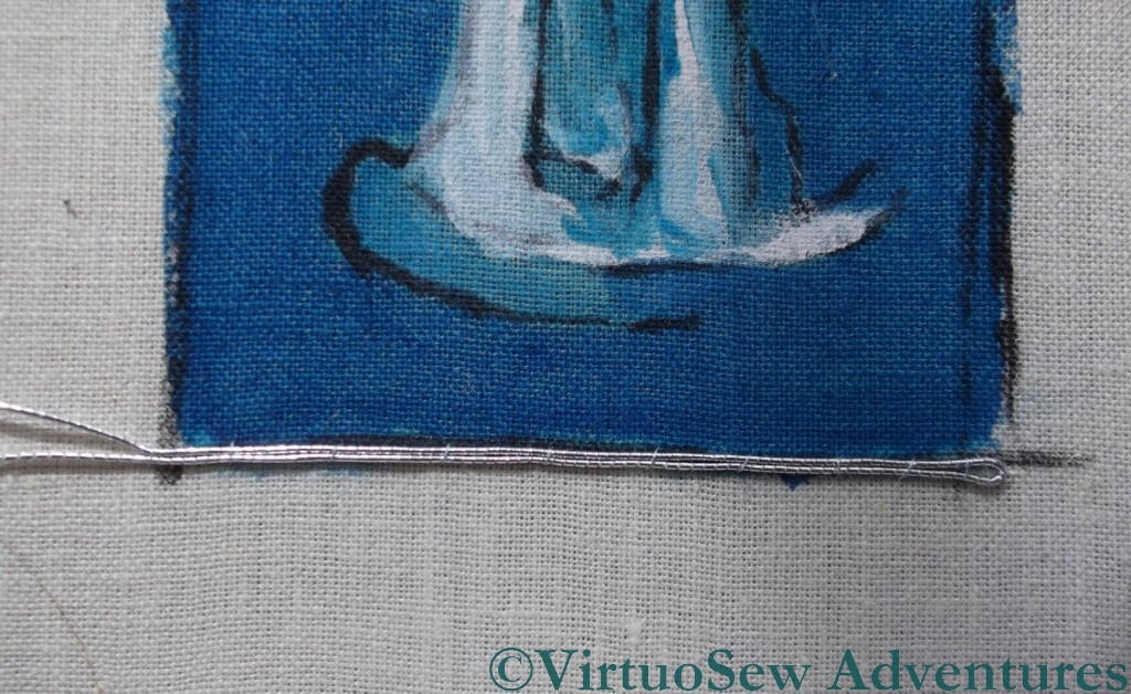
First Silver Row
So, with the Hittite Amulet painted on my fabric, stretched, and ready to go, I have now settled down to stitch. I have decided to aim for a more strongly corded effect in the background of this piece than I used for Christus Natus Est, so each row of stitches will be worked over two rows of silver.
This in turn means that I will spend a lot of time wrangling the springy silver thread to make it lie close and straight. Even the first row was a challenge, and as I reach the core of the spool and find the thread that has been wound closely around it, I am expecting the challenge to become even more challenging!
Still, nothing easy was ever worth doing – so they say…

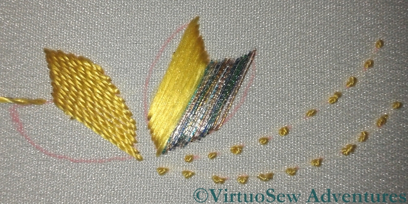
Covered In Silk
This second photo shows the stitching halfway along the third row of background at the base of the piece. You can see the ribbed effect is already building up, and it will create a good strong background. If I get the rest of it right, the Amulet should almost pop out of the surface at me!
I am still trying to decide how to organise my stitching of the Amulet himself, but I plan to allow the silver to show through across the entire design, spacing my silk stitches accordingly. The stitches for the design may cover two silver threads or only one, and I am going to try to space them using the original black and white photo for guidance, to create some sense of the shadows breaking up across the surface.
The Hittite Amulet – all by himself
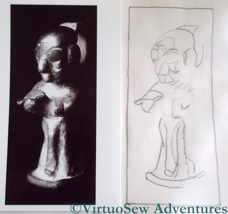
Photo And Sketch
Since I finished the Lotus Flower Tile Fragment, I haven’t had a piece for the Dreams of Amarna to work on. I’ve been thinking about several, of course, but in combination with the Online University projects I’m working on and my sudden idea for the Vision Of Placidus, none of them really caught fire.
Then I filled very dull, dreary afternoon – pouring with rain, with no light to embroider by (remind me, it’s summer here in the northern hemisphere, right?) – with the preparations for working the solo version of the Hittite Amulet. He’s going to be worked in or nué – actually argent nué, since I’ll be using a silver thread! – so the first thing to do was prepare the base fabric.
There were two photos from the EES to choose from, one of them rather moody, with the amulet seeming to look out from the black background, and the other, arguably better lit, and full face rather than three-quarter. Guess which I chose?
Yes, of course, the moody, dramatic one!
Ready To Stitch
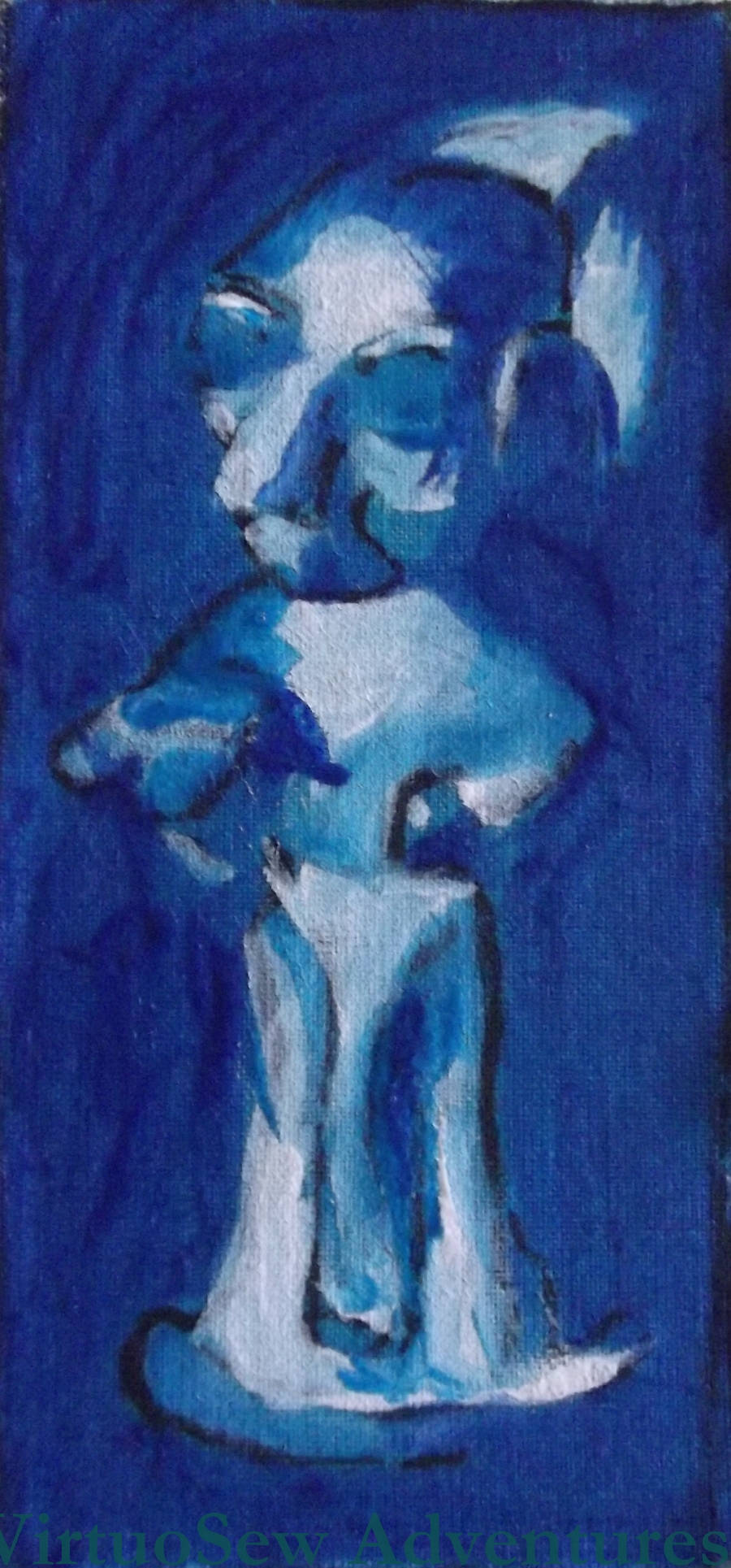
It’s very hard to trace a picture that doesn’t show everything you know is there. You will see that the lines I’ve traced produce a sketchy effect, not complete detail. That’s because I decided to paint more of the details onto the background fabric to help guide my needle, and the lines were really only there to guide my brush!
It may seem that creating this painted panel is a lot of work that will be completely hidden, but while my other or nué panel, Christus Natus Est, had simple sweeping lines, and the coloured background was merely there to prevent cream calico from grinning through any gaps, the Hittite Amulet is a very much more intricate design. Creating my painted version putting darks and lights in the right places took immense concentration and I would hate to have to concentrate that hard on the design when the execution is going to be so challenging.
Wish me luck!
Some opportunistic research for the Vision of Placidus

Conversion of St Hubert (Image from Wikipedia)
Shortly after I had my idea for a panel depicting the Vision of Placidus, I went to London for a lecture. The Pisanello is in The National Gallery, so after the lecture I took the opportunity, before catching the train home, to go to see the painting in real life. It turns out that St Hubert had a similar Conversion experience, so as well as the Pisanello “Vision of St Eustace” I found a fragment of an altarpiece entitled “The Conversion of St Hubert”…
I eventually tracked down the Pisanello, in the Sainsbury wing, and found it very much smaller than I expected – about A2 in size – which is much smaller than I am planning (about five foot by three foot). It was also just as dark as the reproduction I showed you in the first post about this idea. I sat down on a convenient window seat nearby, and started taking notes of the further research I need to do.
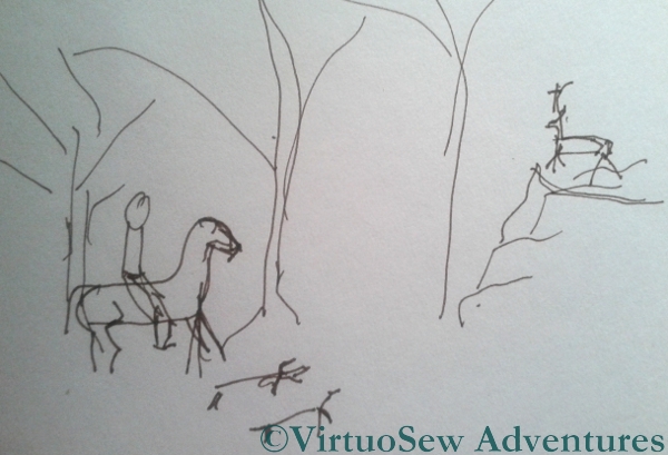
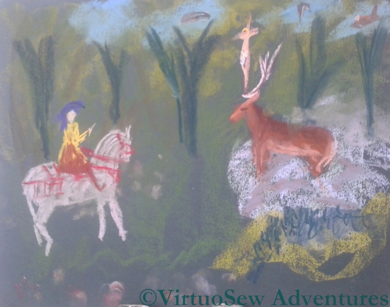
Sketch for the Vision Of Placidus
I will need picture references for
- a horse reined in from a gallop
- a stag with huge antlers
- hounds alert but not moving
- forest flora and fauna
- crucifix
- rocky outcrop
- suitably rich and exotic clothing for the huntsman
I also want to differentiate the vegetation from the background rather more, pull the rocky outcrop away from the background a bit more, and make the crucifix seem to grow out of the antlers rather more than it does in Pisanello’s painting.
Placidus In Pastel
While I was there, I sketched a very approximate idea of the space I want in the picture – the Pisanallo and the altarpiece, and the picture above, are all quite compressed and condensed, and at the moment my idea is to have much more space and “air” in the design.
When I got home I had another go, this time in pastels. Some elements of the pastel work quite well – the horse and its harness, and the crucifix between the deer’s antlers. Others are not so good – the trees in the background are too regularly spaced and too similar in shape, and, like the Pisanello, there isn’t as much space between the stag and the horse as I would like.
I need to be careful, here. If I concentrate too much on creating painted sketches, I might drive out all the stitching ideas, but at the same time, the more I think about the design, the better the chance I have of producing a panel I am happy with!
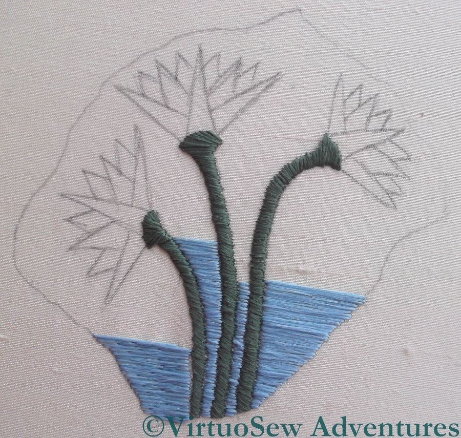
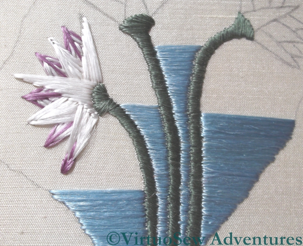
The Lotus Flowers Finished
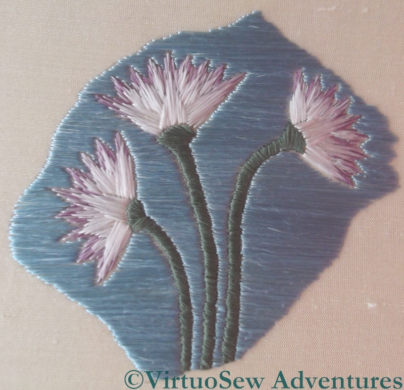
Silkwork Done
The laid silk satin stitches grew surprisingly quickly, in the end. I think of satin stitch as a very painstaking and tedious technique, but for some reason or other, I found the background of the Lotus Tile Fragment the reverse of tedious. I’m sure that the way flat silk spreads out helped with that, and likewise the increasing complication of working the satin stitches around the lotus flowers.
The horizontal stitches worked beautifully, creating the effect of a flowing stream behind the flowers. It can be hard to introduce enough movement into a design to prevent it seeming static, while at the same time avoiding any suggestion of hectic activity. In this case I think the balance between stillness and movement is reasonably well-achieved.
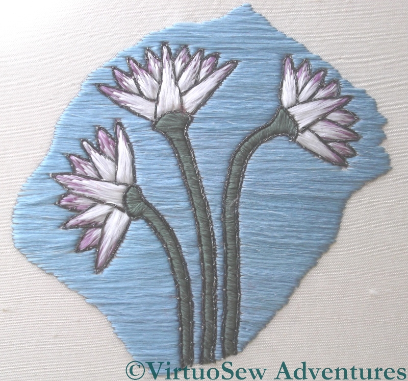
Outlining Done
Once it was done to my satisfaction, I spent a bit of time searching online for images of other Egyptian representations of Lotus Flowers dating from the Amarna period. I was a little disturbed to find that many of the photos in the search results were from this blog, which made my search a little self-referential, but in the end I decided that I should put an outline in, since most of the Egyptian images were outlined.
I was influenced in this decision by the fact that I really enjoyed stitching this little piece, and I felt that re-stitching it if the outline did not please me would be no hardship at all!
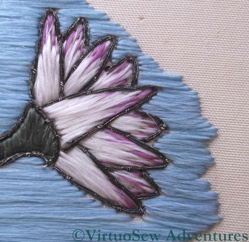
Detail of a Lotus Flower
I used a fine metallic thread, also purchased from Midori Matsushima, and couched it. For the stems I used three doubled threads and couched them – slightly twisting them – using a single doubled strand. For the flowers I used two doubled strands, couched with a single doubled strand. I’m not convinced that the different number of threads made a difference, but believe me, I won’t be unpicking it!
I’m pleased with it. The outlines do make it look a little more like some of the images I found in my search, and they will help the design to maintain its shape when it is overlaid with the gauze portrait.
Vision of Placidus – a project for the distant future…
")
Pisanello “Vision of St Eustace” (Image from Wikipedia)
Lately I have been re-reading a favourite book, “The Herb of Grace” by Elizabeth Goudge. In it, her fictional family discover in their house – a medieval Pilgrim Inn – an ancient fresco, depicting the conversion of Placidus. It is described as being very like Pisanello’s “Vision of St Eustace”, now in the National Gallery – Placidus changed his name when he converted to Christianity – but with the local wood and its animals forming the background. In fact, so enchanted was the fictional artist by the local wildlife that he filled every gap in the trees with animals, even putting land animals in the sky to fit them all in.
")
La Dame à la licorne. (Image from Wikipedia)
It is this element that appealed to me, as it is reminiscent in some ways of my favourite textile, in my favourite museum in all the world – La Dame à la licorne, in the Musée de Cluny in Paris. This is a set of medieval tapestries, depicting the mythological hunt for the unicorn, and the set is displayed in a circular room, with a set of steps down into it. When I first saw it, I sat down very suddenly on the steps, and didn’t move or speak for a good ten minutes, which gravely disconcerted my companion at the time. I’ve since dragged various friends and relations there, too, just to give myself another opportunity to visit the tapestries, not to mention visiting the Gobelins Manufactory in order to find out how such tapestries were made!
One day, I would like to create my own panel, linking La Dame à la licorne with the Vision of St Eustace. There are so many textures – the fur and feathers of the animals and birds, the splendid trappings of Placidus’ horse and his own clothes, the forest trees and flowers, and the rocky outcrop where the stag turned to face him. Just think of the wonderful variety of stitches and threads I could use!
Working On The Lotus Flowers
Blended Thread 1
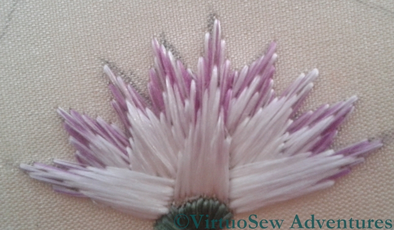
Last week I posted about my progress on the Lotus Tile Fragment, and commented that I was rather concerned about producing a suitable effect. Remember, the original fragment was described by Mary Chubb as “faintly lilac-tipped”, and my first effort looked distinctly clunky. That wasn’t going to be suitable, because the Amarna-period art of ancient Egypt has a particularly graceful style.
Solid Tip
There were a lot of useful suggestions in the comments, and more than one encouraging email conversation as well (thank you all very much!), and I’ve enjoyed experimenting in the week since then.
I’ve now got two lotus flowers using blended thread, and one using solid colour tips, and I can’t quite decide between them.

Blended Thread 2
If it comes to that, I’m not sure whether even I, who stitched them, can tell the difference between the two blended tip flowers! In one case, I simply split my original silk thread in two, and laid the two halves side by side, whereas in the other, I split each half in half again, and reassembled them alternately.
I suppose that if I can’t really tell the difference, that suggests that splitting and reassembling once will be enough. I just need to decide whether to go for blended silk or separate colours.
Decisions, decisions!
Developing confidence in satin stitch
It may not seem as though much has been going on with the Lotus Fragment, apart from satin stitch, but I have in fact been learning a lot, and experimenting rather a lot too.
Choosing a background stitch
To begin with, I was intending to use a couching stitch for the blue background of the image. This is partly because I keep forgetting that the final Dreams of Amarna panels are not intended to be worn or leaned upon. The stitches would need to be quite long, which is contrary to my ingrained instinct to keep stitches short in order to make the finished article reasonably hard-wearing. But then, stitched on silk, using silk, it was never going to land in the washing machine!
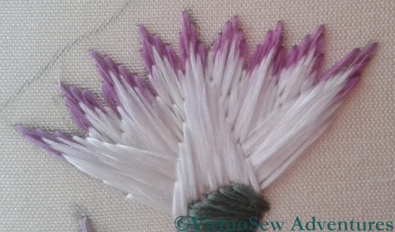
After my short class with Midori Matsushima, I had a little more confidence in my satin stitch, and so I worked one side of the fragment in satin stitch and the other in Bokhara Couching, and then sat back and looked at them. Satin Stitch won, hands down. The flat silk spreads beautifully to help blend the stitches, and the reflectance of the silk filaments creates an almost radiant effect. So that small section of couching has been unpicked, and replaced in short order! In fact, the satin stitch fairly galloped away once I got settled and gained some facility with my mellor.
Lotus Flower Experiments
The lotus flowers themselves are giving me a little more trouble. As you can see in the second photograph, I have been trying various ways of stitching them. My challenge is that Mary Chubb describes the originals as “faintly lilac-tipped”, and so my experiments have two goals, not just one: I want to find the most effective way to use the silk to represent the lotus flowers, but at the same time it has to be a way that lets me tip the petals in the lilac without creating a clumsy effect.
The earlier petals use stitches that come to a point at the tips of the petals, crossing under a central stitch that seeks to smooth those tips. I am not happy with this – it looks clumsy and heavy, even though it makes adding in the lilac stitches fairly easy.
The later stitches use a more classical satin stitch, with the longest stitch on one long side of the petal, and shortening stitches creating the other side. This is better, and I think will be improved if I take all of the experiments out and then begin again, with the long stitch on the central axis of the petal and shorter ones to the side.
However, the challenge of creating the effect of the lilac tips remains. I want to blend the lilac and white stitches into one another, and for the life of me I can’t see how to achieve it, or even whether to stitch the lilac first or the white!
Progress on the Lotus Fragment

Lotus Tile Fragmen
I have chosen to work the Lotus Tile Fragment using Japanese Flat Silk, which I bought at last year’s Knitting and Stitching Show in Harrogate, from Midori Matsushima. This is rather an adventure, because I have never used flat silk before, except when I experimented with one of Stef Francis’s overdyed flat silks.
Suddenly, therefore, it rather matters to me whether I produce the effect I’m looking for, which was not the case with the Experimental Seahorse, entertaining and instructive though he was to do!
Last week , Susan of Plays with Needles quoted a Buddhist proverb in her blog – “When the student is ready, the teacher will appear“, and it turned out to be true for me too. Entirely by accident, I discovered that Midori would be teaching an introductory workshop in Japanese Embroidery techniques, not fifteen minutes’ drive away…
Japanese Embroidery Techniques
In two hours, there was only time for the merest scuttle through the techniques – making a twisted thread (we made a four-into-one), learning how to work a Japanese knot, how to stitch with the twisted thread and with the flat, untwisted silk, and finally how to use one of the fine metallic threads. As it happens, the techniques I have ended up using for the Lotus Tile Fragment are (understandably given my background) more Western than Japanese, but although I am intending to use flat silk throughout, it has already occurred to me that I might work an interesting alternate version using Japanese embroidery techniques. I just need Midori to come back and run another short workshop in s0me of the slightly less basic techniques…
An Experiment in Screen Printing
My current plan for the Dreams of Amarna panels is to overlay the embroidered panels with gauze panels screen printed with the heads of Akhenaten and Nefertiti, and since the panels would be hard to store safely and out of the way while I do the embroidery I have always intended to do the screen printing last of all.
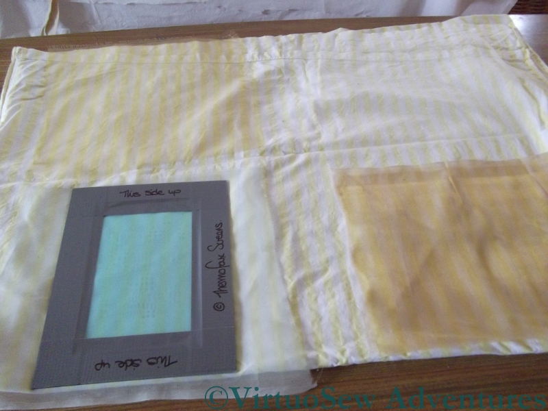
Preparing my screen printing tests
Then, as I mentioned when I was beginning on the Lotus Fragment, I had a Dreadful Thought. What if the gauze killed all the colour in the embroidery? Would it be possible simply to brighten the colours of the embroidery (which would also involve abandoning nearly everything I have done so far) or would I be able to find a suitable fabric? Obviously some early experimentation would be required… Fortunately, “Creative Stitches and Hobbycrafts” happened shortly after my Thought!
I found the stand for Thermofax Screens, and explained what I wanted to do. When I explained that the image I intended to print (in the end) would be of the style of an old-style newspaper print, the lady’s face cleared. Yes, she said, it would certainly be possible to print onto gauze, and when I eventually get to the appropriate stage, it would be possible for them to prepare screens for me based on images I provided. She also said that I should experiment with fabrics, but that synthetic gauzes were likely to prove more transparent than natural fibres. So I bought a starter kit and a screen that had some of the characteristics I expect my final images to have, and got ready to experiment.
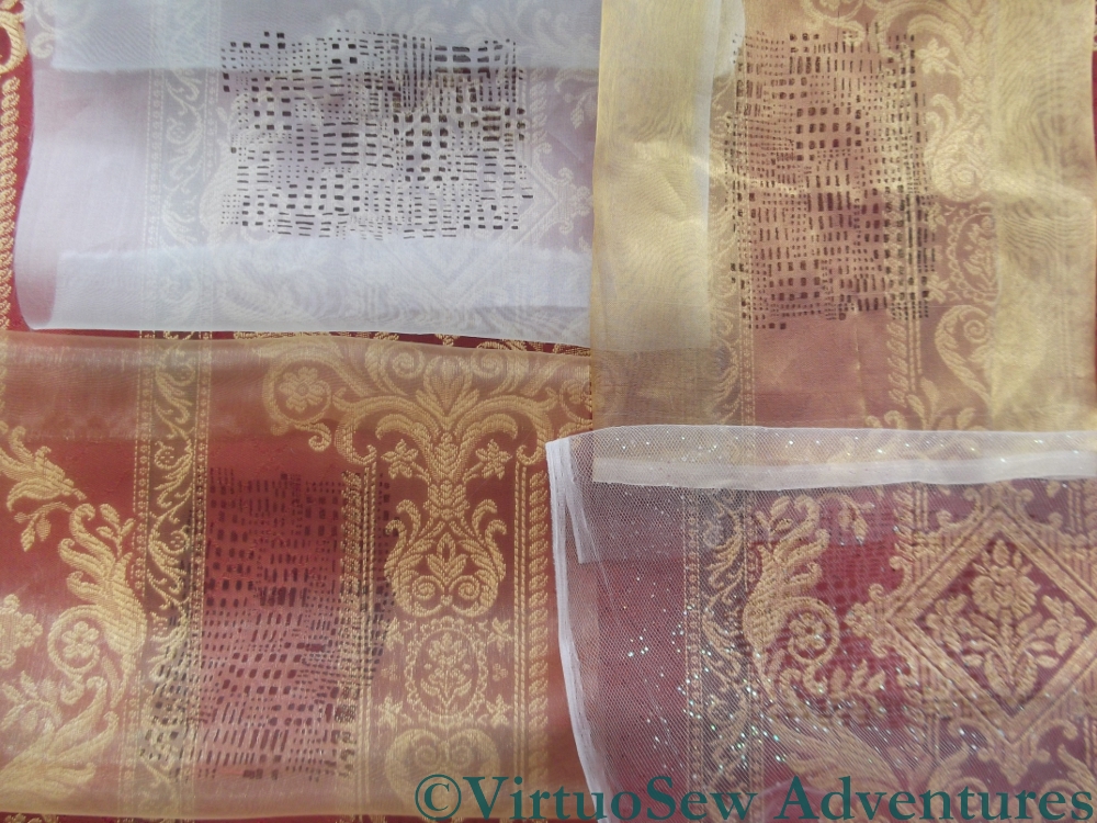
Gazing Through Gauzes
The photo shows, from top left, clockwise: Silk organza, Silk Tissue, Synthetic Diamond Mesh Net, and a Synthetic gauze.
I’ve overlaid them over a strongly patterned upholstery fabric, and it’s clear that the bottom two are going to be better bets. The silk organza all but obliterates the upholstery material, so embroidery is going to stand no chance, and the silk tissue is only slightly more transparent.
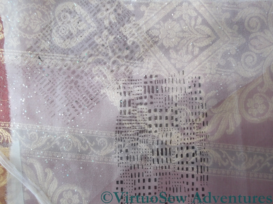
Diamond Net and Silk Organza
This photo shows the contrast between the heaviest and lightest of the fabrics I have tested. The silk organza took up most of the ink that passed though the screen, and the design shows up clearly, but it reduces the fabric underneath it almost to a pattern of light and dark, with very little colour. By contrast, the diamond net has to be laid over the organza before the print shows up at all, as you will see if you look at the middle picture at full size.
To be absolutely certain, I will need to set up some of the embroidery as I intend to display it, and then hang the gauzes about an inch in front, but as an early indication, I think this gives me enough to go on that I can feel reassured. There are suitable fabrics for my purposes, and basic single colour printing is no harder than I remember from university.
I can set my worries aside and continue embroidering – just so long as I bear my ultimate plans in mind!
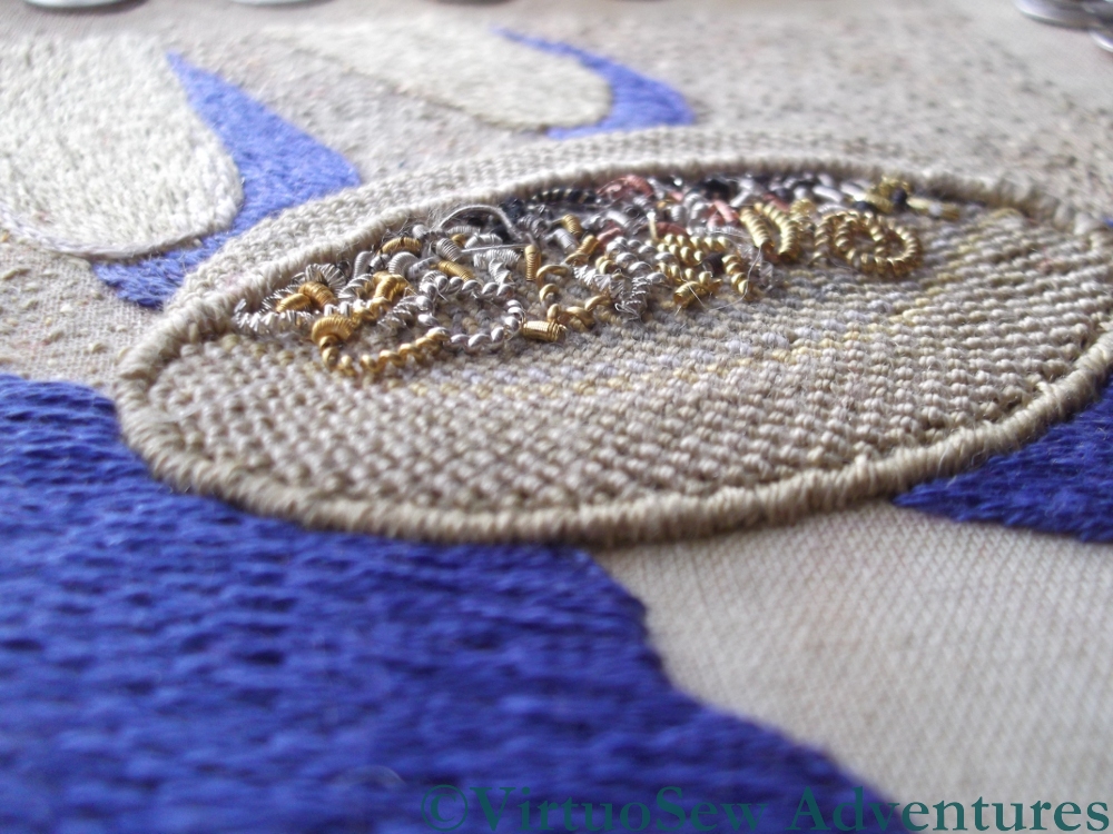
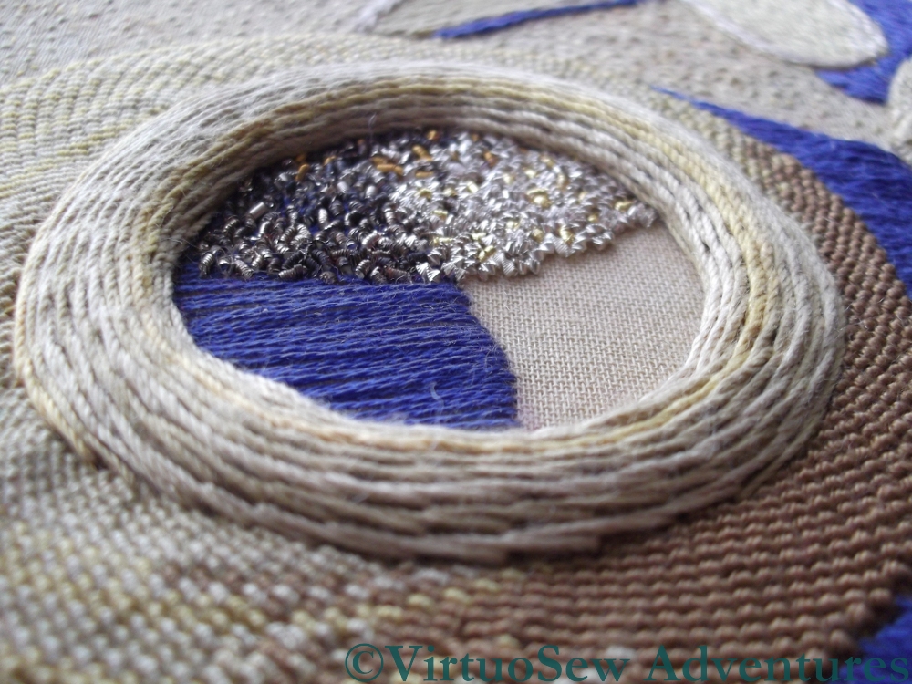
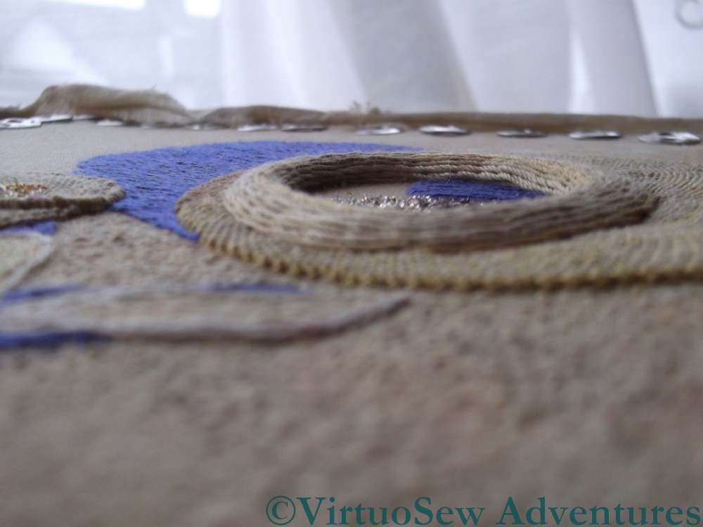
Close ups on The Crock of Gold Hoard
Very few words with this post – Megan asked for some pictures that showed the dimensionality of the various stitches, so here they are!
Looking into the lid
A View into the Crock
I’ve left the pictures larger than usual, so do click on them to have a closer look at the stitches and the purls!
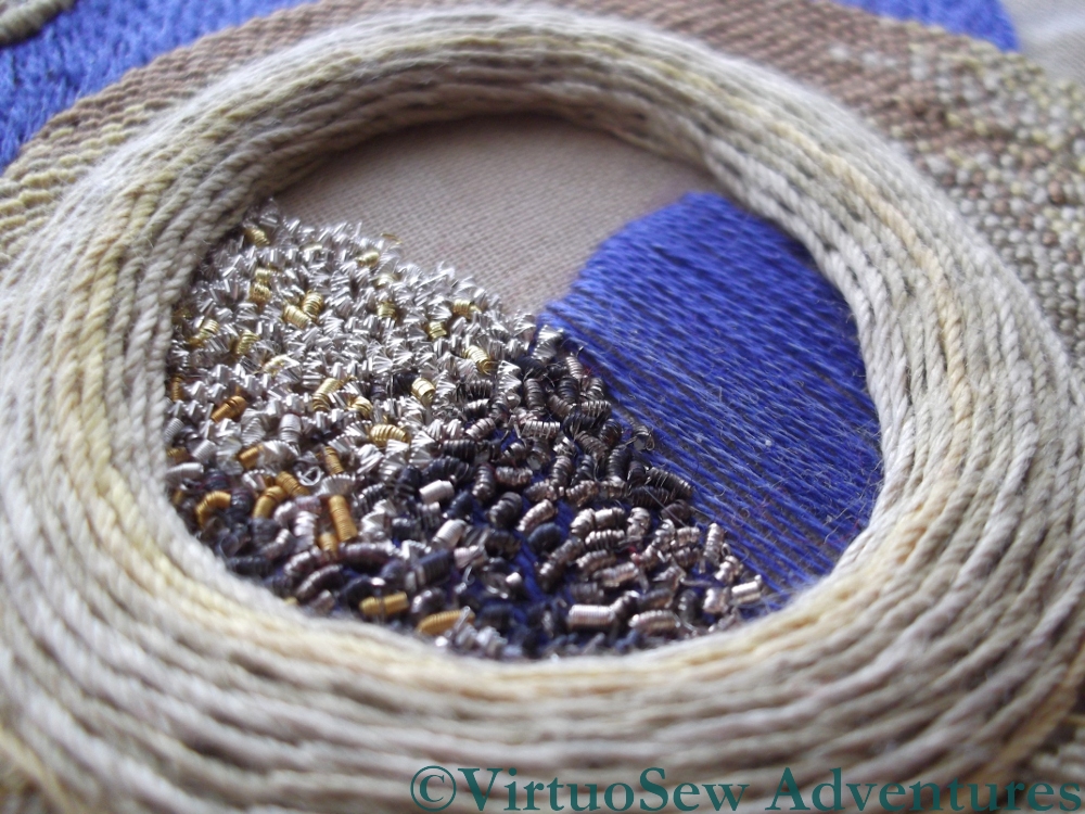
Looking Into the Crock
Side View across the ground
I’ve enjoyed revisiting the Crock and looking at it from new angles. I would have loved a strong side light to pick up the glints, but is has been overcast – a good light for working on the Glittering Nightcap, which I’ve finally got back to, in spite of my breath condensing on the magnifier!
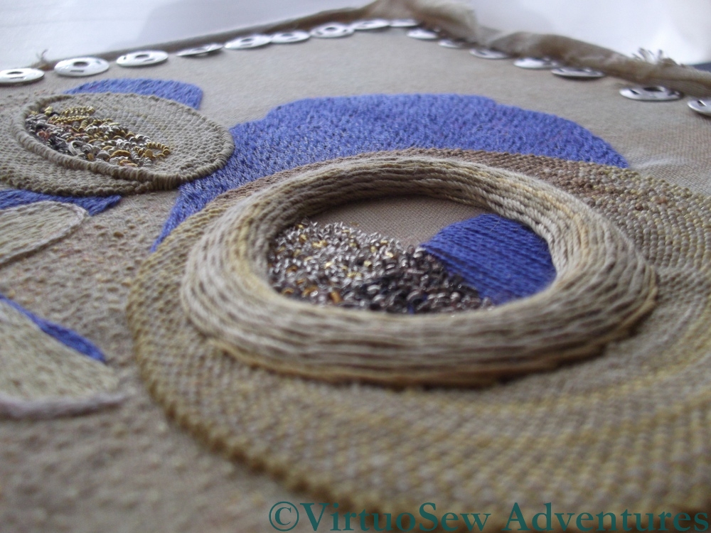
A diagonal view
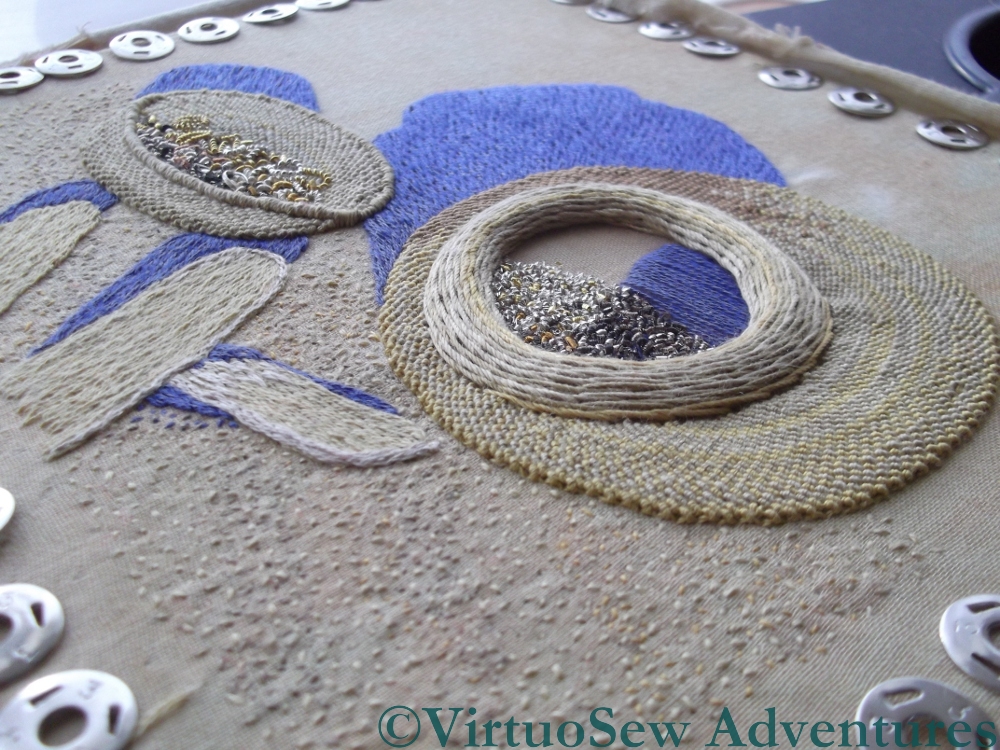
And again…