There’s a good deal of trial and error with this one!
Once I’d divided up the long borders (both of them, so that it remains easy to keep track of) I started to experiment with stitches to fill in the various sections.
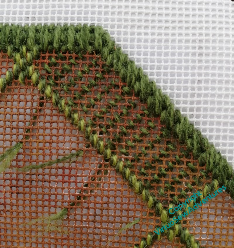
For a while I thought I might like to play with voiding some of the patterns, so I started with a sort of skip tent stitch. I wasn’t happy with that – it ended up combining stripes with a general appearance of not being there at all.
So, next trial – what about some large bosses, Diagonal Rhodes Stitch or something like that, which will be nicely reminiscent of the topiary experimentation that inspired the cushion?
I suppose this might have worked, maybe with a river of stitching in another colour to join the three diamonds, but when I looked at it in the context of the entire border, I wasn’t happy with it. Quite why, I’m not sure, but it felt like a false start. I’ve had quite a few of those with this project, and I’m beginning to recognise the sensation!
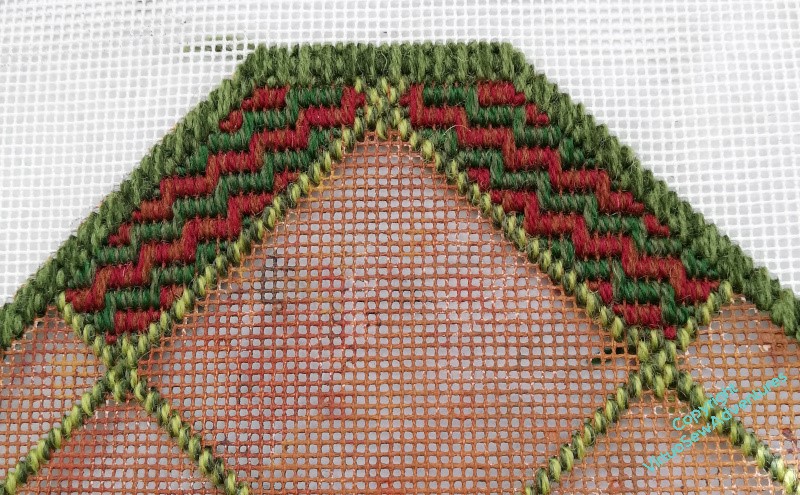
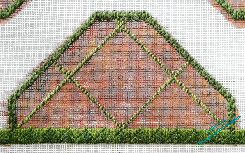
So, in the end, I settled for finding a smallish full coverage stitch, using vertical stitches like the borders, which isn’t on quite the same diagonal as the border edgings, but seems nevertheless to work. It’s called Victorian Step Stitch in Jo Ippolito Christensen’s book, and I’ve never seen it anywhere else (that goes for a lot of the stitches in that book!). A small advantage was that it mirrored relatively easily about the centre line, creating an arrowhead.
Yet another Twixmas project that lasted longer than I anticipated…!
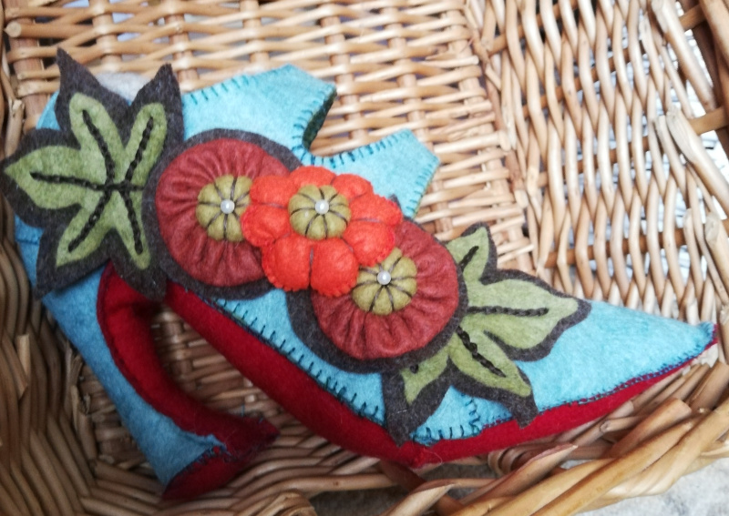
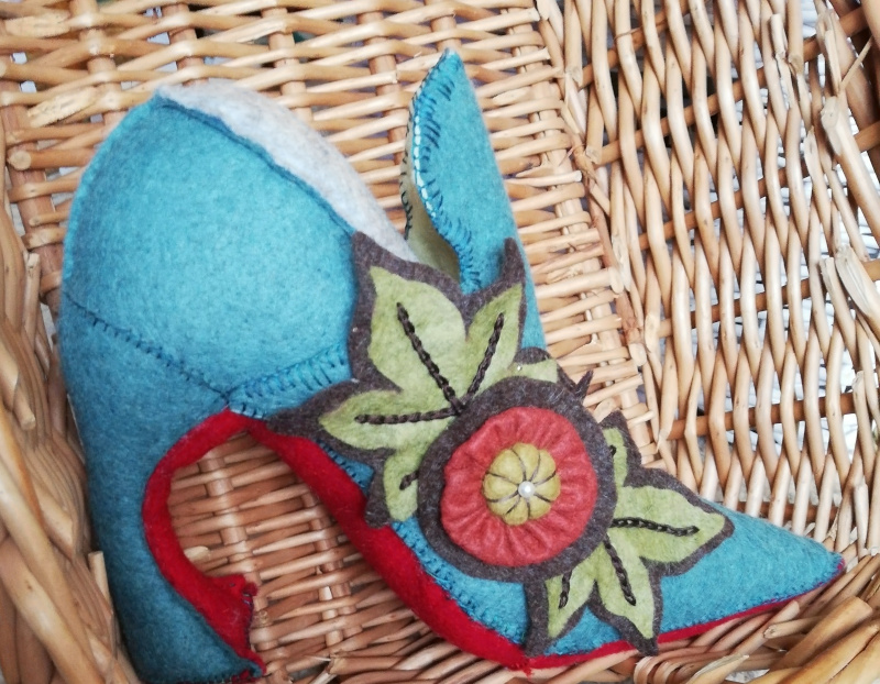
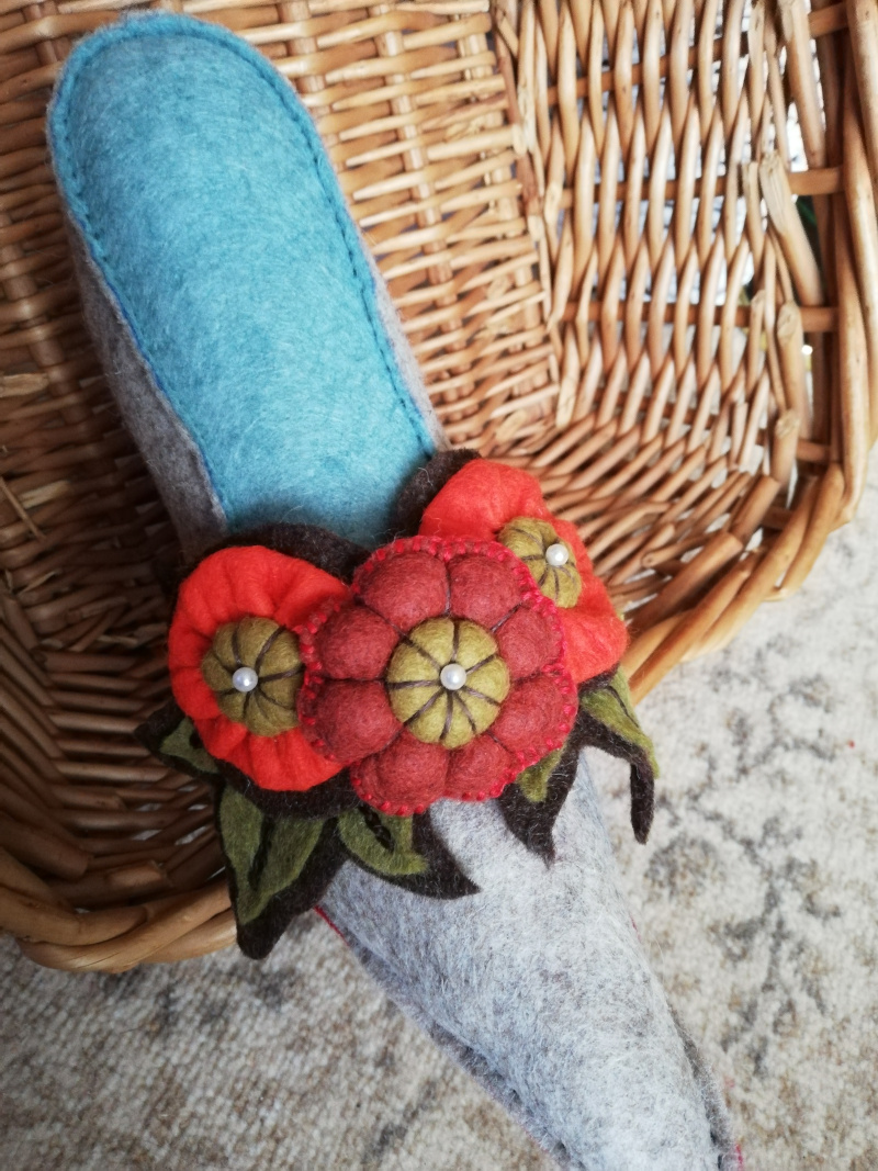
I enjoyed making these – the instructions were clear, and in fact, you make a basic court shoe shape, and then add variations and additions. Some of the felt I had was a little flimsy, so the two decorative additions to the first two shoes are both made of two layers of felt stitched together, using patterned blanket stitches, before I attached them to the shoes.
I varied the stitches I used, not quite following the instructions.
Of Course I Did.
The basic shoe shapes are put together using stab stitch, which I use when I’m making felt cradle toys. It’s secure, simple, and leaves a nice raised seam, which I think adds to, rather than detracts from, the finished effect.
I think the instructions suggest back stitch for the leaves, but I’ve chosen reverse chain stitch. I like the solidity of the line, and it somehow enhances the slight dimensionality of attaching the two leaves together.
The instructions also suggest ready made felt balls for the flower centres – I didn’t have any, so I just made small stuffed balls of the same felt as the leaves. And there are two sorts of flower – one is made of two discs stitched together and stuffed, the other is, effectively, a Suffolk Puff.
I think they are both charming!
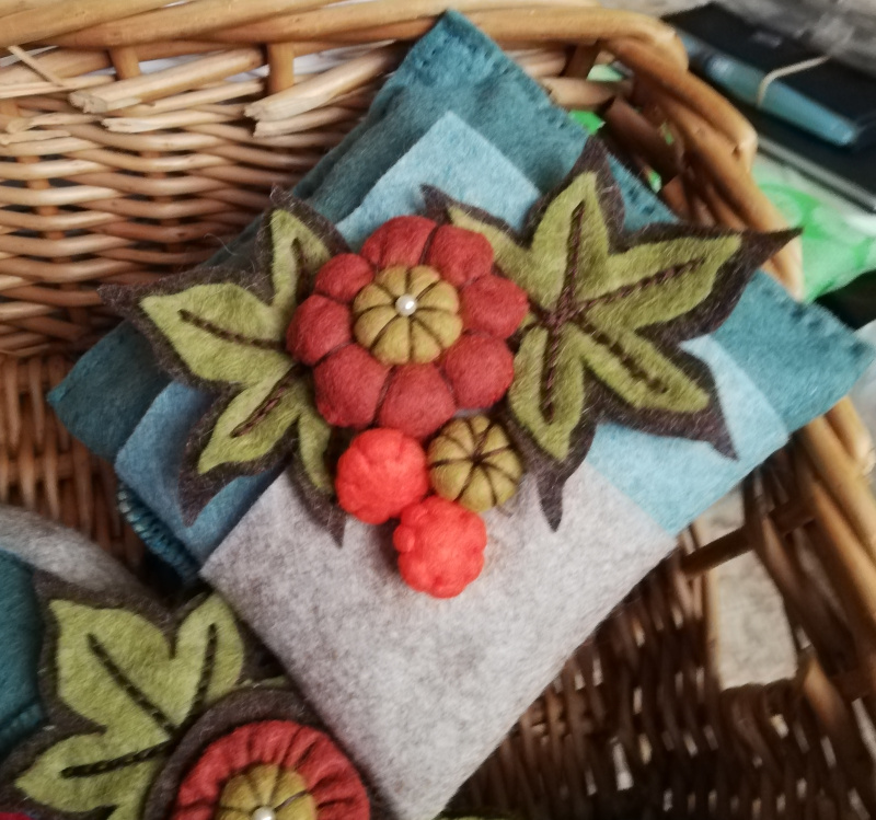
Once I’d done the shoes I gave some attention to hanging them. I had some felt left over, so I made a small felt cushion using the shoe colours, and then made some more flowers and leaves.
The finished mobile is delightful, but it goes very badly with my studio, which is still decorated in the taste of the previous people to live here – yellow (no quarrel with that) with a border panel in pink, blue, and green.
I’m going to have to redecorate the studio, aren’t I!
The long borders just looked too big, too monolithic, if you like, when I came to look at them with the corners in place. I don’t want the pattern looking too “bitty” and fragmented, but a certain amount of breaking up of the shape seemed to be a good idea.
I started by running tacking stitches in stranded cotton so that I could look at the divisions they created and make decisions based on those, rather than using the wool. Tapestry canvas is a destroyer of thread, and it’s rare that you can reuse much of it if you have to take it out. I’ve plenty of stranded cotton, and I can reuse it a few times for experiments – just not for the final piece!
That seemed enough of a division, so I pulled out the stranded cotton and reinstated the new lines using short straight stitches in two shades of the Paterna.
I’m trying to use all the yarn in blends. It makes for a livelier effect, and given I’m not enamoured of Yarn Chicken, it will also eke out some of the yarns!
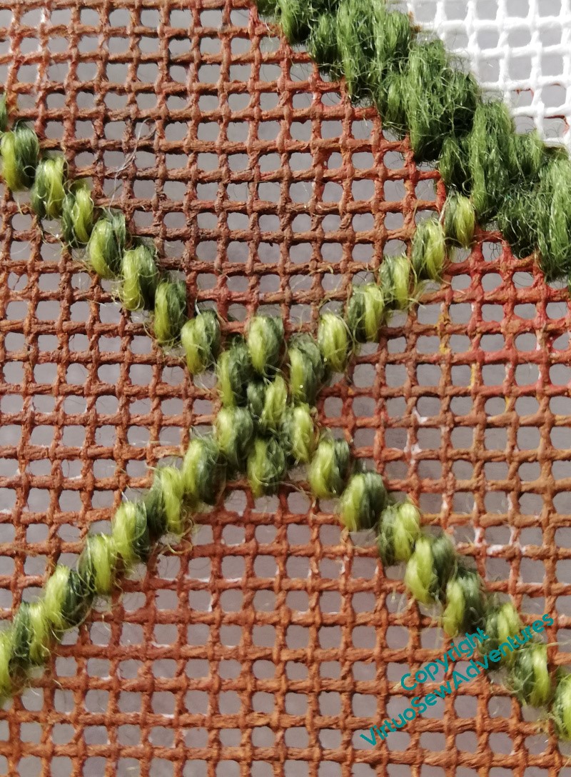
Once I’d looked at the first couple of intersections between lines, I decided to add a bit of subtle emphasis. At this point, I had no idea what stitches I would be using in the “beds” (to retain the link to gardening), but I somehow felt that I needed to blunt the apex of the diamond and triangle shapes.
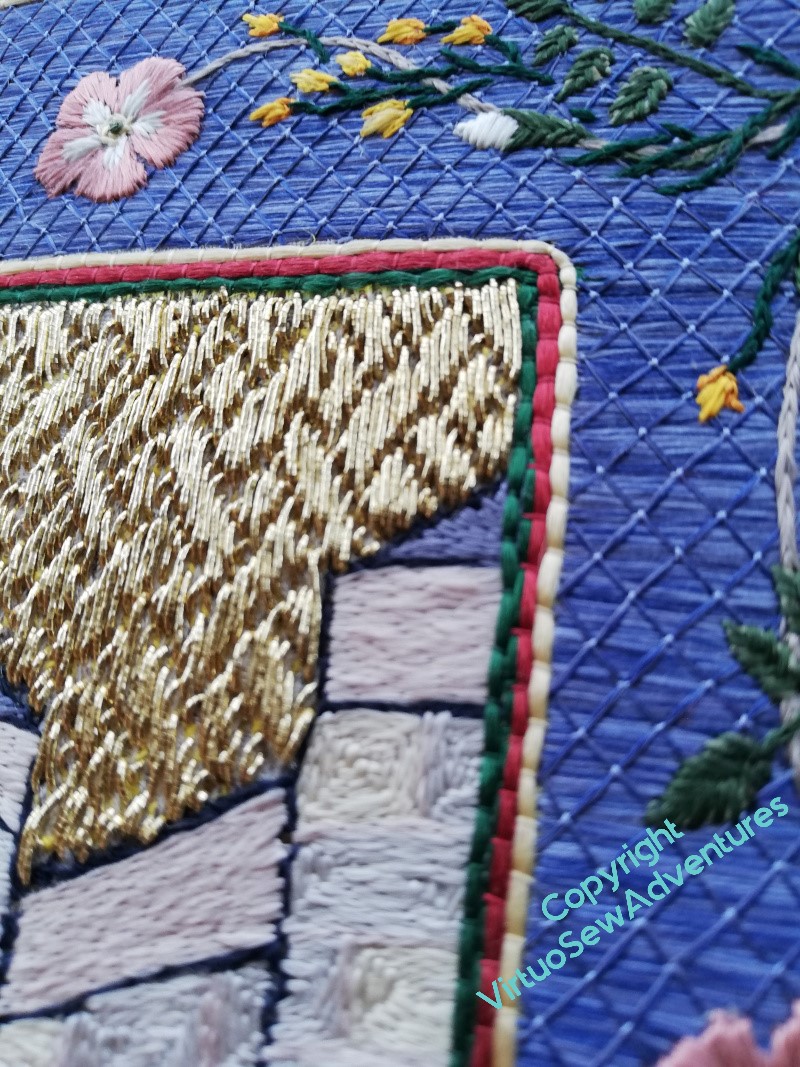
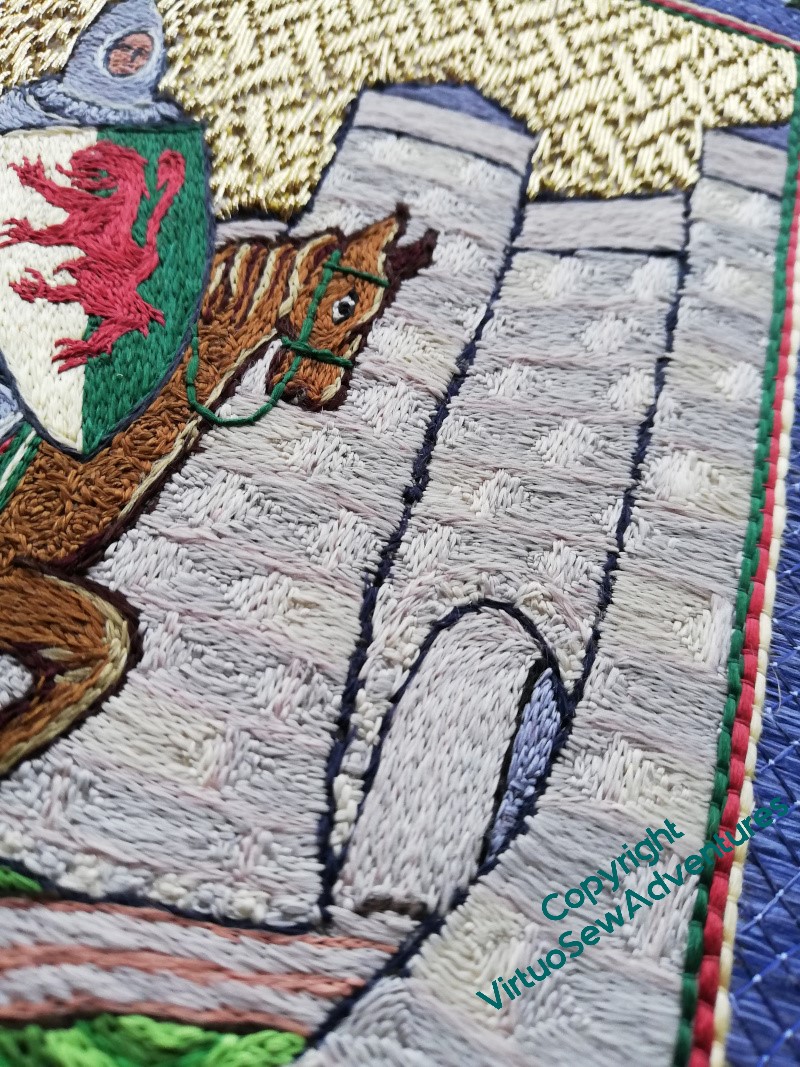
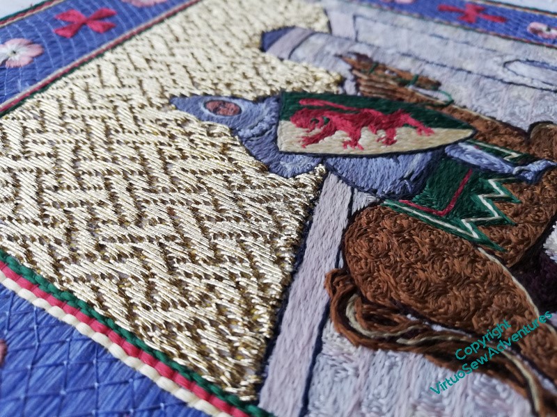
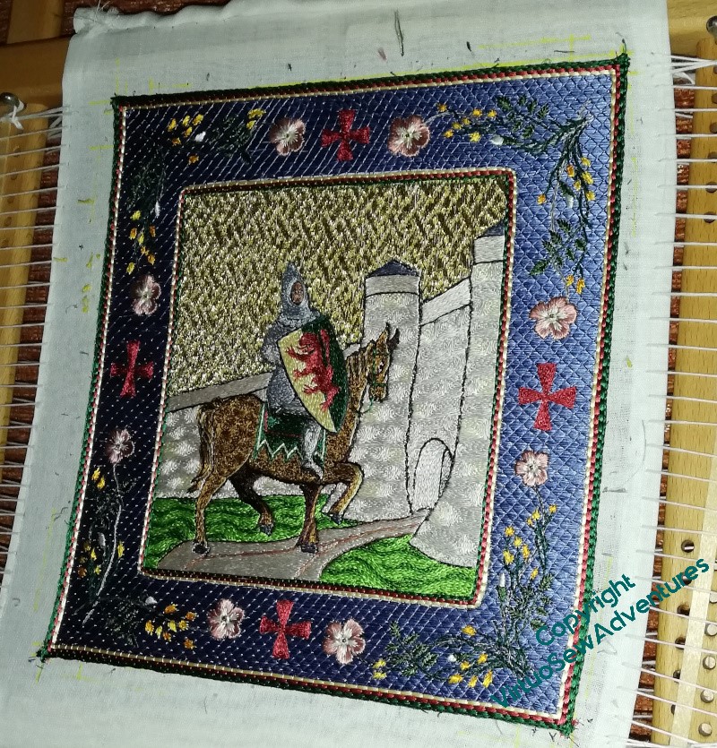
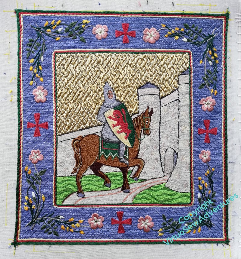
I thought people might enjoy some shots of William from different angles and in different lighting, both of which affect the gold and silk very strongly.
I don’t have much to say for myself, just – Enjoy (with a little editorial, as it were)!
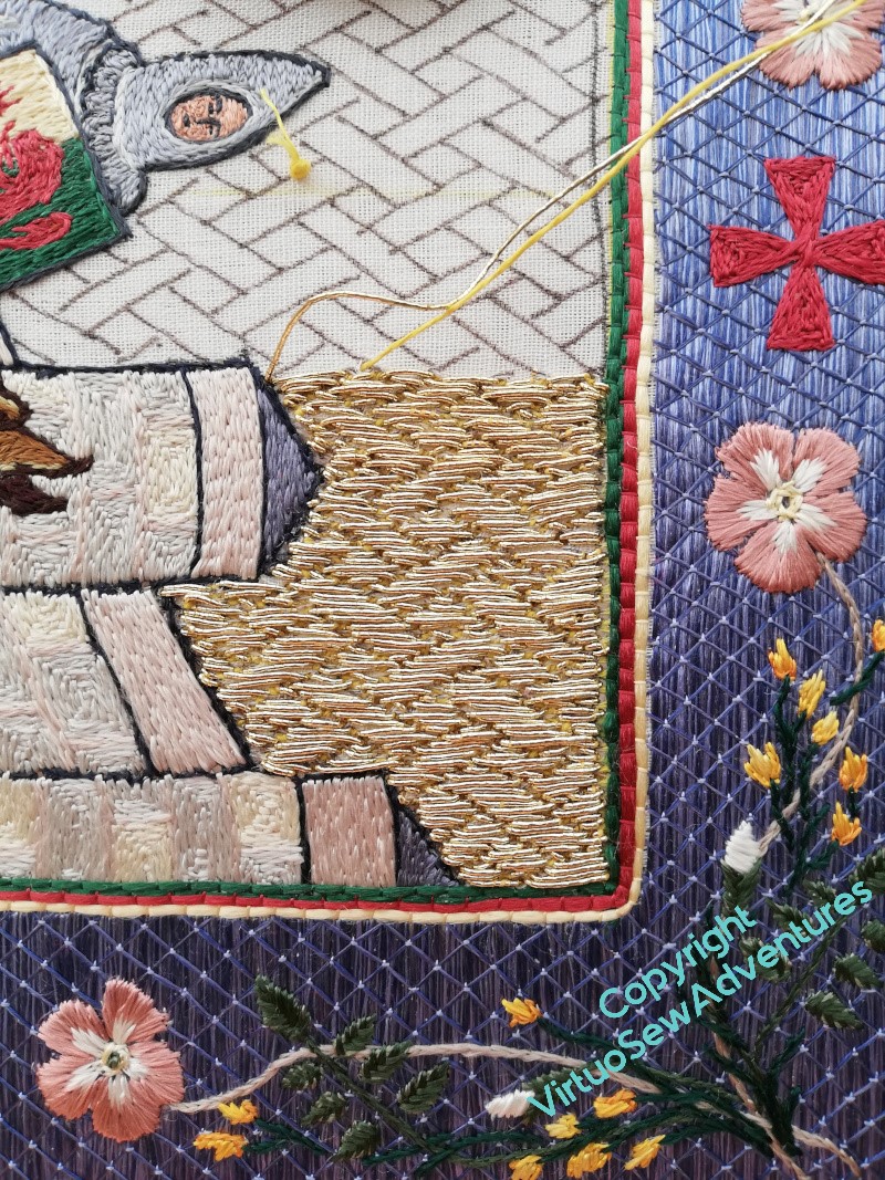
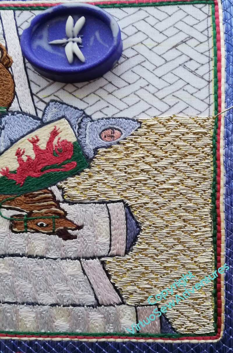
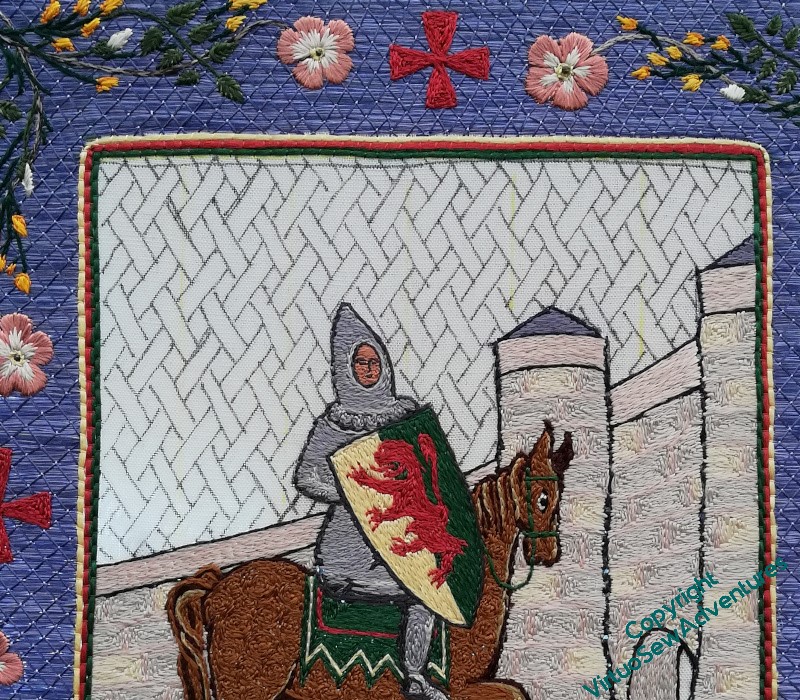
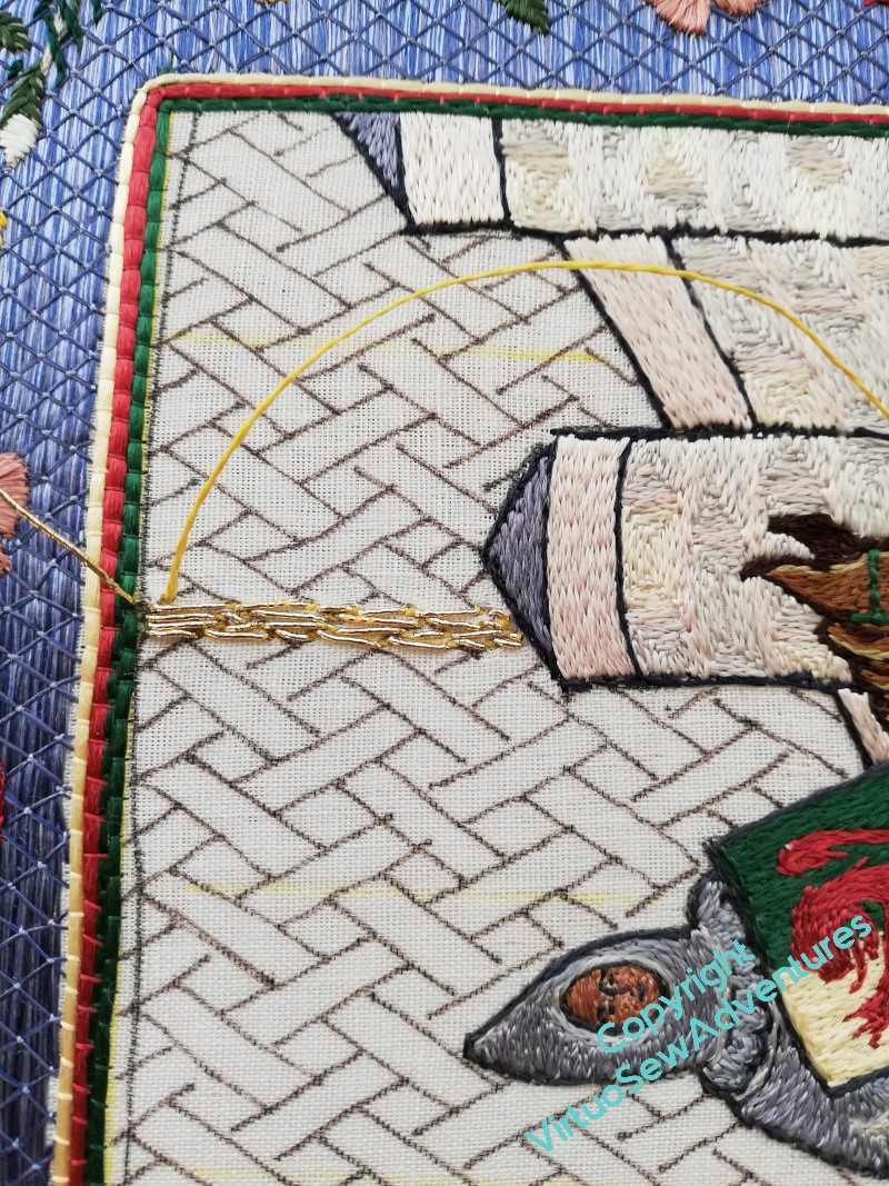
I had intended to fill in the end of the gatehouse tunnel with underside couching, but decided in the end it would make a lot less sense of the picture.
I was greatly relieved that the various oddities around the edges seem not to be drawling attention to themselves!
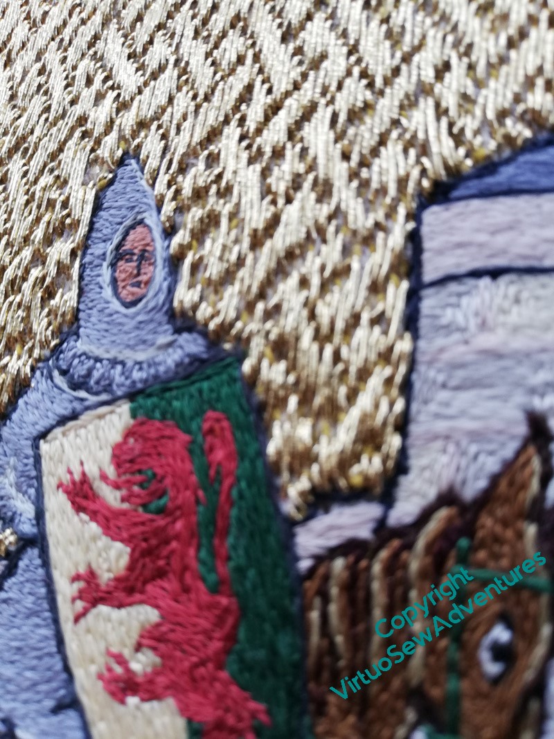
The lion rampant isn’t completely successful in terms of the details of stitch direction, I think, but I couldn’t see a better way to do it, and since when I put a picture on social media, someone was able to type their guess of the blazon (heraldic description) into a search engine and have “William Marshall, first Earl of Pembroke” pop up immediately, I think I’m just going to let well alone!
The points of light are couching stitches on the trellis couching. The flash doesn’t show up the stems in the border as well, but it does wonderful things for the stitch direction on the stonework and the dapples on the horse (Mars, we called him in the end, didn’t we?).
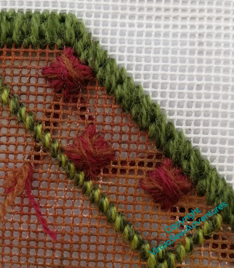
I wondered, once I’d done the large squared daisies and recovered from the experience of the one which kept going wrong, whether I should use Diagonal Rhodes Stitch again, or do something else, so here I was experimenting with a sort of fill pattern using upright cross stitch.
And no, both the thread (too pale) and the stitch pattern (somehow too incoherent, which is an odd thing for such a regimented stitch to look). Rhodes Stitch it is, then.
Ah, but what size of Rhodes Stitch?
The larger one, I decided in the end. This isn’t to be a cushion for leaning on, and although the “boss” created by the larger Rhodes Stitch had very long floats, it created a really lovely contrast with all those stitches going down in the middle of the Squared Daisies.
As you see here.
Now it’s done, I really like the look of this pairing. I think Jo Ippolito Christenson backstitches between her stitches, which I’m not going to do. I think this is a good enough recollection of the inspiration as it is, while staying true to itself as a piece of canvaswork.
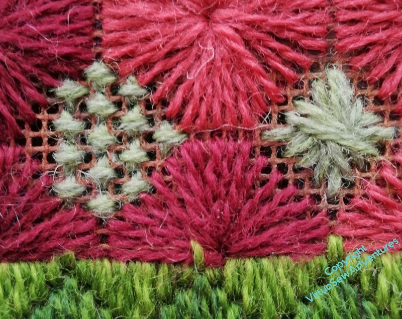
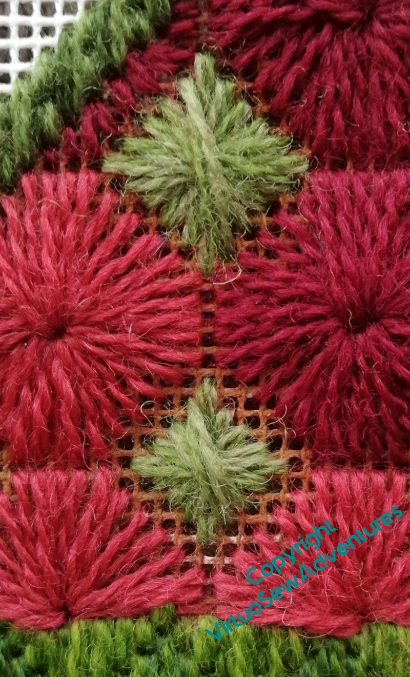
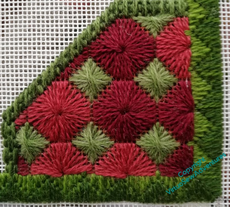
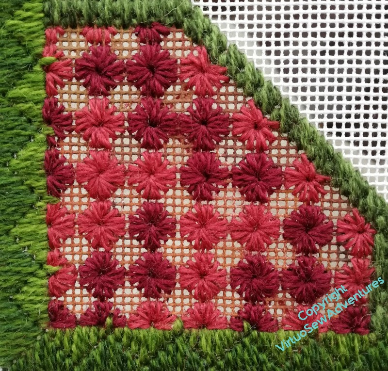
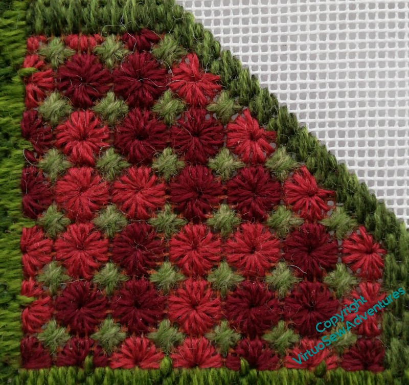
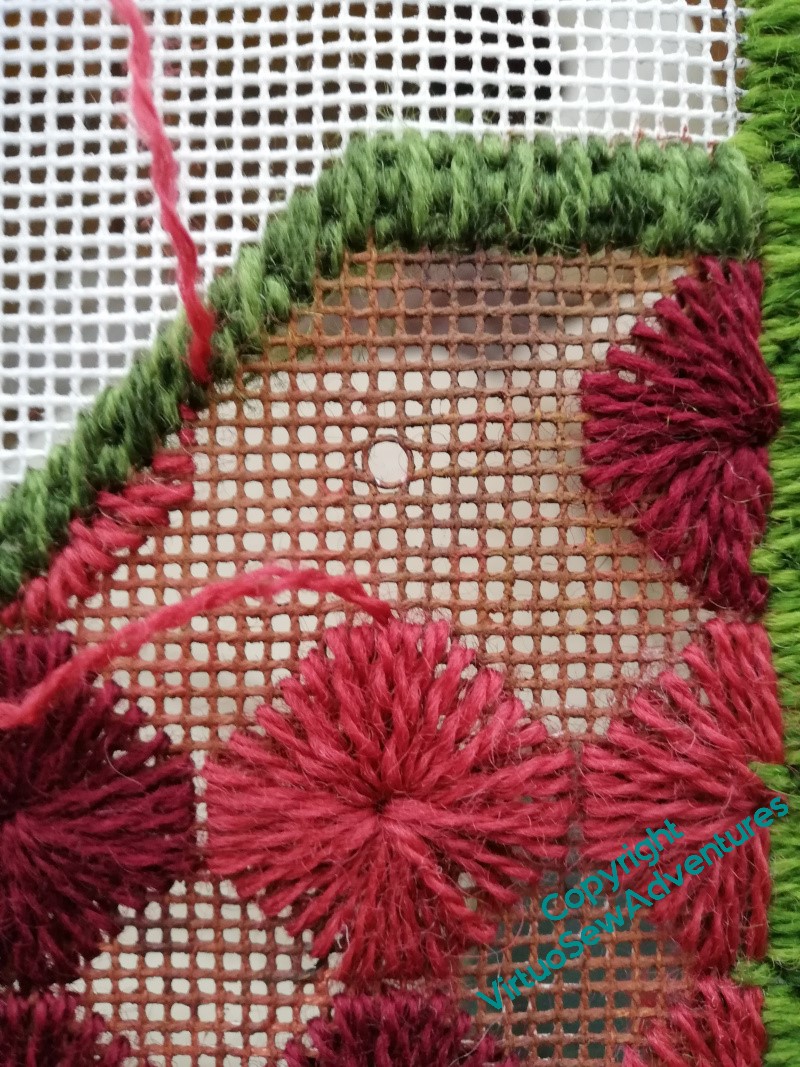
We last saw the Parterre in December, when I’d found a very pretty stitch (Squared Daisies) which was very trying to work, because it involved a lot of stitches going into the same hole.
As I was up to my eyes in exasperation with Amarna and William Marshall at the time, I set the parterre to one side so as to have fewer moments of fury and despair. Now that Amarna is in a totally different stage of effort and William is on the home straight, I’m returning to it, with a quieter mind and greater regularity of effort.
With the very cheering result that you see here. In no time, so it seemed, I’d finished the two panels in small squared daisies, and moved on to infilling them with Diamond Rhodes Stitch. You’ll see that the Daisies are worked in two different shades of red, not quite regularly alternating. The thread is a single strand of Paterna.
For the Diamond Rhodes Stitch, I decided to use a single colour. It’s two strands of Appleton Crewel wool, which is about the weight of the single strand Paterna, and it’s allowed me to soften the colour slightly by using two different shades in the needle.
And then I moved on to the Super Large Squared Daisies, and, as it turned out, some repeated doing and undoing on one particular one, because I had misplaced the central hole.
Howl and Growl!
And do you know what is really infuriating?
It only went wrong in this particular case. All the others were fine.
When we left William, I had just embarked on the underside couching, not without some trepidation, I have to say!
I stuck closely – one might say, religiously – to the advice about working underside couching that Tanya Bentham gives in her book about Opus Anglicanum. That is to say, no more than about half an hour at a time, no more than three sessions a day. In fact I think Tanya says 45 minutes, but I rapidly learnt that I lost focus and precision about the 33 minute mark, and two sessions were very much better for me than three.
If you click on any of these pictures to expand them, (they should open in a separate window) you will certainly see some of the infelicities in my workings here – scraggly bits of fabric showing, unevennesses in the pattern, all sorts of misadventures. There were even a couple of points where the fabric, doubled though it was, gave way at points, necessitating all manner of ingenuity. I suspect that my tension was adrift, as I have a definite tendency to pull too tight on my stitches, especially if I’m concentrating on the unfamiliar.
However, judge for yourselves whether I shouldn’t be pretty pleased with myself…
I do, of course, have to work out how I’m going to mount him, and on what, and it may be that in the end the lines of red, yellow, and green framing the border will need to be redone in some fashion. I like them as an idea, but as I move on to Aethelflaed, Rahere, and the Lady Julian, how much of a unity do I want to retain, and how on earth would I embody it?
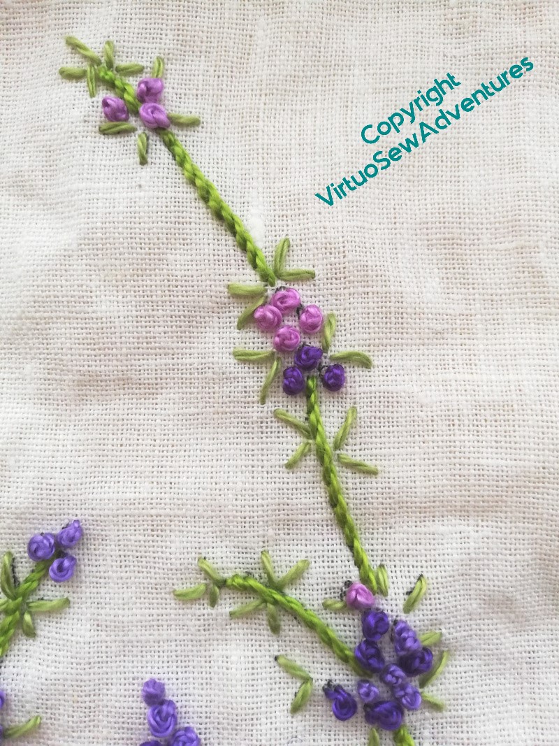
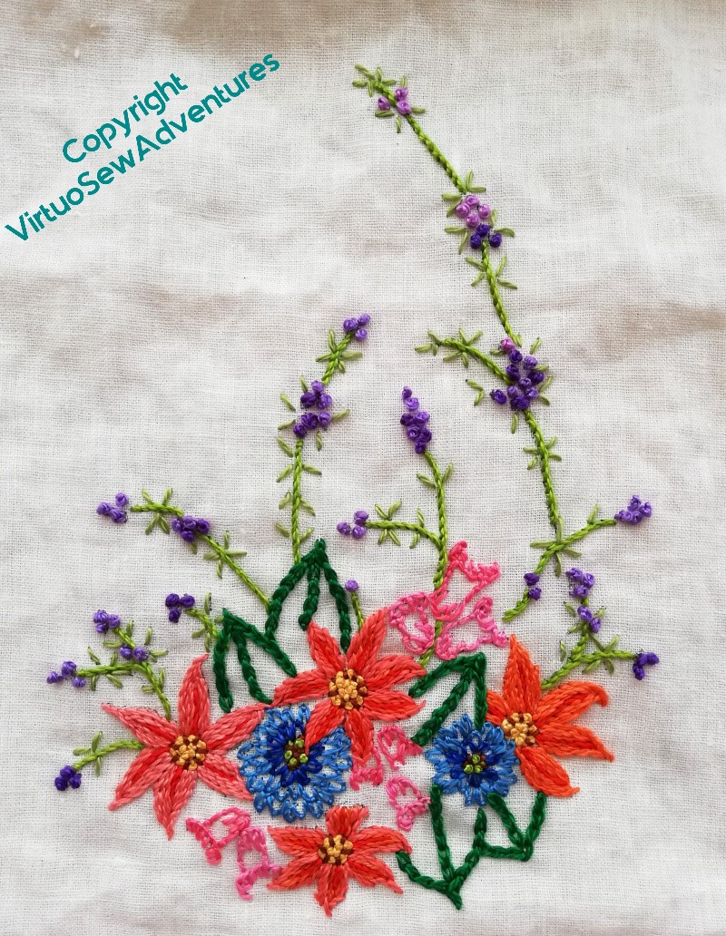
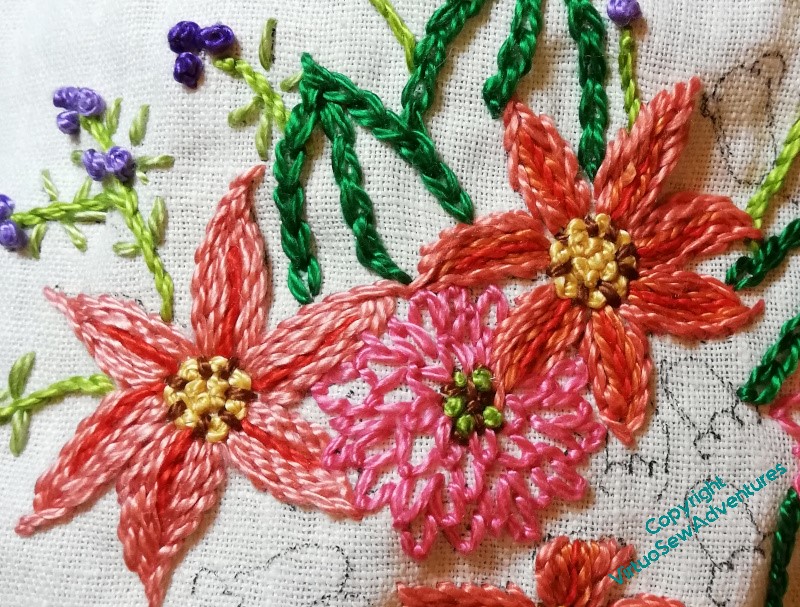
I worked both ends of the table runner at the same time, because I thought that would enable me to see the whole thing as a single piece, rather than two pieces the same. As I’ve said many times, I have a real problem with repeating motifs, and this is one way I try to trick myself into not seeing the repeats, as it were.
The other thing I did was to put the stems in quite early on in the process. Partly because it was an easy choice to make, and partly because one of my other discoveries over the years is just how much different it makes to the sense of making progress if the design is visually joined up. “Spotty” designs are very discouraging, but if the design elements are linked, somehow progress is easier to see.
In the picture here, you see most of the decisions I made for the main section. Each of the orange petalled flowers uses a different combination of the several orange threads I had in my bundle, which turned out to be just as well, as it makes it look deliberate while reducing the terrors of playing Thread Chicken.
I also learnt from the first frilly flowers and when I reinstated them in blue, I used two shades, which makes for a much lighter and less blocky look.
The two shades of pink in the bell flowers also help to make the whole thing a bit less monolithic. It’s just as well, because the weight of the thread does make the stitching very emphatic.
So, it’s finished, although yet to be pressed owing to the fact that the ironing board bites and I’m rather fighting shy of it at present.
My suspicion, based on my experience with Kai-Lung, is that had I been able to use the original transfer, the design would have been larger, making it maybe possible only to do one end of the table runner, but also changing the relative scale of design to thread. The design is a little small for the thread, so when I come to use up the leftovers on something else, I must remember to enlarge whatever I use. I will just have to be ingenious with my colour distribution!
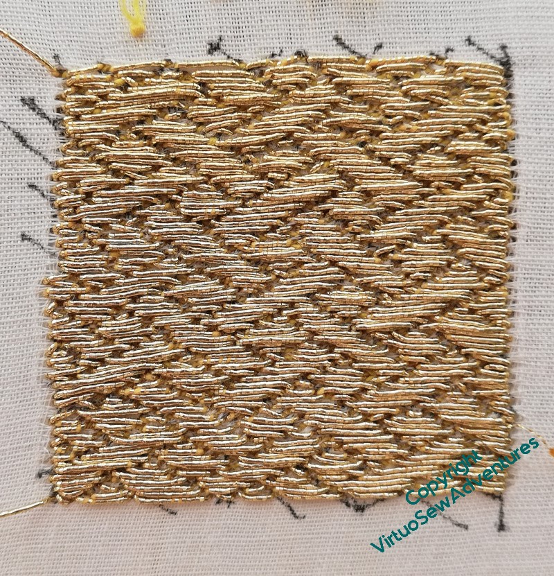
You probably recall that before Christmas I had started to practice my basketweave underside couching and had even got as far as drawing in the guidelines.
And there, I got stuck. Partly because my stitching frame was in the way of the Christmas tree and had to be folded down, and partly because I rather lost my nerve – the interval, you understand!
I decided to finish the test patch with the actual thread I’d decided to use, and then I would have No Excuse.
And in fact, this doesn’t look too bad, does it?
There are bits I’m less than chuffed with, but on balance, the pattern is fairly clear, clearer than on the previous piece, and I think I have to decide that any further improvement had better take place in situ, as it were.
So here I go!
I decided to start on one of the straight lines I drew at intervals to help make sure I stay on track, and slightly off-centre, so that any particularly egregious infelicities in the changeover aren’t bang in the middle. You may recall that one of the discoveries from the practice piece is that I am more comfortable working horizontally and away from me. So I will work from this point to the far edge, and then turn the frame around, and work to the far edge in the other direction.
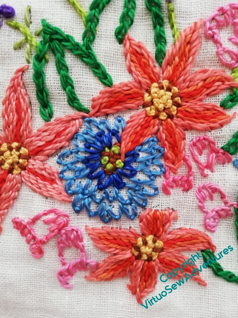
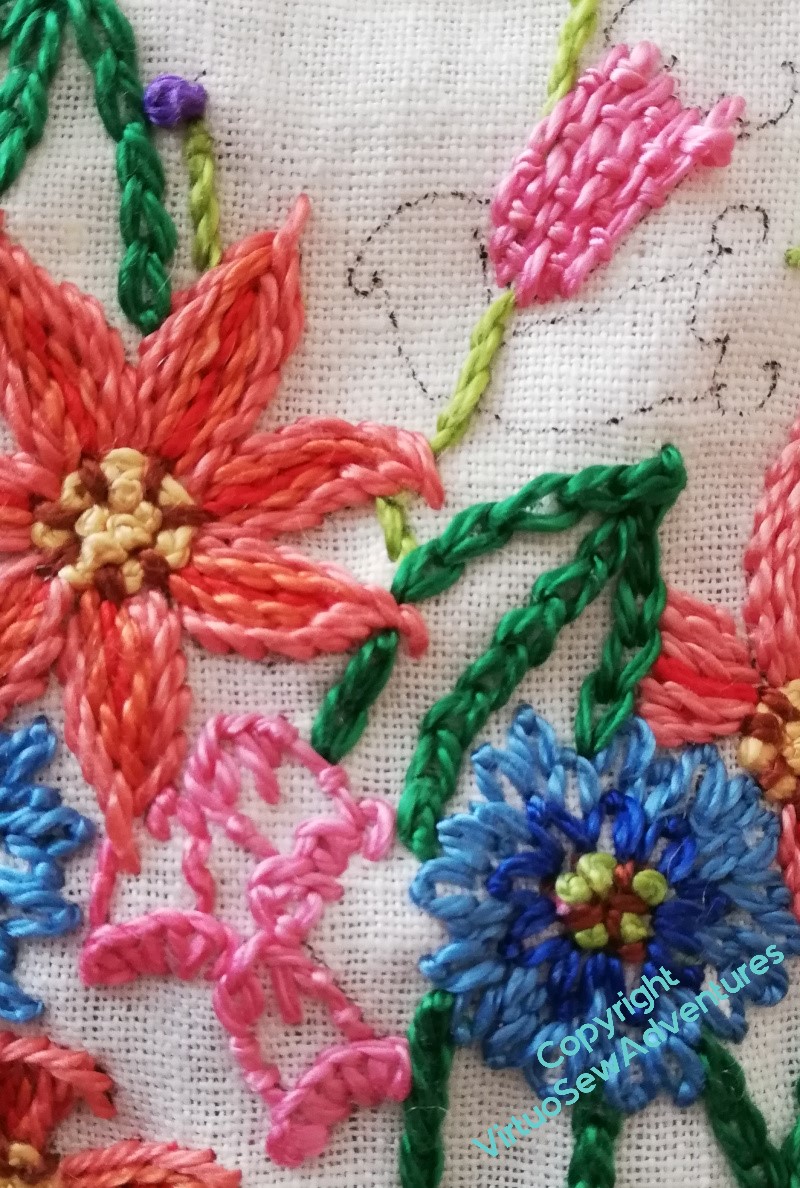
Flox is quite an odd thread to use. It’s tough and almost wiry. I love the shine and brilliance of the colours, but even the fairly loosely woven fabric I chose was a little bit too closely woven for the thread. I had rather a battle with it, and it was a bit tricky to find stitches I liked the look of. I’ve ended up using a very small selection of stitches – chain stitch, stem stitch, French Knots, and fly stitches.
The pink fly stitches on the frilly flower, I decided, were a bad choice. I’ve no quarrel with the stitch, but pink beside the apricot/ orange of the six-petalled stitches looked wrong, too congested and overheated and all in all, Just Wrong. Amid much muttering, and no little anxiety (dear heaven, I’m not used to playing thread chicken to this extent any more!!), out they came.
I replaced them with two shades of blue – much better!
The final flowers were the bell shaped flowers. I did wonder about working them with a full-coverage stitch, such as Romanian Couching or something like it. You can see in the picture at the right that I tried a fully stitched bell. That came out two. But then I discovered that my two pinks were slightly different shades, like the oranges. So I’ve deployed the two shades to eke out my thread a little.
I did the same with the six petalled flowers – each of the four is a different combination of thread shades.