I fished out the blocking board in order to start preparing to block the canvaswork “Constable” when it’s finished, only to meet a roadblock – the blocking board was already occupied!
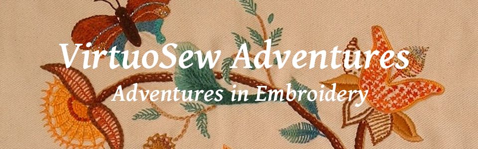
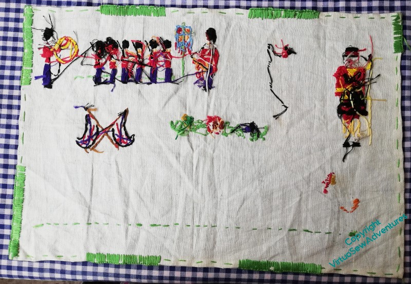
Now, I recall – vaguely – finding this around the Diamond Jubilee, and thinking that Grandmama might have stitched it, either around the Coronation or around the Silver Jubilee, but then, now I’ve looked at the back, I can’t imagine that Grandmama would have been stitching as messily as this in 1952, given the quality of her stitching during the War, and given that I was very much alive and paying attention during the Silver Jubilee, I’m pretty sure I would have remembered her stitching it then.
And I don’t.
At the same I can I assure you it is too well stitched to have been stitched by me at the time, and besides that, I can assure you that I would absolutely remember attempting to stitch it!
I’ve decided that I am going to try to finish it this year. I’ve no idea who started it, but something begun Who-Knows-When by Who-Knows-Who is going to be finished this year by me.
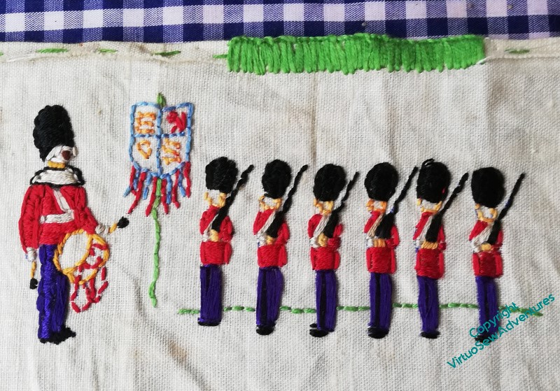
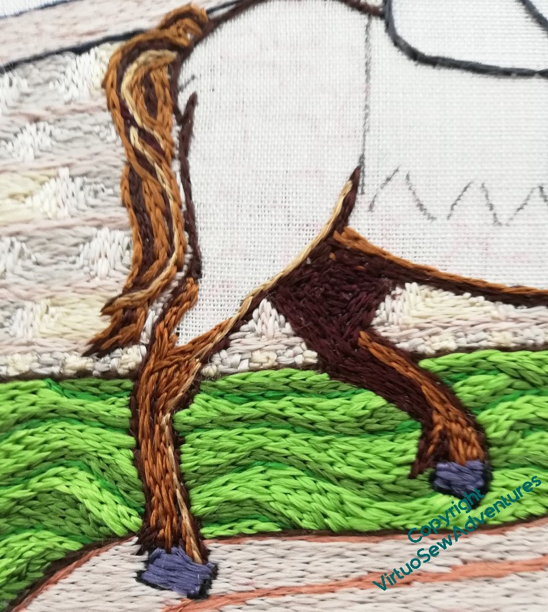
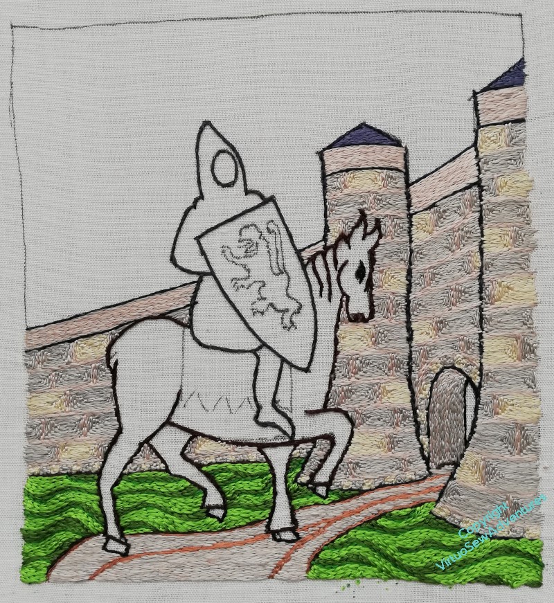
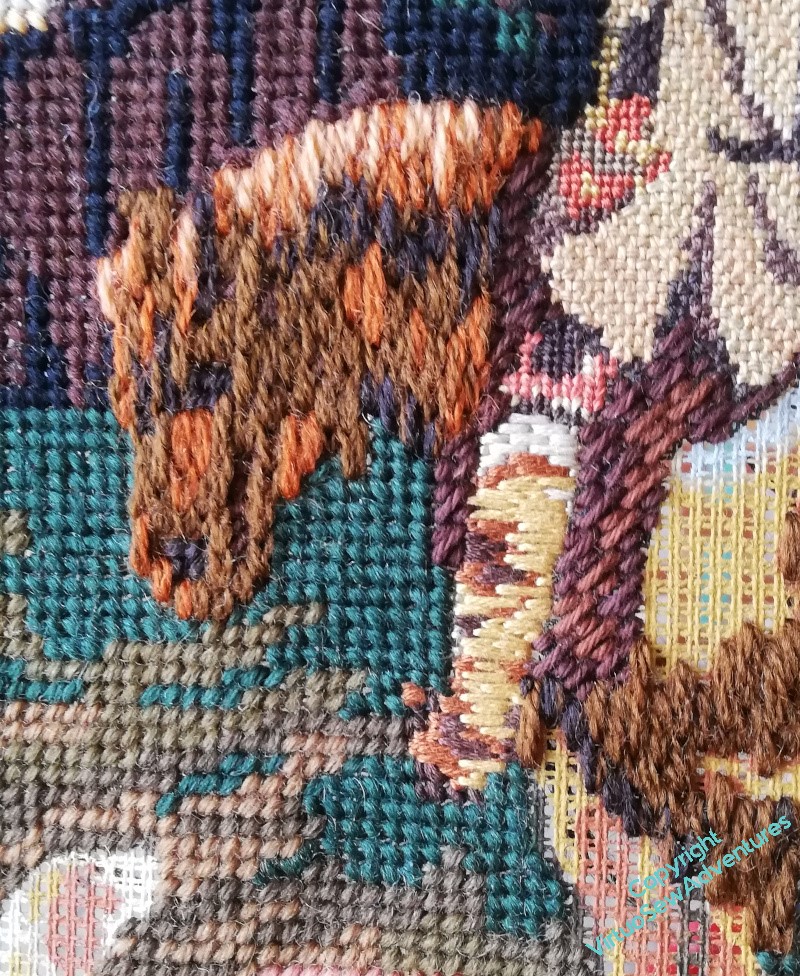
William’s horse is going to need a name, isn’t he! At the moment, suggestions range from “Woros” (think about it for a moment…!) to “Champion The Wonder Horse” (I imagine his groom calls him Bob!) to “Jeff”, via “Mars”, “Thunderer”, and “Dobbin”. I think “Dobbin” is better suited to the horse in the canvaswork!
However, onward!
As it turned out, the colours I chose didn’t quite shade through each other as I would have wished, since two of them were too close together (however good the pictures, online ordering has hazards), so it took me some time to work out what to do.
That “what” turned out to include fishing out a pale cream from among my Thistle Threads reels, which included some filament silk, fortunately. It’s rather finer than the rest of the silk in this piece, so I need six lengths to match four from those.
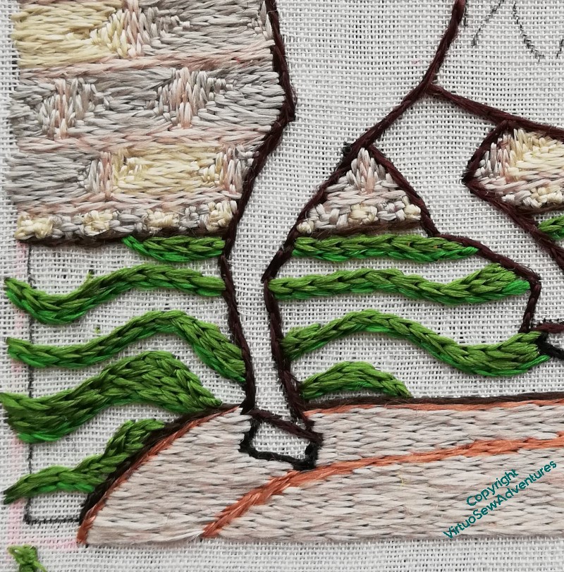
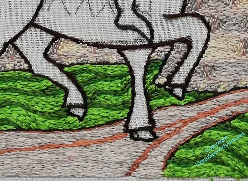
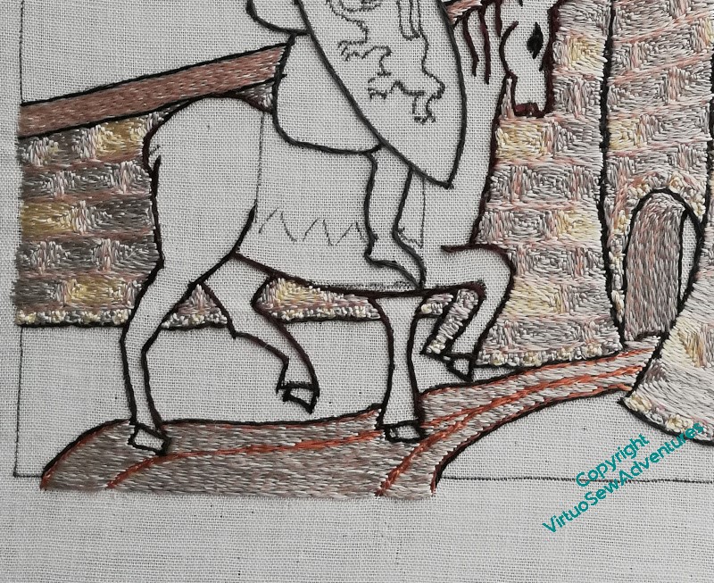
I do wonder whether the tail is quite luxuriant enough, but if it looks a bit spindly when the whole thing is finished, I can add more – although stitching over the wall is quite effortful!
Please note, also, the wonderful blued-steel hooves. Unless they are slate!
I know that roans are not usually shown as dappled, but I decided that I wanted some texture in the horse. I’m intending to make the shield as smooth as possible, and I think a bit of surface variation in the horse will increase the contrast.
So, I shall be going round and round in circles for quite some time!
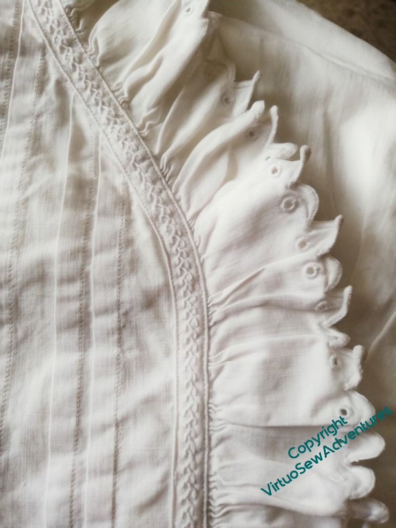
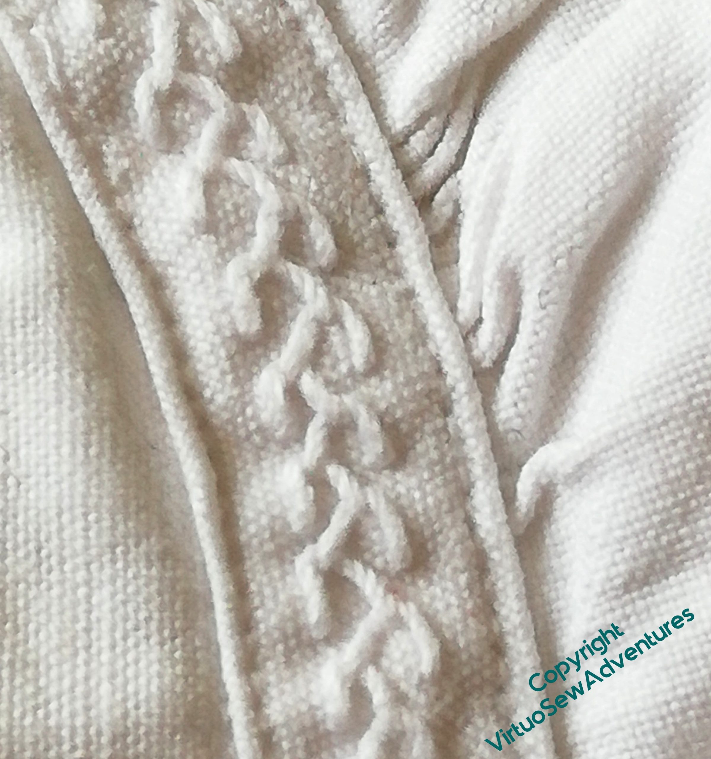
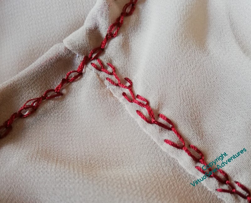
Years and years ago, I bought a white cotton shirt and a long cotton petticoat at a vide-grenier in the Gers, where we were visiting a friend who was restoring an old farmhouse about a hundred yards from the route of the “Camino” to Compostela to run as a pilgrim hostel. I don’t wear either of them much, the petticoat being a little long, and the shirt a bit short in the arm, but I do occasionally just look at them to delight in the work that was put into them.
There is machine stitching on them – they’re not as old as all that! – but there is a lot of hand work too.
The careful reinforcement between the ruffle and the edge of the garment is a case in point, with a single length of neat feather stitches providing just the variation in texture it needs to stand out, subtly, but definitely. From a distance, it looks almost like a braid, but instead of being bought and applied, it was something the maker could do by themselves.
The ruffle itself is a super-simple version of broderie anglaise, a single eyelet within a pointed edge, hand-finished.
Well, now…
I don’t always do epic garments like the Jacket of Many Stitches or the Coat of Many Flowers, but sometimes I do decide that a garment needs a little bit of lift.
Expect to see rows of feather stitch popping up on assorted garments for the next several years!
In her book, Tanya suggested using a slightly thicker thread for the ground (that is, more strands in the needle), to help it look a bit more uneven without interfereing with the glorious light effects of silk. I decided to vary the different colours as well, to help with that effect. This is the mid tone, although the “dark” isn’t so much dark as a different tint – that’s because I bought it online, and when I started stitching with it, it wasn’t quite the colour I thought it would be.
That said, I think it has turned out very well indeed. I enjoyed trying to keep the curves curving the way they needed to, varying the way each colour filled the allotted space, changing the way the lines flowed. It somehow does manage to look a little like an illustration in a book of fairy tales, partly because of the lines of colour, partly, I think, because the lightest of the greens is very much in that vein.
Not an Arthur Rackham illustration, obviously!
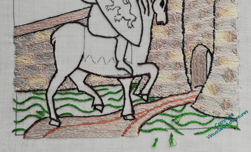
I love the way the grass has made the horse look much crisper, as though he’s conscious that this is An Occasion, and he’s putting his best foot forward.
But I do keep looking at him very panicked, to make sure that he’s not going to fall over. I once did a painting of an elephant, and it was only afterwards that I realised that the poor beast would have overbalanced and landed on his side with a rib-crushing Thump! if what I had painted had been accurate observation…
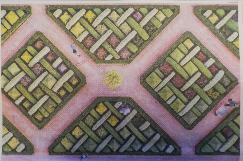
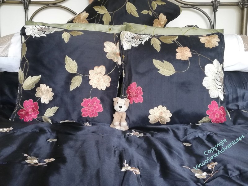
The next canvaswork project, commissioned by my cousin, has had a slight change of direction. It is still based upon this drone shot, but it is to be full coverage rather than voided stitches, and it’s going to sit on her bed, worked in colours from the curtains, to pull those colours onto the bed.
So when I went to visit a few weeks ago, I did a site visit – as shown here, including the Hound of the Doleful Countenance, for scale. We’ve decide that the final cushion is to be a rather Biblical cubit in length (that is, forearm from elbow to fingertips), which will go from the middle of one black cushion to the middle of the other, and at least a handspan high.
I’ve also brought home the cover for the doorstop, in the fabric I need to reflect in my thread choices – which means, not only did I not have such a weight to bring home, but my cousin also still has her doorstop!
My next job is to draft out the pattern to transfer to the canvas. Once upon a time, I had canvaswork design software, and I might have tried to chart a design first, but it didn’t include some of the stitches I might want to use, and with so many of the more unusual threads in my view, I will be doing a lot of experimenting along the way!
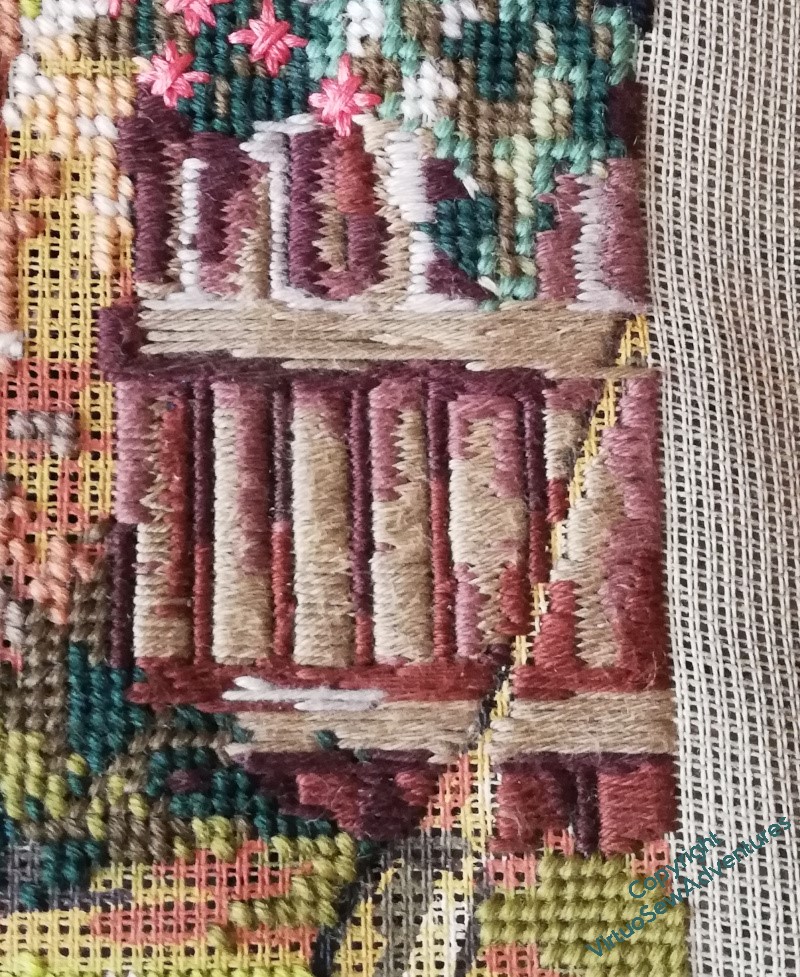
It took a certain amount of puzzling to come up with a choice of colour for the path. I wanted it to help to anchor the scene, but at the same time, I didn’t want it dark enough to challenge the horse, and it seemed logical that it would share some tones with the stonework of the castle. I wanted some wheel ruts as well, although of course they run togther into a single line quite soon.
And then there was stitch direction to think about. A stitcher’s thinking is never done!
Well, a bit of thought, and the stitch direction was obvious – horizontal. The stonework is angular and archway is vertical/follows the curve, so horizontal seemed a good contrast.
Similarly, I settled on using both the pink and the grey from the stonework in the needle. I thought the yellow might brighten the road a bit too much for comfort!
Once the path was done, I could move on to the grass. I thought of doing some rather mad tussocks, going up and over the castle walls, but in the end it seemed to me that the area close to the castle wouldn’t be neglected to that extent. Whichever fairy tale I want my viewers riffing off, I don’t think the briar-overgrown castle of Sleeping Beauty is the one!
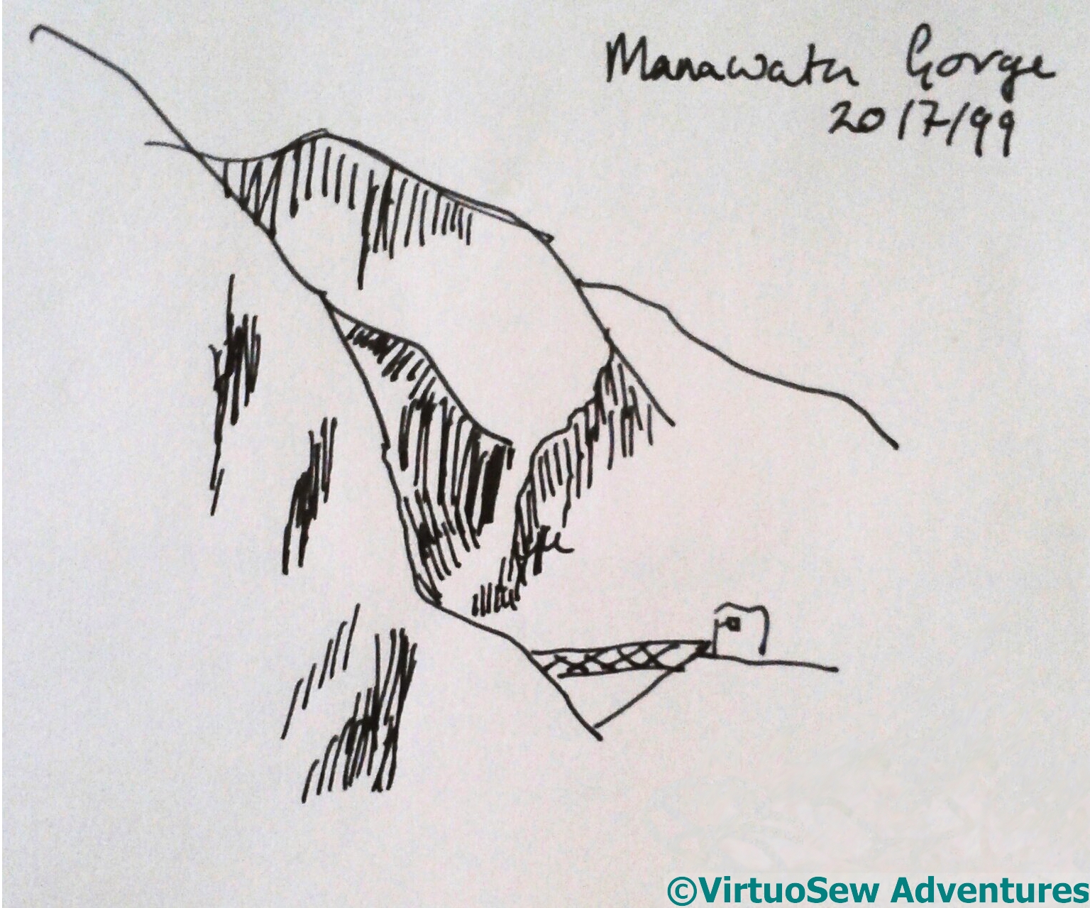
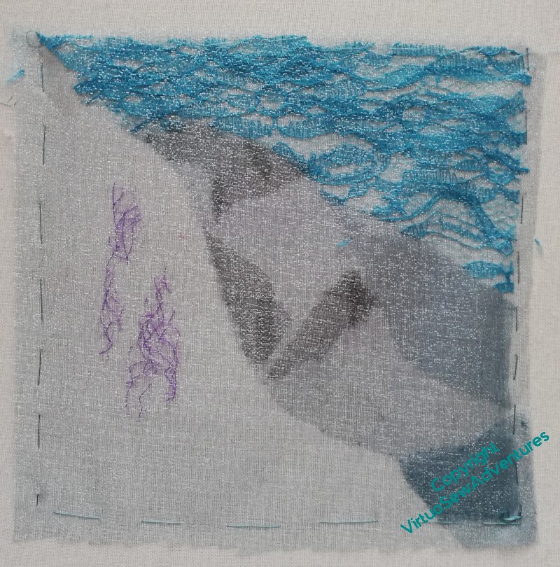
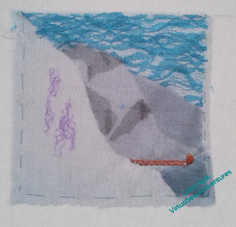
This is such a wild and not-my-comfort-zone sort of experiment that posting the original sketch each time seems sensible. There’s a lot of interesting texture hinted at in the sketch, and I don’t think layered gauze is going to reveal it, so another version is definitely on the horizon at some point!
In the meantime, and bearing mind my original thought that the cross hatching indicates some combination of rocky outcrops from, and shadows on, snow, this version layered a blue, slightly sparkly gauze repeatedly over itself and some fragments of the black and purple to create the look of the cross hatching.
Looking at it as I write this, with the sketch on view in the top corner, I realise that even with that simple sketch to work from, I’ve not accurately observed all the details. This is why drawing and sketching are hard: it’s not the control of the pen that’s difficult, it’s the accurate observation of the subject that requires time and practice.
My memory of a rusty-red girder bridge with some sort of lifting engine on one end is really what has kept this sketch in my mind off and on for years, so having noted it needed some land to stand on, of course I wanted to add it in. Since I’m also working on William Marshall, silk was what I had to hand, so iron girders are all in silk!
At this point, I intend to pause. I feel as though some additional stitchery on the rocky bits might help, but equally, maybe I’ve learnt all I can from this sketch, and the thing to do is undo it all and think more about the canvaswork!
The Georgette Heyer ReadAlong on Twitter was one of the few truly delightful offspring of lockdown. Through it, I met a host of funny, feisty, warm, and loving women, intelligent and well-read, but not inclined to take that as a sole criterion for worth. Their take on almost everything is worth reading, they combine charity of heart with a refusal to take any nonsense, and they have improved everything about my experience of Twitter ever since.
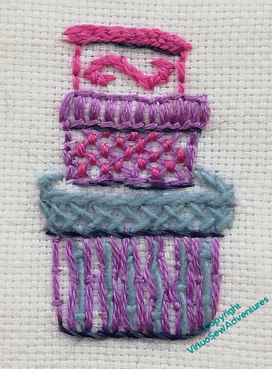
We ended up with an entire sub-language of hashtags and references, and when the readalong came to an end, we embroidered some of them and one of us collaged them together as a gift for the lady who started it all. These are my contribution.
“Hatboxes” appear frequently in adventures, being small and portable containers that someone too young to have luggage might be able to pack with a few necessities. Mine turned into a positive sampler of stitches. The lid of the pink one is Hungarian Braided Chain, there is Trellis Couching, Herringbone Stitch, Burden Stitch, Blanket Stitch, Stem Stitch and Back Stitch.
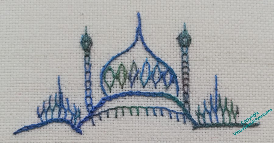
“Fainting In The Pavillion” refers to an incident in one of the books when the heroine, overcome with heat and repugnance, faints in one of the rooms of Brighton Pavilion, greatly embarrassing her host, the Prince Regent (he had it coming, waste no sympathy!). This one includes Cretan Stitch, Open Chain (looking neat and delicate for once), Fly Stitches, Stem, Chain, and Blanket Stitch.
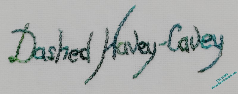
“Dashed Havey-Cavey” refers to suspicious and underhand circumstances, so rather than trying to illustrate it with a picture, I simply chose a dark and moody thread and put on my most pernickety mode of Reverse Chain Stitch.
The whole thing was enormous fun, both to take part in, and to stitch about afterwards!
After which delight, it seems rather unfortunate that the latest video in SlowTV Stitchery, Episode 77, should be a sad one, full of struggle, and as yet not crowned by success..
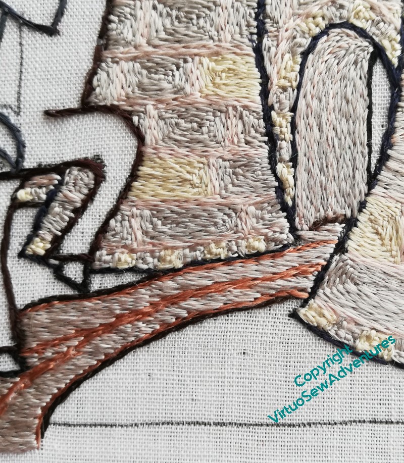
I intended to work the horse using Paterna, in something a little like long and short stitch, but having done his head, I looked at it and decided it needed a little more thought. It looks like some sort of unholy hybrid of horse and highland cow, and I wasn’t at all sure that it would look better when I’d done all of it. So I decided to divert my attention elsewhere and think about it for a little longer.
The most obvious element to tackle next was the fence, which is so far the only piece to be done in horizontal stitches. I’ve used soft cotton, which has nearly enough body to stand up to the tapestry wool, and slightly more sheen, which also helps. You’ve probably noticed that I haven’t extended my diversion to the broom, which looks a lot more like the birch besom my grandmama used to use in the garden. That’s likely to be last of all, as I want to raise it over the rest of the stitching.
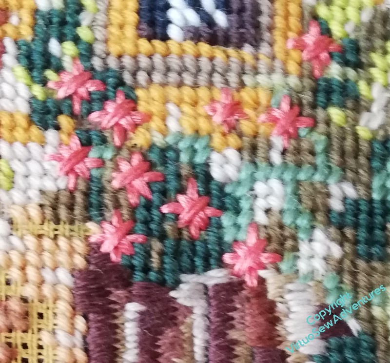
Since I was working at this size of the canvas I was reminded that I’d been leaving gaps for some of the flowers. Diagonal Double Cross Stitch makes for some huge flowers, which might very nearly be the size of dinner plates if scaled up and aren’t at all cottagey – more Professor Branestawmy, in fact! – but they do stand out nicely against all the tent stitch, and they’ve enough personality to live with the fence, too..
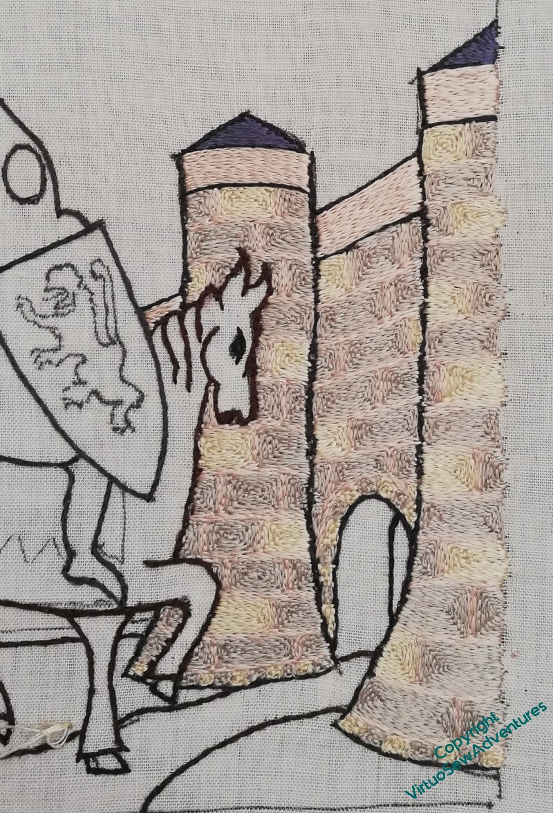
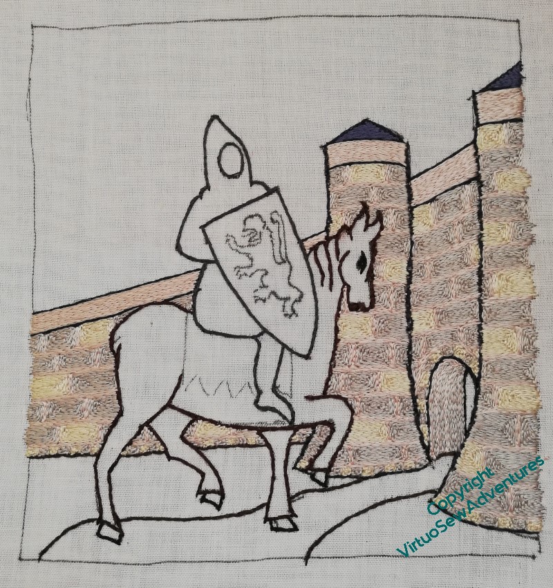
I’m trying to work this systematically (I may also be slightly anxious about tackling William!), so the first thing was to finish the castle.
And there’s a lot of castle…
The yellow blocks appear only on every other row, and I’ve tried to make sure that they never line up. Once I’d worked the gatehouse itself I carried on to work the wall behind it, and then paused for thought.
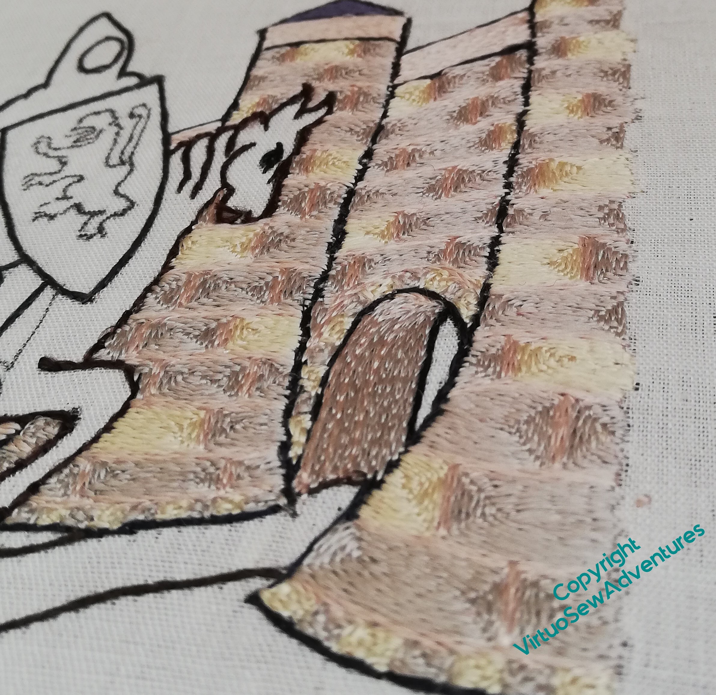
The interesting question at this point was to decide how to work the wall inside the gatehouse, the “tunnel”, if you like. I wanted some evident difference in relation to the blocks of stone in the walls, and in the end, settled on alternating rows of grey (stone) and pink (mortar), turning them vertically, following the curve of the arch as best as I could. As I went deeper into the tunnel there were more lines of grey between the pink, although to say the difference is subtle is to rather understate the case!
It is a constant delight to look at the way the silk changes in appearance as the stitches change direction, and even more so to change the angle of view, so I suspect you will see a good few shots like this over the course of the piece.
Doesn’t it look lovely – and don’t these quiet, pearly tones help to create the fairytale atmosphere I’m looking for!