A “Site Visit” recently gave me the chance to look at my wools in the room for which the cushion is destined, and to talk to my cousin about the whole thing. It also provided a reminder of the truism that, no matter how extensive the stash, for any particular project, the stash will prove inadequate!
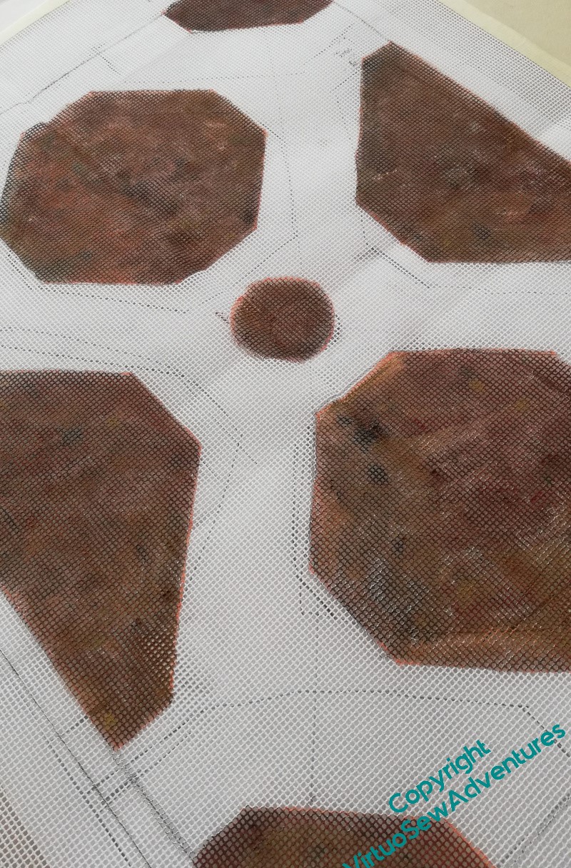
I had my experimental panel with me, and one of the things my cousin said was that she was not particularly taken with the effect of the tent stitches or straight stitches infilling between the pattern stitches. I agreed that it looked a bit clunky and congested, so when I got home again, I got out my acrylic paints and painted the canvas, just the area of the borders.
What I have done is to use three different shades of brown, solo and in mixtures. And I’ve painted both sides of the canvas, to make the coverage a bit more thorough. This way, I’m not trying to produce an absolutely flat colour, as though the canvas were dyed or coloured from the start.
You can also see in this picture that the “pathways” spill out into the surrounding canvas. I was intending the stitching to do so as well, but there’s an old saying in military circles, that “No plan survives contact with the enemy”. I would adapt that for stitchers – I don’t regard the canvas as my enemy, but no plan survives the first stitching session unchanged!
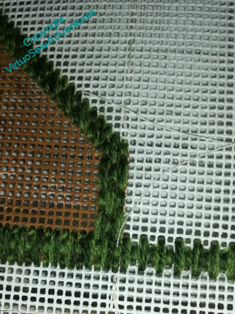
I started to work the Parisian Stitch border around the beds, using two different colours of crewel wool in the needle, and soon decided that although I want to have a couple of rows of tent stitch around the outside, to help with adding the back to the cushion, I also want the pattern area properly delimited. So the line between the beds will be filled with a line of Parisian stitch as well.
You may recall that I had an idea to combine the Daisy Beads and the Stumpwork Violets into a little display under a parlour dome. The colours and scale don’t work with the main panels, and besides, both items are tied specifically to Mary in a way that nothing else is.
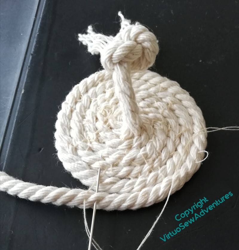
My first thought was a gold trinket pot, but so far I have entirely failed to find a pot of the right sort of dimensions. For some reason, everything I could find was too wide or too high, or not the right surface for gilding.
So after some frustration, I decided to tie the display back to the excavations by using a coiled pot made using braid or cord. It should be slightly reminiscent of the baskets used to carry away spoil from the excavations.
After some experimentation, I settled on piping cord, sewn together with ordinary sewing cotton as I wrapped the cord around a former (a spice jar, since you ask). Even that involved some unpicking and restitching.
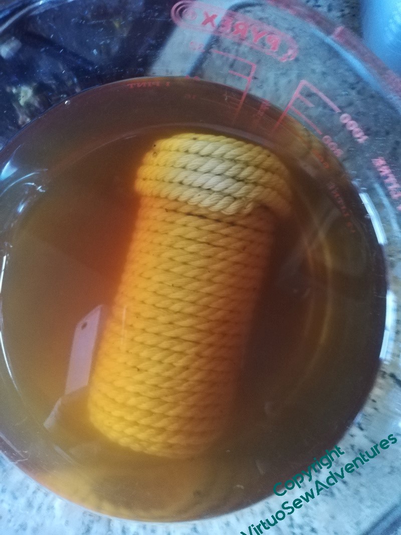
When I’d done it, however, it was too white and stark, not a kindly background for the Daisy Beads. Hmmm…
So that is how I found myself tea dyeing a coiled pot made of piping cord!
Underside couching, I’ve decided, is rather like satin stitch. In concept it is simple, not to say obvious. The execution, accurately and aesthetically, is very much less so!
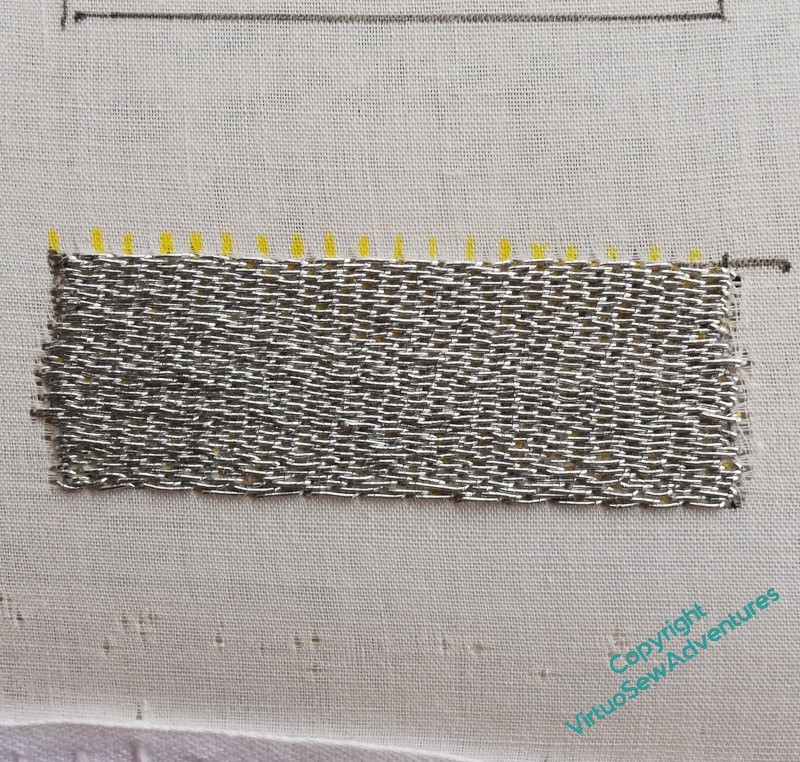
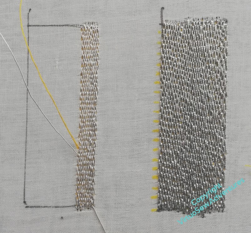
I had intended to use the gold thread left over from the Amarna Family Group as my thread for William’s background, in the interests of economy, if nothing else, but then I had advice from Tanya Bentham and others, to at least try the Smooth Passing, which might for a multitude of reasons behave rather better.
So here you see the second practice block started, again using silver, but this time smooth passing thread.
The passing thread is, as suggested, much pleasanter to use, and creates a smoother and less shadowed surface, which in turn, I think, should help the pattern I intend to use. Which, you may note, I’ve not yet got around to practicing!
However, that brings me to my decision. I do not think that I can be certain that the spool of Gold Smooth Passing I have left over from a Thistle Threads project will finish the job, so I shall have to buy some smooth passing. And it turns out that Gold comes in more than one shade!
The decisions are never at an end, are they…
And since I’m working on pulling the Amarna pieces together properly at present, I can’t claim to be giving my whole mind to the decision-making!
Telling stories without words can be a little tricky..
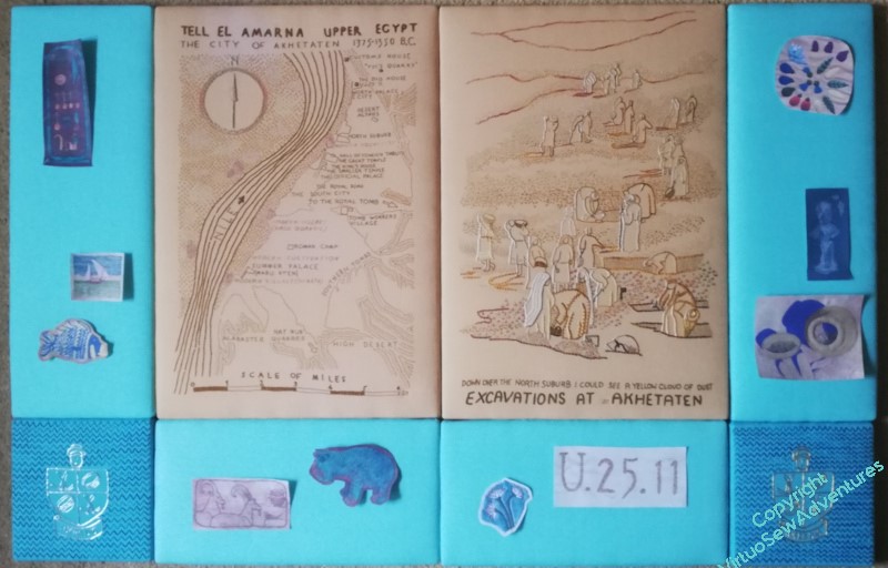
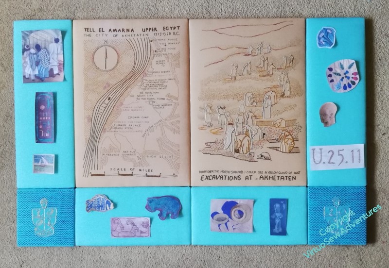
I’ve managed to get the Amulet and the Crock together here, and “Typed on Camelback” is on the horizontal panel, which works. But I put the Lotus Fragment at the top because it is the first thing mentioned in the book, only to find that it makes the whole thing fizzle out rather.
So for the next one, I’ve swapped the Faience Necklace with the Lotus Fragment. Better, I think. I like the way the Amulet echoes the Cartouche in shape, but not in placement. I also rather like the new, closer placement of the Fishie with the Felucca. Typed on Camelback and the Lotus Fragment look fairly happy together, too.
So, final tweak. The square tops of the Cartouche and the Crock of Gold balance each other nicely, and the grouping of Fishie and Felucca take only a little more space than the Faience Necklace. I think I will put the Hippo lower and the Antelope higher, mirroring the Lotus Fragment and Typed on Camelback. And incidentally, making more sense of them – antelope are dry land animals and hippos like water, after all!
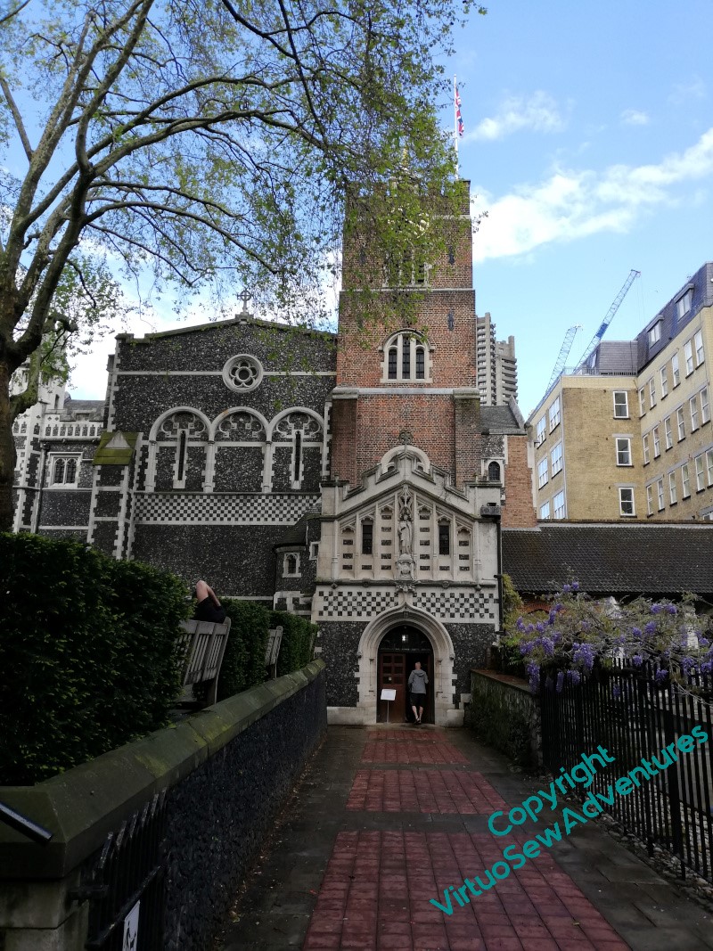
A journey through London gave me the opportunity to visit the Church of St Bartholomew The Great in Smithfield, which is indeed very close to the Hospital Rahere founded, known today as St Barts.
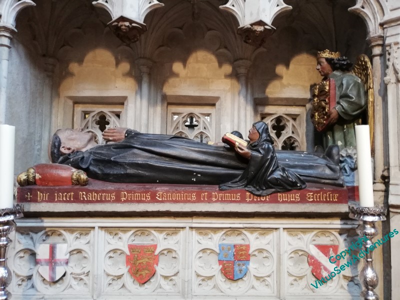
It, and Rahere himself, have had varying fortunes and visibility over the years, and, for example, Rahere’s tomb was built in the fifteenth century, nearly four centuries after his death.
I haven’t yet discovered whose shields are displayed there, but it seems likely I will. The Rector was involved in a wedding rehearsal when I arrived, but I carried on quietly sketching and walking around the Church, staying out of the way as best I could while still continuing to work.
And I had my reward in due course, when, on the principle that Bairns As Don’t Ask, Don’t Get, I tracked him down afterwards and asked what, if any, information they had on Rahere and the early days of his foundation.
I may have bewildered him slightly – I have the impression that’s not the first thing people usually say! – but he took it well, and informed me that as this year is the anniversary of the foundation, a substantial History has been produced. So when that arrives, I shall have more to say on the subject, I’m sure!
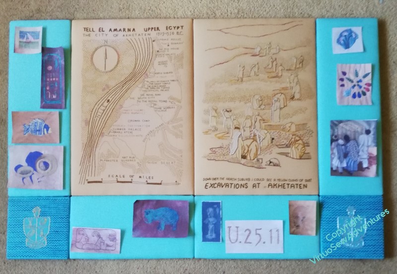
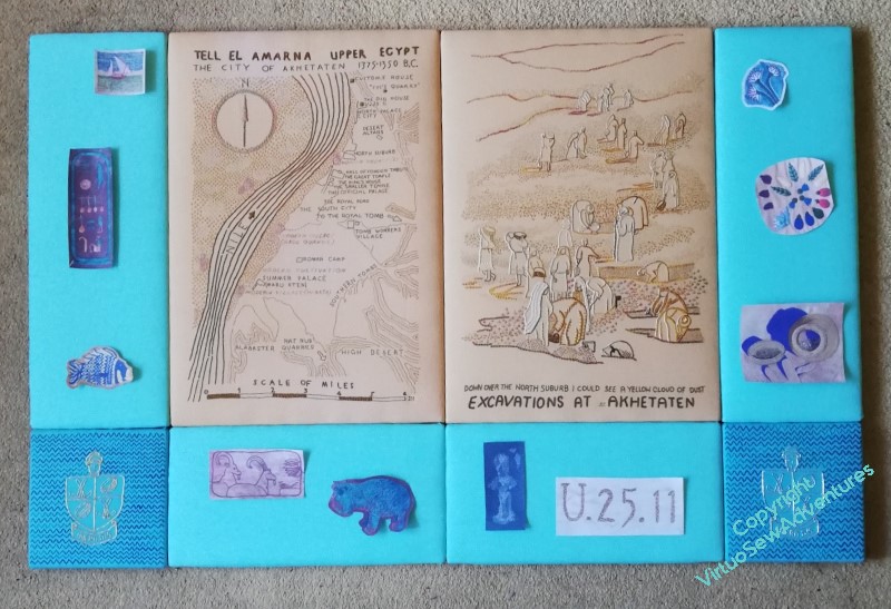
The first place to start with planning layouts was to simply trim my photocopies neat, square, and not too close, and see what result I could achieve.
I’m not at all pleased with this. It looks much too congested – or alternatively, not congested enough! If I had twice as many spots, maybe slightly smaller, and had them all jammed together, it might work, but this is betwixt and between, which is no place to be!
So I tried again, trimming some of the pieces closer or in a more shaped fashion, but still all of them being used. This is better. Actually, much better – but I think it still feels congested, and rather unbalanced. So, I need to think about what I can pick up from this, and take forward.
But before I do that, I do have a guideline in mind already: I want to use the “spots” which refer to finds or incidents that Mary referred to in the book with the View, and the ones which depict things already known about with the Map. So it’s arguable that I should either have “Loading The Felucca” with the View, or mount it separately. As it is bordering on too large in any case, I think I may choose to mount it separately.
The other one which is a bit tricky to wrangle is “Typed on Camelback”. It clearly has to be with the View, but it’s a little too wide to fit comfortably on the uprights, where I had it in the earlier two pictures.
So how about this? I’ve taken off “Loading the Felucca”, and the “Head of Ankhsenspaaten”, and everything is now rather more spaced out. I think this works quite nicely, but at the same time, I thought the “Hittite Amulet” and the “Crock of Gold Hoard” had looked very happy side by side, so I wonder what further adjustment I can come up with?
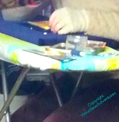
The next challenge was to work out how to attach the Family to the navy blue velvet stele I had prepared for them. It was a bit too awkwardly sized for the various tables I have tried to work on – or they were at entirely the wrong height – so I ended up perched on a stool beside the ironing board.
What’s the phrase? Adapt, improvise, and overcome!
I keep trying to make use of my Grandmama’s curved needles. For some reason it has become one of those skills I am determined to master. Goodness, I wish I’d asked Grandmama how she managed!
In this case, I began to feel that maybe I was getting the hang of the idea. Gradually. Work speeded up a little after I managed to remove a burr from the point, restoring the proper sharpness.
I was a bit baffled to begin with as to how to remove that burr, but a question on Mastodon elicited several replies in varying detail. I used a nail file, since you ask (lowest tech solution), although one of my friends suggested a dart sharpener – which I never even knew was a thing that existed!
I have a lot of mounting embroidery in my future, so I suppose I am going to get the hang of it – or go stark crazy, of course, always an option!
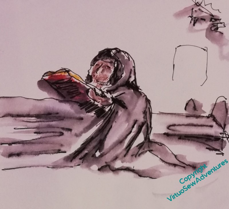
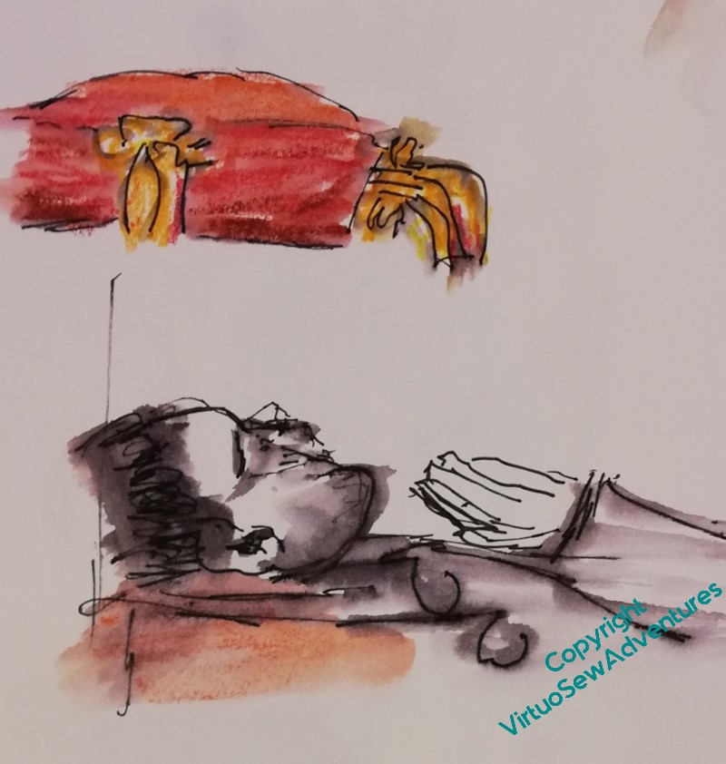
Anyway, several stitching sessions later – the Family had to stand on their heads for their closeups, to bring themselves into reasonable range of the camera!
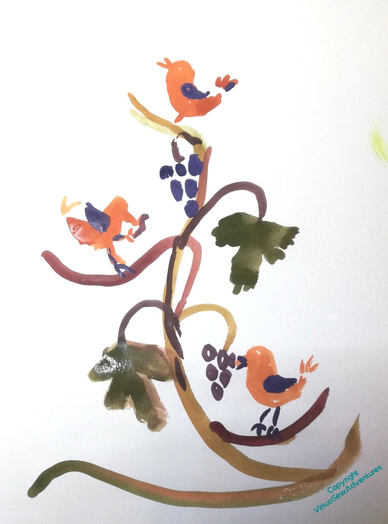
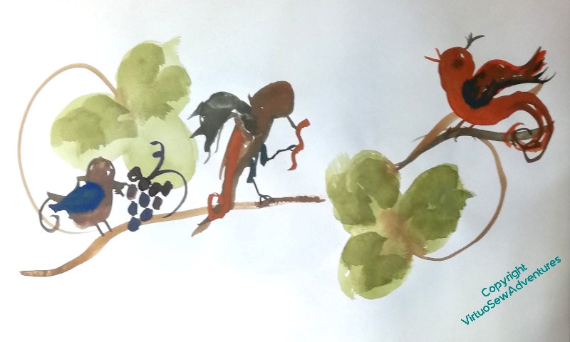
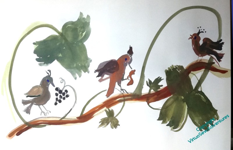
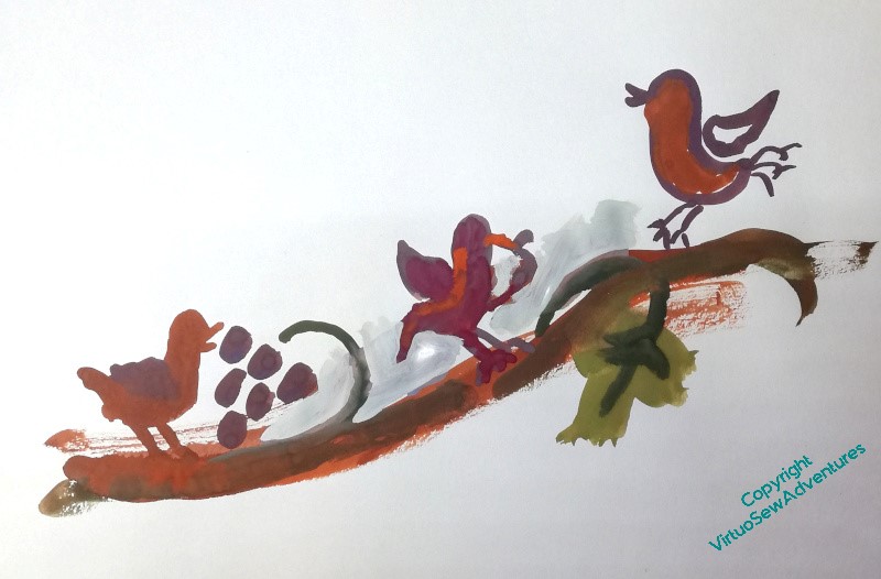
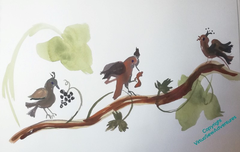
You may recall that I said last time I mentioned the design I am trying to work out here, that it was proving very difficult to balance three birds not looking the same way, and that making them look the same way didn’t work at all.
Then it occurred to me that – obviously! – the two earlier birds would be facing towards the one that’s singing. Partly because we always turn to look where the noise is coming from, and partly because that is their aspiration.
You will notice that all of the rough designs I’m playing with here are in colour, which is not at all in keeping with my idea of using Mountmellick work. That’s because at present I want to find it easy to distinguish parts of the design. When I’m a little clearer about the shapes and their flow, I’ll start moving towards a more tonal patterning that will help me to think about stitch choice.
In the meantime, I am playing with shapes and layout in very vague terms.
Eventually, I want the birds to be quite medieval and slightly mad in appearance, and I’m thinking of trying to find some suitable thread – a round, matte cotton in two or three thicknesses – in a variegated colour that will help me to create the look of carved wood. The challenge is in finding it. This is not something easily bought online with any confidence, and so many of the thread companies don’t go to the shows anymore.
As regular readers are well aware, when in doubt I have a policy of benign neglect which allows ideas to ebb and flow until something filters to the surface as The Right Idea. Sometimes this takes longer than others, although I have noticed that recently I’m getting ideas a bit more quickly.
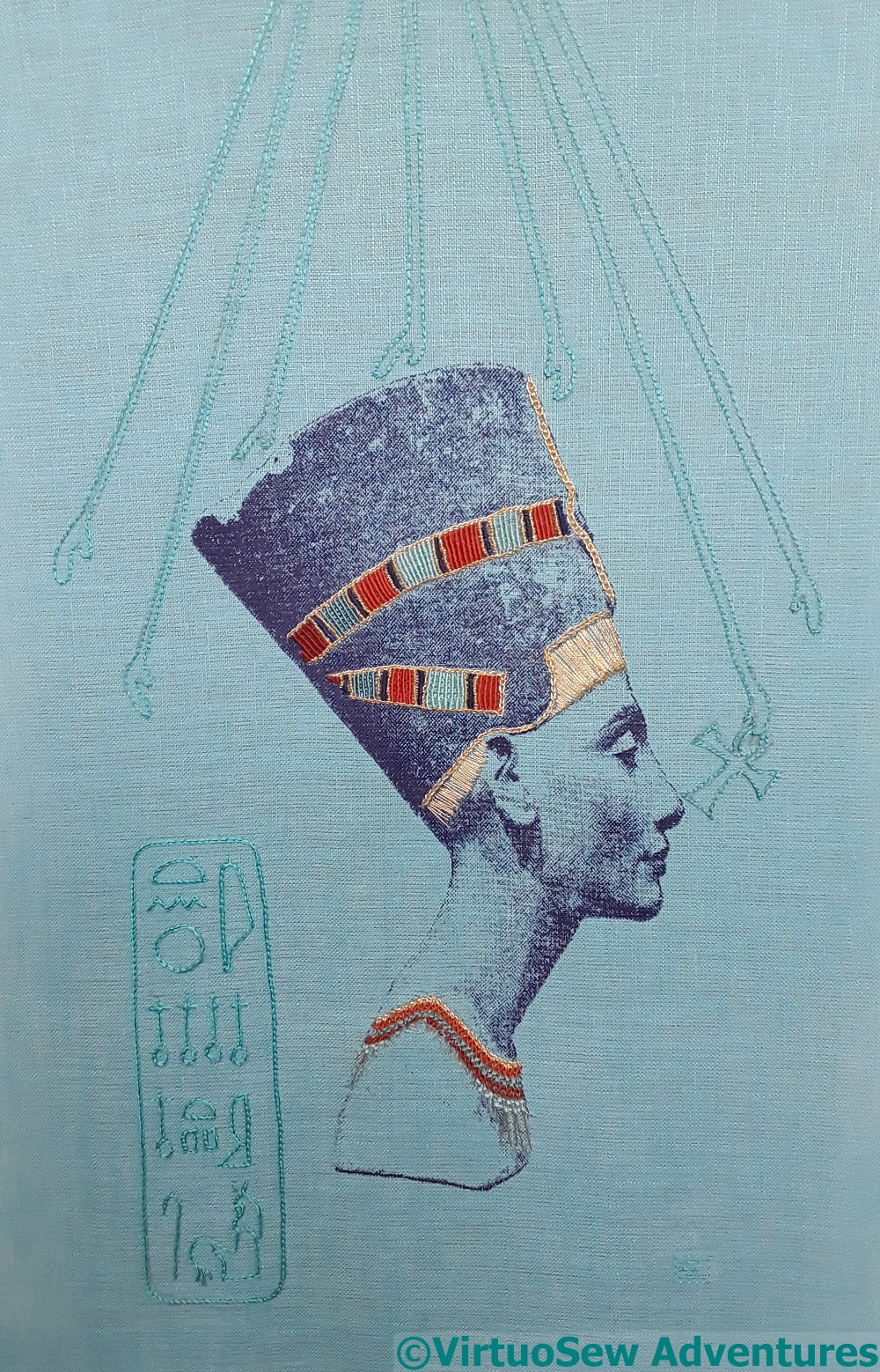
Head Of Nefertiti
Or maybe it’s just everything coming to a head, all at once!
Nefertiti came off her frame after I’d finished her (in 2017, dear heavens above!), and then went into a box while I tackled such hair raising adventures as the Colossus of Akhenaten and the Amarna Family Group. This was partly because that seemed safest, and partly because I hadn’t the vaguest idea how I was going to display her. She certainly couldn’t be mounted on anything that would move, or suffer abrasion, not with the sort of gold thread I had used, but I have a deep aversion to mounting embroidery behind glass, except in particular circumstances.
So what I needed to find was some way to mount, frame, and display the Head of Nefertiti in a way that would be satisfying and sufficient, that that would allow her to stand alone, with no glass, no frame, but nevertheless complete. I’m not sure when the idea finally swam to the surface, but I had a thought that maybe what she needed was cloth-of-gold.
Then I found some!
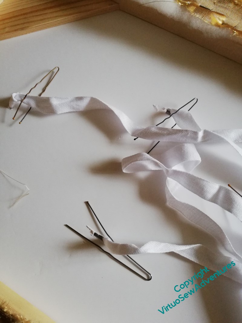
Not the real thing, unfortunately, but at least I found something rather spectacular, that clearly had the idea of cloth-of-gold somewhere in its family tree. Then the difficulty became how to make the assembly work. The wretched stuff frays, pulls, and crumples. Then it didn’t iron nicely – but it responded well to being steamed under tension and ironed on the back, so that was well in the end! Next, the frame my friendly carpenter made had a front of foamcore attached, with slots corresponding to the slots in a separate piece of card attached behind Nefertiti, through which I had threaded cotton tape. The foamcore was covered with padding and then the “cloth-of-gold”, and then, with some trepidation, I cut through the padding and the gold from the back. I’ve reinforced the cuts with fabric glue, to inhibit fraying.
Then I resurrected a hairpin-as-hook trick I used to use to fasten my character shoes in ballet class (buttonhooks being no longer available, in these degenerate days!) to pull the ends of the tape through to the back, pulled the tapes tight, and tied two bows.
This of course skates over a lot of fussing and measuring, stretching and stapling, anxiety and tension, but I’m sure most of you have had similar experiences and don’t need every detail!
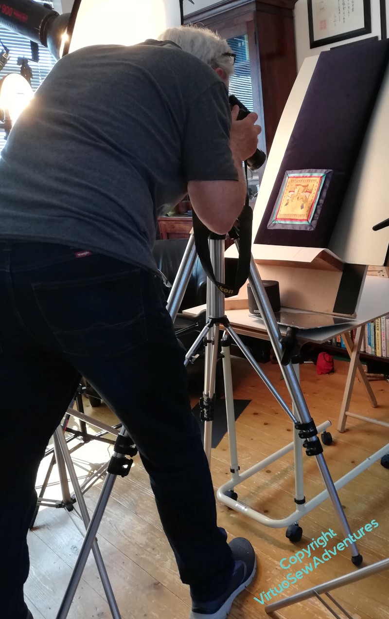
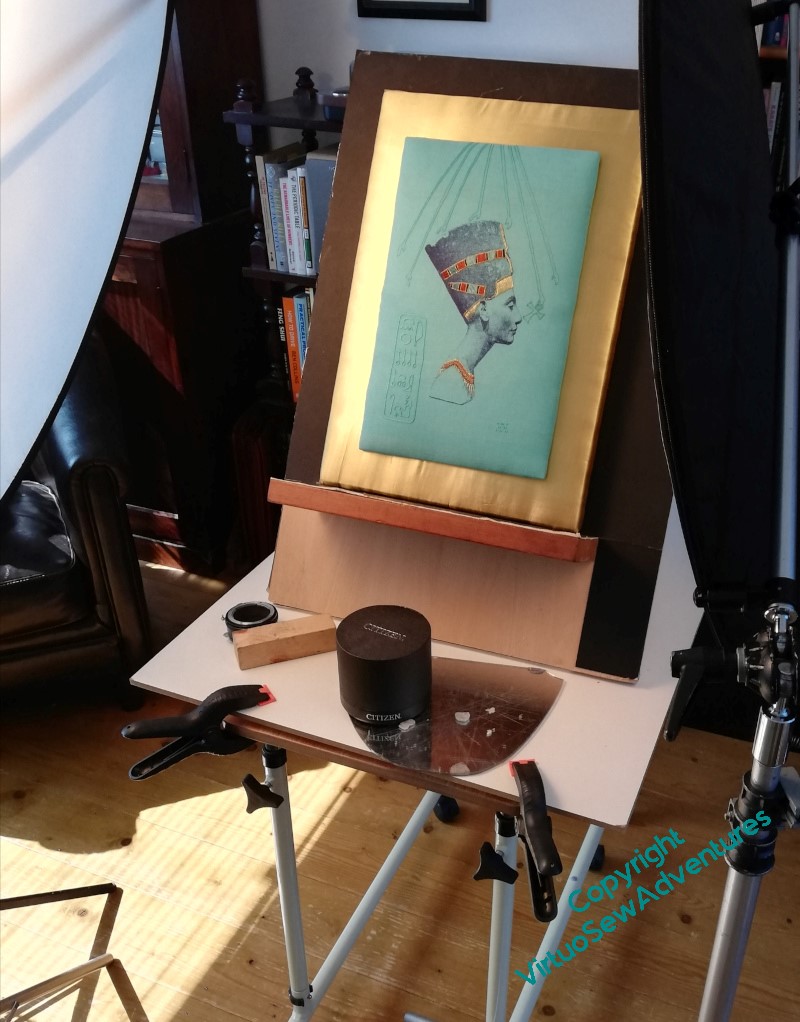
However, the final result is what you see here – Nefertiti, The King’s Great Royal Wife, At Whose Coming One Rejoices – on set at Bernard Rose’s studio, ready for her close up and commanding the stage.
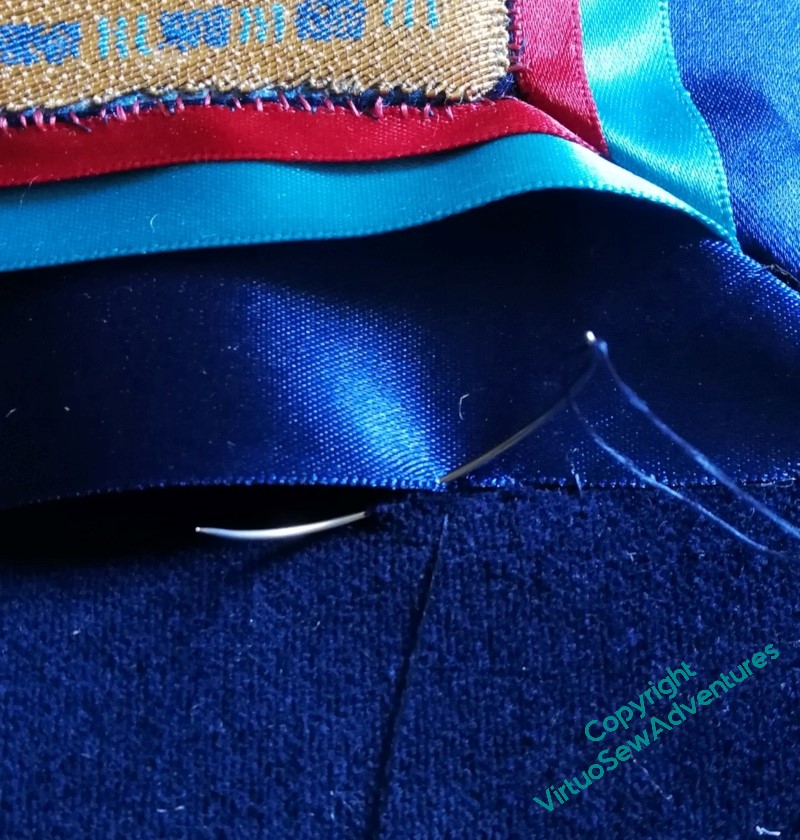
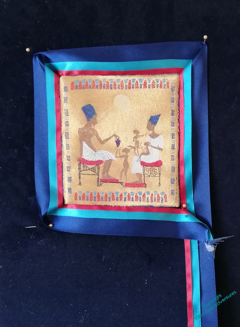
We left the Amarna Family lurking at the far side of the living room, surrounded by coloured ribbon. I was very certain it was better than the gold, but I wanted to be sure I was happy that there was nothing better somewhere at the back of my mind.
After rather longer than is evident in the gap between the posts on the subject (doing and writing often get thoroughly out of sync, for me), I decided that it was probably the best presentation I was going to invent, and needed to be done properly. The ribbons were already attached, so the next stage would be to make sure the corners were made neat and square, and the attachment was secure.
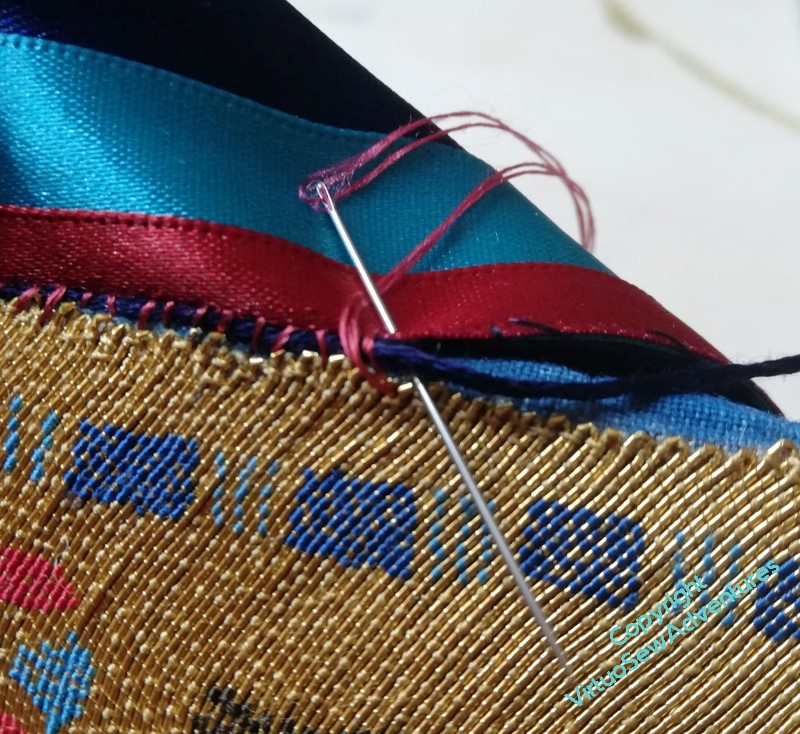
Secure, and not too noticeable.
I was a little afraid that the join might leave the fabric showing, or otherwise draw attention to itself, so after a little thought, I decided to overstitch a navy thread (stele-coloured, as it were) with red silk. I’m hoping that because it’s not a single colour, the join will be slightly camouflaged. I did consider gold, but decided in the end that camouflage-by-lighting was not my aim!
The whole process took a couple of days, because holding the navy thread at the right angle and tension was something that required frequent breaks to avoid cramping fingers.
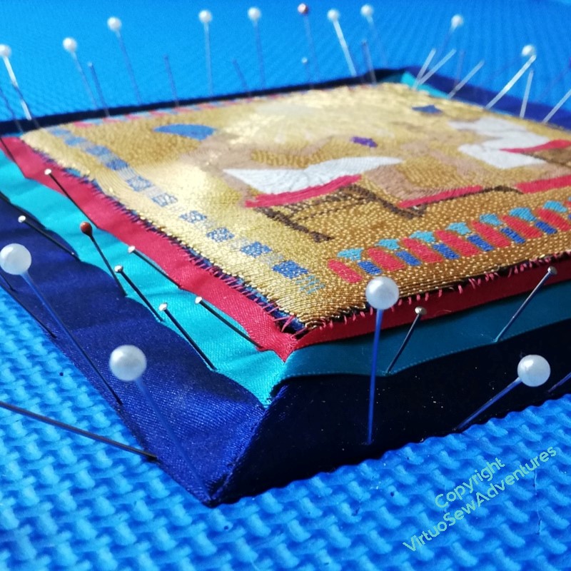
Each corner then required some manipulation to make it work, so once I felt I had the corners mostly settled, I pressed them (not the goldwork!) very, very cautiously.
And then pinned them down very thoroughly, and turned my back for a few days!