Tag: Dreams of Amarna
Loading the Felucca – starting on the packing case
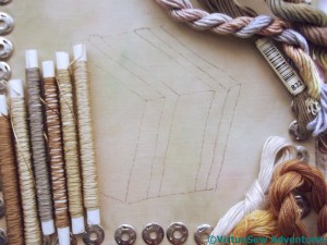
Since appliqué is a layered technique, I had to work forwards from the most distant object. For this subject – once the background was in place, that was the packing case.
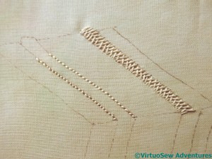
The first thing I had to do was to work out how I was going to represent the lengths of wood running as bracing all around the box. My first thought was to use reverse herringbone stitch, as I did for the contour lines on the Map of Amarna, but as I was stitching it I became less sure.
I worked the other band in ordinary herringbone stitch, then sat back and frowned at the frame for a while.
The result of my frowning cogitations was that I decided that I definitely didn’t like the reverse herringbone stitch, and wasn’t totally happy with the standard herringbone stitch either.
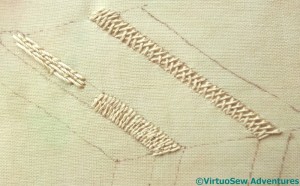
I tried variations on couching stitches – Bokhara Couching and Roumanian Couching, in the lower half of the nearer band – and was no happier.
Just as well I enjoy these puzzles, isn’t it!
Finally it occurred to me that the grain of the wood would be running lengthwise in these pieces of wood, while in the planks that make up the box, the grain would appear to run across the box. The stitching I had tried had given the impression of the grain running across the bracing struts. So I tried Bokhara Couching again, but running lengthwise.
That’s better, I think, but the next task is all that unpicking.
Loading the Felucca
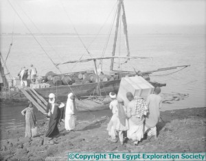
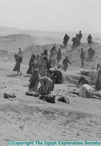
Here is another one of the photographs from the Egypt Exploration Society that I would like to represent in some way.
The expedition felucca was loaded with all the excavated finds and taken to Cairo so that the Cairo Museum Director could choose what would be retained for their collection. The carpenter spent weeks making special boxes to carry the more delicate finds, like Hatiay’s carved door lintel, and a large section of decorated wall plaster (more things for me to embroider!). Then everything had to be loaded on to the felucca…
I’ve decided to concentrate on the group carrying the packing case. Partly this is because the whole photograph is a little confusing and difficult to decipher in places, and partly because they rather drew my eye, and I want to experiment with appliqué. What I hope to do is “dress” each figure, so the folds of the fabric I use creates the folds in the garment. I have no idea whether this will work, but if I don’t try I will never know!
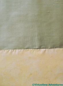
Last time I was at the Harrogate Show I found myself in unfamiliar territory, frequenting the patchwork stands, in search of suitable fabrics for the ground and the clothes. I’ve used a piece of silk dupion from The Silk Route for the river. It’s a pale grey-green, and I think I will have to find somewhere else to use it to pull it into the overall design properly, but it has a lovely subtle sheen that looks quite watery. I’ve attached it around the edges using strands pulled from the weft, because I have nothing else suitable. The ground is a sandy cotton, doubled because I could see the silk through the first layer, and attached using a single strand of stranded cotton from my stash.
You last saw the fabric I chose for the packing case being used as the background for the Crock of Gold Hoard. It’s a flimsy overdyed turban cotton which won’t take much stitching without reinforcement, so I’ve backed it with a layer of white cotton to give it a bit more body.
Then I had a wonderful rummage in my stash, and pulled out a selection of silk and cotton threads to play with. The tubes are Mulberry Silks threads (also last seen in the Crock of Gold Hoard), and I’ve also laid out a linen thread, two Stef Francis stranded silks, and a couple of miscellaneous threads from I-Know-Not-Where.
This should be fun!
The Second Crest for the Dig
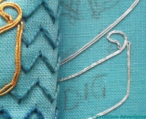
Last month, I had made several unsatisfactory trials with silver thread, and took my headaches to the Harrogate Knitting and Stitching Show to ask advice on the Golden Hinde stand.
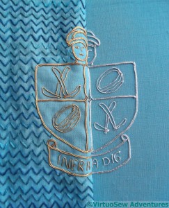
I got to the show with about 40 minutes to go of the Thursday evening late opening, which meant that the aisles were relatively clear and I could actually talk to Sarah. After some discussion, we came up with a very bright and blingy silver Jap. In fact it’s so bright and blingy as to be verging on mirrored, and I was surprised at quite how calm it looked when I finished it.
The reason it is so bright is that the metallic wrapping film is much broader than it was on any of the other silver threads I tried. That carries its’ own penalty, because turning corners becomes trickier – and indeed, in a few cases, rather untidier (click on the picture to enlarge it and look at a few of the corners!). I found that I had to devise new pathways for the couching, and use more short lengths. This panel is markedly more fluffy on the back than the gold one was!
I just have miles of that cloud filling stitch variation to do now (and, of course, choose and apply the braided edging!). The background stitching will help to throw the silver crest into relief. I have laid the completed gold over the silver so that you can see. With decent lighting, it should have enough personality to hold its corner.
If it doesn’t, I will frame it up as a separate panel, and show people just how difficult it was!
Experiments with A Marudai
I’ve been fascinated by Kumihimo braiding for ages. I first heard about it many years ago from a mathematician friend of my husband’s. Quite why, I can’t now recall, unless it was a desperate attempt on the part of the mathematician to find something textile-related to talk to me about.
Jolly decent of him, don’t you think? He certainly had no idea what he was starting..
Anyway, I’ve heard a lot about it, and rather like the effects that can be obtained. In the UK, the best source for information and equipment is Jacquie Carey at The Carey Company. Jacquie has also become better known to historical embroiderers because while she was researching historical braids she became fascinated by the stitches in them, and besides her books on Braiding, she has now written books about Elizabethan Stitches (remember my experiments with some of them for the Glittering Nightcap?), and Sweet Bags!
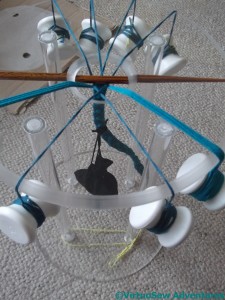
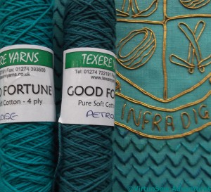
I’ve bought myself an acrylic marudai and bobbins, and spent a fascinating – not to say, bewildering! – couple of hours at Texere Yarns in Bradford, trying to find some suitable yarns to experiment with.
Since my initial aim is to create a braid edging for the Crest for the Dig, I began by finding some cotton knitting yarns that seem to go very nicely with the panels, as well as a whole load of extra yarns for additional experiments.
Then I started playing…!
A Dilemma
Now, you may recall from when I began the first one that there are to be two Crests, one for each panel, balancing each other. Furthermore, since there will be a gauze overlay, everything has to have the visual strength to show through it.
I don’t think that this silver thread has enough force or shine. Even with a fairly strong background using my Cloud Filling variation, to throw it into relief, it will simply disappear.
So I have been experimenting. The edge of the shield, the top of the scroll, and the bottom of the scroll, all use different threads.
All of them are equally insipid in comparison with the gold. I’m afraid that if I use any of these threads for the panel, I will end up with an unbalanced overall appearance with one corner panel seeming very faded in comparison with the other.
I hope to find a more suitable thread at the Harrogate Knitting and Stitching Show this week. Or alternatively – more of the gold so I can do a second gold one!
The First Crest for The Dig – Finished
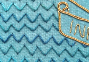
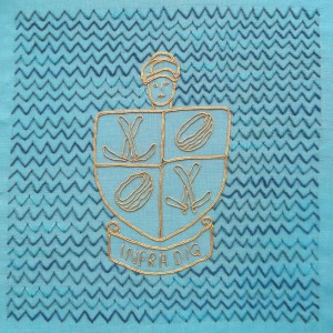
The Cloud Filling Stitch variation that creates the ripple effect is fairly easy to do, and once I had decided to get working on it, finishing the first panel really ripped along.
As you see, I’ve not been too pernickety about spacing. It would have been possible, but it wouldn’t have been in keeping with the original inspiration, besides being utterly maddening to achieve.
I began by working each row individually, first the short stitches and then threading the pearl cotton, but I soon found that it was much quicker to do several rows of the holding stitches, and then threading the pearl cotton through them.
So here it is, done. The other crest panel, when I get to it, will be in silver, with the same background. I need to get the other piece of fabric onto the frame and get ready, because it is good to have at least one project in which I know exactly what I want to do.
There is one question that remains to be solved – how will I edge each panel? I’ve been thinking about lucetting, crochet, or kumihimo. I have a feeling that a lot of experimentation lies in my future.
Progress on the Crest for the Dig
The goldwork on the Crest for the Dig went rather quickly, and I found myself running straight into a brick wall. I narrowed my background choices down to two, and then stopped. I’ve even extended the patches of trial background, and propped the frame up to stare at.
The arrowhead stitches create a subtle effect; patchy ripples, almost here-and-then-gone-again. Rather like Amarna, in fact – it’s thought the city was inhabited for less than thirty years.
On the other hand, the pearl cotton cloud stitch variation is more reminiscent of the rippling paint pattern that originally inspired me. The variegated thread helps to stop the background pattern from being too solid and monolithic.
Choices, choices….
In fact I took the frame to my parents’ house, last time I visited, and said plaintively “Help!”
We stared at it, talked about it, and finally decided that the pearl cotton variation on Cloud Filling Stitch is the way to go. It’s more in keeping with the idea of the doodle that inspired this design, the thread is closer in scale to the scale of the gold thread, and it’s also a better reflection of the ripple pattern I want to bring to mind.
I’m also considering how I’m going to edge the panel of stitching. At the moment, my ideas include lucetted cord or a flat kumihimo braid. The lucetted braid might be too narrow, but on the other hand I’ve only ever done one piece of kumihimo braid, so that would be rather a leap into the unknown!
The Plan for the Dreams of Amarna
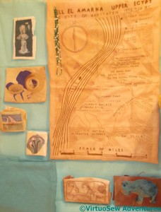
I had several very useful comments after my last post, but they all (understandably!) failed to take into account my overall plan for this project.
So, a quick re-cap, for the benefit of everyone who hasn’t (unlike me) been thinking about the Dreams of Amarna for the last twenty years. I first wrote about this in March 2010, but I first started thinking of an embroidery project inspired by the book “Nefertiti Lived Here” a good fifteen years before that!
I thought about various ideas for the Amarna embroidery for a good five or ten years, on and off, but then it finally came together in about 2008 during conversations with my cousin. In fact I started this blog partly in order to give myself a push, and to make sure that I kept at it.
My idea at the moment is for two large panels, which will be colour-blocked as mirror images of one another using sandy colours (for the desert) and turquoise (for the faience used so often in ancient Egypt).
The sandy panels are about 35 centimetres by 50 centimetres, and getting the right proportions for the turquoise will be very important.
These panels will be overlaid with a gauze layer, screen printed with the heads of Akhenaten and Neferetiti. I have already done some experiments with screen printing on gauze, and I know that not only will it be rather tricky to find the right gauze, but working out how to hang it is going to be a real challenge. The gauze overlay means that colours that are subdued may not show strongly enough – in fact some of my early pieces for the project may end up being mounted as standalone pieces, for that very reason.
This post, from earlier this year, gives you a very rough idea of how the layout may look.
The Antelope Frieze and the Felucca may both turn out to be too inspidly coloured to show through.
Continuing The Crest for the Dig
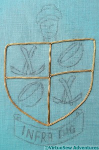
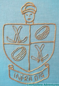
The sensible first stage for the Crest was to do the goldwork. First of all, I’m not at all sure how I am going to do the background, so I should concentrate on the bit I’ve decided on. Secondly, I was a little worried that I might not have enough gold thread of the type I wanted to use…
That being the case, I decided that rather than giving each line a stop and a start, I would try to keep the lines going. That has meant a lot of thinking had to go into getting all the double lines right, and a bit of a fiddle at the central crossing point!
In the interests of both contrast and economy, the charges – motifs, in non-heraldic language – and the motto will use only one line of gold, but the shield, the Gufti’s head, and the scroll will use double rows to help pull it out from the background.
The goldwork of the Gufti’s head doesn’t have quite the same sense of life as my original sketch, but I am very pleased with how the folds of the turban turned out.
The charges – crossed touriehs (mattocks) and rush baskets (used to carry the spoil away) – have turned out well too. I was concerned that I might need to create a woven effect on the baskets, but now I look at the finished goldwork, I think it is enough to create the effect I am looking for.
The motto is a little uneven, but after all, it recalls Pendlebury just doodling something over dinner, and while drawing and sketching were vital skills for archaeologists – in fact they still are – I doubt he would have put the care into a doodle that he put into recording a trench!
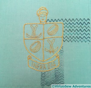
That didn’t take very long, did it. Suddenly I realise that I should have thought it out a bit better before I started. There’s a rippling pattern sometimes seen on plaster which I would like to recall in the background. It’s a simple pattern, but I think it could be effective – if I can get it right. In order, the trials I have done here show:
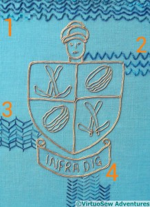
1 – Variegated Pearl cotton following a ricrac “stencil”, couched as invisibly as possible using a single strand of stranded cotton.
2 – Variegated Pearl cotton in a variation of cloud filling stitch that creates a ripple effect instead of the usual diamond pattern.
3 – Variegated Stranded cotton in rows of open cretan stitch, using three strands.
4 – Variegated Stranded cotton in Arrowhead Stitch.
I’ve discounted the first and third possibilities, but I’m still staring thoughtfully at the other two.
The Panel of the Excavation
Having completely redesigned the idea and the thrust of the second of the two background panels, I have to design the actual image I will use.
This image is cropped from a photo of the excavation from that wonderful collection of photos that The Egypt Exploration Society has allowed me to use as reference material for this project, and rather than using it just as it is, I’m going to alter it and maybe even add people to it…
There’s a lovely shape and pattern here, but the overall proportions of the picture don’t match those of the Map of Amarna, and they must. I need to make the design taller, without leaving myself with too much empty space top or bottom. A certain amount of empty space can be filled with stitching, but since this isn’t an abstraction of reality – like the map – but a representation of a moment in time, I need to be a bit more careful about what I do and how I represent everything, including the ground.
Here is the intermediate stage. I tweaked the contrast on the original photo and printed it out at a couple of different sizes, then my mother and I had an orgy of primary school paper collage, arranging and re-arranging groups of people to create a slightly busier, taller, picture of the excavation.
The next stage is to reinstate detail where I need it. The blobby effect of the reduced level of detail is just what I needed while planning the pattern of the excavation, but although the finished embroidery won’t have a high level of detail in most of the figures, I’m not sure that the lack of detail is in the right places…
This is not proving quick to develop!

