
Tag: experiments
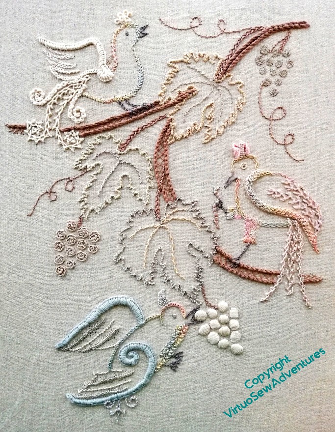
Stella’s Birds Finished
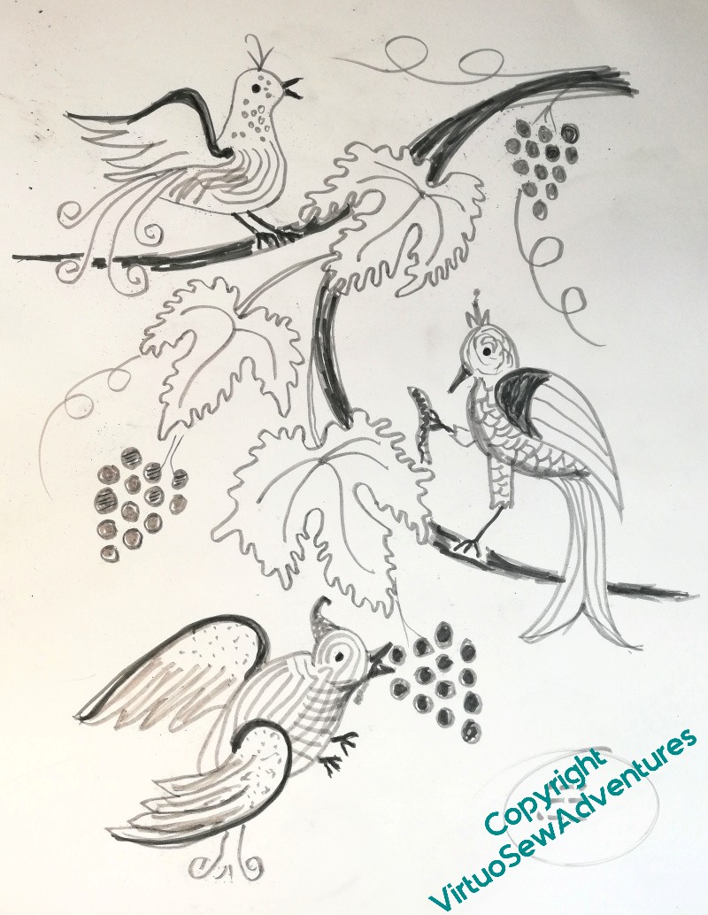
Once I got the design settled for Stella’s Birds, the principle elements remained pretty much unchanged when I got the stitching done. The details, not so much. The drawing shows where I intended to put most of the raised sections and the patterning. Note: intended!
I ended up not filling in any of the bodies of the birds, to leave the effect a little lighter and less blocky. Every time I tried to fill them in, they went grumpy at me, and if nothing else, I’ve learnt to pay attention when my embroidery shouts at me! Furthermore, Stabby has a leading edge, rather than a shoulder, and I simplified the structural details slightly, using the same stitch for all the curlicues, and another same stitch for all the stalks for the leaves.
If you recall, the idea was to create something that might evoke the idea of a light, carved wood, but using a technique reminiscent of Mountmellick Embroidery. It gave me a chance to use some well-beloved stitches, and to rejoice in the textural effects available from those stitches and the choice of threads to stitch them with.
I’m pleased with it.
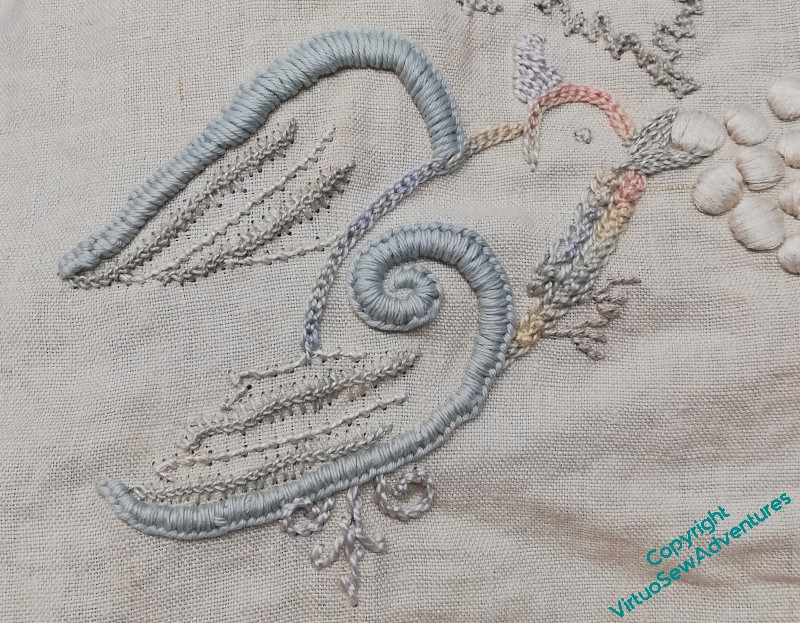
Stella’s Birds – Shouty Bird
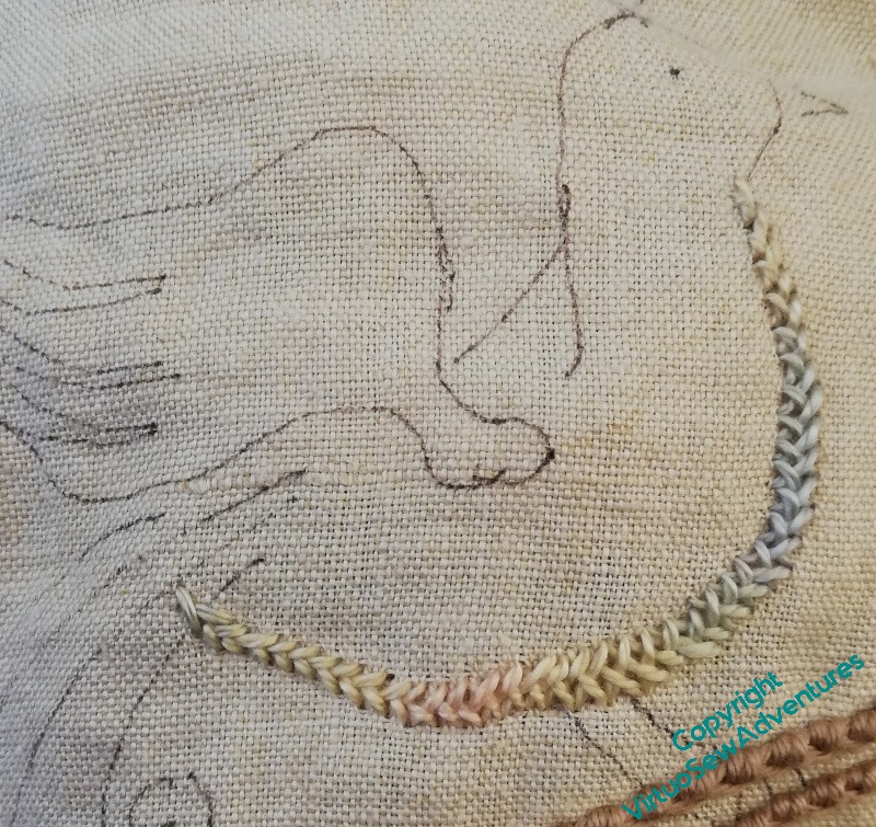
Shouty started off with basic herringbone stitch in the variegated thread. I do like the way the colours are shading here, but to be honest, I really didn’t think hard enough about the next few stages!
That’s been a bit of a theme with Stella’s Birds, there have been false starts and missteps galore, but I don’t mind too much. I am still learning to visualise the elements I want, and I don’t always see them clearly. Once I’ve stitched them, it’s much easier!
I’ve been keeping to the strongly raised leading edge of the wing, and I’m happy with that. But I’m not happy with the bird’s body – it’s either too textured, or not textured enough – neither fish, fowl, nor good red herring, as my Grandad used to say.
Furthermore, the two central lines of the tail are too bright, too white, shouting too loudly, louder than the bird himself. And the crest is untidy and coming undone.
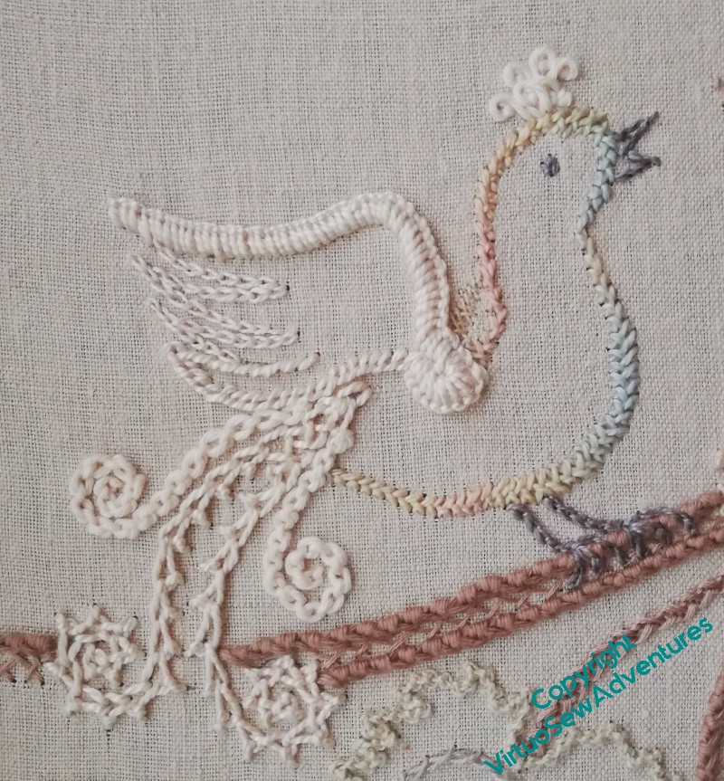
So a lot of it came out. I’ve knocked back the tail – a cream pearl cotton, rather than white. That was already better.
Then I went back to the variegated thread for the rest of the bird’s body, and I’ve left it unfilled – in the end, all the birds are mostly just outlined, with the odd point of detail.
The flight feathers are just simple lines of stitching, nothing too fancy, just enough. I like it much better now.
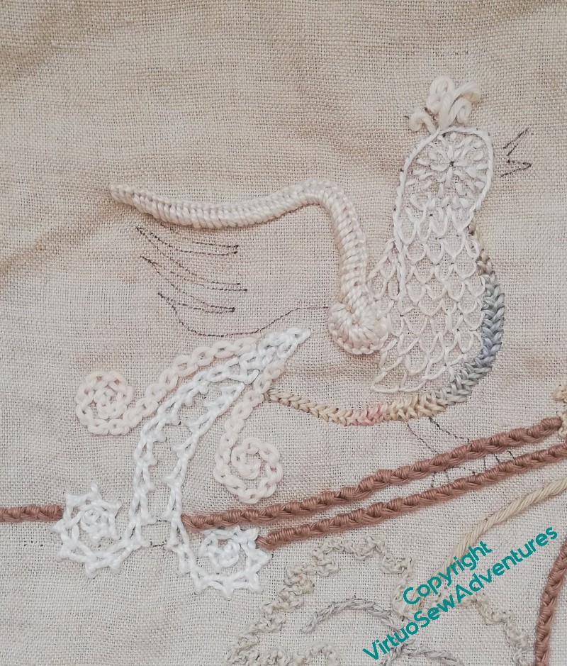
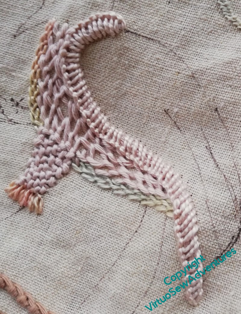
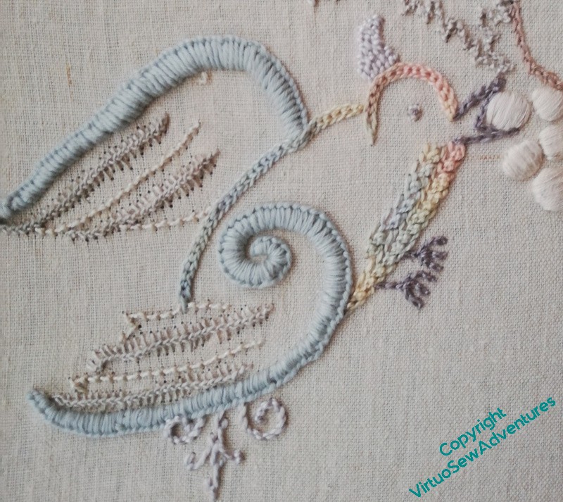
Stella’s Birds – Stabby Bird (part 2)
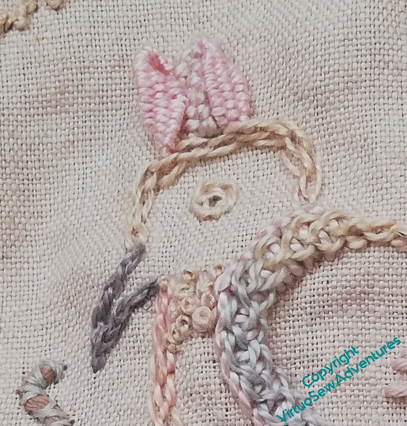
I wanted to play with some really raised stitches.. The little woven picots on the crest are worked with one end off the fabric, around a pin, which meant that I could give them a twist before stitching them down. It was a bit fiddly – the pearl cotton I was using is a bit on the chunky side, so the needle was too, and the space I had for it was a bit on the small side to be in proportion.
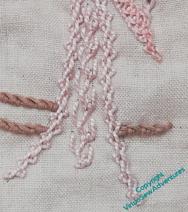
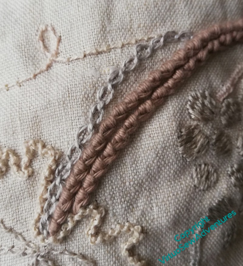
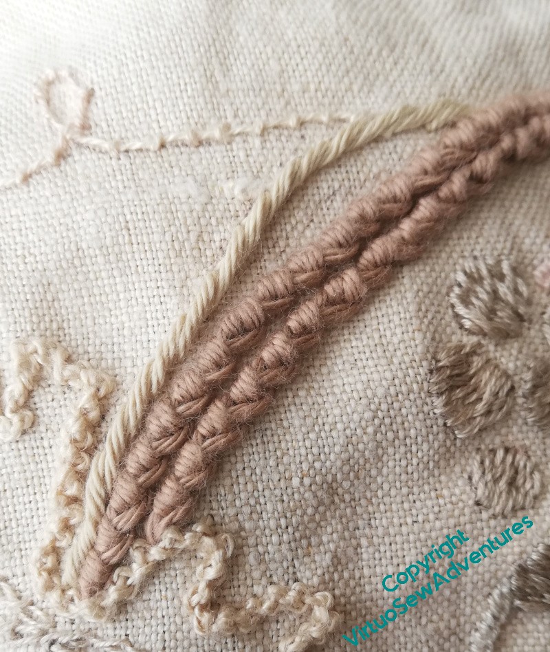
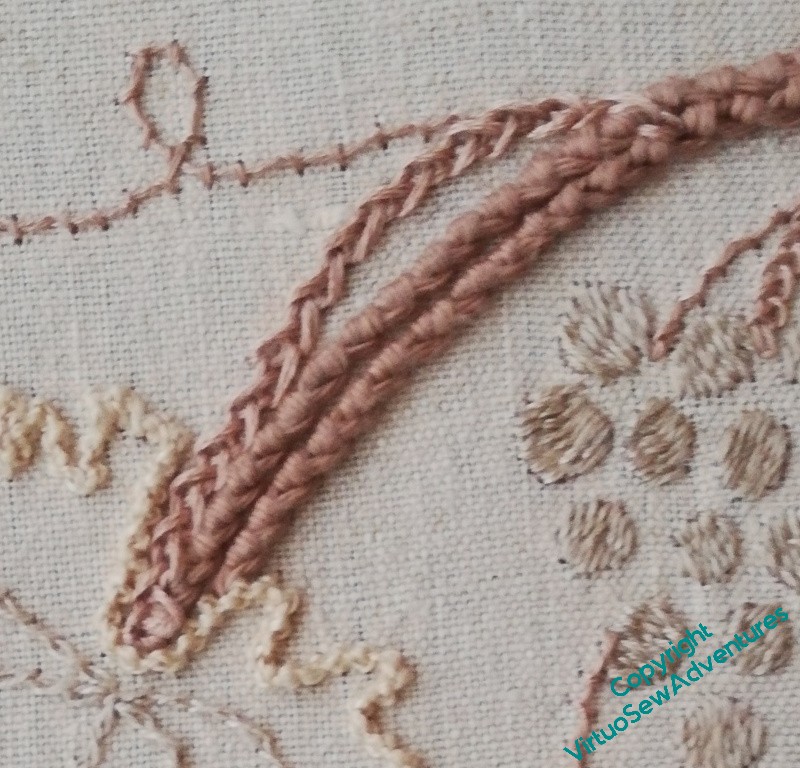
I’m using pearl cotton and soft cotton in tandem on each of the birds – the soft cotton ended up on the wing. The pearl cotton ended up on the tail: Mountemellick Thorn stitch down the centre, Spanish Knotted Feather Stitch down the sides. That’s another stitch I really enjoy and haven’t made as much use of as I would like to.
This whole panel is full of insufficiently-often-used favourite stitches. It has felt a little like coming home. I need to find ways to do more!
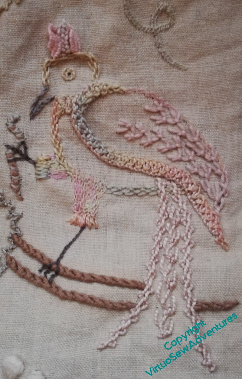
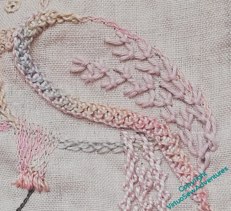
Tail in place, Stabby Bird only needed beak and legs to be finished.
Oh, and the worm to stab. I used a few short lengths of soft cotton, couched in a crossing pattern. I had intended something much more substantial, but when it came to doing it, it seemed to me that that would be too much, unbalancing the piece. So there is a worm, but not a very emphatic one!
I may reconsider the legs when the whole thing is done – they look just a bit dark in this photo. We’ll see. Tweaking and rebalancing is best at the end, when the whole context gives me a chance to decide more easily and definitively.
Stella’s Birds – Stabby Bird (part one)
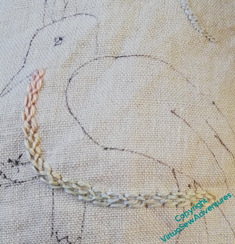
I started Stabby Bird quite simply with a line of feather stitch in the variegated thread, but then, my goodness, I wandered off the path of success and created a sad and congested mess!
I like the padded buttonhole stitch on the leading edge of the wing, but the tangle of fly stitches and feather stitches on the body , and the trellis stitch on the leg – nope, don’t like any of that. It’s too heavy and blocky, it doesn’t provide any light and shade, it just makes the wrong impression. Out it came!
I added a bit to the leading edge of the wing – feather stitch in the variegated thread. I like that, I think it’s fun.
Floral feather stitch on the wing – that’s a stitch I’m very fond of, but don’t often remember. I must do it more often! The top edge of the wing, and the leg, both in feather stitch in a very fine linen thread. It’s a bit pinkier than I had in mind, but it doesn’t draw attention unpleasantly.
Stella’s Birds – Bitey Bird
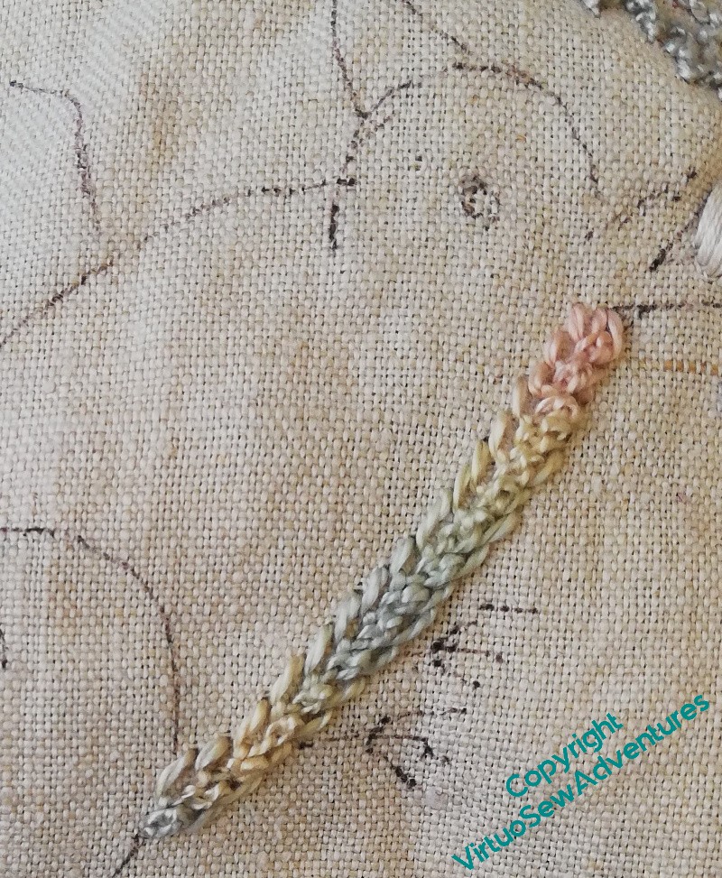
I decided that all the birds would have the variegated thread in them, and that it would be used to outline the body as a starting point. In the case of Bitey Bird, I used a single thread (“Watercolours” is separable into three plies, each of them just like a pearl cotton in behaviour) and started with Mountmellick Thorn Stitch. I did a second row to give Bitey a bib (as it were), and while it looks a little stiff as I concentrate on it, it will probably settle nicely when the whole panel is done.
The rest of Bitey was worked during the MathsJam Gathering, and I took no more photos of work in progress, so cue me desperately trying to remember what I did….
So here we go.. Hungarian Braided Chain for the bird’s head and back – see how it’s not such a thirsty stitch as the Mountmellick Thorn, so the colour changes spread out more? Vandyke stitch to separate the feathers, Cretan Stitch for the crest, Coral stitch in various other places.
I had specific areas I planned to make strongly raised, particularly the leading edges of the wings, so in this case I used Buttonhole Stitch, padded with chain stitch. I do love that redundant but highly ornamental spiral!
I finished Bitey – to a first approximation! – ten minutes before the formal part of the MathsJam Gathering ended, knowing, however, that various changes would be needed once I had the whole thing before me.
Not much changed, in the end – the beak darker, and outlined rather than solid, and the legs darker too. And now he looks nicely ornamental and joyfully voracious. Just as he should!
Stella’s Birds – A few false starts
As anyone who follows my adventures will know, I always expect to improvise and have any number of false starts.
This is Cording Stitch, which is a classic Mountmellick work stitch, so I wanted to include it. I enjoyed stitching it, but once the whole design was stitched, I had Reservations.
I stared for a while, and then decided that it wasn’t working in the context I was using it, somehow it looked too stiff, and the thread didn’t seem like the right colour.
Another false start was when I started the second vine leaf. I was planning originally to have a riot of different stitches across the whole design. I was happy with the first one, in Palestrina Knot Stitch, but I thought I’d try something else.
Wheatear Stitch is a pretty stitch, and it fits well within the textural theme of the design, but it’s too broad – however hard I tried – to deal with all the wiggles around the edge of the vine leaves. After some thought, I realised that keeping some consistency in the “background” – the branches, the leaves, the tendrils – would enable the birds to shine.
That insight helped me with the tendrils and the stems for the vine leaves, When I was first stitching them, I used different stitches, and different threads, and somehow the piece wasn’t hanging together. When I found a stranded cotton that matched the colour I used for the branches, and used that for the tendrils, and for the stems of the leaves and the grapes, that worked better.
The tendrils are now all in Coral Stitch, and the stems are a Feather Stitch variation. I’ve not been able to track it down, but it’s created a loose and pretty plaited effect that I’m very pleased with!
Dragonfly – first trial..
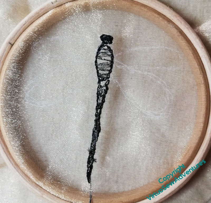
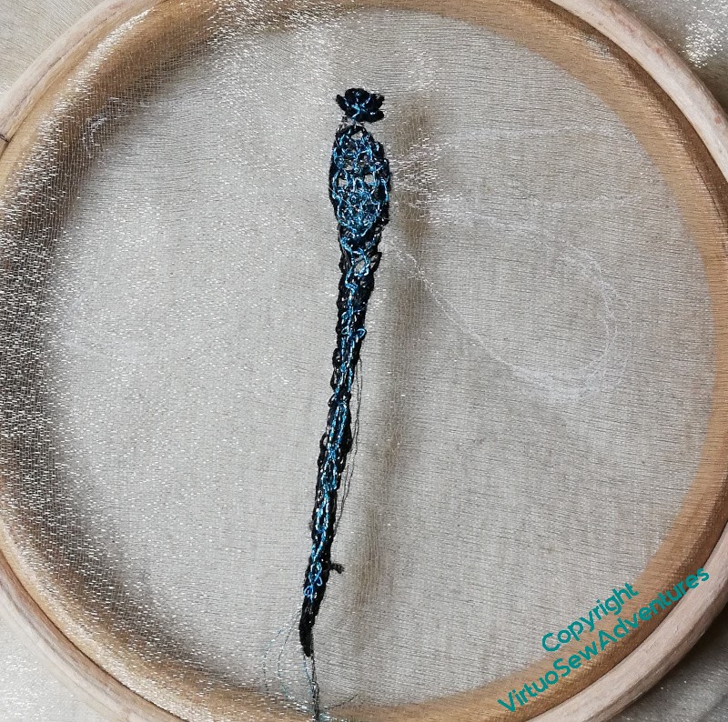
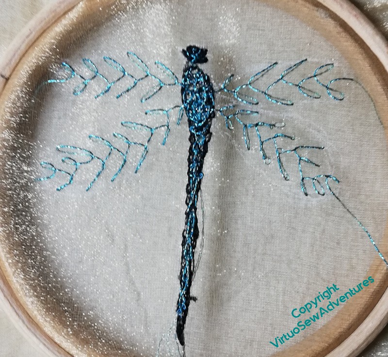
I find dragonflies and damselflies absolutely enchanting. I’m not entirely sure that I’ve got the right sense of delicacy and enchantment here – the threads are a little clunky, maybe, and the metallic thread wants a conditioner or something else to protect it as I work. I wanted to use a longish thread so that I didn’t have lots of tyings-off, but that just meant more opportunity for tangles.
I outlined the body and then worked straight stitches across in a dark metallic thread. The intention was to work needlelace type stitches in the coloured thread, catching into the dark straight stitches. The idea was that that would modify the colour slightly.
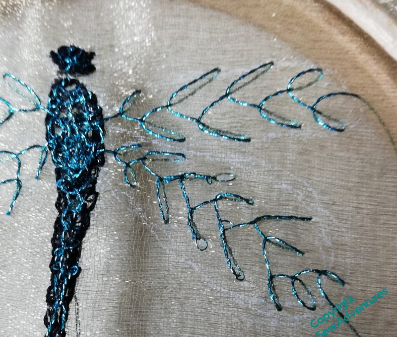
It has worked after a fashion, and the feather stitch veins on the wings also work after a fashion. But not quite.
I need to think of ways to finish off the veins in the wings so the stitches don’t unravel – glue? fraycheck? enclosure?
And I think I maybe need to do it again, smaller, and using a single strand.
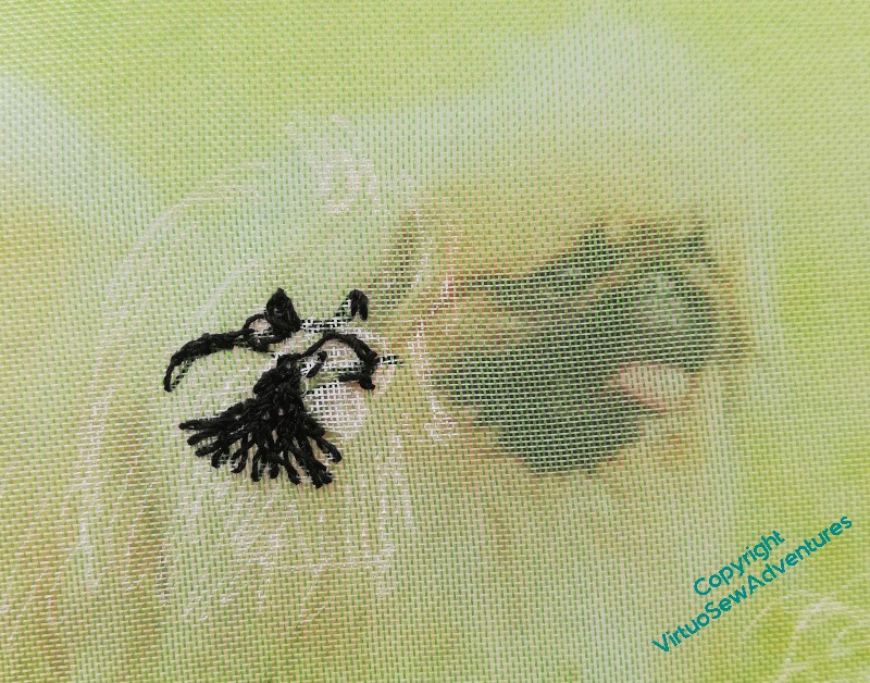
Mary The Pekinese again
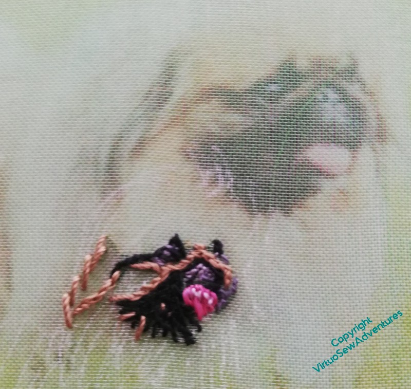
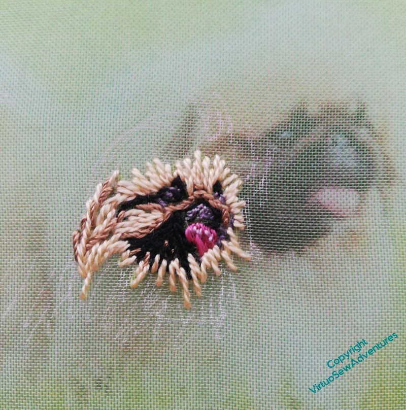
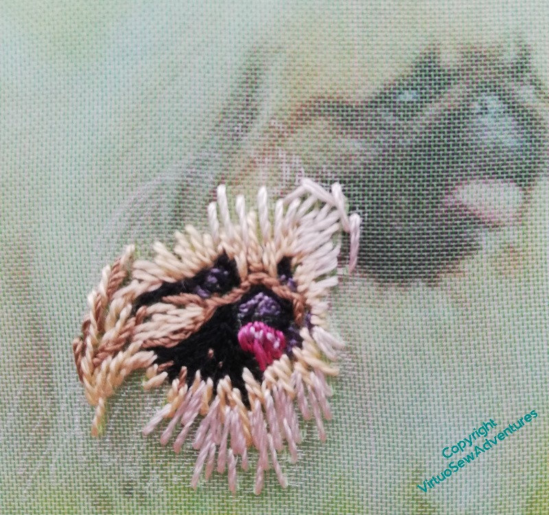
It’s quite hard to explain what I mean by the improvisatory, painterly approach I’m using for the assorted Animal Vignettes for the Conversion of Placidus project, so since Mary the Pekinese is relatively simple compared with some of the others – mostly straight stitches, rather than the tangle of Cretan I used, for example, for the little rabbit, I thought maybe a sequence of photos was the best way to show you what happens.
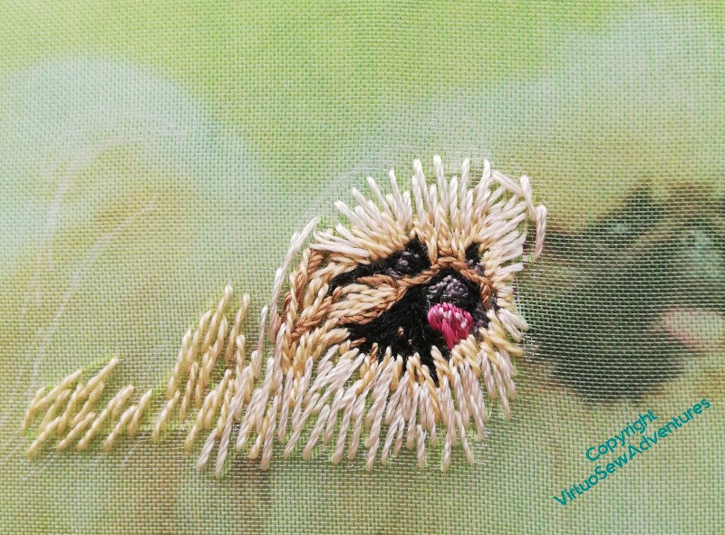
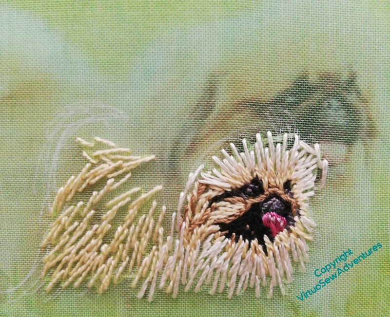
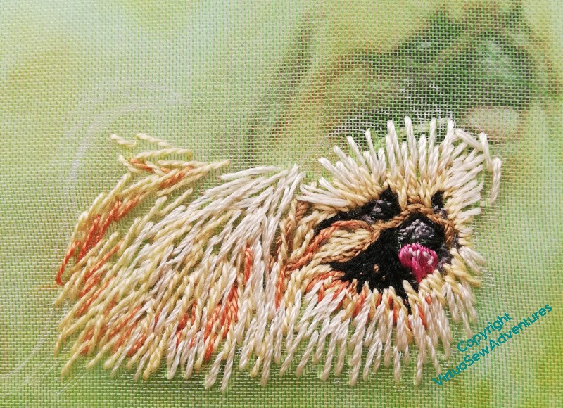
In each case I’ve put the frame on top of the photo I’m using. The finer, subtler details of the fur don’t really show through the gauze, but it does give you some sense of how I am selecting my threads to capture the impression of colour and texture that I’m working from. I’m not concerning myself at all with what fibre the thread is made from – if it does what I want it to do, I’m using it.
I’m also recollecting a quotation I found, attributed to the painter Edgar Degas : “If it were not difficult, it would not be fun!”
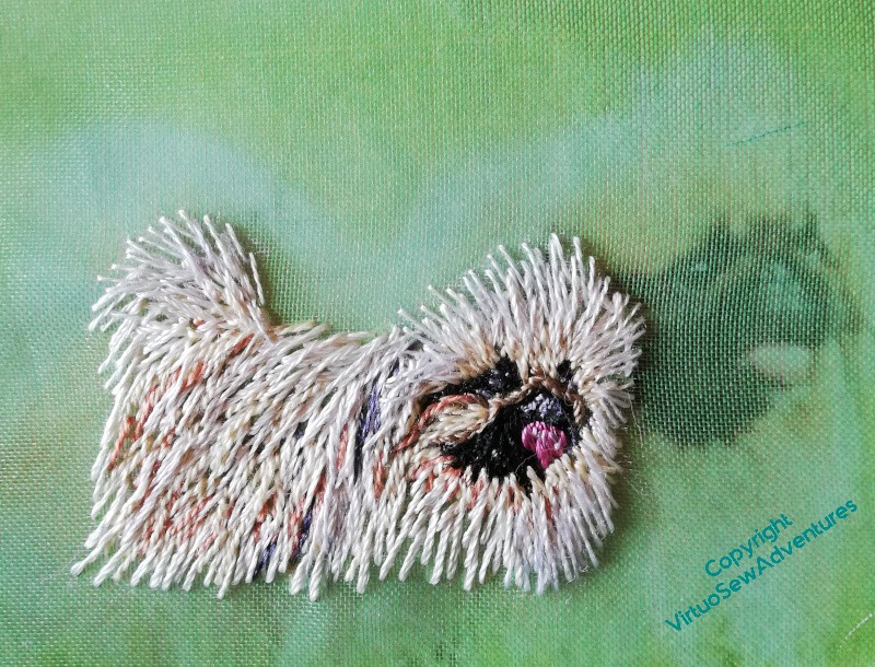
Worth the effort, though. I do think she’s turned out rather well!
Starting Mary the Pekinese
Now, although the starting impulse for the Placidus panel is the Pisanello painting (and I will be saying more about that in another post), it is also Elizabeth Goudge’s story, woven around an imagined version on an ancient wall. In the book, “The Herb of Grace”, the painting is already in the air, in your mind as you read, long before the mischievous young twins start pulling wallpaper off the pantry wall to reveal an ancient fresco.
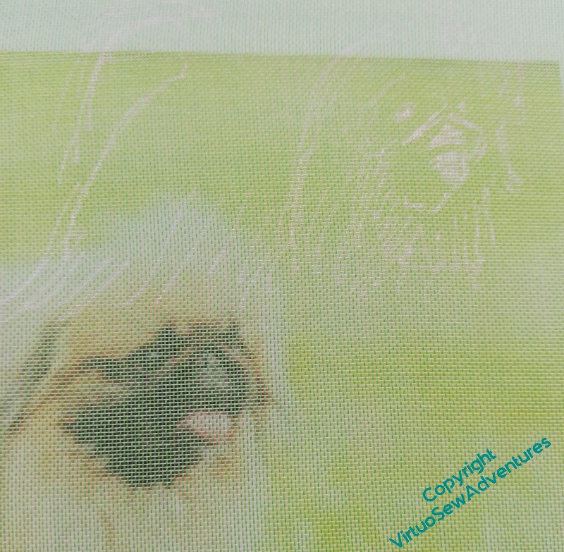
So although I’m not intending any humans other than Placidus himself to be in the painting, the family dogs are definitely going to be in there, and I am starting with Mary the white pekinese.
And here we go again – the sketchiest of outlines, a piece of gauze, and the sort of breathless pause you take when you Definitely Don’t Want To Ruin It.
As you can see, the stitched version isn’t the same size as the source photo, so I can’t quite lay the gauze over the top to find where to stitch, but I can compare the shapes I’m creating. The black thread (good grief, I’m using black thread!!) is a fine silk, as used on the woodpecker.
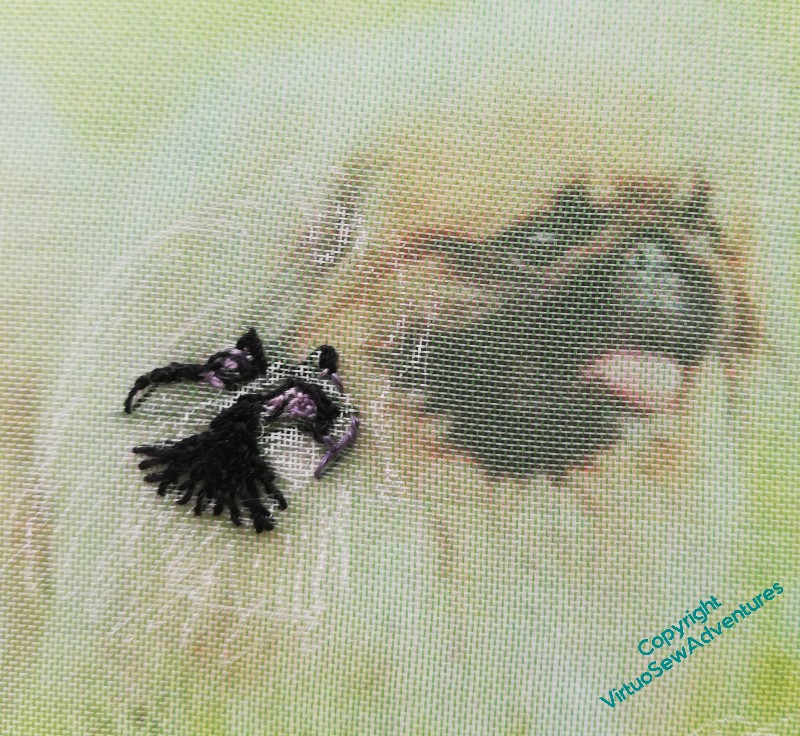
The grey thread here in the highlights is from a gorgeous variegated silk eight strand thread. I think I may have bought it for “Leaving The Tyne“, but to be honest, at this stage I have no idea! It’s going to be useful, though, because I have several shades to pick from within a single length..
And I am already startled by how well Mary the Pekinese is looking.
There’s going to be a woodpecker, too..
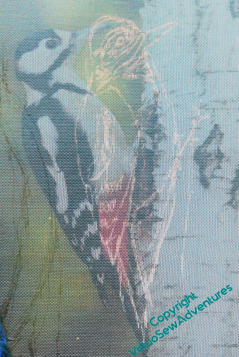
I am going to start rereading the book again, at some point soon, but in the meantime, since I’ve rediscovered my “Vision of Placidus” notebook, I know that one of the birds I was going to include is a woodpecker.
I’m going to have to go to the shops and find some more gauze soon, as well, but while I can squeeze an animal in to the existing fabrics, I will do so.
I’ve commented before, I think, that getting a readable and workable design drawing onto gauze is a non-trivial exercise, but this opaque white line (a Posca pen) is pretty much the best I’ve found so far, and it also allows me to help myself by putting a few extra emphases on the lightest parts.
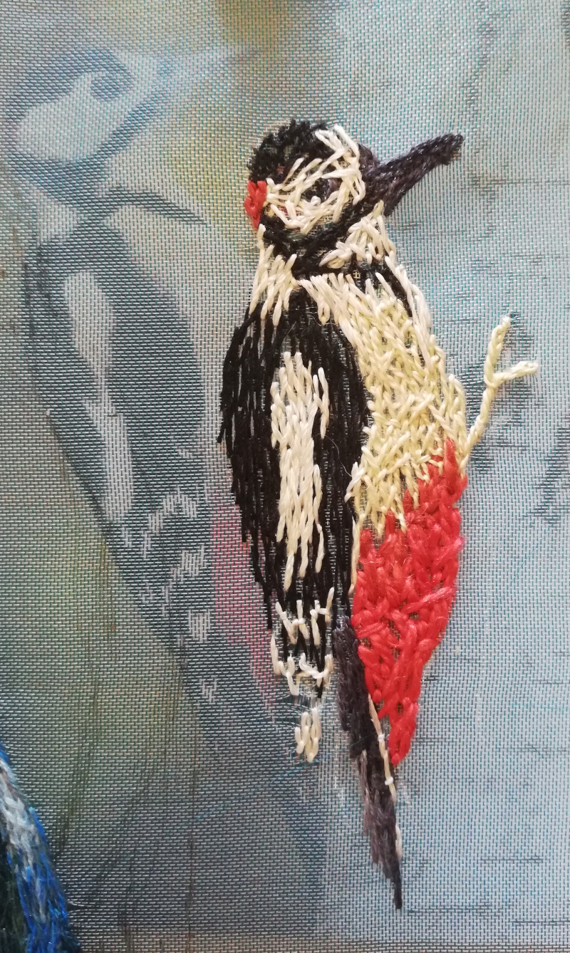
It’s amazing how quickly these little animals go, once I have a chance to get started. In fact, I was so entranced by how Woody was growing that I didn’t stop to take photos. In fact, I barely stopped to draw breath.
So this photograph shows a single afternoon’s work. I’ve used mostly fine silk threads, although his red breeches are a soft perle, and some of the white is probably cotton. As for approach – I simply tangle my stitches together, feather stitch variations, Cretan stitch variations, the occasional chain stitch or straight stitch. What I’m hoping is that the tangle of stitches will create a subtle variation in colour that will help the whole thing feel alive when it’s viewed from a reasonable distance.
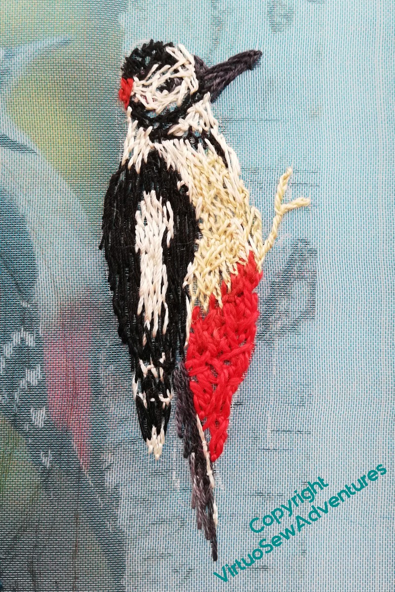
I didn’t have much I wanted to add, in the end. A few highlights, filling in the wings a little, and then really the woodpecker is done. I may add more when it comes to assembling the piece (remember all those seed stitches I added to the View of the Excavation once I started assembling the Dreams of Amarna panels?), but that can wait until I know what is being balanced with what.
I have been thinking, on and off, since I was asked about it after my talk, that assembling Placidus may prove to be an exceptionally challenging process. The panel I envisage is going to be about five foot by four foot, and I have a horrible feeling I’m going to be propping it against a wall or slinging it from hooks or even emulating one or other of the great Impressionists by somehow arranging a slot in the floor to drop it into while I tackle the top.
Maybe I shouldn’t be in too much of a hurry to finish this one…!