
Tag: experiments
An Experiment in Screen Printing
My current plan for the Dreams of Amarna panels is to overlay the embroidered panels with gauze panels screen printed with the heads of Akhenaten and Nefertiti, and since the panels would be hard to store safely and out of the way while I do the embroidery I have always intended to do the screen printing last of all.
Preparing my screen printing tests
Then, as I mentioned when I was beginning on the Lotus Fragment, I had a Dreadful Thought. What if the gauze killed all the colour in the embroidery? Would it be possible simply to brighten the colours of the embroidery (which would also involve abandoning nearly everything I have done so far) or would I be able to find a suitable fabric? Obviously some early experimentation would be required… Fortunately, “Creative Stitches and Hobbycrafts” happened shortly after my Thought!
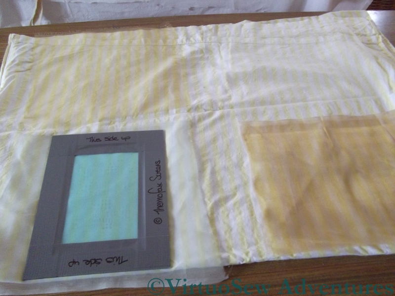
I found the stand for Thermofax Screens, and explained what I wanted to do. When I explained that the image I intended to print (in the end) would be of the style of an old-style newspaper print, the lady’s face cleared. Yes, she said, it would certainly be possible to print onto gauze, and when I eventually get to the appropriate stage, it would be possible for them to prepare screens for me based on images I provided. She also said that I should experiment with fabrics, but that synthetic gauzes were likely to prove more transparent than natural fibres. So I bought a starter kit and a screen that had some of the characteristics I expect my final images to have, and got ready to experiment.
Gazing Through Gauzes
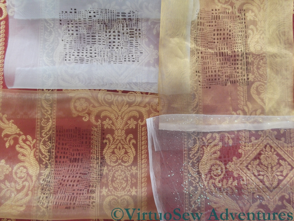
The photo shows, from top left, clockwise: Silk organza, Silk Tissue, Synthetic Diamond Mesh Net, and a Synthetic gauze.
I’ve overlaid them over a strongly patterned upholstery fabric, and it’s clear that the bottom two are going to be better bets. The silk organza all but obliterates the upholstery material, so embroidery is going to stand no chance, and the silk tissue is only slightly more transparent.
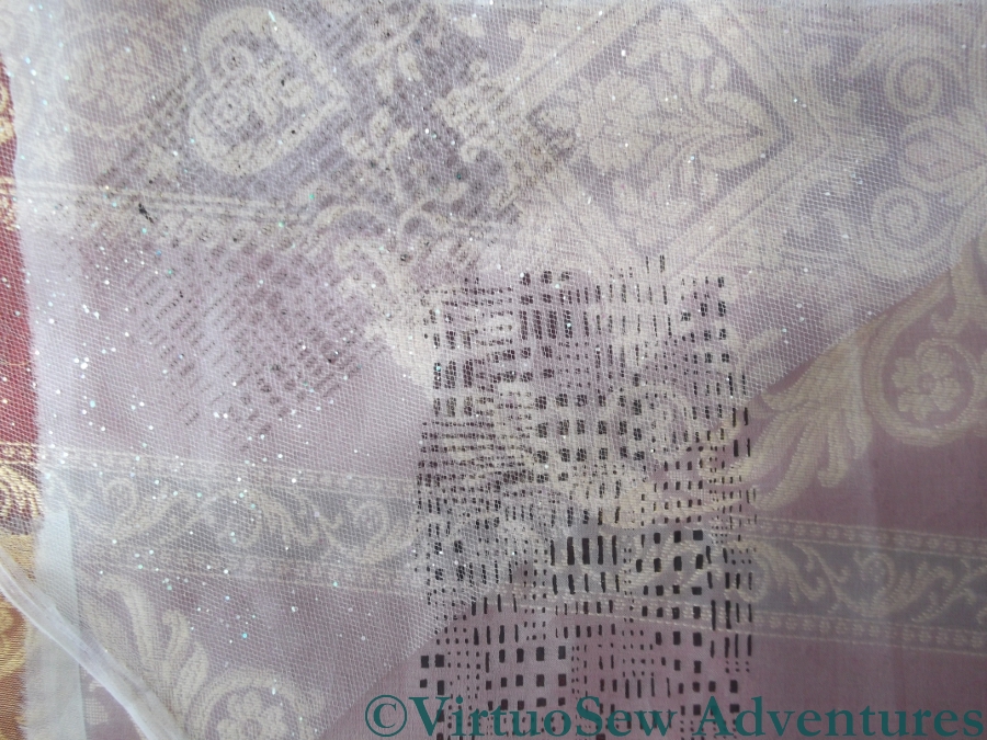
Diamond Net and Silk Organza
This photo shows the contrast between the heaviest and lightest of the fabrics I have tested. The silk organza took up most of the ink that passed though the screen, and the design shows up clearly, but it reduces the fabric underneath it almost to a pattern of light and dark, with very little colour. By contrast, the diamond net has to be laid over the organza before the print shows up at all, as you will see if you look at the middle picture at full size.
To be absolutely certain, I will need to set up some of the embroidery as I intend to display it, and then hang the gauzes about an inch in front, but as an early indication, I think this gives me enough to go on that I can feel reassured. There are suitable fabrics for my purposes, and basic single colour printing is no harder than I remember from university.
I can set my worries aside and continue embroidering – just so long as I bear my ultimate plans in mind!
Happy Holidays – The Sea Tractor At Burgh Island (part two)
The Sea Edge
Continuing the Saga of the Sea Tractor…
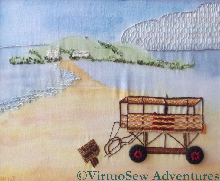
I worked the sea edge in short lengths of scroll stitch in close pastel blues. The idea was to create the sense of the ripples at the edge as a wave settles and flows back down the beach – but only on one side of the sandy bar that leads out to the island. I wanted to create the sense of a prevailing wind that came at an angle so that the waves would be more noticeable on one side than the other.
Cloud, island, and sea suitably depicted, I could leap in and render the Sea Tractor in all its outlandish and spindly glory.

The Sea Tractor
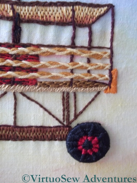
The Sea Tractor was great fun to do. I worked bi-coloured Dorset Buttons for the wheels, to evoke the painted metal hubs – pretty ambitious for my second and third Dorset Buttons ever!
The canopy and the base of the chassis seem to be in Brick Stitch, the main structural elements are either stem stitch or back stitch – the latter in particular for the terrifyingly spindly steps. Notice, by the way, that the steps themselves didn’t actually make it into the embroidered version. I wish I could say that was to emphasie the spindliness – that would be why I would do that now – but I have a strong suspicion that it was really either forgetfulness, or simply not being able to get the angles quite right.
Detail Of Sea Tractor
I used heathered stranded cotton (red and black) for the engine-mounting, and ordinary black for the exhaust pipe that goes up through the roof.
The planks that create the side barriers were a bit of a challenge. In the end I settled on two long stitches in one colour, couched down in herringbone stitch in a lighter colour. I think they make pretty convincing planks, and looking at the detail, I even added the bumper at the back.
I didn’t include the barriers of the back or far side of the sea tractor, but I do recall thinking about that point. Even a painter – even a photo-realist painter – has to edit their image to make sure that it “reads” properly. Often this is a matter of making sure that the colours of things in the background recede sufficiently, but sometimes that isn’t enough. In this case I decided that adding those details would make the Sea Tractor even harder to work out, and discretion would be the better part of valour.
There really wasn’t enough stitching on this piece to qualify for a needlework competition, but I enjoyed working it!
Happy Holidays – The Sea Tractor at Burgh Island (part one)
The Sea Tractor At Burgh Island
This piece was intended as an entry in a competition run by “Needlecraft” Magazine about 25 years ago. The brief was to recreate “A Holiday Memory”, and as it happened, that year we had had a great adventure – a ride on the Sea Tractor at Burgh Island in Devon.
“Needlecraft” had also run an article shortly before, describing and teaching Dorset Buttons, and they seemed perfect for the Sea Tractor’s wheels. Since time was short and the complexity of the Sea Tractor likely to be time-consuming, I also experimented with a painted background on my cotton fabric.
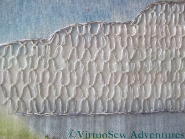
The Cloud Stitch Cloud
In retrospect, the painted background isn’t hugely successful, and it doesn’t have enough stitchery to qualify for high marks in an embroidery competition, but I enjoyed adding those details I did create, and so often in these early pieces, you can see “Rachel-Now” and her ideas prefigured in the stitch choices of “Rachel-Then”.
Looking at it now, I might have done better to work the cloud filling smaller, in white rather than pastels, over a painted base, and without outlining it. Still when you consider that the whole thing was an experiment….!
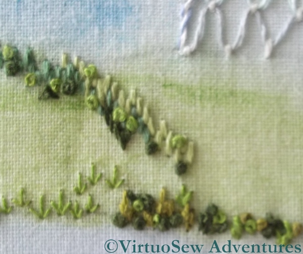
Hillside Stitch Details
The hillside details involved a lot of different stitches in lots of different greens. There are straight stitches, French Knots, chain stitches, and arrowhead stitches (upside down to look like shrubs). Again, if I were to work this now, there would be a great deal more stitchery in it, but I suspect that the combination of lack of time, and a disinclination to work areas of repetitive stitching led me to stop before I should have done.
What I can’t, now, recall, is whether I was pleased with it at the time. I’ve had it propped up in my living room since I rediscovered it, and I’m very tempted to crop it to show just the Sea Tractor itself – which would at least afford me the opportunity to re-block the piece and get rid of the ripples!
Making It Up As I Went Along – The Big Reveal
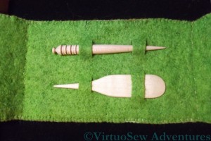
Stiletto And Mellor
The last time you saw the case I planned for the wooden mellor and stiletto, I’d cut the slits and described how I finished assembling it, using chain stitch down each spine, and blanket stitch around the edge.
When I put the tools in place, though, the whole thing seemed rather flimsy, somehow. I wracked my brains for a bit, and then thought that maybe if I were to needlefelt the layers together, it would give it a little more body.
I have a needlefelting tool with five needles in a single holder, so I fished it out, and stared at it pensively for a while. Fortunately it has a plastic guard around the needles, so I left the tools in place, and needlefelted around them. From both sides.
Finished Piece
Then I took out the tools, and felted between the loops so that the fabric behind the tools would stay in place and only the loops themselves would be free of the backing.
Finally, I needlefelted around the edge of the sampler panel and across all of the back, so that the whole case would have the same sense of solidity.
Here is the finished piece. You can zoom in on the picture to get a better view of the stitches, and the needlefelting that gives the piece its body.
I’m very pleased with how it turned out, and I hope my cousin will have many opportunities to use it, and will find the sampler panel inspiring and intriguing.
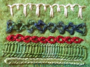
Making It Up As I Went Along – Part Three
Close Up 3
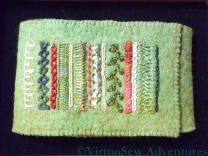
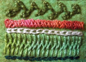
The final set of stitches for the sampler panel starts with Chained Feather Stitch, using very heavy plain pearl cotton
Braid Stitch (number eleven) is another stitch I’m fond of – I used it on the Frolicking Teddies Cot Blanket. It’s a stitch with a huge personality, so it needs to be used with care, but it’s a good one to have in the repertoire. The thread is another overdyed mercerised round yarn, and because braid stitch uses so much thread, it cycles beautifully through the colours and shows them off very well.
Stitch number twelve is Reverse Chain Stitch. This is a stitch I’d never used before the Goldwork Masterclass, but it is a very useful one, because for some threads it is much easier to work than conventional Chain Stitch.
Stitch number thirteen is Cretan Stitch. This is a great border stitch, but because the thread I chose – an overdyed soft cotton – was in a green that was rather close to the colour of the felt, I decided to add a row of Chain stitch in a very dark green silk to define the edge. It balances the cream Up and Down Buttonhole Stitch at the other end beautifully.
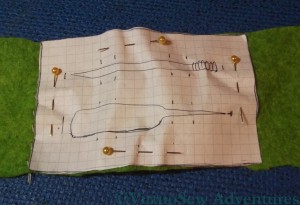
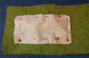
Layout For Tools
I double checked that I was happy with the layout for the tools by pinning an outline of the two wooden tools onto the felt.Since I used squared paper for the templates it was also very easy to plan where I would place the slits that would allow to tools to be held in place, and to line them up properly.
Then all I had to do was to make use of my mother’s buttonhole cutter to cut the slits – straight through the paper template – and reassemble the two layers. That was harder than I expected. I’d forgotten that felt is a very flexible material, and it bent and stretched itself, and needed to be coaxed back into shape, and then pinned firmly back into stability. Then I chain stitched down each spine, and blanket stitched around the edge….
Making It Up As I Went Along – Part Two
The idea of the sampler section was to give my cousin some inspiration for her own embroidery, and the chance to see what stitches look like in real life, since however good the book or the photo, it doesn’t come close to having the stitch there in front of you in real life! So I decided that it would consist of a sequence of stitches using a variety of threads. Naturally, I included some of my own favourite stitches!
Close Up 1
Here, the top one is Up and Down Buttonhole Stitch, using a stranded linen thread from DMC. I first used this stitch in the Persian Fantasy, and I’ve loved it ever since. In this case I’ve added to the ornamental effect by alternating long and short upright stitches.
The next is Diamond Stitch, using an over dyed pearl cotton from Stef Francis. This is a stitch I’ve never used before but often wanted to. I’ll use it again, I’m sure – it was rather fun!
The third – in standard Anchor pearl cotton – is Cable Chain Stitch, which is my favourite chain stitch variation. It isn’t always suitable, because it is a stitch with a very strong character, and sometimes something more subtle is needed, but I always enjoy stitching it.
The fourth is Ladder Stitch, which I struggled with so much on the Tudor and Stuart Goldwork Masterclass course. Here I have used an overdyed soft cotton (Stef Francis again) and found it so much easier to do!
The fifth is Heavy Chain Stitch, which I have found very useful a number of times. It produces a smooth, clean line, definition without texture, which can be hard to achieve in embroidery, which after all is a very textural form of expression!
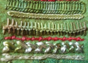
Close Up 2
The first new stitch in this photo (sixth in the sampler panel) is Loop Stitch, this one in a round mercerised cotton. It’s another stitch I’ve not often used, but it provides a great contrast in texture with the Heavy Chain Stitch above it.
Stitch number seven is Coral Stitch (remember I used it for the little girl’s hair in the Holiday Traycloth?). I used another overdyed pearl cotton – one of my favourite threads, because it brings stitches to life.
Closed Herringbone Stitch is next, using an almost untwisted rayon thread. This produces a dense plaited effect – very glossy and dramatic.
The final row in this second photograph, number nine in the sequence, is a combination of Stem Stitch set beside Outline Stitch. I know it looks a lot like chain stitch, but the two stitches are mirror images of one another!
Making It Up As I Went Along – Part One
Since Christmas is over and the present duly received, I can at last show you the present I made for my cousin. She’s become interested in embroidery, and when I saw some hand made, beautifully-finished wooden tools (a mellor and a stiletto) at the Knitting and Stitching Show in Harrogate, I decided that I would give them to her for Christmas.
That was all well and good, but I couldn’t think of a suitable way to present them, so I decided to make a case for them. I spent some time sat in the picnic area at the show, sketching different possibilities and trying to work out what other supplies I needed to buy, and when, between mid-November and Christmas Day, I would be able to make it since I was still suffering from tennis elbow (I still am, but not nearly as much!). I was beginning to threaten to put together a kit and giving her that when one of the other ladies at the table pointed out that I would still need to make one as a proof of concept (a phrase I never expected to hear at the Knitting and Stitching Show!). She was right, because it evolved considerably in the process!
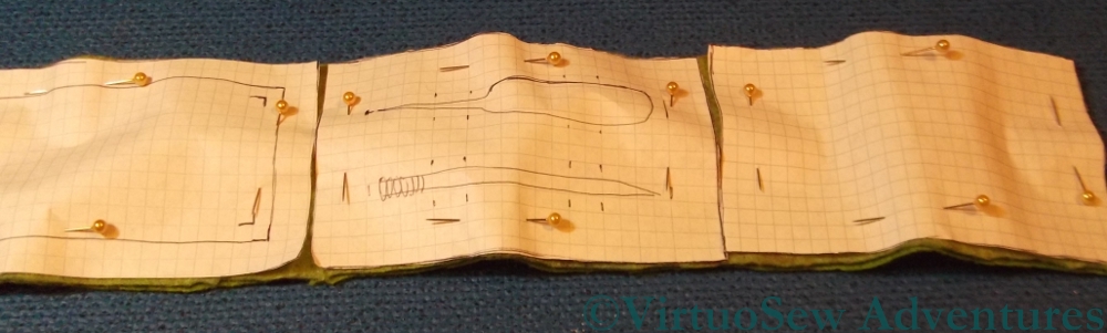
Final Layout Plan
In the end I decided to make a case with three panels, using two layers of felt. I drew out paper patterns for each panel, and pinned them on to the piece of felt I had decided to use. I had considered putting a panel of canvaswork stitches on the front – I even bought a piece of congress cloth to use – but then decided that since she is interested in embroidery, it should be a panel of embroidery stitches.
Layout For Sampler Panel
As you can see, I also had second thoughts about the size of the sampler panel, and made it slightly smaller. That meant that there would be a wider border around the panel – always an improvement!
I ran tacking stitches around all the design elements to make sure I knew what was where, and then started thinking about the stitches to use for the sampler panel.
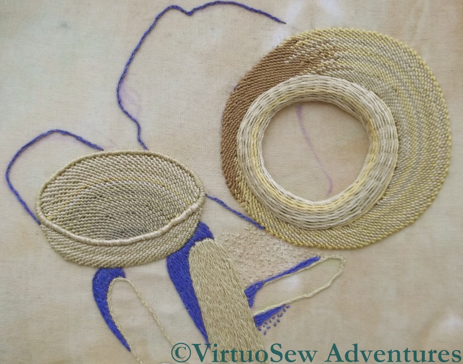
The Crock of Gold Hoard – The Ground And The Shadows
There’s been a frustrating hiatus in my stitching life of late – I’ve had tennis elbow, and have had to write up old embroidery projects for you instead of making progress on any of my current ones. I’ve been going stark, staring mad with frustration, because even holding a book has been painful.
Beginning The Shadows – Take Two
However, I’m beginning to get back to it at last. Cautiously, so there will still be older projects interspersed with the current ones!
I’ve been doing a few stitches here and there while I’ve been trying to rest the elbow, as much as anything else to gauge my recovery (or lack of it, as it sometimes seemed!). So now you can see that I’ve nearly outlined all the shadows. There’s just the shadow inside the pot to deal with and it occurs to me that I might need to find some tarnished purl to create the effect of the shadow on the metal inside!
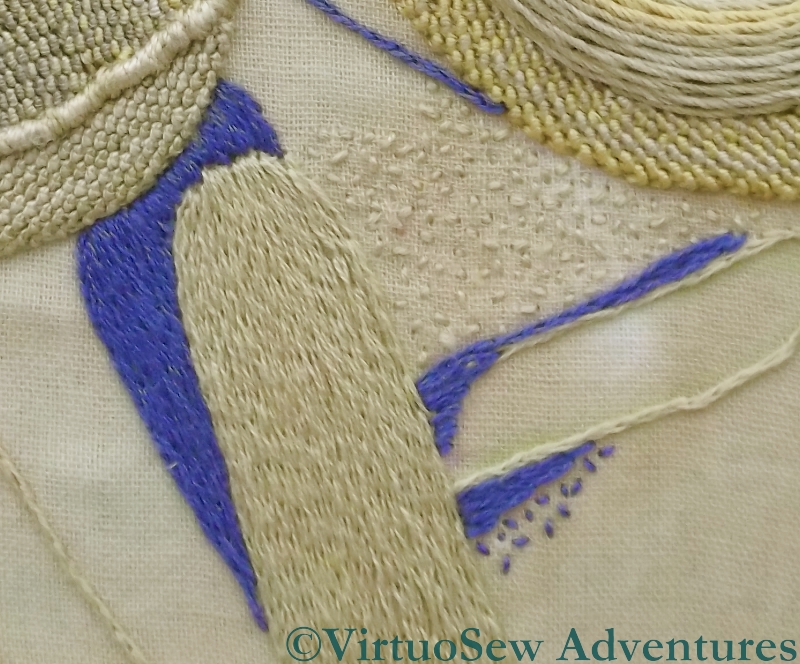
Close Up Of Sticks
I’ve also made a start on the sandy effect seed stitches, in a small section between the pot and the sticks. That’s going to challenge my boredom threshold, even though I don’t intend to have the seed stitches all over the background!
This close up shows that I’ve also managed to fill in the first of the sticks, using split stitch filling. I need to add some highlights later, because as it stands it’s a little flat.
Still, it’s great to be back!
Dressing Cécile
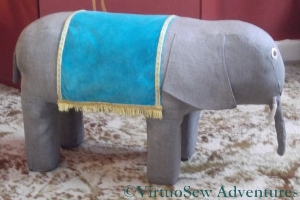
Cécile’s Saddlecloth
Once she was fully reassembled, with a neat patch across her tummy to hide the joins of the sides and ends, I was very keen to put back Cécile’s glorious turquoise velvet saddlecloth. I started sewing it on in the centre of each long edge – roughly where her spine would be – and worked outwards, to make sure that the saddlecloth didn’t end up squiffy. I’ve also not stitched too closely, because I want the fabrics to be able to move a little when I put my feet on the finished footstool and the padding “gives” a little.
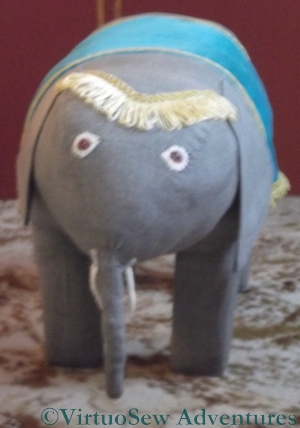
Cécile’s Browband
I should note in passing that while Cécile is unquestionably a darling, she’s been the most preposterously obstreperous pachyderm I’ve ever encountered. Getting her legs re-covered was hair-raising, getting the body attached suitably was a challenge and tidying up the undercarriage so that Cécile stayed in one piece involved the sort of contortions that make me wish I’d been doing yoga all my life!
Grandmama gave Cécile a browband of upholstery fringe – probably left over from one of the many lampshades she made – and that was the only real casualty of her years in the loft. Even a run through the washing machine didn’t revive it, so it was abandoned and replaced with a similar piece left over from a lampshade recovered by either my mother or myself. The tradition of keeping and reusing scraps is very strong in our family!
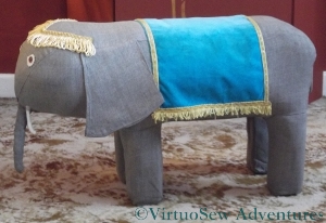
Cécile Finished!
So here she is, refurbished and back to her former glory. I was very fond of Cécile when I was a child, and I’ve enjoyed bringing her back to life.
Even it she was occasionally obstreperous!
Reconstructing Cécile
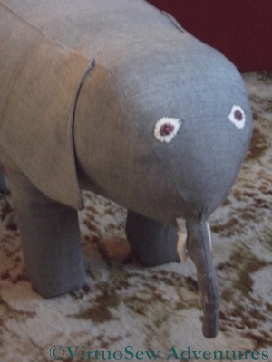
Face of Cécile
Allow me to introduce Cécile.
Grandmama made her for me when I was about two or three, we think, and I remember her as a constant and beloved part of my childhood. We rediscovered her recently in my parents’ loft, and I thought it would be nice to have her in my own living room, as a footstool and a seat for visiting children. Unfortunately, when I sat back and put my feet up, the stuffing collapsed, and Cécile began to look very sad indeed. So we skinned her (as it were!), washed the skin, and started looking for a suitable replacement for the padding.

Padding For Cécile
In the end, we used a spare cushion pad, and rearranged the stuffing slightly to leave the cover free to be stapled through. I think my grandfather must have made the basic internals – four sections of square wood for legs, screwed firmly into some equally solid half-centimetre thick hardboard.
I have all of Grandmama’s books about needlework and crafts, and there’s nothing like Cécile in any of them, so I think Grandmama must have made her up as she went along. I can’t imagine how she managed to assemble the whole thing unaided, because it took the combined efforts of my mother and myself to put the stockings on, and covering the assembly with the body was even more of an adventure.

Cécile Reassembled
But we got there in the end!
I added more stuffing while I was doing the assembly, to make sure that the finished piece would be nicely padded, and swapped the ears around – there was a hole in one side of one of them, which is now the underside.
I’ve also replaced the feet. Grandmama had glued small sections of carpet to the bottom and then stitched around the edge with wool. The carpet was looking distinctly sad and tatty, so I removed it – not without considerable effort! – and replaced it with two layers of grey felt.
Cécile is now reassembled, and just needs some of her finery re-instated. I’ll write about that when I have returned her to her former glory.