Tag: finishing
Planning Titles for the Excavation
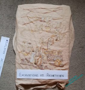
You may remember that I was a bit concerned about ensuring that the View of the Excavation properly balances the Map. When I got the Map out again it was much more emphatic than I had remembered.
Eeek!
Then came a suggestion that if I gave it a title – at the bottom, rather than the top – it would add visual weight, and the presence of lettering on both would enhance the sense of a conversation between the pieces. I liked that idea, so I started making plans.
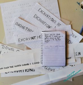
I started with a single large title, but the Map has title and subtitle, so I thought, maybe what I need is title and surtitle. Furthermore, I thought, the surtitle should be in Mary’s words. I’m sure she would approve of my foregrounding of the artifacts and the Egyptians, both ancient and modern, but had she not written so enchanting a book, I would have missed out on years of delightful adventures in embroidery. So, that gave me a perfect excuse to curl up with the book, notebook by my side, which enabled me to feel I was making progress while I was fading in and out of focus with Covid.
Since I’m not at ease with lettering, once I had chosen – or at least half-chosen – my text, it required a whole lot of squared paper and letter counting, and a depressingly uncolourful desk for a while, as I tried to bring it all together. This is the Very Unglamorous side of planning and creating. I’m getting better at it as I learn and invent more techniques to help myself pull my ideas together, but it is still very much the part of inspiration that isn’t inspiring!
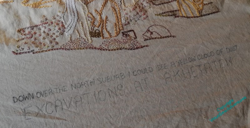
Finally, I chose my extract: “Down over the North Suburb I could see a yellow cloud of dust”, in the smaller capitals of the subtitle, and “Excavations at Akhetaten” in the larger capitals, and transferred it by prick-and-pounce. Progress!
Beginning the additions to the Excavation
There will be a lot to do, I think, to bring the Excavation up to balance the Map properly. In my usual fashion, I will sneak up on this, doing what seems obvious and then waiting to see what seems necessary.
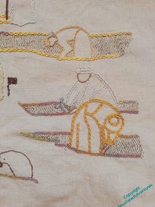
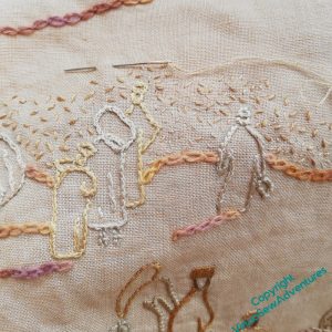
The first thing that was obvious was that something should be done to point up the idea of the trenches being dug. Row upon row of vertical running stitches seemed to me to suggest the walls of a trench – maybe not accurately, since the book suggests more of an open area excavation. The photographs I used as my source for this, however, suggested that there were at least a few individual trenches.
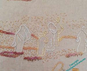
The next obvious element was a dust cloud to suggest activity stretching into the distance. Tiny random seed stitches in two or three shades of stranded silk were, again, the obvious choice, although I do wonder, now, whether those will be sufficiently emphatic when I set the panels side by side again.
As I believe I’ve already mentioned – random stitching is really quite difficult to achieve!
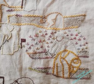
At this point I decided it needed much more “weight” at the bottom of the image, and chose to use tête de boeuf stitch (upside down to resemble a plant) as I did originally on the Map to suggest the cultivation on the far side of the river. These tête de boeuf stitches are much bigger than the ones on the map, using two strands of the variegated silk thread, and I’m going to spread them right across the breadth of the panel towards the bottom.
More work needed…
If you compare these two layouts, you may notice a bit of a difference.
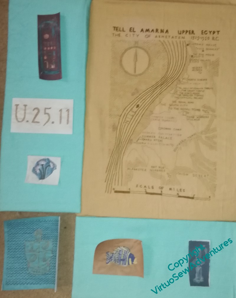
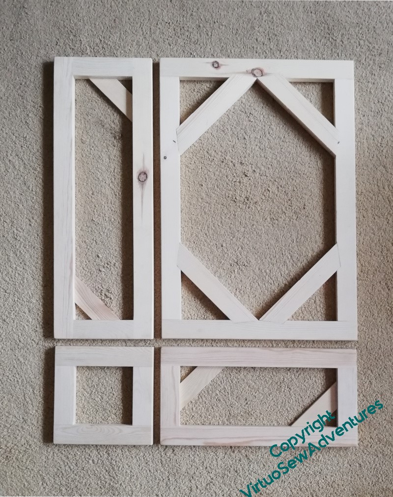
When I pulled out the panels to give the measurements to my friendly carpenter, I reduced all the dimensions slightly to concentrate the whole assembly. I’ve noticed recently that whereas watercolours are the better for being mounted with plenty of “air” around them, embroidery is often the better for being framed quite closely. This will help me to achieve that.
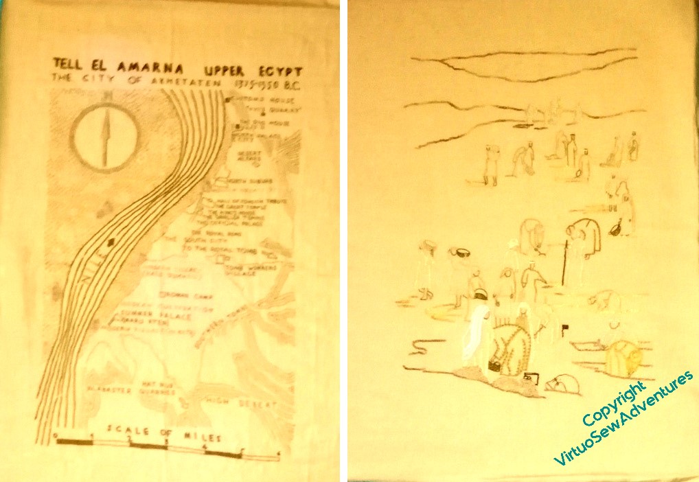
When I have the coloured fabric mounted, I will be able to continue planning the placement of the spot designs. And in the meantime . . . I’ve had to pull out the colour and contrast above here, to try to show what is worrying me here. These two panels are supposed to balance each other, and I don’t think they do, or at least, not yet. I think I need to do a bit more stitching on The Excavation so it can stand up to the Map of Amarna.
I’ve started in the far distance with some seed stitching. It’s going to take some time to get the right level of texture in the right places, but it’s always good to have made a start!
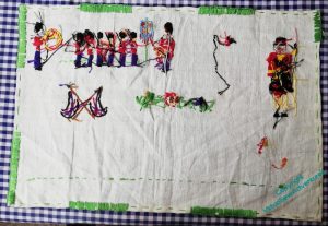
Mystery Finished
Remember this?
I found it on the blocking board and decided that it would be Finished And Done this year.
One of the reasons I didn’t persevere with it the last time I found it was that I was rather daunted by redrawing the bits of the transfer which had worn away while it was hidden – or maybe not transferred properly in the first place.
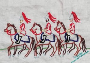
In particular, the bottom row was a procession of Horse Guards, and horses are rather tricky to draw. I was interested to find that the past few years of working on my painting and drawing had made me much more calm in the face of that particular challenge. I don’t say my horses are particularly good, but they don’t look like elephants, and I count that a win!
I also decided that, since there was no way I could reconstruct the way the design was intended to be done, I would do something different, so all my additions are line stitched.
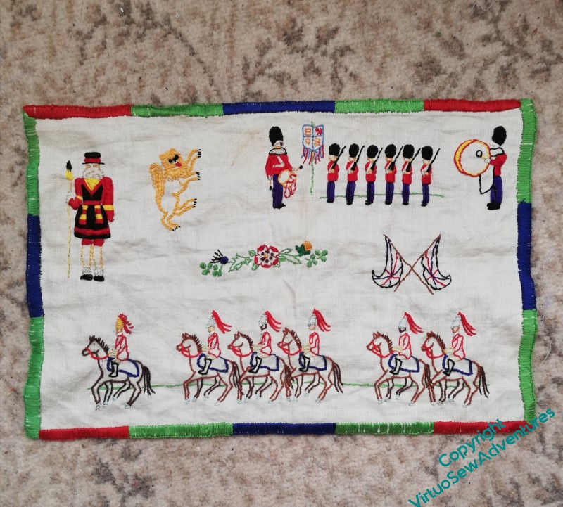
Apart from the border, which as you see I have blanket stitched to create the effect of one of those striped borders some banners have. Another alteration was to make the faces of the troupers a variety of different shades. A few years ago I might have picked one shade and used it for all of them, more concerned with pattern than verisimilitude, but our Armed Forces have never been restricted to white Britons, and now I am more concerned not to obliterate that service in the name of Design.
And it was finished before the death of Her Majesty Queen Elizabeth II. If, as I half-suspect, it was a magazine design for the Coronation, I managed to finish it within the 70 years of her reign.

