Tag: Opus Anglicanum
Researching Rahere..
It’s going to be some while before I can start stitching on the other Medieval Movers and Shakers (I’m going to have to find a better title for that quartet, they’re going to drive me demented if I don’t!), but given I have much research to do, that’s no great difficulty.
I have been accumulating books – which is also rather a delight in any case.
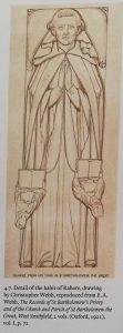
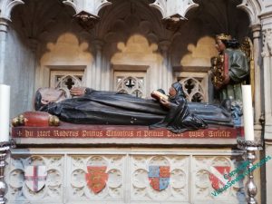
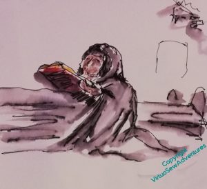
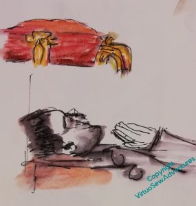
The history of the church Rahere founded duly arrived a week or so after our visit, and proved very interesting indeed. It included among the illustrations this engraving of the tomb effigy on Rahere’s tomb. The tomb was not made for Rahere when he died, but about four hundred years later, so one should take the likeness of the face with a pinch of salt, but I’m sure it will have got his Dominican robes right, so it may be useful in planning how I depict him. (I’ve just double checked – white cassock and black cloak, so for the purposes of the embroidery I can go for the look of undyed wool for the cassock, and dark greys and browns for the cloak).
I also found a reference to an epic poem called The Romance of Rahere, thinking it might at least be atmospheric.
Well, no. It’s set in the Civil War, about the orphan daughter of the vicar of St Bartholomew the Great who is named after the founder (poor lass) and who dies in the church during a thunderstorm, leaving the boy who wants to marry her absolutely distraught, and becoming a soldier to seek death, but surviving and returning home to right the wrongs caused by his greedy and abusive father.
So not even remotely helpful!
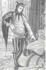
In the Kipling tale in which he appears, “The Tree of Justice”, Rahere, the Kings’ Jester, is described as: “more of a priest than a fool and more of a wizard than either“, and his jester’s outfit as parti-coloured in black and red. There is so little information about the person that I’m going to be using that as the basis for my characterisation. My current idea for the embroidery design is to have Rahere in his Dominican Robes, with a model of St Bartholomew the Great in his hands, and his jester’s cap at his feet. The border – well, maybe the flower London Pride, maybe bells (for the jester) and scallop shells (for pilgrimage). We’ll just have to wait and see!
Another decision to make!
Underside couching, I’ve decided, is rather like satin stitch. In concept it is simple, not to say obvious. The execution, accurately and aesthetically, is very much less so!
I had intended to use the gold thread left over from the Amarna Family Group as my thread for William’s background, in the interests of economy, if nothing else, but then I had advice from Tanya Bentham and others, to at least try the Smooth Passing, which might for a multitude of reasons behave rather better.
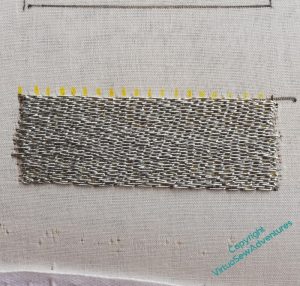
So here you see the second practice block started, again using silver, but this time smooth passing thread.
The passing thread is, as suggested, much pleasanter to use, and creates a smoother and less shadowed surface, which in turn, I think, should help the pattern I intend to use. Which, you may note, I’ve not yet got around to practicing!
However, that brings me to my decision. I do not think that I can be certain that the spool of Gold Smooth Passing I have left over from a Thistle Threads project will finish the job, so I shall have to buy some smooth passing. And it turns out that Gold comes in more than one shade!
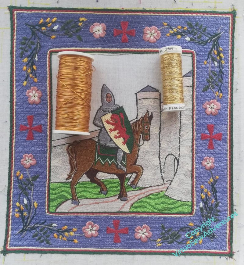
The decisions are never at an end, are they…
And since I’m working on pulling the Amarna pieces together properly at present, I can’t claim to be giving my whole mind to the decision-making!
Researching Rahere
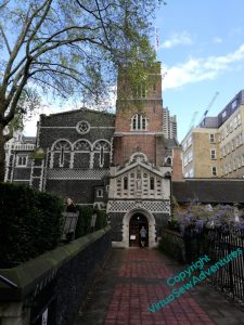
A journey through London gave me the opportunity to visit the Church of St Bartholomew The Great in Smithfield, which is indeed very close to the Hospital Rahere founded, known today as St Barts.
It, and Rahere himself, have had varying fortunes and visibility over the years, and, for example, Rahere’s tomb was built in the fifteenth century, nearly four centuries after his death.
I haven’t yet discovered whose shields are displayed there, but it seems likely I will. The Rector was involved in a wedding rehearsal when I arrived, but I carried on quietly sketching and walking around the Church, staying out of the way as best I could while still continuing to work.
And I had my reward in due course, when, on the principle that Bairns As Don’t Ask, Don’t Get, I tracked him down afterwards and asked what, if any, information they had on Rahere and the early days of his foundation.
I may have bewildered him slightly – I have the impression that’s not the first thing people usually say! – but he took it well, and informed me that as this year is the anniversary of the foundation, a substantial History has been produced. So when that arrives, I shall have more to say on the subject, I’m sure!
Practice Beforehand
The crosses in place, and the whole border looking very much like a Book of Hours, or at least, a rather tame Book of Hours, I sat back and drew breath.
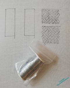
Having got William and his border done, and being really very pleased with how he’s turned out, I now need to tackle the sky. And from the first, I have intended the sky to be in basketweave pattern underside couching, which is an entirely new technique to me.
Regular readers may have spotted that I only rarely practice beforehand, regardless of the technique, preferring to throw myself headlong into the novelty, mind concentrated by terror. The exception tends to be in goldwork, when an exception occurs, and indeed, I had some of the fabric stretched in a frame, ready to practice, well before I had got William to that stage of finishing. Mindful of the advice from Tanya Bentham’s Opus Anglicanum book, however, I decided not to try practicing while I was still working the silk. In winter it is hard enough to keep the hands from catching on silk without making it worse by using metal threads!
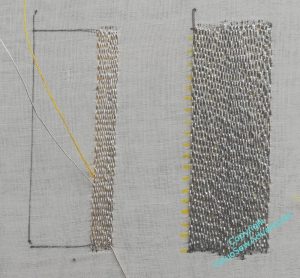
I’m using silver for my practice pieces. One could practice with silk, or pearl cotton, but they would both spread and cover any failure to keep the lines close. I think this silver is the same size as the gold I intend to use, so it will make a better practice material.
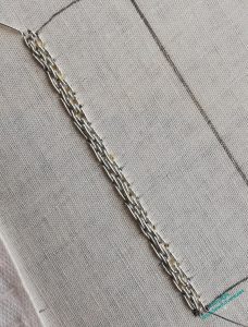
It’s easy enough to understand the principle underlying underside couching, but there are all sorts of hazards, As always, I suspect that once the management of the thread becomes second nature, all the difficulties will fall away, but packing the thread closely without cramming, making sure the stitches lie happily on the surface, and stopping the couching thread (a sturdy linen, beeswaxed before use) from showing, are all proving challenging at present.
I am determined to practice this properly, so I’m going to do this inch-wide strip before even considering practicing the basketweave pattern.
I have been looking further at Ko-fi, and how it might be used as a shop front, at least for digital items, and as an experiment, I’ve uploaded the Hug For A Handbag instructions to my Ko-fi Shop as a free/pay what you feel download. If anyone would like to go through the process and tell me what it’s like, and give me the opportunity to see what happens from this side, I’d be very grateful!
William, as far as he’s gone
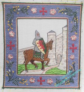
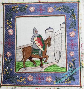
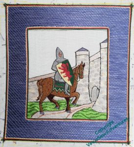
I realised when I came to write about beginning to practice underside couching, that you’ve not seen William for a while, so here is a a quick update on progress.
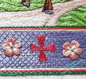
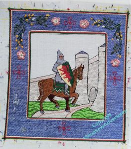
I got all the broom and dog roses done on the border, and then sat back to look at it. You may recall that I said last time that I thought that I would be filling the crosses, but I wanted to sit back and stare again, just to be sure.
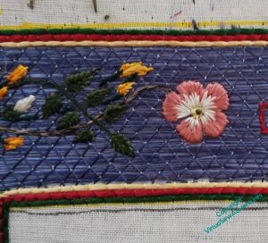
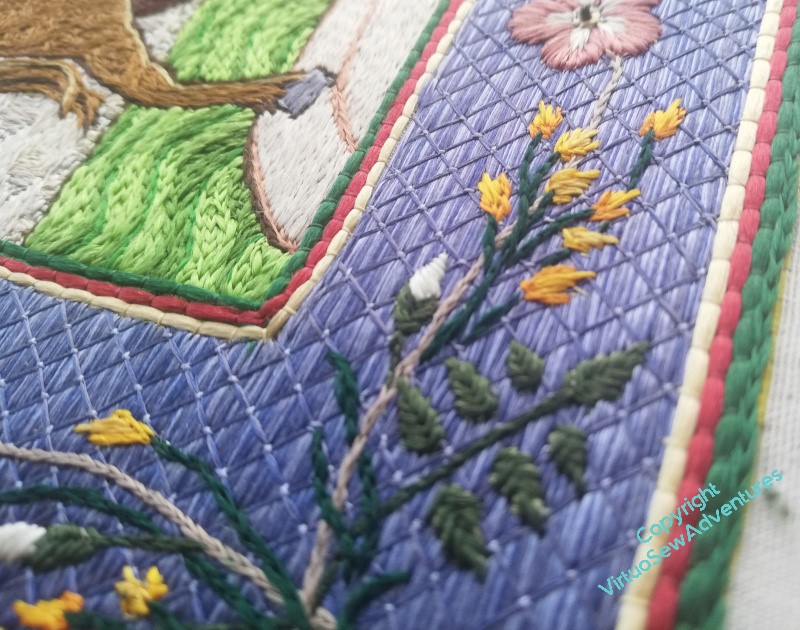
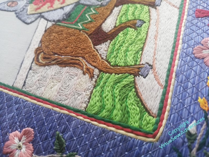
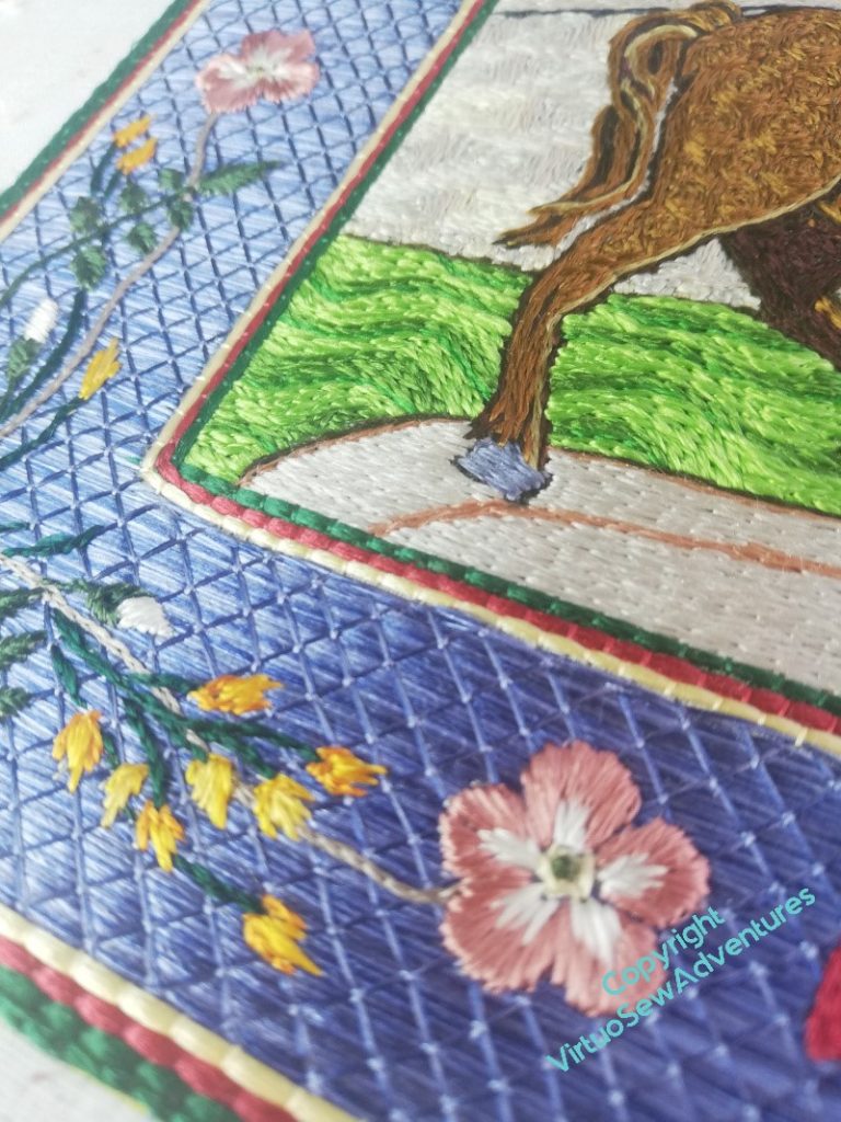
That staring didn’t take long. The crosses, as outlines, don’t really have the authority they need, so it soon became clear I needed to fill them all in. I doubled the outline, as a single line, and then filled in each triangle separately in split stitch. I did consider using satin stitch, or some sort of couching stitch, but I felt that with the dog roses bracketing the crosses, a different texture was required, and I am content with the result, I think.
One of the delights of working with floss silk is to see how it responds to the light, so here are some more pictures to enjoy.
Medieval Movers and Shakers
While I was working on William, my Mam passed to me her copy of Current Archaelogy, which included an article about the church founded by Rahere, jester to Henry I, then pilgrim and monk, founder of of St Bartholomew’s Hospital. Now, Rahere is a major character in one of the tales in Kipling’s “Rewards and Fairies”, which as a child I loved, and suddenly I found myself with an idea for some companions for William Marshall.
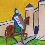
William Marshall, 1st Earl of Pembroke, jouster, statesman, guardian of kings, re-issuer of Magna Carta, subject of the first biography in English not concerning royalty or sainthood.
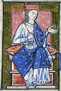
Athelflaed, daugther of Wessex, Lady of the Mercians, war leader and peaceweaver, guardian of Athelstan, she refortified Chester, and refounded the Minster which became, in due course, Chester Cathedral.
Rahere, jester, minstrel, courtier, pilgrim and monk, founder of St Bartholomew’s Hospital, which exists to this day.
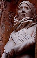
Dame Julian Of Norwich, anchoress, mystic, author of the the first book in English known to be written by a woman.
In all these cases, some vestige of their activities still echoes down the ages, and between them they cover both the political and religious life of medieval period. Their activities are scattered across the country, providing some excuse for some visits and much reading.
I wonder what images I could put in their borders?
I think this could be interesting!
Another Decision To Make
I can’t imagine how people can have a design planned down to the smallest detail before they begin. Even when I’m more organised than usual – William is a prime example – there are always details that either escape me, or that I hadn’t even considered at the start.
I should say, this isn’t a complaint. I don’t think I would find it remotely interesting to have planned everything out and have nothing to discover. These days, when I follow someone else’s design, it is to learn what they can teach me, so even though the design is planned, there is nothing sterile about the experience.
However, the fact remains that I am, yet again, wondering what to choose.
When I twisted together the fawn and the brown silk to stitch the stem of the dog rose, it was partly because I wasn’t happy with the colour and wanted to modify it slightly. When it was done, however, I felt that maybe I hadn’t, in fact, modified it enough. It seemed too close in tone to the background, so I worked the stem in the top right in just the light fawn.
And all the time I was working it, I felt twitchy. It seemed too bright, too bald, too obvious.
Now I have the top two corners done, and I have a decision to make – two colour stem, or single colour stem?
It doesn’t seem quite as glaring from a respectable distance. Note to self: for goodness sake, never decide anything from ten inches away, that’s not how anyone else is likely to see it, and if they do, you’ve already won them over anyway!
There is, of course, a middle ground. I could do the two colour stem on one diagonal and the fawn the another, echoing the angle of the castle walls and the trajectory of William’s career.
However, one decision has already been made – remember I wasn’t sure whether to fill in the crosses or not? I am now, and they will be filled.
Beginning The Border
Once I took the tissue paper away, I discovered that in fact my running stitch transfer wasn’t very clear. So I’m going to start by split stitch outlining each element before I fill it in.
You can see in this photo that I still hadn’t quite got all the tissue paper that had the design on it out from under the stitches, and I’m only part of the way through outlining this corner.
I did think I might try to outline everything first, and then I thought about what happens when I have something like that to do, and decided that each corner would be worked to a finish separately!
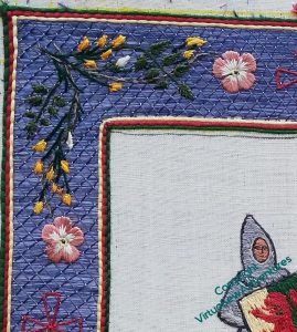
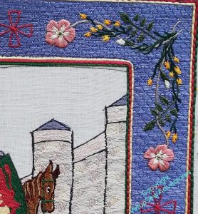
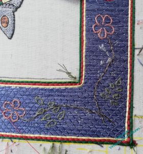
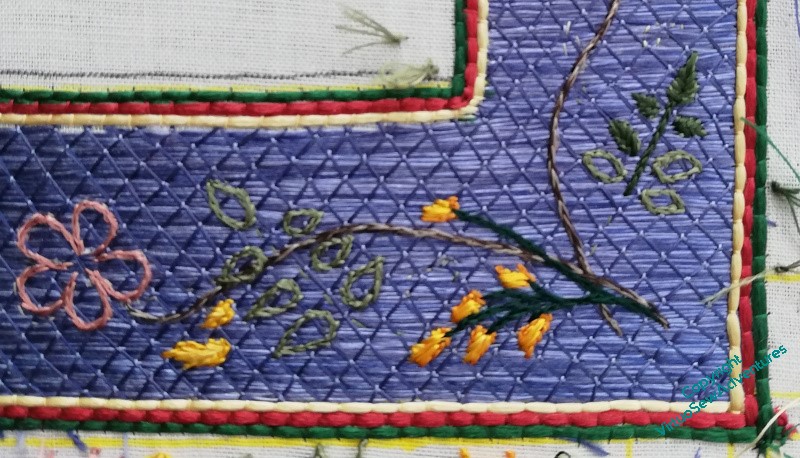
It is probably at this point that I start to wander from the path of classical Opus Anglicanum. I’m using fishbone stitch for the rose leaves and satin stitch for the broom. But after all, this is a modern work, by a modern embroiderer, not a reconstruction of an existing, or imagined, medieval work.
The wanderings continue with the dog roses – long and short stitch in the petals, over two rows of split stitch outline to help define the edges, and a tiny French knot for the dark centre.
I’m using two differnt dark greens for the rose leaves and the broom, to help the design make sense, and I worked the rose stem in split stitch using two shades of brown. I am not entirely sure about that, so I think the next corner around I will use one, maybe the darker one, and see whether that is an improvement. If it is, bringing this one into line might be a bit hair raising, considering how small all of this is!
Border Transfer
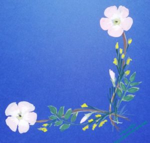
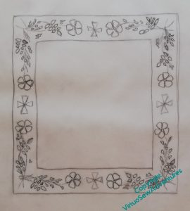
It may not be very obvious in the line drawing, but although the two sides of the corner sprig are very similar, they aren’t quite identical. I wanted to keep a sense of movement and flow, without the chaos of having every little bit different, so in the end I chose to create my corner sprigs based on two slightly different straight sprigs. In this photo you can see that the rose leaves are pointing in different directions, and the broom flowers are arranged differently.
When I did the line drawing, I took my guiding sprig and turned it through ninety degrees for each corner. By doing that, there’s a sense of continuity, whereas I think if I had reflected the design in a mirror line through either the vertical or horizontal crosses, it would have created a rather stop-start effect. I was much impressed, years ago, by a programme about the carver and sculptor Grinling Gibbons, which said that he always aimed for balance rather than symmetry. I like that, it feels more human somehow, so that’s what I try to do too.
Now, however, I have to transfer the design to the border. Clearly that’s not going to be possible using prick and pounce or a drawing method, so I have chosen to create a drawing on tissue paper of the main elements, and running stitch along the design lines. I am hoping that this will be sufficient!
In any case, it allows time for the extra thread I had to order from Devere Yarns to arrive..
Finally, two Announcements:
- The eagle eyed among you may have noticed that the Ko-fi link went away and is now back (plug-ins not playing nicely!). I’m still hoping to put together an exhibition and a book about Dreams of Amarna, and any support, whether financial, moral, or material (suggesting venues, publishers, copy-editors) would be gratefully received!
- You may also noticed the lack of a link to Twitter. I’m mostly on Mastodon now, as @virtuosew@mathstodon.xyz, for reasons that anyone else who’s been on Twitter lately will probably understand very well!
Border Design Finally Nailed!
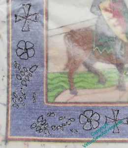
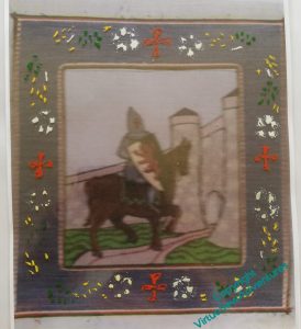
Once I had the border trim in place, I felt I really had to get the details sorted out – but having that trim in place seemed to help. The dark green, red, and yellow on the inside, mirrored by the yellow, red, and dark green on the outside seem to bracket the blue just exactly as I planned, and I began to feel that all that painting and puzzling might have been worthwhile.
So I tried photocopying the full piece to see whether playing with my cut out sprigs on a flat surface I wasn’t worried about snagging might be useful.
In actual fact, the photocopying wasn’t a great success, but it was close enough that when I overlaid an old acetate and experimented with the border sprig I’d finally, tentatively, settled on, I suddenly became a lot happier. The paint is gouache, and it really doesn’t get along well with the acetate, but I felt that it gave me just enough of the sense of the design that I could be confident it would evoke an illuminated manuscript – which is what I was hoping it would do.
It’s always so pleasing when a plan comes together!
The next stage was to produce a line drawing of the planned design, and use that to transfer the final design to the piece itself.
And this was the point at which all that painting and drawing and redrawing began to show real benefits, because even though the photocopied sprig design I was using as a guide was distinctly muddy, I found myself drawing the lines I needed with a freedom from care I rarely experience with pencil in hand.
Well now, who’d ha’ thunk – more practice does produce better effects!

