
Tag: Silk thread
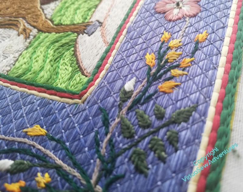
Aethelflaed’s Border Progresses
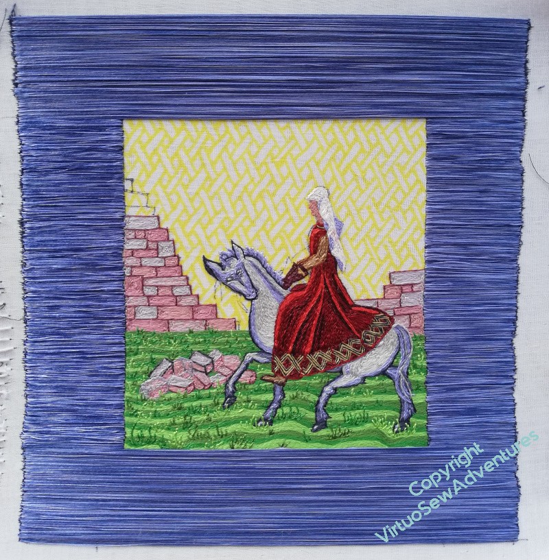
The border for the Medieval Movers And Shakers takes quite a lot of doing. The first layer is the broad “colouring in” – surface satin stitch, using the three colours of silk straight from the reels. I don’t enjoy this very much, because every time I sit down to it, I have to get re-attuned to balancing threads at either end, and it’s just difficult.
I do, however, like the effect.
It’s not stable enough to be left like that, though, and it’s not stable enough to be stitched over, as it stands. This is why the next stage is to do trellis couching over the top. If you look at the rightmost image in the gallery below, you will see the bit that remains unstitched of the diagonal stitches, and how much the couching settles everything down by comparison.
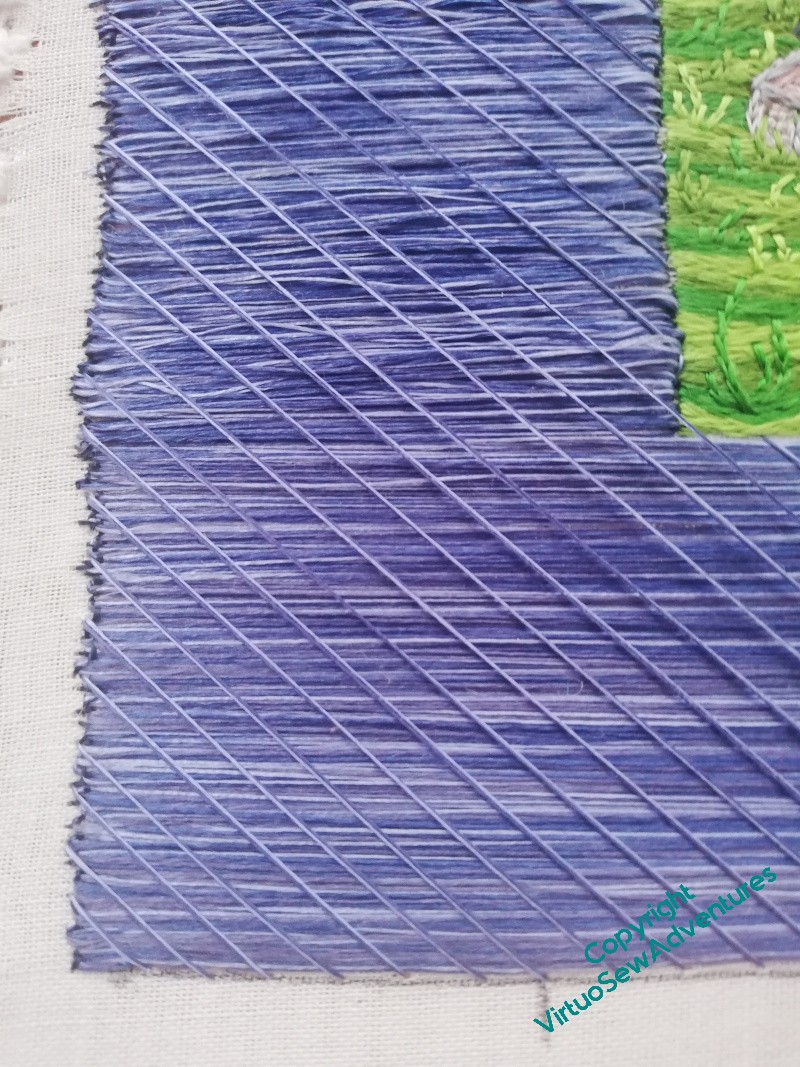
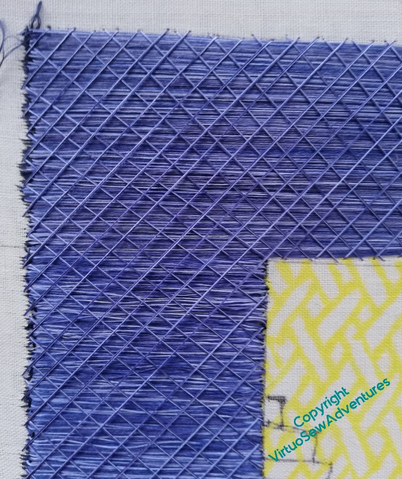
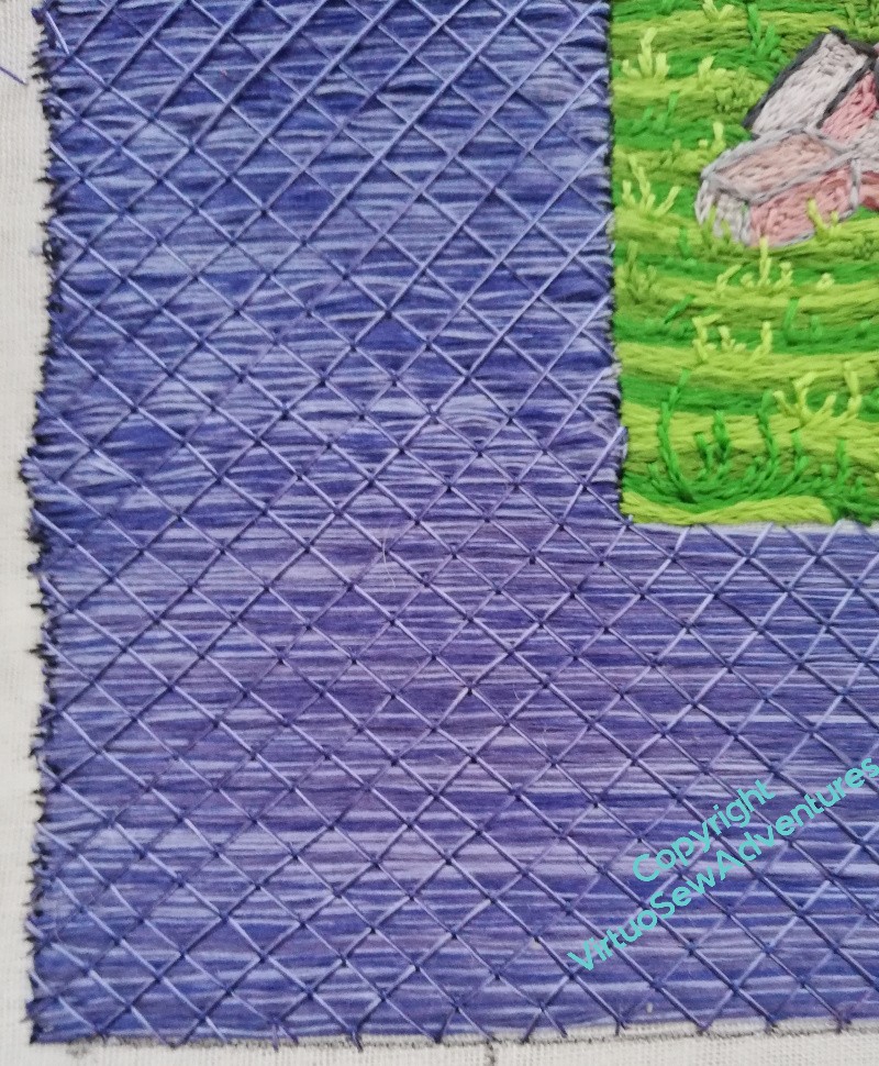
The diagonals are not as regular as I might have liked, but I’ve discovered that I can ease everything slightly one way or another with the couching, so the finished Trellis Couching looks more regular than just the diagonals. And of course, this is an intermediate stage, because I have yet to finish planning the roses, the beer barrels, and the bee skeps. And with William Marshall, I had an easy choice, framing the border with his heraldic colours.
All my questions to medievalists I’ve met concerning heraldry or symbology in Mercia and Wessex have met with apologetic looks. There probably was some, but they didn’t record it for us. So I will probably go for garnet and gold, because I would like to continue the structure I used for William Marshall, and have a suitable cross at the cardinal points. The borders framing the border can echo the crosses, and that will tied everything together.
Progress on the Lady of the Mercians
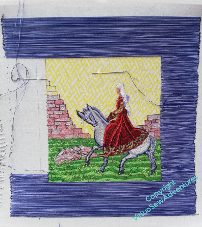
I realise that you’ve not heard about Aethelflaed for a while. In fact the period of silence is partly misleading and partly calendar related.
In terms of the calendar – my Serious Embroidery Frame sits beside a table in the bay window in the living room, and that is the table that the Christmas tree goes on. We don’t put the tree up early (I usually scoot in at the last moment on Christmas Eve, as was the family tradition when I was a child), but I do start clearing that space and thinking of other things.
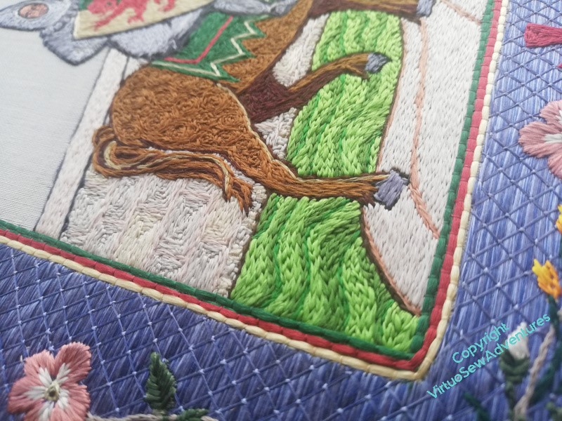
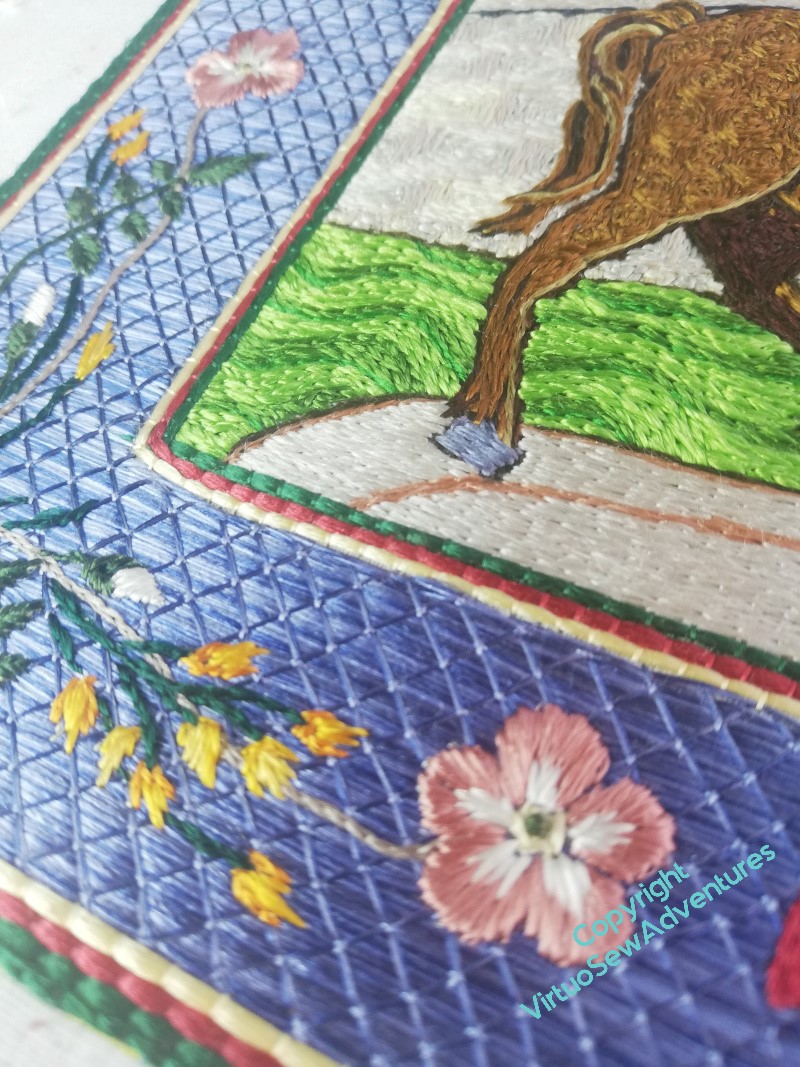
In fact, however, before I put Aethelflaed away for that period, I had made considerable progress. Even with the pause for resupply, I had managed to finish the first layer of her border. It’s harder than it looks, because I couch the coloured silk at either end, straight off the reels, to avoid having too much wastage from starting up and ending off and misjudging lengths. I find every section I do requires me to rediscover my rhythm, and until I do, I feel clumsy and tied in knots. I think the result is worth it, however.
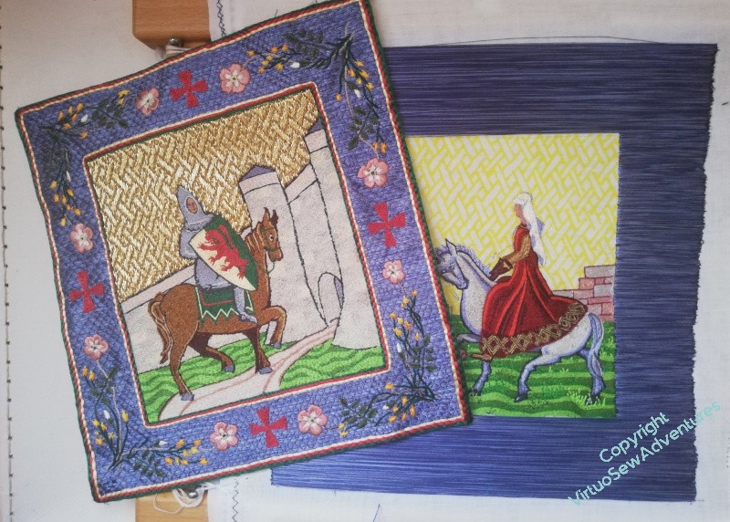
Comparing Aethelflaed thus far with William completed, you will see that I have to do the Trellis Couching (which goes alarmingly quickly once I get a run at it) and then finalise the design for, and then work, the embellishments.
Bee Skeps, Beer Barrels, and Roses, oh my!
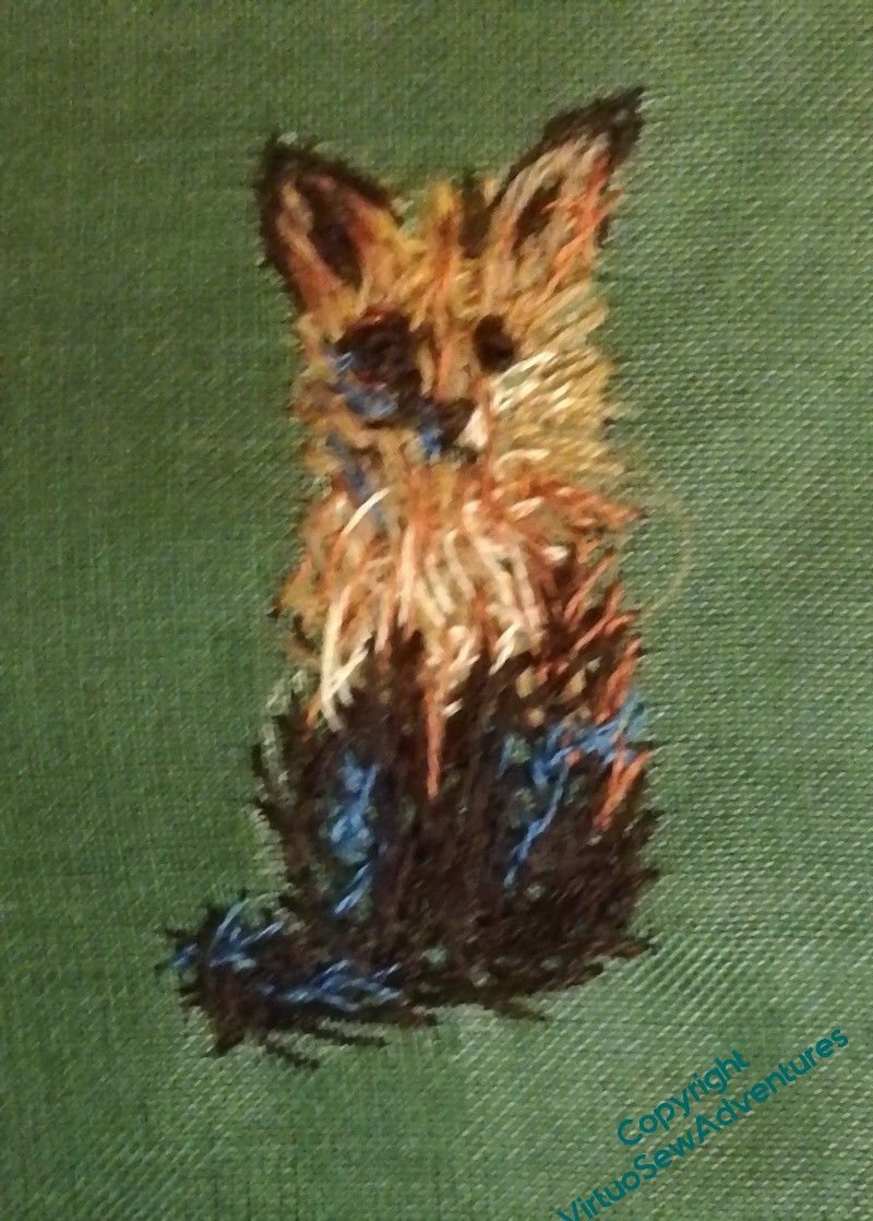
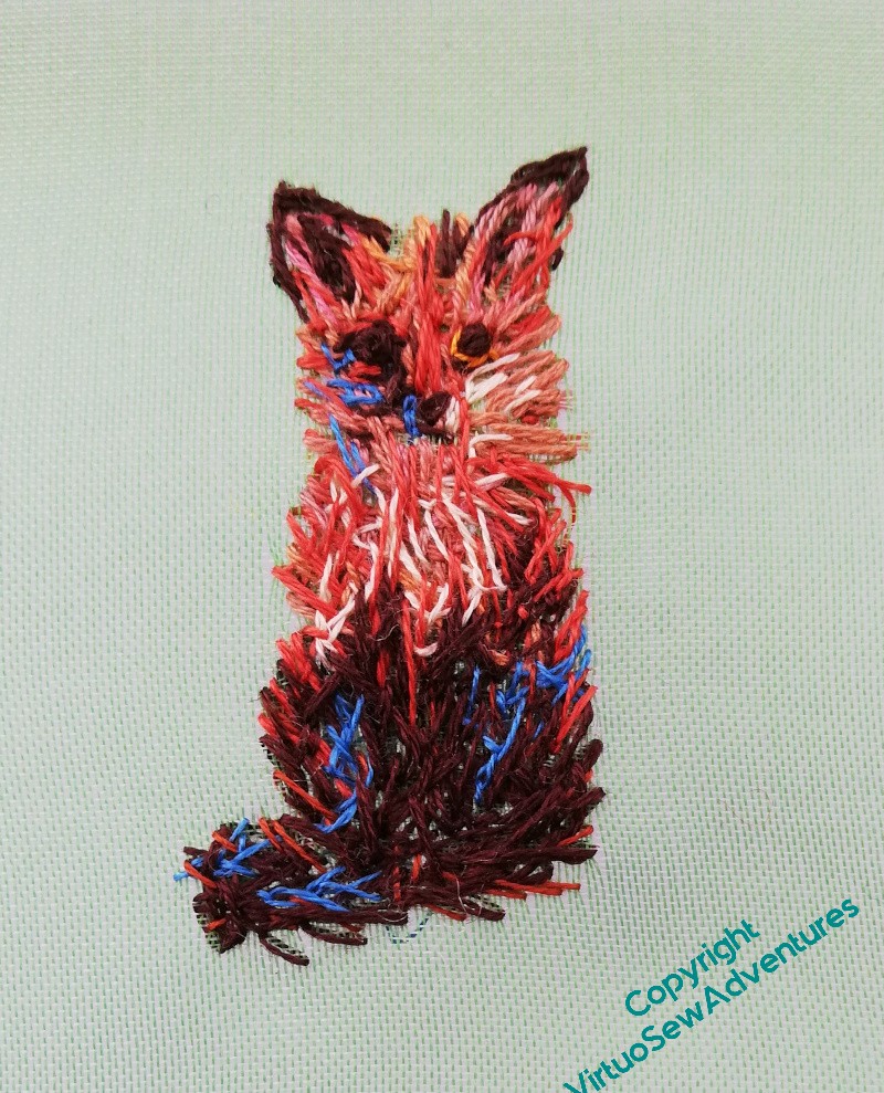
Mus’ Renard, Mus’ Renard…
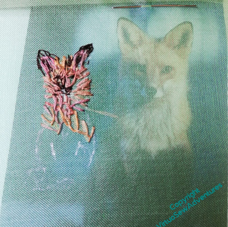
This getting started on the animal vignettes seems to be working, for the moment.
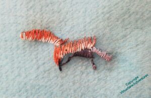
I found a lovely picture of a fox staring straight out of the picture, so I’ve gathered russets and browns for this one. He’s awkwardly sized – maybe too big, when I finally get to the assembly of the panel – and I kept changing from one to two strands of stranded cotton and not being happy with either.
The half stage shows – rather blurrily, unfortunately – that I’ve used blue for the white-in-shadow. It’s amazing how often white does, genuinely, look blue or purple, but in any case, it helps to “lift” the general effect. When you’re mixing colours in painting, you can get lovely blacks and greys which have shades of other colours in them, and aren’t as deadening as straight lamp black would be. In embroidery, as I’ve said before, flat black has a tendency to unbalance a design, and in truth a lot of the greys aren’t much better. You might recall I turned Akhenaten’s black wig blue...!
Well, the gauze really does vanish under light, doesn’t it!
Some of the stitches had to be woven into to shorten the length of the colour on display, and I’m not as happy with Mus’ Renard as I was with the Brockis. But he looks much better from the distance that he’ll be viewed from than he does in analytical close up, and I have to regard at least some of these as studies for the final piece, rather than necessarily parts of that finished piece.
We’ll just have to wait and see…
Working on the Brockis
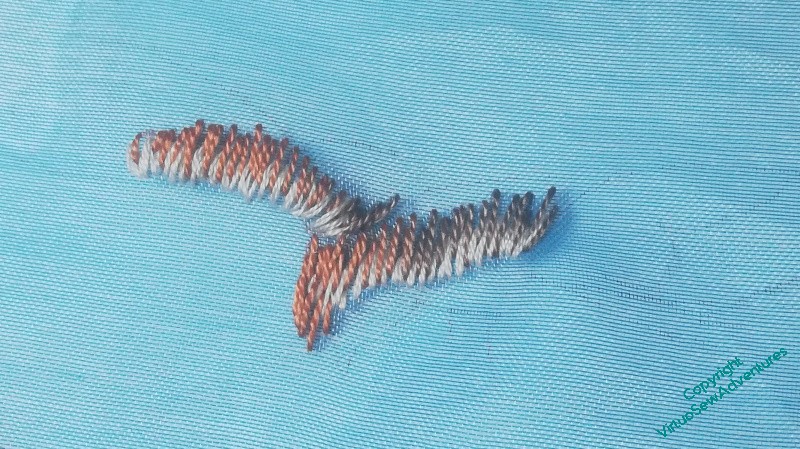
You may or may not be able to see that there’s a drop-shadow effect in these photos – I learned from the mistake of the hawk, as I mentioned, and mounted the green gauze on a frame before I started. I rather like the result when I set it down for photography, and it gives you a much better sense of the view I got as I stitched.
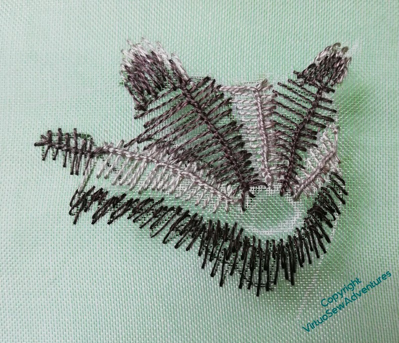
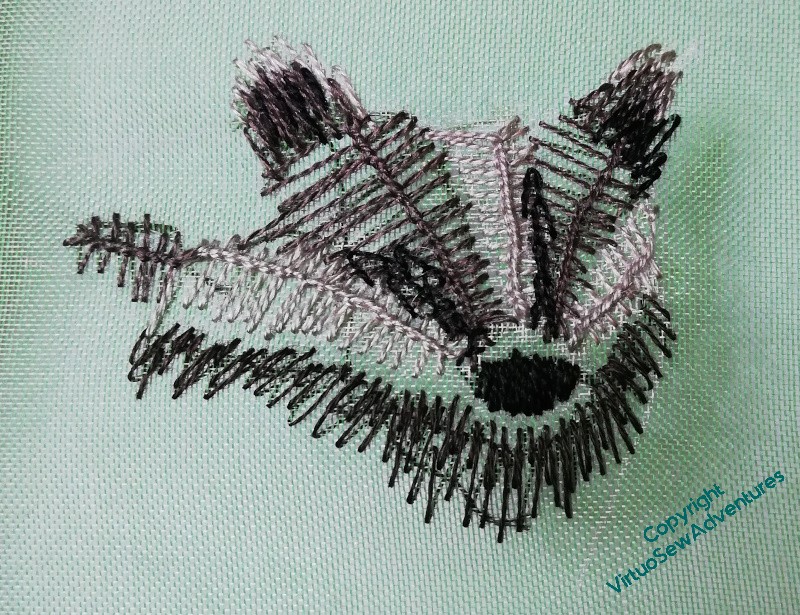
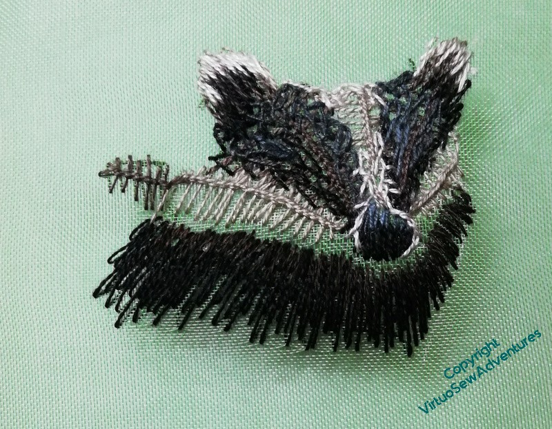
Ordinarily, I would be very concerned about working on gauze – the hawk is virtually satin stitch to ensure there’s nothing grinning through the gaps – but I have a feeling that this is going to evolve as I work on it. Regular readers will know by now that if I’ve convinced myself that something is necessary for the effect I want to achieve, I grit my teeth and do it, even if I don’t think I’ll enjoy it – although by the alchemy of Achieving What I Aimed For, it’s amazing how often I do in fact enjoy it!
My brockis is going to be peering out at the main scene from behind a tree, so he’s going to be on the ground, in amongst the undergrowth, and probably backed by darkish fabric and stitch. That being the case, gaps in the stitching might in fact enhance the sense of depth in the whole assembly. I want him to have rather rough fur, so he’s not going to be satin stitch, is he?
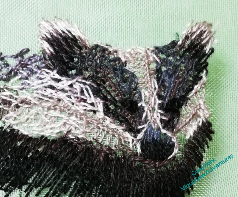
So my brockis is made, again, purely freehand, referring to the photo for guidance, but simply in layers of stitching. I’ve used silk, cotton, and linen threads, and a tangle of Vandyke stitch, Cretan Stitch, feather stitch and alternating twisted chain stitch. The silk came from the same stash as the silk I used for the hawk, the linen is a Stef Francis yarn I bought for the Dreams of Amarna that never quite worked in any of the projects, and the cotton is ordinary stranded cotton, but only single strands.
I’m rather pleased with him.
Another observing animal for Placidus
Elizabeth Goudge’s book “The Herb of Grace”, which gave me the idea for Placidus, is set in a pilgrim inn near to some ancient woodland, and in her writing she regards the trees and animals of that woodland as very much part of the world the family inhabits. She wouldn’t, I’m sure, have considered herself an environmentalist, but only because she probably couldn’t imagine considering herself as other than part of the natural world. Certainly the fictional fresco maker she imagines would have done so.
My reboot over the period between Christmas and Epiphany has suggested that since I want to have a welter of animals observing the scene, maybe I should just start on them. Once I have enough to make a start, that might help me with the trees, the rocks, and the stream. Then Placidus with his horse and hounds, and the stag will have somewhere for their drama to take place.
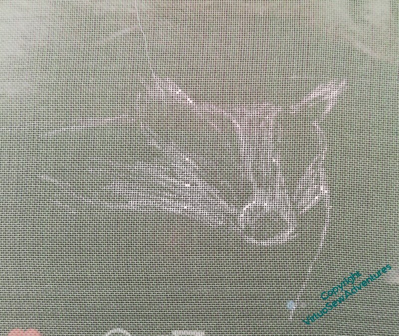
It was the Herb of Grace that told me of the word “brockis” as an old name for a badger, and over on Patreon, the writer Anne Louise Avery has a character she calls “Grey Brock”, whose adventures are often illustrated with a photo of a badger paying very close attention. I’ve used that photo as my starting point, and sketched my brockis on some green gauze (on a frame, this time!) using a white gel pen.
And can we just pause there to celebrate the fact that I sketched this, freehand, on a difficult surface with an indelible pen, and ended up with a recognisable badger? Even last year, I don’t think I’d have managed it!
The animals are going to be quite experimental, I think. Certainly there won’t be a lot of long and short stitch. I want a lot of rough and ready texture and an excuse to experiment.
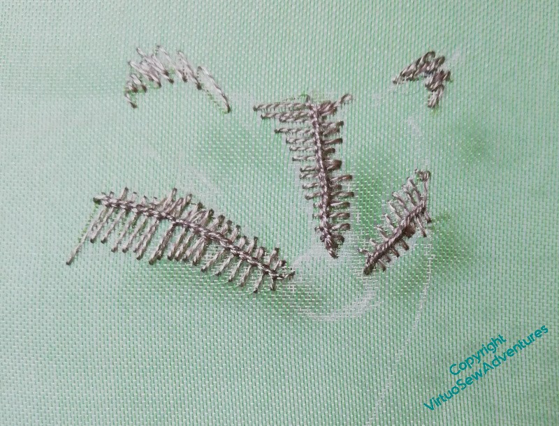
So the first layer of my brockis is actually vandyke stitch in a middling creamy beige that will help, I hope, to create some depth in his fur.
Hawk in a clear blue sky…
A good, optimistic start to the creative year, here, with my first bit of stitching for Placidus – who’s only been in the planning stage for a decade or so!
You will see from the progress pictures that I was absolutely rocketing along the edge of catastrophe curve here, very little planning, and just alternating staring at my source and stitching. This is the way I tackled Ankhsenspaaten, and a few other pieces, and it’s very much the way I prefer to paint. But it’s highly uncertain as to success, and I may come back in a few years and try again.
Clicking through will show you how little guidance I’d put on the gauze, and how little it showed once there. Furthermore, I was in such a fever of impatience to start that I used neither frame nor hoop, working in the hand instead. I won’t do that again.
(Until next time I do it..)
I’ve mostly used silk perle, which is lovely, and the particular bundles I’m using I’ve had in my stash for decades. I use it, but it’s quite fine, and until recently I’ve preferred to work with rather more solid materials. We also discovered, when my grandfather’s carer boil washed a tray cloth I’d embroidered for him, that the colours aren’t washfast. Not a problem in this case: a panel hanging on the wall, using a wild mix of materials, is unlikely to be boil washed unless by someone deliberately seeking to destroy it.
In the meantime, if it is to work in the eventual piece, it will need to be savagely blocked or pressed to get the crinkles out of it – not because my tension was tight, but because the stitching is filling up the spaces between the fabric threads and making them move and misbehave.
I don’t mind – I’ve already pinned it out, and I’m just so pleased to have made a start on the Vision of Placidus at last!
Update: I showed this to The Australian, who immediately started singing the Hawthorn team song (Australian rules football). Go, Hawks!
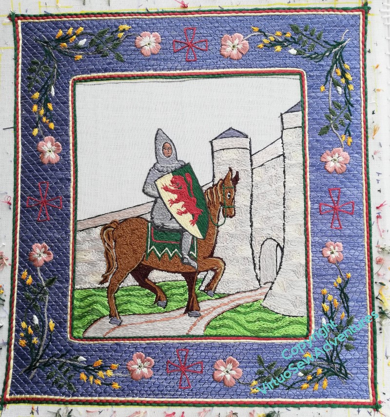
William, as far as he’s gone
I realised when I came to write about beginning to practice underside couching, that you’ve not seen William for a while, so here is a a quick update on progress.
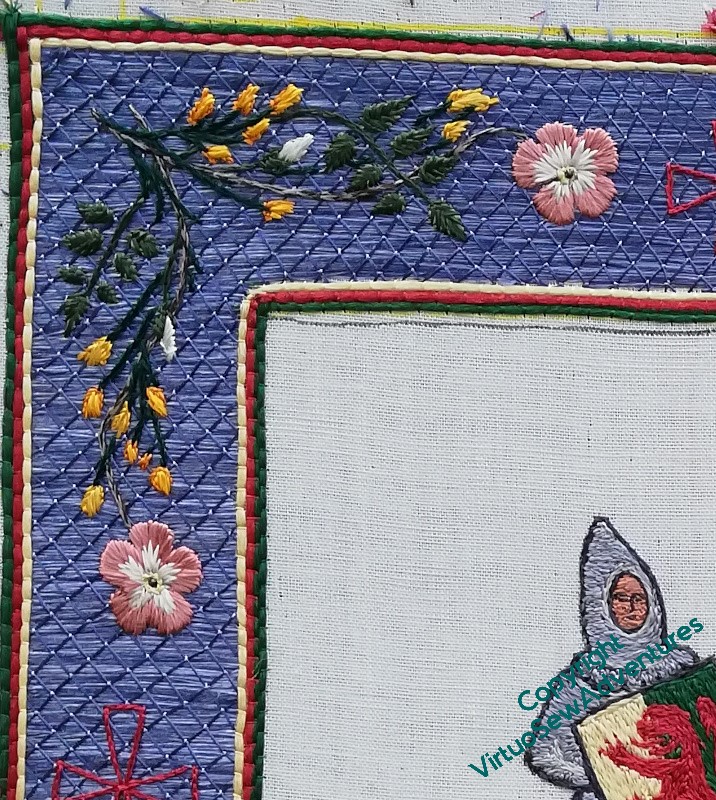
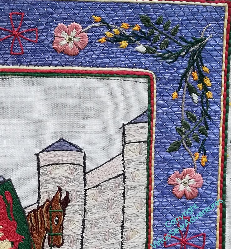
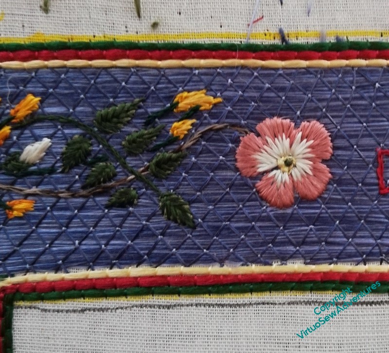
I got all the broom and dog roses done on the border, and then sat back to look at it. You may recall that I said last time that I thought that I would be filling the crosses, but I wanted to sit back and stare again, just to be sure.
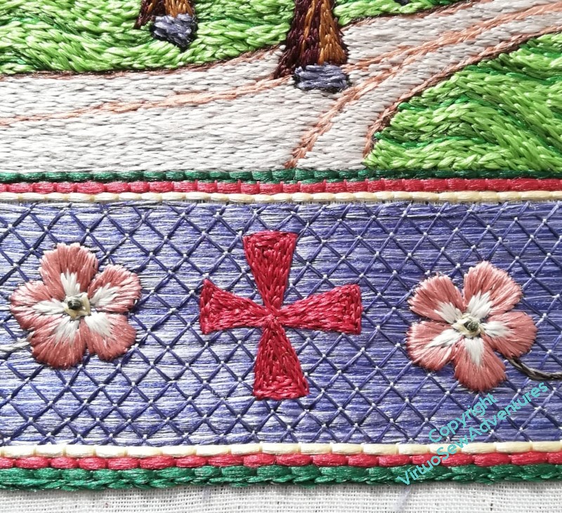
That staring didn’t take long. The crosses, as outlines, don’t really have the authority they need, so it soon became clear I needed to fill them all in. I doubled the outline, as a single line, and then filled in each triangle separately in split stitch. I did consider using satin stitch, or some sort of couching stitch, but I felt that with the dog roses bracketing the crosses, a different texture was required, and I am content with the result, I think.
One of the delights of working with floss silk is to see how it responds to the light, so here are some more pictures to enjoy.
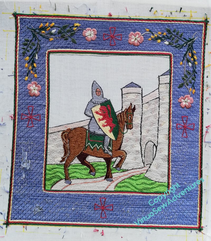
Medieval Movers and Shakers
While I was working on William, my Mam passed to me her copy of Current Archaelogy, which included an article about the church founded by Rahere, jester to Henry I, then pilgrim and monk, founder of of St Bartholomew’s Hospital. Now, Rahere is a major character in one of the tales in Kipling’s “Rewards and Fairies”, which as a child I loved, and suddenly I found myself with an idea for some companions for William Marshall.
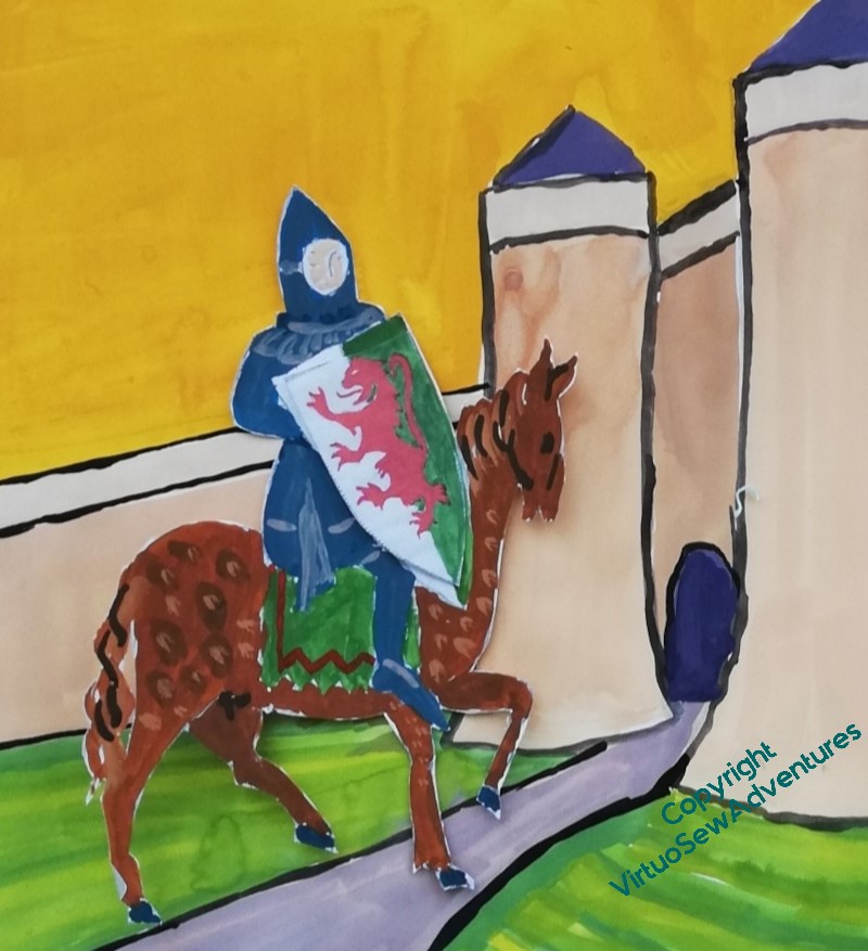
William Marshall, 1st Earl of Pembroke, jouster, statesman, guardian of kings, re-issuer of Magna Carta, subject of the first biography in English not concerning royalty or sainthood.
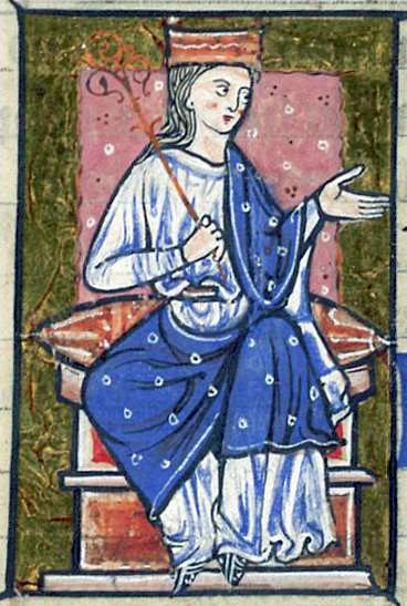
Athelflaed, daugther of Wessex, Lady of the Mercians, war leader and peaceweaver, guardian of Athelstan, she refortified Chester, and refounded the Minster which became, in due course, Chester Cathedral.
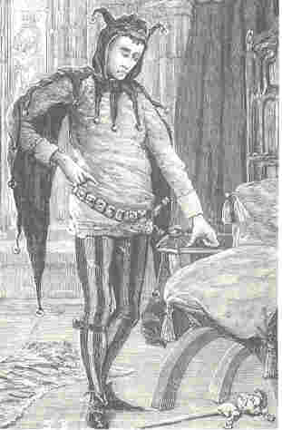
Rahere, jester, minstrel, courtier, pilgrim and monk, founder of St Bartholomew’s Hospital, which exists to this day.

Dame Julian Of Norwich, anchoress, mystic, author of the the first book in English known to be written by a woman.
In all these cases, some vestige of their activities still echoes down the ages, and between them they cover both the political and religious life of medieval period. Their activities are scattered across the country, providing some excuse for some visits and much reading.
I wonder what images I could put in their borders?
I think this could be interesting!
Another Decision To Make
I can’t imagine how people can have a design planned down to the smallest detail before they begin. Even when I’m more organised than usual – William is a prime example – there are always details that either escape me, or that I hadn’t even considered at the start.
I should say, this isn’t a complaint. I don’t think I would find it remotely interesting to have planned everything out and have nothing to discover. These days, when I follow someone else’s design, it is to learn what they can teach me, so even though the design is planned, there is nothing sterile about the experience.
However, the fact remains that I am, yet again, wondering what to choose.
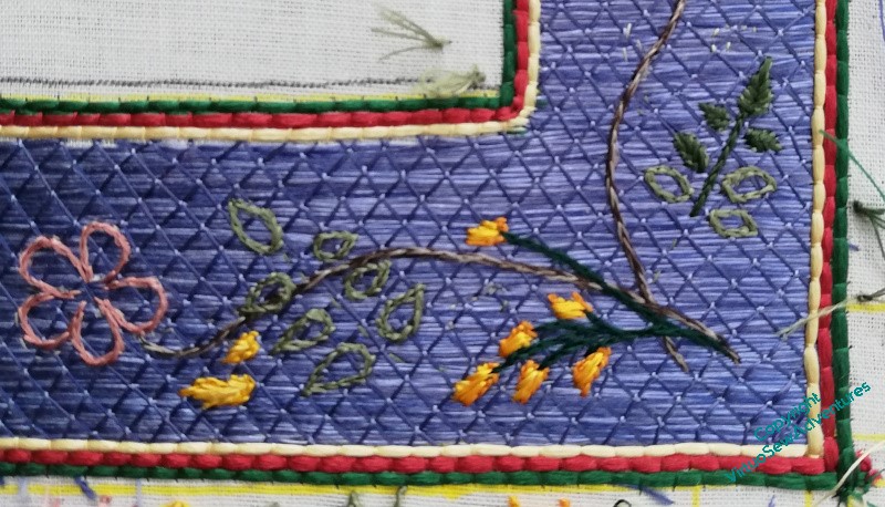
When I twisted together the fawn and the brown silk to stitch the stem of the dog rose, it was partly because I wasn’t happy with the colour and wanted to modify it slightly. When it was done, however, I felt that maybe I hadn’t, in fact, modified it enough. It seemed too close in tone to the background, so I worked the stem in the top right in just the light fawn.
And all the time I was working it, I felt twitchy. It seemed too bright, too bald, too obvious.
Now I have the top two corners done, and I have a decision to make – two colour stem, or single colour stem?
It doesn’t seem quite as glaring from a respectable distance. Note to self: for goodness sake, never decide anything from ten inches away, that’s not how anyone else is likely to see it, and if they do, you’ve already won them over anyway!
There is, of course, a middle ground. I could do the two colour stem on one diagonal and the fawn the another, echoing the angle of the castle walls and the trajectory of William’s career.
However, one decision has already been made – remember I wasn’t sure whether to fill in the crosses or not? I am now, and they will be filled.
Beginning The Border
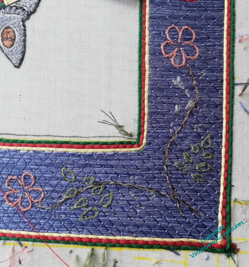
Once I took the tissue paper away, I discovered that in fact my running stitch transfer wasn’t very clear. So I’m going to start by split stitch outlining each element before I fill it in.
You can see in this photo that I still hadn’t quite got all the tissue paper that had the design on it out from under the stitches, and I’m only part of the way through outlining this corner.
I did think I might try to outline everything first, and then I thought about what happens when I have something like that to do, and decided that each corner would be worked to a finish separately!
It is probably at this point that I start to wander from the path of classical Opus Anglicanum. I’m using fishbone stitch for the rose leaves and satin stitch for the broom. But after all, this is a modern work, by a modern embroiderer, not a reconstruction of an existing, or imagined, medieval work.
The wanderings continue with the dog roses – long and short stitch in the petals, over two rows of split stitch outline to help define the edges, and a tiny French knot for the dark centre.
I’m using two differnt dark greens for the rose leaves and the broom, to help the design make sense, and I worked the rose stem in split stitch using two shades of brown. I am not entirely sure about that, so I think the next corner around I will use one, maybe the darker one, and see whether that is an improvement. If it is, bringing this one into line might be a bit hair raising, considering how small all of this is!