Tag: Silk thread
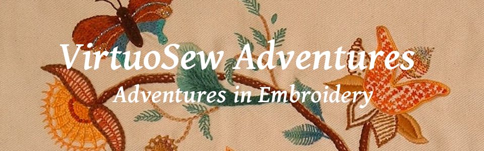
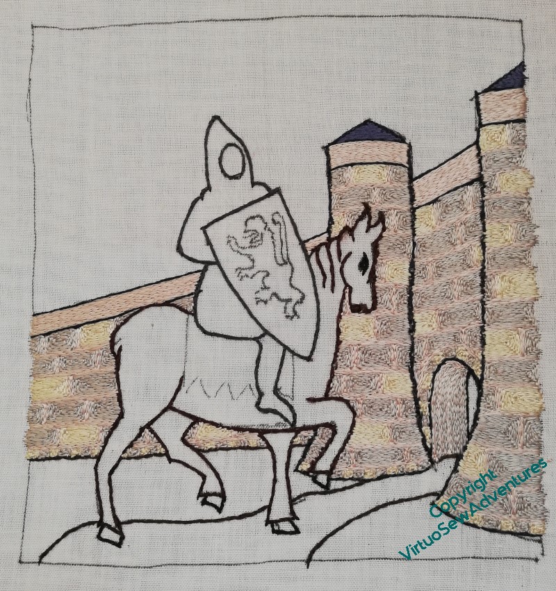
The road in to the castle
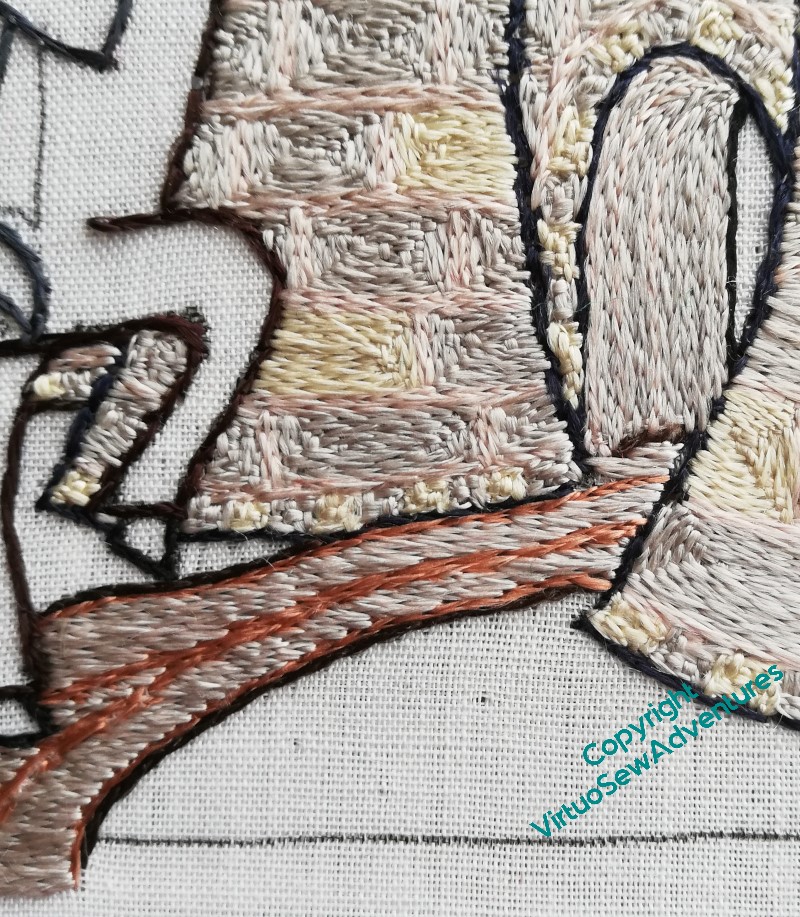
It took a certain amount of puzzling to come up with a choice of colour for the path. I wanted it to help to anchor the scene, but at the same time, I didn’t want it dark enough to challenge the horse, and it seemed logical that it would share some tones with the stonework of the castle. I wanted some wheel ruts as well, although of course they run togther into a single line quite soon.
And then there was stitch direction to think about. A stitcher’s thinking is never done!
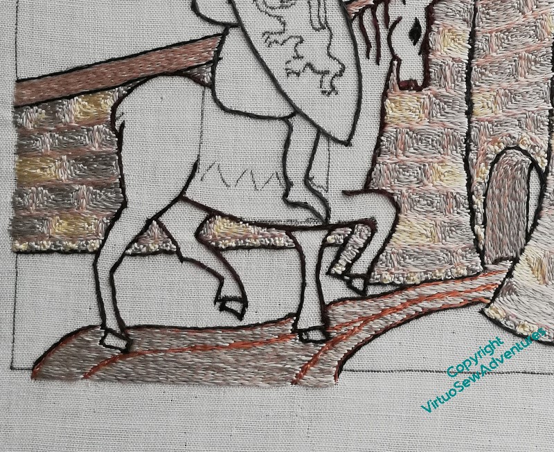
Well, a bit of thought, and the stitch direction was obvious – horizontal. The stonework is angular and archway is vertical/follows the curve, so horizontal seemed a good contrast.
Similarly, I settled on using both the pink and the grey from the stonework in the needle. I thought the yellow might brighten the road a bit too much for comfort!
Once the path was done, I could move on to the grass. I thought of doing some rather mad tussocks, going up and over the castle walls, but in the end it seemed to me that the area close to the castle wouldn’t be neglected to that extent. Whichever fairy tale I want my viewers riffing off, I don’t think the briar-overgrown castle of Sleeping Beauty is the one!
William’s Castle
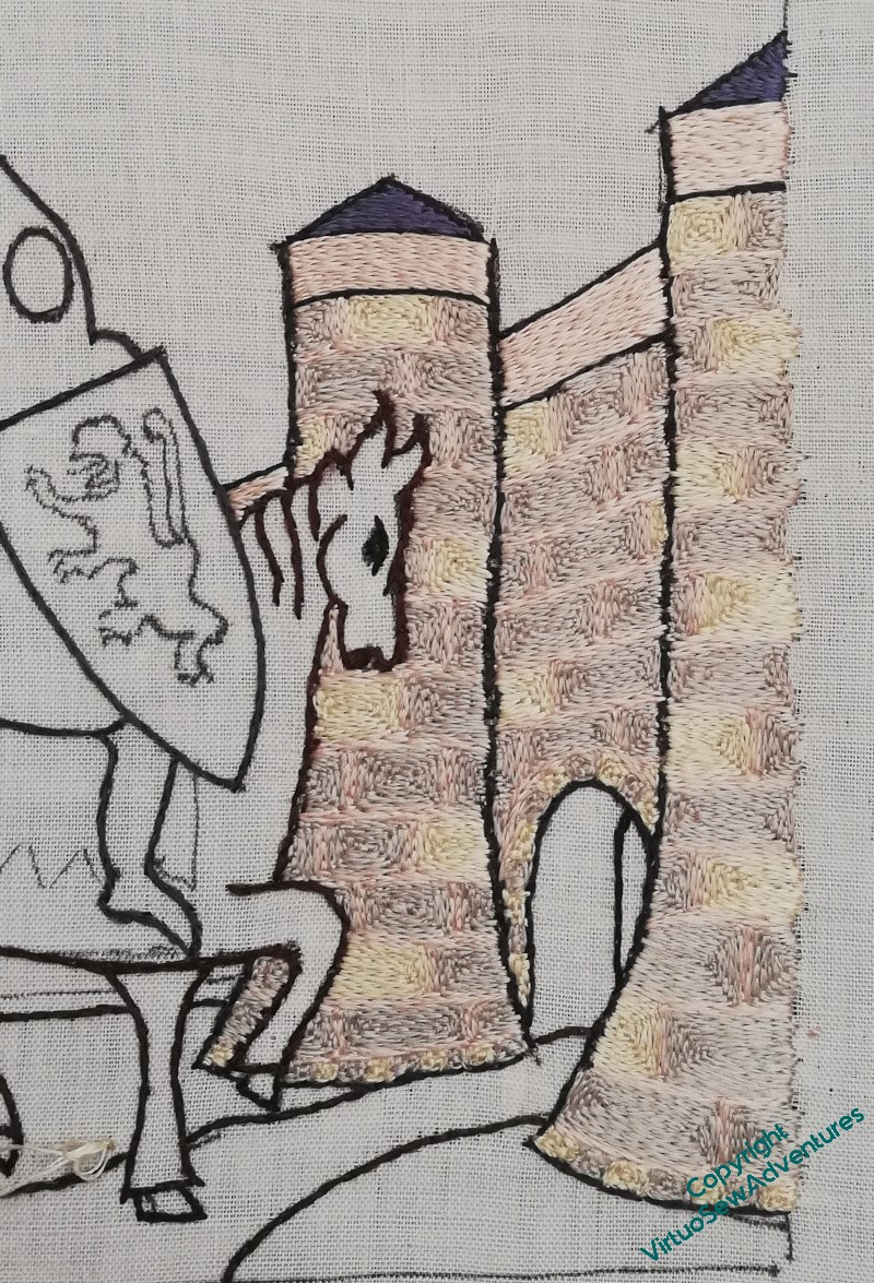
I’m trying to work this systematically (I may also be slightly anxious about tackling William!), so the first thing was to finish the castle.
And there’s a lot of castle…
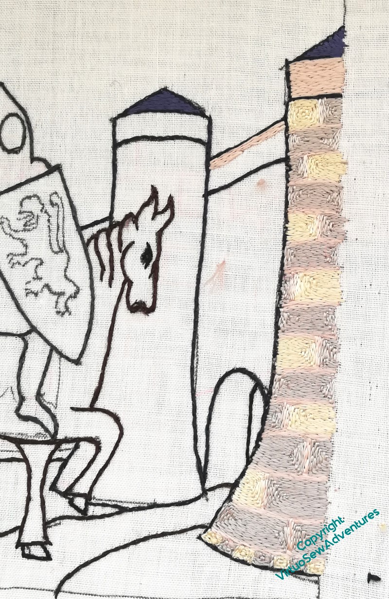
The yellow blocks appear only on every other row, and I’ve tried to make sure that they never line up. Once I’d worked the gatehouse itself I carried on to work the wall behind it, and then paused for thought.
The interesting question at this point was to decide how to work the wall inside the gatehouse, the “tunnel”, if you like. I wanted some evident difference in relation to the blocks of stone in the walls, and in the end, settled on alternating rows of grey (stone) and pink (mortar), turning them vertically, following the curve of the arch as best as I could. As I went deeper into the tunnel there were more lines of grey between the pink, although to say the difference is subtle is to rather understate the case!
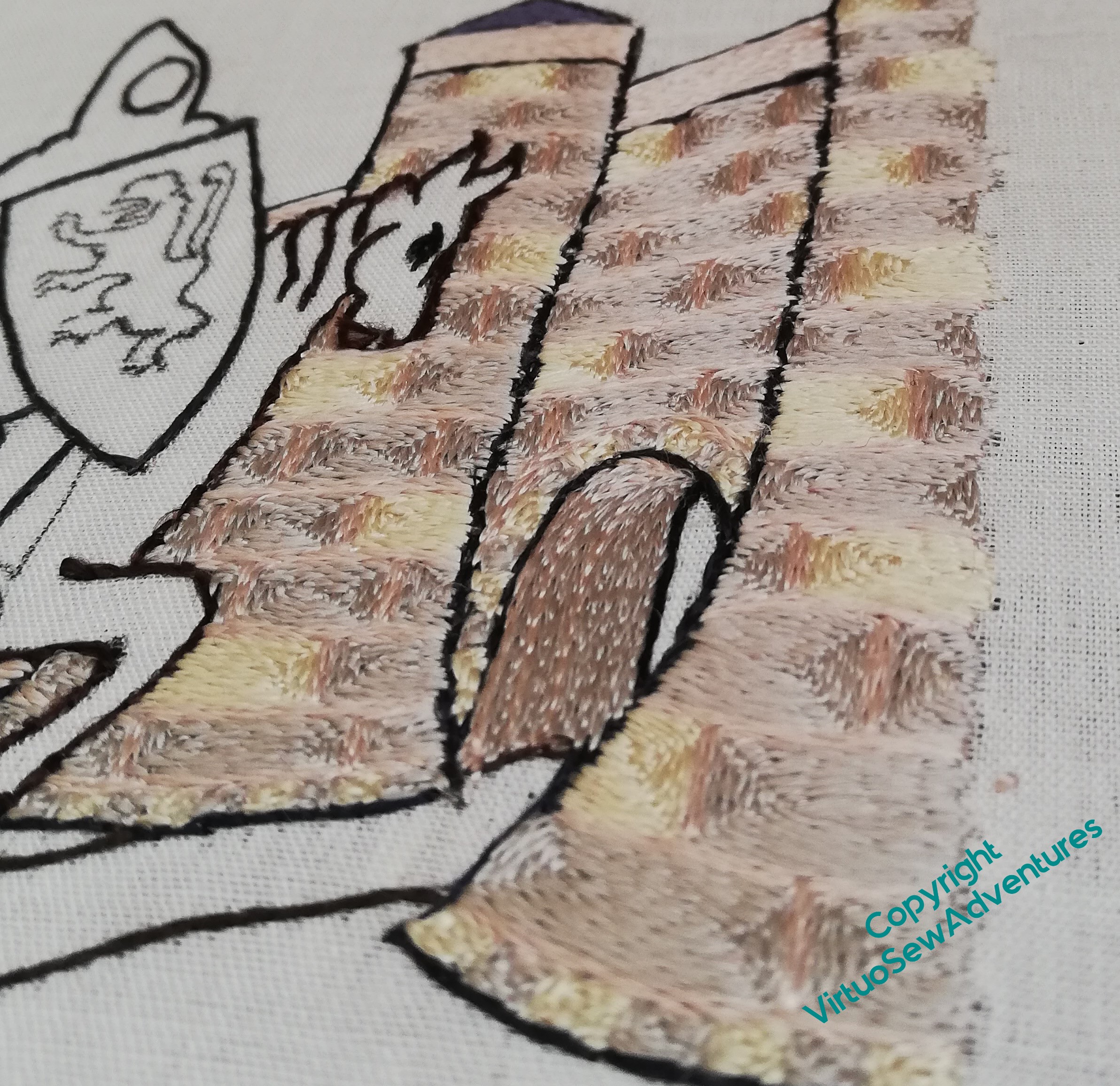
It is a constant delight to look at the way the silk changes in appearance as the stitches change direction, and even more so to change the angle of view, so I suspect you will see a good few shots like this over the course of the piece.
Doesn’t it look lovely – and don’t these quiet, pearly tones help to create the fairytale atmosphere I’m looking for!
Exhibition – For Worship and Glory II
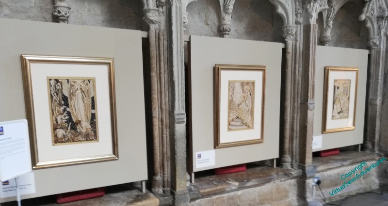
A few weeks ago I went to see the Royal School of Needlework Exhibition “For Worship and Glory”, in its second incarnation, in the Lady Chapel in Ely. The centrepiece of the exhibition was a series of embroideries inspired by the Litany of Loreto, donated to the RSN when Mayfield Convent in Surrey was closed during the 1970s. Since I saw the first version of the exhibition a few years ago, it has been discovered that the designs were created by an Italian graphic designer, Ezio Anichini, at the beginning of the 20th Century.
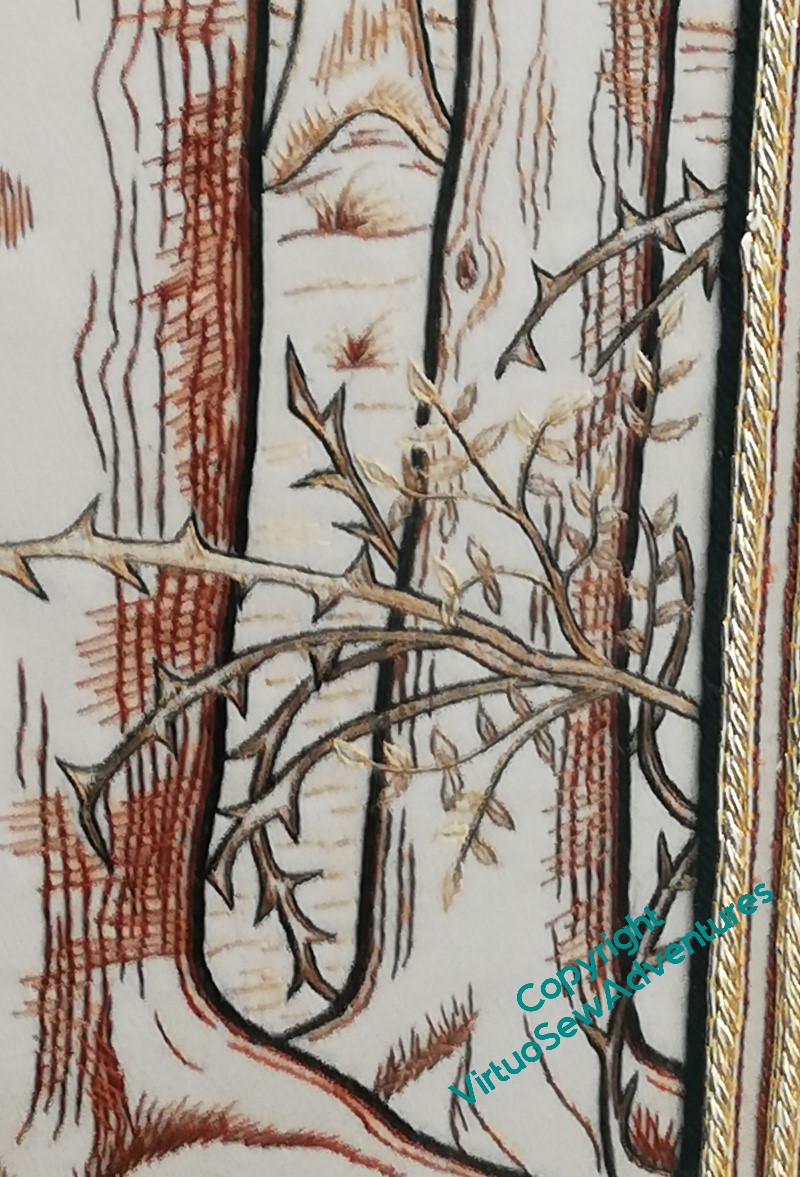
The panels are in a very restricted palette using silk floss and filoselle – browns and golds, some black, and a very tiny amount of blue, and although the stitches are described as “mostly long and short”, with the addition of stem stitch, split stitch and straight stitches, the panels didn’t have the heaviness I associate with long and short stitch. On the contrary, my primary impression was to be astonished and impressed by the manner in which the works were clearly embroideries and yet maintained a kinship with the drawn design. Look at the bark on this picture, the sketchy and textural feel to it, contrasting with the almost naturalistic rendering of the briars.
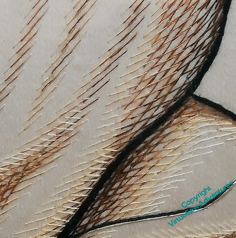
Even more strikingly – and my phone camera, in spite of the wonderful light in Ely’s Lady Chapel, really wasn’t up to the task – look at the rendering of the folds of fabric here. The stitches are just straight stitches, using carefully chosen shades and thicknesses of thread, at carefully judged spacings and angles, and yet the impression of flowing folds in fabric is beautifully realized.
I was very glad I’d thought to take my lorgnettes, because there were so many enchantingly embodied ideas that I wanted to examine!
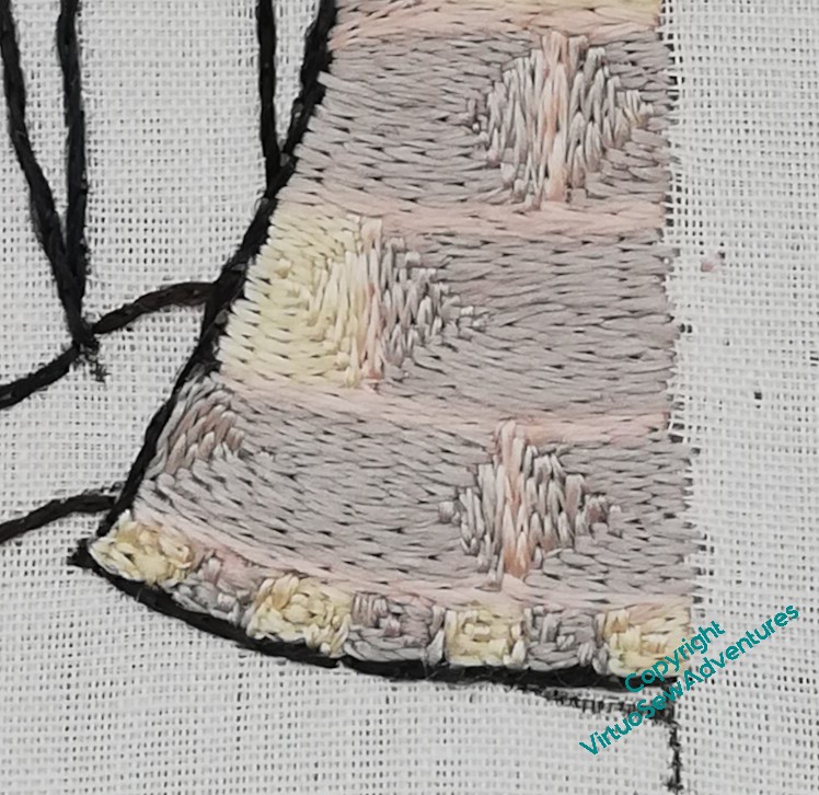
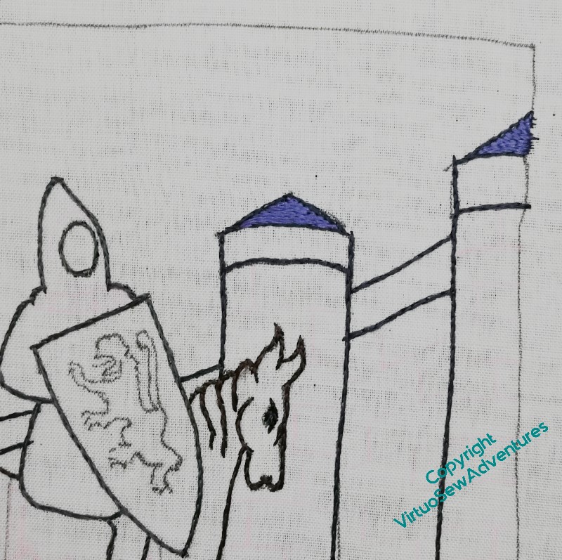
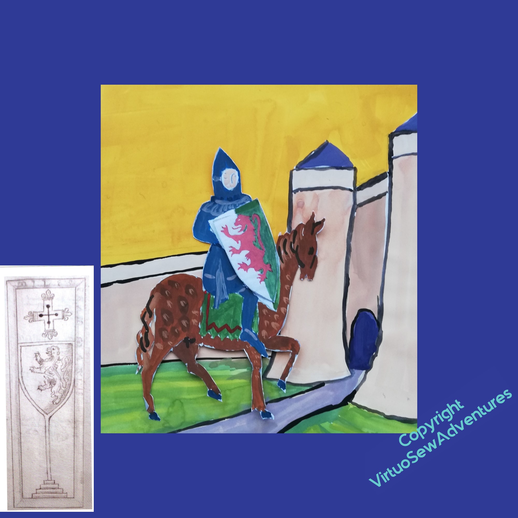
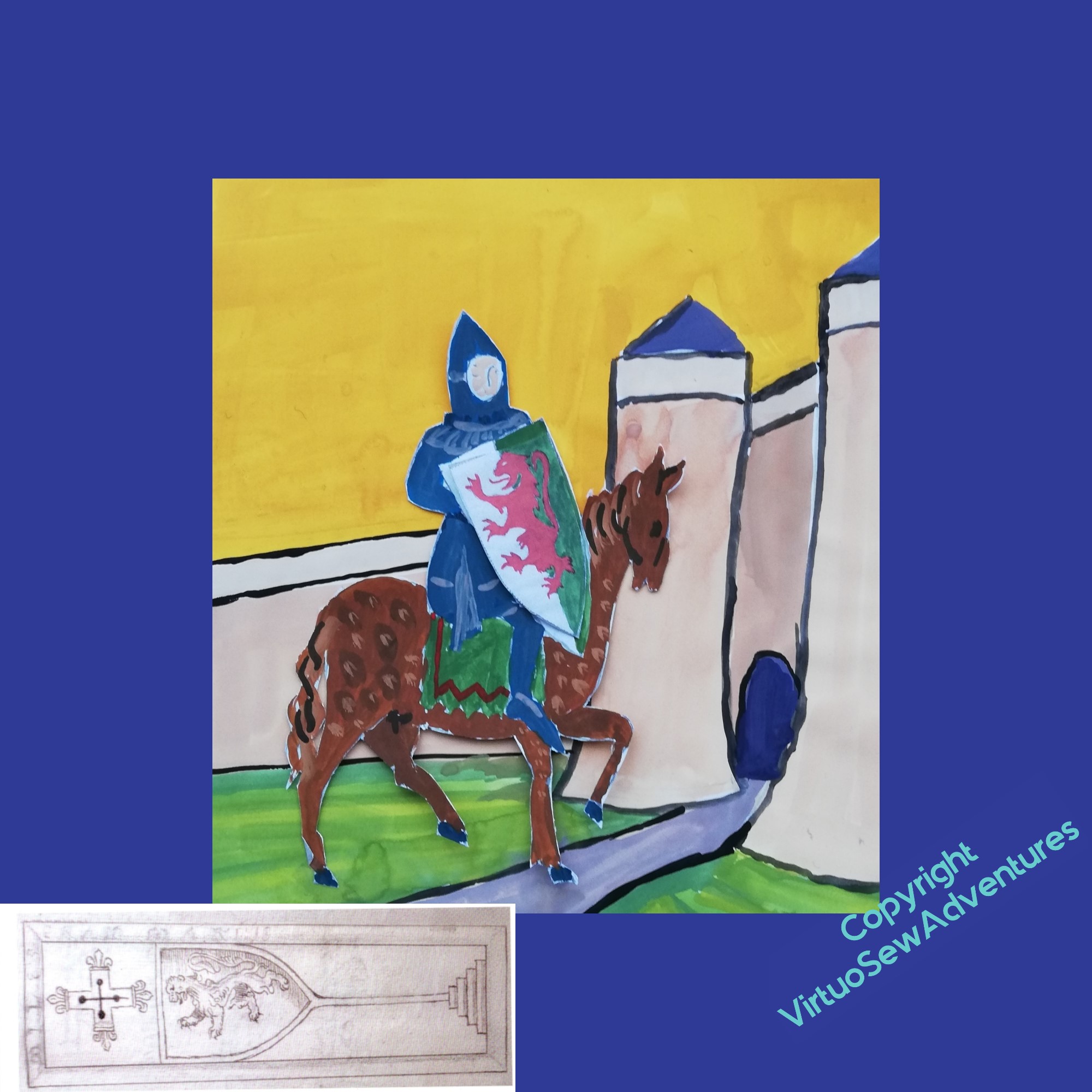
William Marshall – first Turret
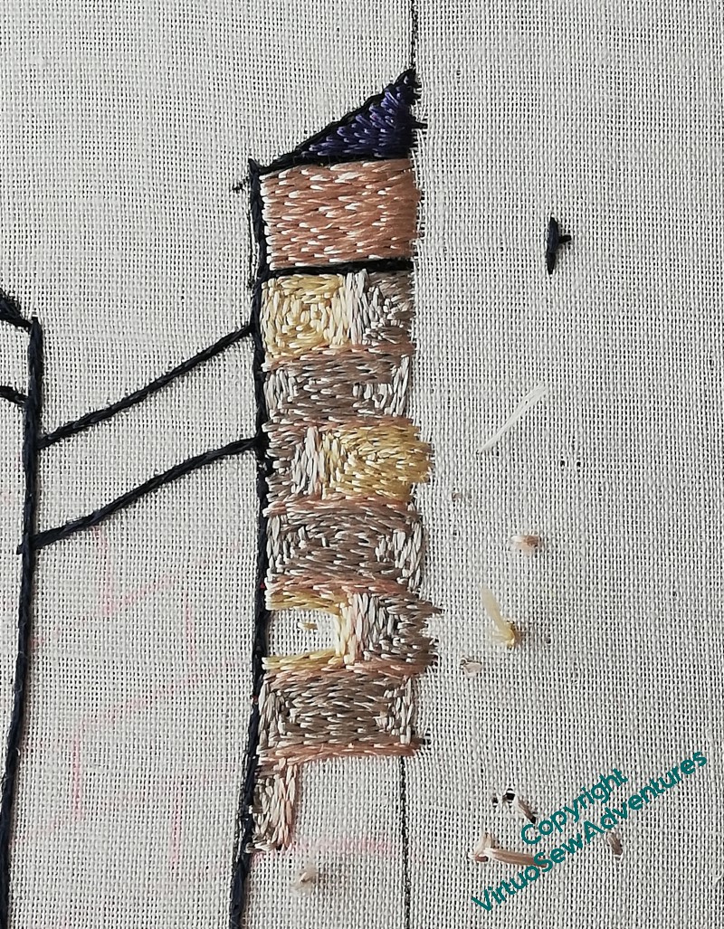
I had three colours for the stone – a grey, a cream, and a pale rose. The idea is to echo the colour variation you often see in stone when you start looking, but also, at least some medieval masonry made ornamental use of colour variations. Again, remember that I am looking for a faintly mythological feeling to this, not a historically accurate one, so I don’t mind that I’m tweaking my representation of the Chateau de Tancarville until William’s kinsman wouldn’t recognise his own home. He might, after all, rather like what I’ve done!
I put some thought into whether I would use all three colours in the walls, and if so how, but in the end I decided that since the “sky” will be underside couched in gold, it would be better to put the rose or the grey on the topmost course. Grey felt a bit too lowering, like a stormy sky, and William had quite enough squalls to face in his life, so I chose the rose, and used it also for the mortar.
The narrow course at the base seemed to need a different treatment, still in the the same vein. I used six strands instead of the four I’m using elsewhere, and made a little narrow chequerboard, without any suggestion of mortar.
And here it is, the first turret of the gatehouse complete. I was a little anxious lest the sameness of everlasting split stitch prove exasperating or otherwise offputting, but as it turns out, that’s not the case. I’m finding the different effects of stitch length and direction endlessly intriguing, and while I don’t expect to spend the rest of my stitching days entirely on split stitch, I’m certainly expecting to enjoy William.
William Marshall – beginning to stitch
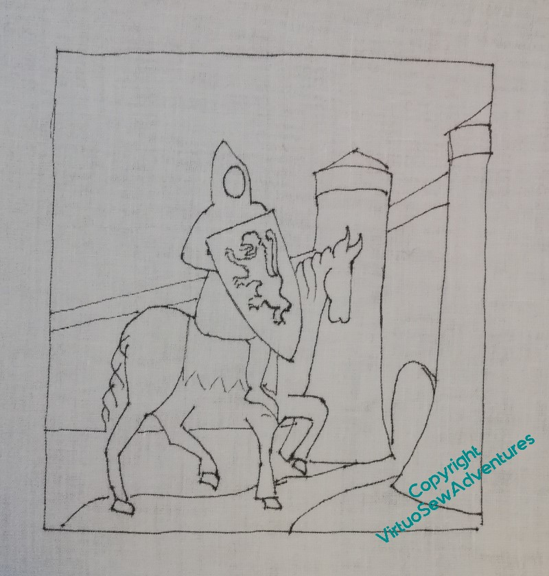
I have a small lightbox now, so I used that to transfer the design. It was a bit of a battle, because the lines showed through so clearly I couldn’t be sure I’d got them all.
And I hadn’t – spot the non-deliberate mistake!
However, one horse’s belly can be added freehand. I haven’t put in the lines for the reins, either, because I’m anticipating putting them over the top of the stitching below, and that layer of stitching would cover the design lines anyway.
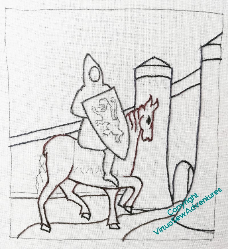
When I began the outline, I used the darkest thread I have, “Ebony”, and it looked a bit monolithic. After a couple of comments from Tanya Bentham, I unpicked it all, took the opportunity to restretch the fabric, which had sagged, and reinstated the outlines with some variation – navy blue for the building, brown for the horse, and dark grey for the armour. They are all very dark colours, so there’s only a slight difference, but there is a difference, and already the design looks livelier.
So, once I had the outlining in, I started with the conical slate roofs on the gatehouse turrets.
At this point, I should admit that those conical roofs are not remotely historical. The seventeenth century engraving that gave me the view of the gatehouse I liked the most didn’t have conical roofs, and I think I can be pretty certain that in William’s time those turrets probably had a man-at-arms on patrol, and no roof.
All that said, I’m not doing an entirely historical piece. I’m telling different stories here, and I want a slightly fairytale/mythological quality to the image. I think the conical roofs help with that.
Ready to Start on William Marshall…
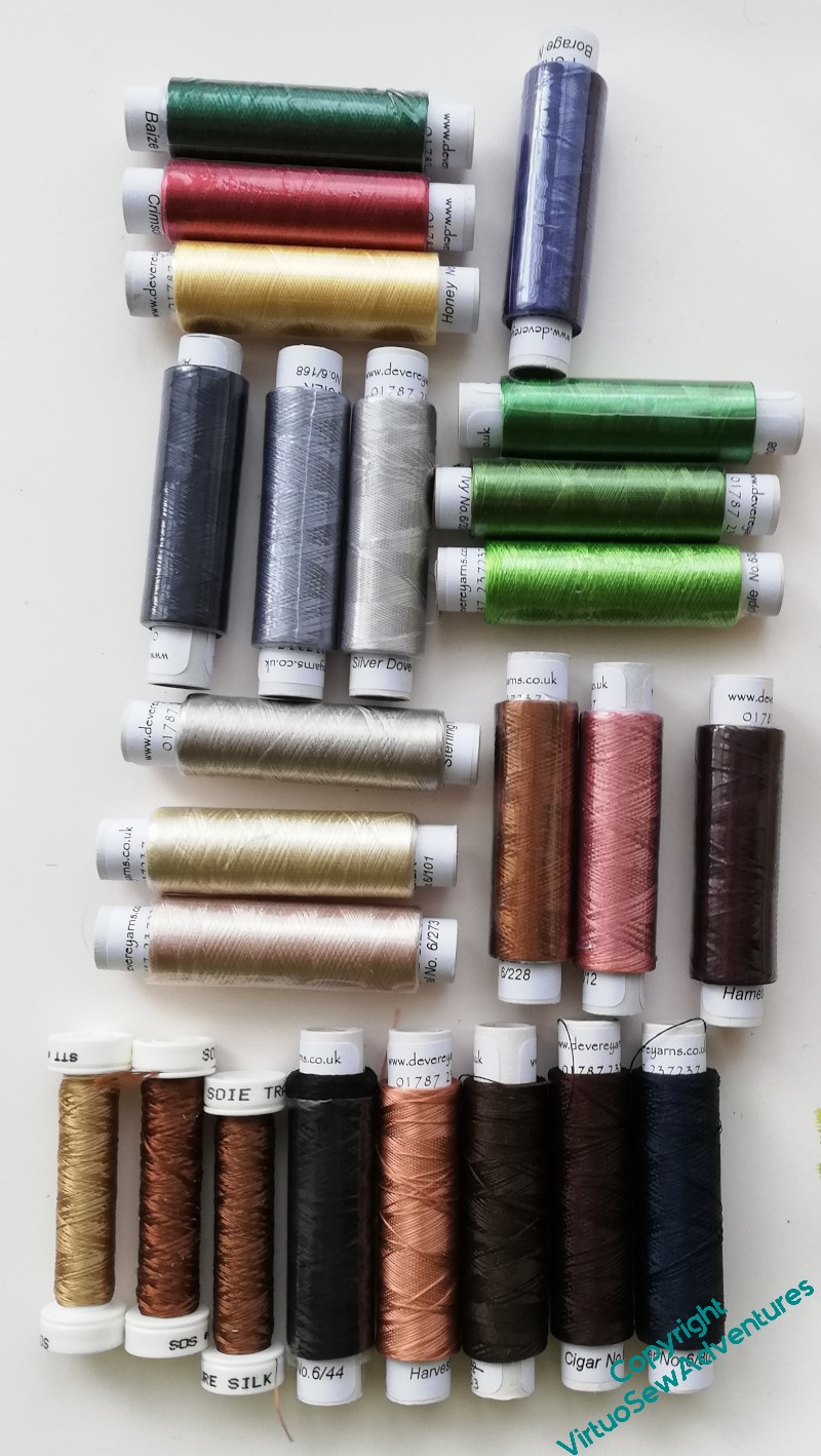
Having spent some time in my stash, deciding that mixing even filament silks might be a bit unpredictable, I finally pulled myself together and placed an order with Devere Yarns. While I waited for them to arrive (it didn’t take long), I went back to Tanya’s book and read the early technique sections again. Homework is always more fun when you’re interested.
I do have some darks left over from the Amarna Family Group, so the outlining is sorted. I’ve got three stone colours, three shades for William’s armour, three greens for grass, three shades for the horse, the three heraldic colours for the shield, and a blue for the slate roofs on the turrets.
The blue is probably also going to be the colour I use for the border.
The Victorians remodelled Temple Church, where William is buried, found a strapping six-footer that they believed – based on what we’ve been told of him – to be William, and in due course, reburied him, and everyone else they’d moved, in the garden. So I’m planning a silk border, of blue laid-&-couched work, embellished with roses (for the garden) and common broom (for the Plantagenet kings he served so faithfully).
The grave slab is shown in a leaflet I got when we visited, which is no longer in existence, but is shown in an engraving from the 17th Century, and was thought to be associated with William. The lion looks right, anyway! I’m wondering whether to include that in my design for the border in some way, and if so, in what orientation..
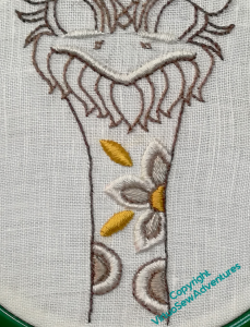
Finishing Silkie
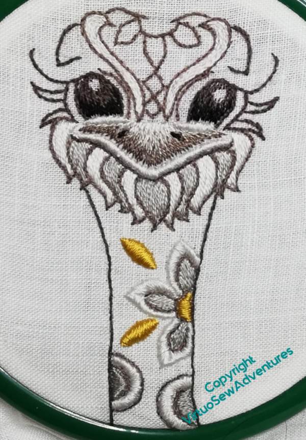
The next stage with Silkie were the main details on the head. The eyes, the beak, and the beard were all long and short stitch, which is not a favourite of mine, as long term readers are very well aware.
However, I have now grown reconciled to long and short stitch to the extent that, if I believe it to be the right choice, I will settle to it without too much grousing. Just a token mutter or two!
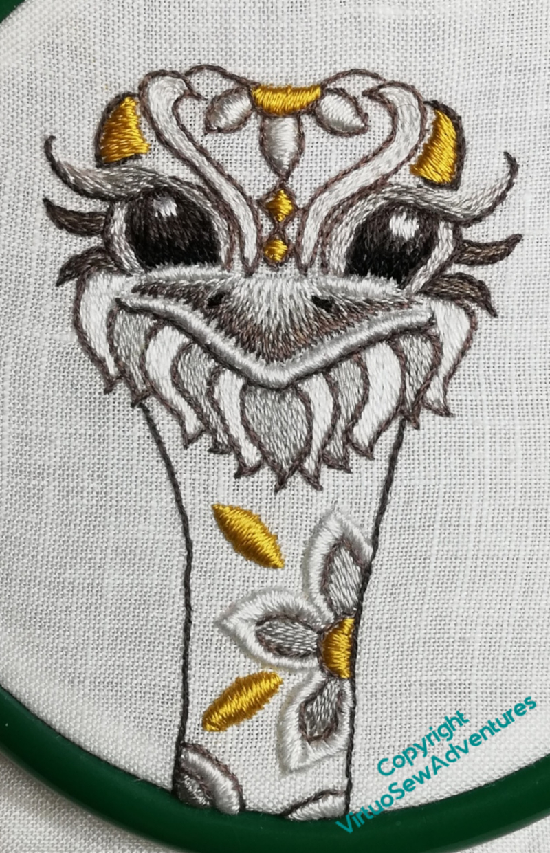
In truth, satin stitch isn’t a huge favourite, either, but the jewel-like golden shapes were what attracted me to Silkie when I saw the kit in the shop, and besides, silk thread is such a joy to use, and so rewarding in both satin stitch and long and short stitch.
So Silkie’s decorations, eyelashes, and bushy eyebrows all came together in something of a rush, and brought the goofy expression properly to life.
The final detail was to seed stitch the neck and the forehead. As it happened, I couldn’t find anywhere in the instructions the detail of which colours to choose, so the final detail may not be as intended.
But I like it – lighter on the forehead where the eyes, eyebrows and beak all concentrate the darker colours, and darker on the neck to bring out the flower with its un-outlined petals.
Now I need to work out where to put Silkie so I can continue to enjoy him!
Episode 49 of SlowTV Stitchery is now live. In which we tackle the Angel’s hair, remember the Great Ladys Magazine StitchOff, and consider music while we work.
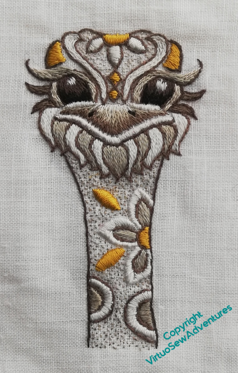
More on Silkie The Ostrich
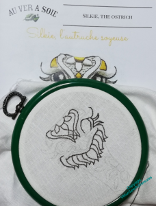
I got started on the design by doing the split stitch, partly to cover the design lines, and partly because I find it easier to maintain interest if the design advances all over, rather than in spots. That’s why I did all the stems first when I did the Coat of Many Flowers!
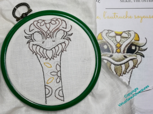
The next element, with the white silk from outlining still in the needle, was to tackle the padded satin stitch around the beak and beneath the eyes.
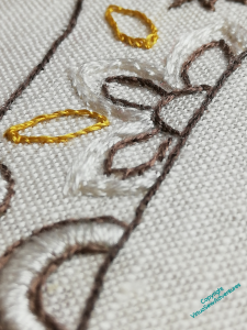
After that I moved on to the decorations on the neck. The patterns are picked out in padded satin stitch. Of course, I decided to complicate matters for myself, and I have decided to vary the levels of padding, and the placement of the padding. For example, I hope you can see here that the padding on the white petals of the flower is shifted to the outside of the petals, and has been done in a couple of layers.
When it came to the two golden leaf shapes, I combined two layers of chain stitch padding with a layer of satin stitch at right angles to the final layer.
The light grey elements are all unpadded.
I’m not sure that it shows at all well, but it does make more of a difference in person than in reproduction!
Meanwhile, Episode 45 is now live – in which I continue planning Placidus, while considering the challenges of image searches, and the occasional opacity of musical jokes.
A rather belated start..
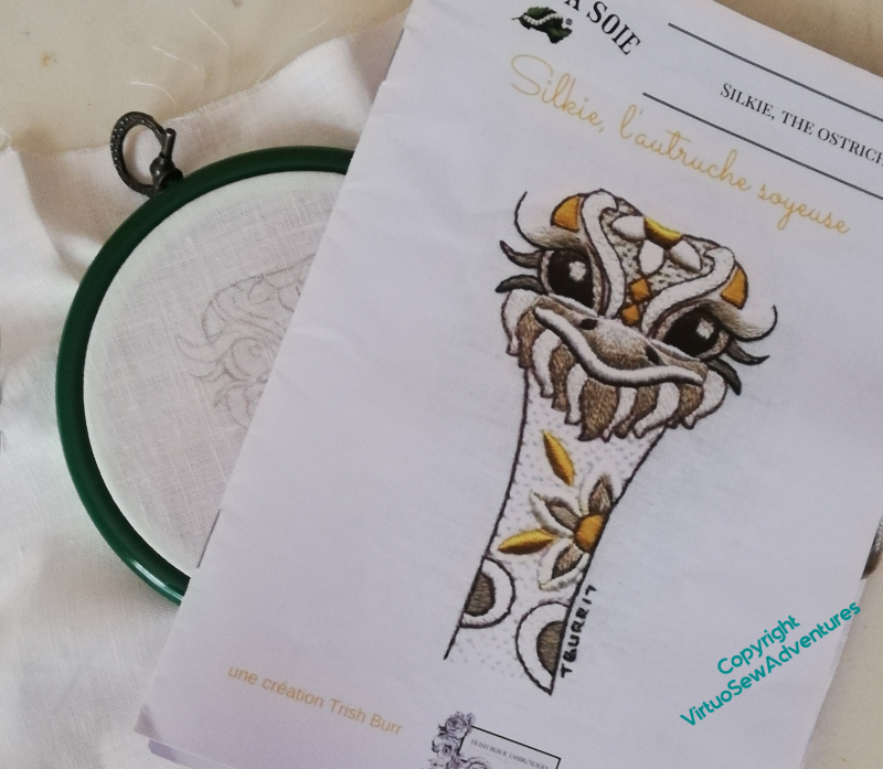
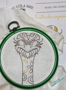
Some of you may recall that a year ago I worked Tanya Bentham‘s kit of the Hounds in the period between Christmas and New Year, as a change of scale, material, and subject while my bigger projects were tucked away to make space for decorations. You may also recall that I bought a Trish Burr design, “Silkie The Ostrich”, from Au Ver A Soie, to fill the same space in the turn of last year to this. And you may have been wondering why you hadn’t seen it yet…
Well, it took two goes to get the design transferred, for a start! When I tried at home, using the low-tech sunlight-through-the-window technique, there wasn’t enough sunlight! So I had to wash off the failed version and use my mother’s rather fabulous LED lightbox (we’re in a bubble, so no, it didn’t involve breaking lockdown rules).
The more I invent and develop my own designs, the stranger it feels to follow instructions. This is still stranger, because the instructions are in French. I do speak French, but I didn’t do any embroidery when I lived there, so I don’t have any embroidery vocabulary. Not the least of the oddities of advancing years is finding which weird thing you couldn’t possibly have second-guessed you wish past-you had done…
In this case, partly because I’m concerned about losing my design lines, I’m not following the order of working in the booklet of instructions. I’ve started by working all of the split stitch outlining. It’s all in a single strand of silk, so it’s questionable as to how much of a rest from my other projects this will give me, but I lost my heart to Silkie’s smile the moment I saw it, so I think it will be a rest in a different sense.
We have reached Episode 43 of SlowTVStitchery, a rather short episode, owing to some difficulties with camera focus. I was beginning to tackle the full width of the piece, while pondering the challenges posed by Brahms and Messien, and the lectures given for Gresham College by the late Christopher Hogwood.
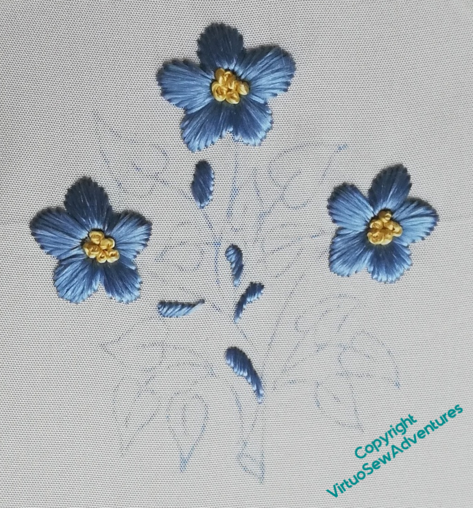
Japanese Embroidery, 2
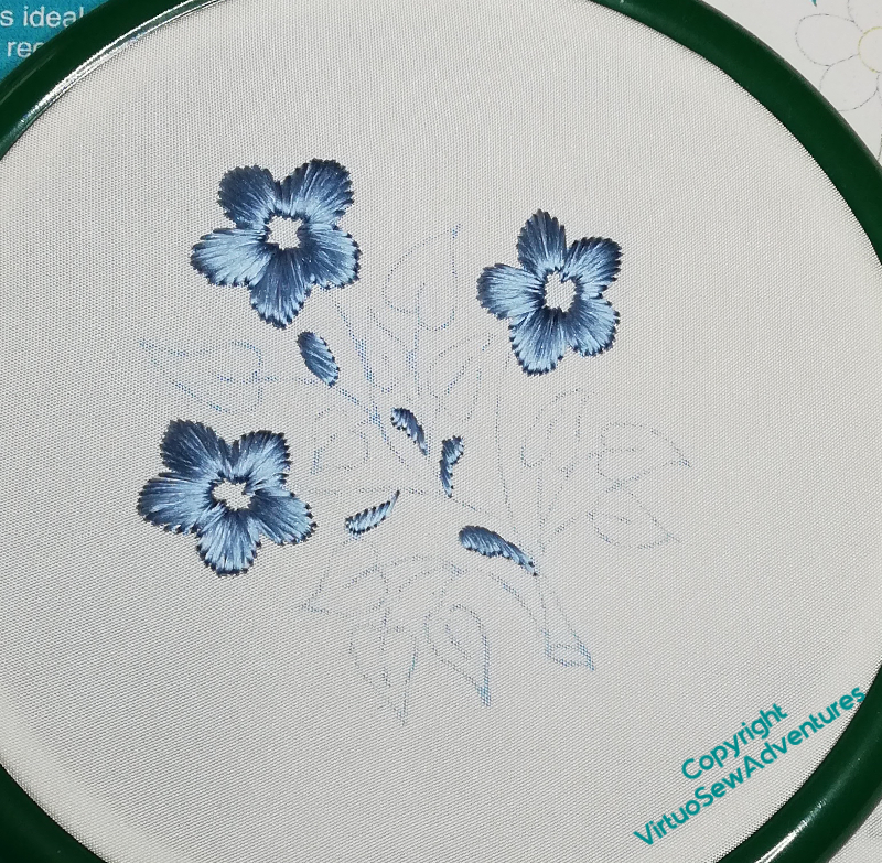
Once the padding was done, the next stage was the flower petals. These were fairly quickly done, in satin stitch. I tried to keep the stitches in the right orientation by starting in the middle of each petal and working the halves separately.
Have I mentioned before how much I love the effect you get with flat silk? The stitches almost glow, even in poor light!
The instructions for the other elements weren’t quite as clear as I expected them to be, although I can’t quite put my finger on why. That said, I could fill in the gaps with a bit of guesswork, so it’s all good.
French knots for the flower centres, using hand twisted thread. I found the needle harder to thread here, because the twisted thread was quite heavy, and it untwisted easily, too. This is a problem I’ve noticed with my hand twisted thread before, and I’d love to know whether there is anything to do to avoid it!
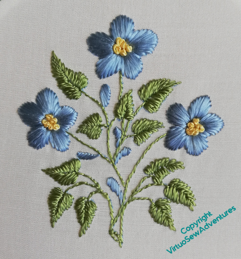
The leaves were satin stitch, again in twisted silk, while the stems were in stem stitch. The pattern didn’t specify, but I took absense of specification to indicate using the silk untwisted. It keeps the stems light and delicate, anyway.
So, finally, after nearly thirty years, I’ve finished the forget-me-nots!
Now I just need a pot to put them in….
The next episode of Slow TV Stitchery is up – Episode 25 – on reaching the fourth border, and the pleasures of lute music. Do go and have a look!